While acknowledging that art is subjective, I don’t understand players who are turned off by a game due to the art or art style. If I can say, “The art isn’t good, but it’s a good game,” I’ll play it. In particular, “cartoony” art is fine by me.
Glory to Rome: The caricatures on the cards looked like clip art. I never gave it a first thought.
Terraforming Mars: The card art is mediocre and inconsistent. I never noticed because was focused on the iconography and the text (which is generally excellent).
Automania: The cover art is cartoony. I never look at the cover when playing the game. I bought it based on the mechanics and theme.
However, I do think art is an important selling point for Kickstarter. It has to grab you and make you interested in exploring more about the game. Games with poor art choices (which can include using good art in a bad way or just using cliché fantasy or science fiction art) may be an indication of bad game design choices, especially with rpg projects.
The character art of Circadians is static (those eyes!) with a heavy line. It is neither stylized (cartoony) nor realistic, existing instead in an uncomfortable middle-ground that I find distracting. I’ve never played it (I haven’t played most games), but the art wouldn’t stop me.
I always feel bad criticizing art and lore in games, because 9999 times out of 10000, it’s better than what I could do. I also feel that it directs a disproportionate amount of my game-buying-dollars towards established publishers and away from indie game creators.
Don’t fall for that trap. It’s fine to not like things. You can criticize a movie or a song even though 9999 times out of 10000, it’s better than what you could do. I do think it’s important to explain why you don’t like something even if you couldn’t do better yourself.
Paying for good game art is exactly the kind of thing Kickstarter should help facilitate.
I’m definitely with you on this one, but I can’t really fault my potential players, either. We’re all avid gamers and the fight for table space is hot and ongoing. Off-putting art is a barrier, plain and simple. It’s unfortunate, but pretty common given how many games are competing for our attention.
(FWIW in my group we all buy games, which is a good problem to have for variety but definitely comes with its own challenges with respect to table time).
I must say, art that I don’t particularly like would not put me off a good game, but on the other hand, excellent art can pull me towards a not so good game? At least a game that is well presented is attractive. And that is an advantage, I guess. Visuals are always a way in. That’s why we wash our cars and give them a good make up before selling them, like our houses, etc. It is a selling strategy.
In general, I’m much of a “visual” person. I can play dry, beige euros just fine. I prefer my trains to be cubes (and not train-meeples), and I dislike when meeples have stickers on (I’m still confounded as to why I stickered my copy of Glen More II, though they are particularly well-done in my book, having a low-key design and not “busy” like MeepleSource “upgraded” meeples)
But an amateurish graphic design or illustration style can seriously put me off of a game, and I’m not entirely certain why; I suspect it has more to do with me reading into it a bit too much and determining that the entire game may be as sophomoric as the art assets.
Ratcatcher is one that I tried to look past. I really thought it wouldn’t bother me, but every time I reach for it to try it, I just struggle to follow-through
I remember looking into the first edition of Captains of the Gulf after hearing about it on the SUSD podcast, but the art just pushed it a little too far out of my interest (after hearing the not-quite-glowing coverage from Mattl and Quinns)
The Circadians: First Light as previously mentioned is not terrible, but there’s a lot of stiffness in the characters that leads me to look right past it.
And then countless Kickstarter covers have issues and I don’t know if I’m going to pick on any of them in particular; generally speaking it’s “the artist can comfortable illustrate people in 2 or 3 positions, so all of the characters have roughly the same stance/pose” or “the foreground detail is all quite good but the composition and backdrop look like it was composed in MS Paint”
I’m not a design person, but I do find I’m surprisingly sensitive to “the artist basically just did one page of characters, and we’ve composited them in different combinations and backgrounds”.
I got the pnp of Ratcatcher and a lot of it makes me twitch. But I did enjoy the amount of feedback from the designer who held his hands up to his amateur ness.
Hmm, that box cover for Circadiansis pretty bad. There’s a comic style to it that does not work for me, I will agree (despite it being better than anything I can manage). The others look okay to me, though Captains is certainly bare-bones, from images I can find online. But maybe I’m just easy to please.
@RogerBW - considering the sensitivity you mention, what are your feelings on the card art in Undaunted: Normandy, if you have any? Since the artist basically uses the same pose for each unit type, but makes small changes to individualize each face and possibly a bit of difference in the clothing. It makes sense, as that way at a glance, you can easily recognize what unit it is, but since they went and named each card, the small art changes makes each one an individual rather than just a bunch of clones.
There is a (perhaps surprisingly) large amount of psychology and philosophy education in fine arts academia. Without digging in too much, suffice it to say there is no Arts Council deliberating on what constitutes “good” art or a “correct” composition. There are, however, natural inclinations with respect to how we’re wired, a lot of it well studied clinically, and the best artists know how to compose images that attract and lead the eye. You can train yourself to be “good” at critiquing art, but most people are innately skilled at pointing out good/bad art, even if they aren’t necessarily able to explain why.
I could not buy the 1st ed Glory to Rome, no matter how cheap. That’s how much I dislike the amateurish graphic design. Instead, I made English cards based on the much nicer Polish edition.
I generally agree that art/production I dislike won’t stop me from playing a game, it’s definitely a hurdle, especially when it comes to purchasing a game.
Part of that is that I’m a very visual person, and want “beautiful things” on my table (subjective of course), but it’s also am easy “filter”. There are simply too many good games to play, let alone buy, them all. So having an easy “that’s ugly I’m passing” test just helps.
I say that as someone who games exclusively at home, and am therefore the sole purchaser of games.
I’ve only played it on TTS and wasn’t looking at the cards in detail, but it didn’t seem terrible.
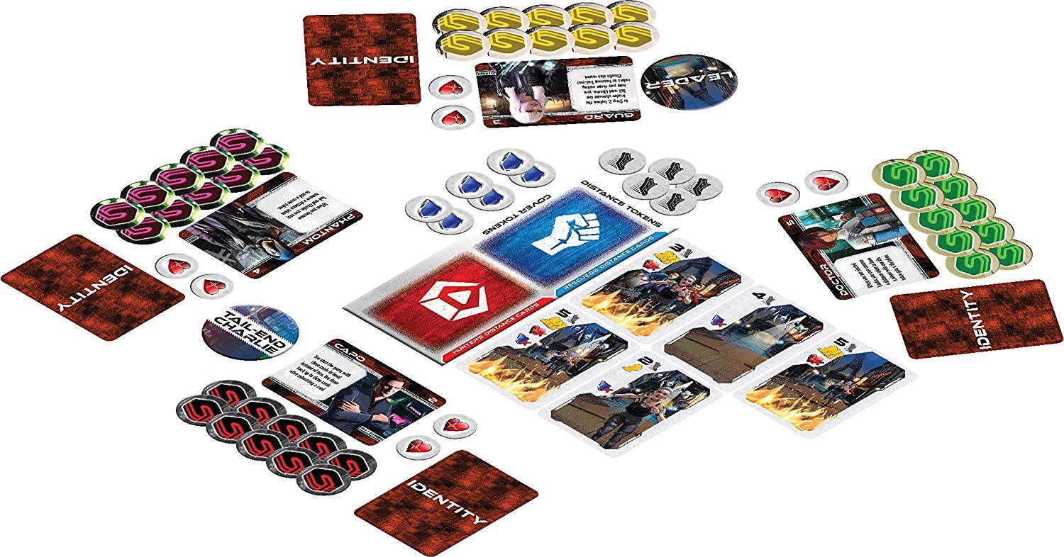
One that’s really blatant about it: Exodus: Paris Nouveau. There aren’t a lot of images of this, but you can get some idea from the cards in the middle here (next to the red and blue ones):
So basically all the art they needed was the background, three human figures, the fire and the drones, and out of that they get a layout person to make 80 cards. It feels cheap. (Similarly the lady with the long white hair, seen inverted next to the “Leader” token above, is the exact same art as on the box cover.)
Okay, that’s definitely some cost cutting on art assets there. I remember seeing this somewhere and thinking the same thing. It does seem cheap and is off-putting.
When you start to reach Rocket Robin Hood levels of asset recycling, people really start to notice.
[EDIT] @COMaestro Roland MacDonald is one of my favourite artists in board games, particularly for characters. He’s not always used well; for example, the covers for both Undaunted games and Western Legends seem like gaudy composites rather than cohesive works. But he does some truly stunning stuff.
Is there any of you that sort of likes that “not so good” art that has a very board gamey feeling. I am thinking games like Pillars of the Earth or Village. It’s not great by any means, but it has a feeling of… belonging there?