I can honestly say that I don’t look at art too much, I’m much more about the mechanics. I appreciate games that look spectacular, but unless the art is offensive I don’t think I’d ever not want to play something because of how it looks
I grew up on that kind of art… for me it’s just what classic (YMMV on that label) boardgames look like. But there are good and bad versions of it. New Hansa Teutonica is pretty good:
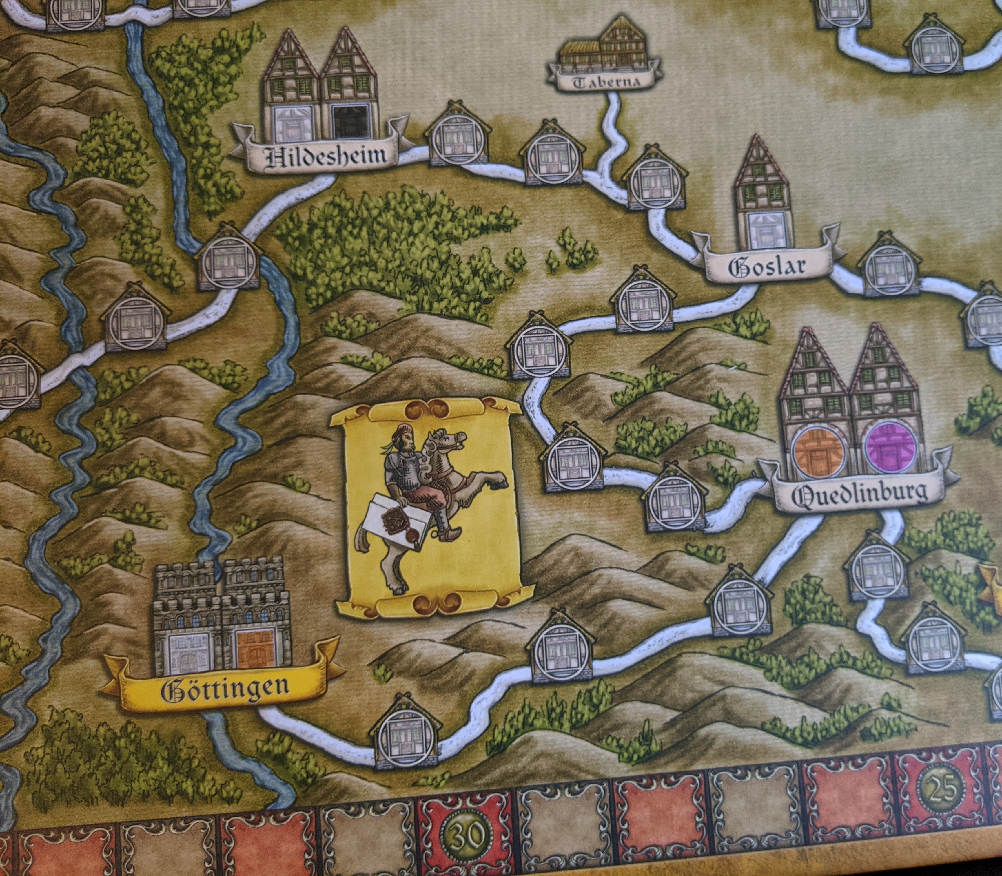
The details are clear, the background is a background and doesn’t blend with the game icons. The style is consistent. The font readable. The colors are clear enough and don’t “pop” too much.
I do like beautiful games, especially beautiful covers. But again what I think is pretty doesn’t necessarily convince the next person. I think quality of art and materials enhances a game for me and makes it more fun. If a game is really great, the art obviously doesn’t matter. But thematic art makes the game come together as a whole more easily. It supports the game while bad art detracts from it.
Art is incredibly subjective but as @VictorViper stated above there are some things about composition and colors that just draw the eye. Many of us can tell these things without explicit training. I think games are not just art though, there is a lot of graphic design here and good iconography is just as important as a pretty cover–even more so. The best game artists make both and are able to blend them into a consistent looking whole.
There is a reason Lacerda games by EGG are so expensive. On Mars has to be one of the best games I have from a art/design perspective (also the game itself is a piece of art–meshing together so many different systems and still achieving a consistent whole that can be played). I cannot think of another atm that is quite so consistent throughout the game.
We can tell when something is cheap because we know the recycled clip-arts and we see the repeated patterns and the bad blending of assets.
6 Likes
All this talk reminds me of a burgeoning geek cafe franchise in the UK. My opinion is that their chosen colour scheme is an assault on the eyes and I really wouldn’t want to do anything in it.
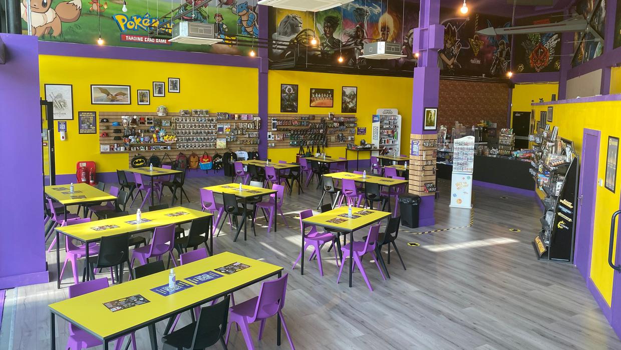
(back on topic) I’d take slightly wonky art in favour of good design and clear layout. Ideally both.
6 Likes
Clearly the supply chain crisis is hitting so hard in my homeland that stores can’t even buy coordinating furniture and paint.
4 Likes
The Dobble colour scheme
8 Likes
I was just thinking that
Which Quinns intimated in a podcast is a best seller for it’s publisher by a long shot.
2 Likes
My friend used to work in the one that recently opened up here, until her and the other female staff made a complaint about being sexually harassed by another member of staff. I’ll give everyone 3 guesses about who got fired and who got to stay ![]()
8 Likes
Scaled to a cafe scale just seems wrong
1 Like
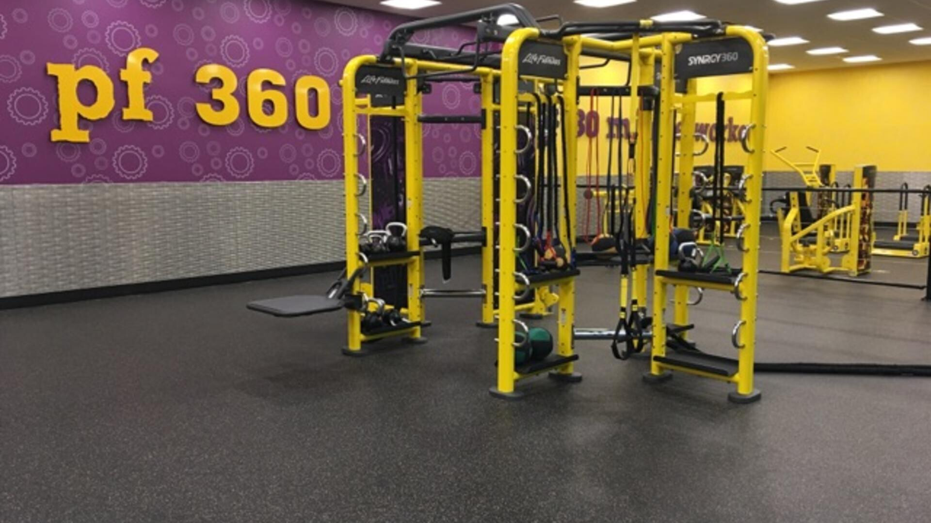
Looks like a gym to me:
Planet Fitness (a national chain of gyms here in the US (and I guess Canada and Mexico))
3 Likes
Ah, they’re this year’s fashionable colours.
1 Like
Isn’t that the gym that you can never cancel?
1 Like
I’ve never had a problem. I signed up with a special offer ($120 for 12 months). They’ve never pressured me to renew it when it expires. And, as far as I know, I can call them up or walk into a location and reactivate the same account again, pay $120 up front and have a valid membership for another 12 months.
3 Likes
Ahhhh the 90s…
“Do you go to the gym?”
“I pay for it”
5 Likes
I just read a BGG comment pointing out a neat piece of graphic design that I would never have recognised by myself…

12 Likes
That is a beautiful flag.
2 Likes