The resurrected miniatures painting and showing off thread

Another model attempted by a relatively-close reading of Sorastro’s video tutorials.

I say “relatively”, because I use contrast paints for a lot of the areas that Sorastro uses custom colours and steps of highlight and shading because ain’t nobody got that time. But I tried to stick with the colour palate, and I used his techniques (although not his skill) for the gemstone and staff.

No zenithal highlighting this time… straight to the Wraithbone White.


Orkflesh Contrast for the skin. This was my first stumble… Sorastro went with a much more yellow-tone for the skin (almost Plaguebearer), but I decided to go green instead. Messed up one of the pieces of cloth initially since “Warpstone Contrast” and “Orkflesh Contrast” are virtually indistinguishable. Oh well. That’s a future problem.


Sorastro somehow managed to make the clothing on this model white… I went with a more forgiving light-gray. I think it ends up looking pretty okay, but not as striking as the white is. Oh well.


I painted the inner clothes dark green, and the outer ones yellow (instead of the light green Sorastro uses). Looks okay? Looks okay. “Skeleton Horde” for the boney protrusions (teeth, claws, spines).

Moving on.


Okay, so Sorastro uses a black-orange mix for the staff, and i figured that I’m going to try Non-Metallic Metals for the first time, so I’ll follow suit. I don’t usually (read: ever) like mixing custom colours, but whachagonnado?


Okay, the gemstones. These fackers. I used a combination of Vallejo purples, violets, and fuchsias, and the coverage was awful. I hate when paint doesn’t go on smoothly… that’s why I use Vallejos, because usually they go on super smooth, even if too thin sometimes. But NOOOoooOOOOoooo… sometimes they just refuse to behave. Whatever, moving on.


An hour later, many thin coats… and they still look wrong. WHATEVER! We will push through!


Adding the thin white really helped the front… the back? Hmmm, not so much. But again, better. I touched it up a little more. I think it helped…


Front is still way better than the back, but other than the staff I was basically done at this point… so let’s try the NMM on the staff!

What could possibly go wrong?


Not a great job on the staff. I wouldn’t even say a good job on the staff, but it’s okay. I understand NMM more (no putting like colours on angled nearby surfaces, for example). And the end result is… okay? It’s okay. I’m happy with it.

Next up is Syrus (this is Vaerix) from Descent… but then I think I’m out of Descent video tutorials, so I don’t know what to do after that! We will see, we will see…

Thanks for coming on this insanely long hike.

12 Likes

It looks amazing!

2 Likes

Got a (precisely) 12° day yesterday with only moderate wind and sub-60 humidity, so the rattle cans came out. I wasn’t really prepared though, so I got started on this piece of pure frivolity:

I should have this done by tonight I hope.

[EDIT] Squeezed in a little painting during naptime.

5 Likes

A pair of vampires for my Silver Bayonet collection.

7 Likes

Looks like they are singing in an opera… Nothing to do with your painting, just their faces…

3 Likes

I got started on The Kraken from Dead Men Tell No Tales this morning. I’m generally happy with the mouth, but will be going back in for some touch-ups and highlights later on I’m sure. Meanwhile I’m pretty keen on that awful skin tone, which is a simple two-coat base and easily repeatable for the 15(!) arm segments I’ll be painting up along with this beautiful mug.

I’m still not totally sure how I’m going to handle the spikes/fins or the gill sections, or frankly even the highlights for the scales, but it’ll surely be something to contrast the green.

8 Likes

Okay, on the heels of finishing Vaerix from Descent 3rd Edition, I tackled the human mage Syrus.

If people don’t want me to post the process pictures, do let me know: I’m happy just to post the finished product if that’s easier/more interesting/less bothersome!

With that stated, for now here is Syrus primed:


Humble first steps: a few coats of Darkoath Flesh to try and get the tone of his skin right (it’s not, it should be darker, but oh well).


Another two coats of skin (trying to make it darker… it worked, kinda) plus the beard.


Pink in the mouth, white for the teeth. And I tried to do the eyes, but not this time, eyes… not this time.

First couple passes of yellow for the cloak, plus Apothacary White for the pants/robes.


Next, dark browns for the staff, gloves, sandals, and wand…


Some rudimentary highlights on his cloak, and painting the base (Camo Green for the vines, mid-gray for the rocks, and then a brown/black wash).


First pass of yellows and oranges for the phoenix, with white mixed in for the phoenix itself to make it seem brighter.


Drybrush of red over the lower parts of the flames, drybrush of white on the phoenix itself, a few highlights on the base.


Last bit of Object Source Lighting (poorly done), plus some gold touches, and Syrus is ready to be sealed!


I think I did a much better job with Vaerix (a few posts above), but honestly I’m okay with how Syrus looks. The models are good enough that they’re pretty forgiving.

But now I am out of Descent tutorials, and so I’m at an impasse. Do I wait months for Sorastro to make more tutorials for Descent? Or do I risk doing a bad job by painting them now? I honestly don’t know. I guess we will see! I have all the heroes primed already, and a batch of the villains… and nothing else immediately pressing on my painting queueue.

We shall see, we shall see.

10 Likes

Hands up people who are sick of me posting all my progress pictures… nobody? Cool! Let’s do another one, then.

Fewer pictures this time (longer gaps between steps, and I forget to take pictures sometimes), but hopefully enough to clarify what I did.

Primed in white, and then a quick coat of medium gray over most of the base, and a coat of “Gryph-Charger Grey” contrast paint on the stone column.


Cool. Then a bunch of washes… brown wash, followed by green and blue washes (for shadows), and then sponging on a light green, a dark green, and a muddy-yellow to give the effect of moss.

Honestly, I’m impressed with how it looks. It’s not as good as I’m sure Sorastro’s base will look (his will glow or be made of jade or something), but it looks pretty passable. I am satisfied with the base at this stage. I will touch up a few of the bigger yellow areas in a bit with some gray paint just to tone it down a little, but I think it looks okay.


Anyway, time to paint Chance. Dark purple for all the clothing areas… one of my main complaints with the new tutorial guy I’m using (since Sorastro is sublime but only releases 1 or 2 tutorials a month at most, and alternates between 6 or 7 different product lines so who knows if/when he’ll finish Decent) is that he doesn’t describe or show all the areas he paints very well, so I have to guess in a few places. Oh well. Nice purple, at least.


Okay, so, purple wash over parts of the clothing (the parts in shadow, natch), followed by two levels of highlighting over most of the cloth. Then a coat of medium gray (which, sadly, is the same colour that the rocks are, but due to the washes I don’t think it’s super obvious) for the fur. Also did the first coat of highlights on the fur before this picture.


And then I forget to take any progress pictures until Chance is done… but basically Snakebite Leather for all the leather, bronze for the shoulder pauldron and katar, steel and then dark aluminum for the leg plates and knives… and I think that was it!


She Who Is My Consort (a silly Star Trek joke that we use as a running gag) has requested green eyes. So gonna try to do that real, real quick, but otherwise, done!

I miss Sorastro’s tutorials. I think Chance (this model) turned out pretty well, but the last two are just… better.

Anyway, next up is Kehli (the dwarven artificer, I believe). Already started working on her base, but it’s going to take longer to dry than I have tonight, so I’ll keep plugging away at it tomorrow.

Thanks for reading!

12 Likes

Goblins to harass my Napoleonic French.

9 Likes

Man, apparently there is much I do not know about the Napoleonic wars…

7 Likes

Brothels were nasty back there, man…

5 Likes

Time for another “let’s see how Marc screws up this model” session! Yay!

Okay, so I think I mentioned that I’m out of Sorastro tutorials… at least, I think I am. Lemme go check his YouTube quickly…
Yup. Still no more Descent tutorials. Such is life… at least by doing my Descent models now I’m giving him an opportunity to finish up with all the Journeys in Middle-Earth models, which I can paint after these.

Right! So, today I’ll be showing the progress on Kehli. I think the guy who’s tutorial I’m using is okay… but this is not one of his better tutorials, BUT I managed to make it work so maybe I shouldn’t throw stones? Whatever. Here is Kehli after I started her base:


Basically just some wet-blended Contrast paints (dark brown for the mud, greens and browns for the foliage, and grey for the rocks).

Then a few touchups to make the leaves pop a little.


Oh, and sponges of dark and light green, and a little yellow for texture. End result is pretty good, honestly. Happy wiht the base, we move on to the skin.


I think this is two coats of “Fireslayer Flesh” contrast paint… might be 3? I think at the end I finished with 3 in most places. “Dryad Brown” (not a contrast paint, le-gasp) for the hair, and Blood Angel red for the gems in her hair.


I didn’t think it would ever happen, but it has… I found a gold paint I really like! Retributor Armor… gosh, what a great gold! Liberator Armor, which I am going to use for highlights in a moment, is okay… but Retributor is great!


Medium gray for the shield and the hammer.


Black wash for the stone sections (shield and hammer), brown for the crossbow wooden handle.


Highlights on the shield and hammer, steel for the crossbow.


Highlights on the golds, another set of highlights on the shield, and string for the crossbow.


Some of the leather sections (gloves, top). Here is where the weaker tutorial really starts to show: it’s really hard to tell what sections the guy is painting… oh well.


Blood Angel red for the armored sash and belt buckle, some white areas, and a lot of confusion (the guy never actually paints the belts on the front of the model… basically just leaves them primed white… which is weird… so I decided at this point to put in a bunch of silver instead of the whites).


And boom, Kehli done. As mentioned I did silver instead of the specific-to-the-art white-with-gold-trim for the armoured sections, but otherwise I think I did a pretty fair approximation of the official art.

And now I am 4 minutes late for leaving for work, so I better go! Galahan (sp?) the elf is next!

9 Likes

What you’ve done with that model is fantastic. The whole thing looks great, but I particularly want to say what an amazing job I think you’ve done with her face.

I always preferred painting models with closed helmets so that I didn’t have to try and do skin. Never got the hang of it… which is unsurprising since I also rarely got any practice!

1 Like

Aww, thank you!I think I’m doing an okay job with these minis… it’s not quite as satisfying as crunching through a full Lance in Battletech, but it’s a heckuva lot better than painting my Infinity models (too tiny! Too fiddly!). It helps that the Descent models themselves are basically top-tier sculpts.

I don’t think I did anything particularly amazing. Getting the little dot of white in there just requires a really good brush (I’m currently using one of the same brushes that Sorastro recommends… a Rosemary and Co sable brush that’s pretty good. Not as good as my old Winsor and Newtons, but a third the price and a really nice tip). Other than that, some careful application of contrast paint fleshtones does almost all the work (multiple coats because they don’t have a truly dark-skin tone yet… I used Fireslayer Flesh for Kehli, and Darkoath Flesh for the human mage who’s name I can never remember).

Now, if you want to see an eye I am really proud of…

(Credit where credit due: I didn’t do the iris, that’s part of the sculpt. Did I mention these models are next-level? They’re next level).

But yeah, really happy with how Chance’s eyes look when I went back and made them just a little green.

2 Likes

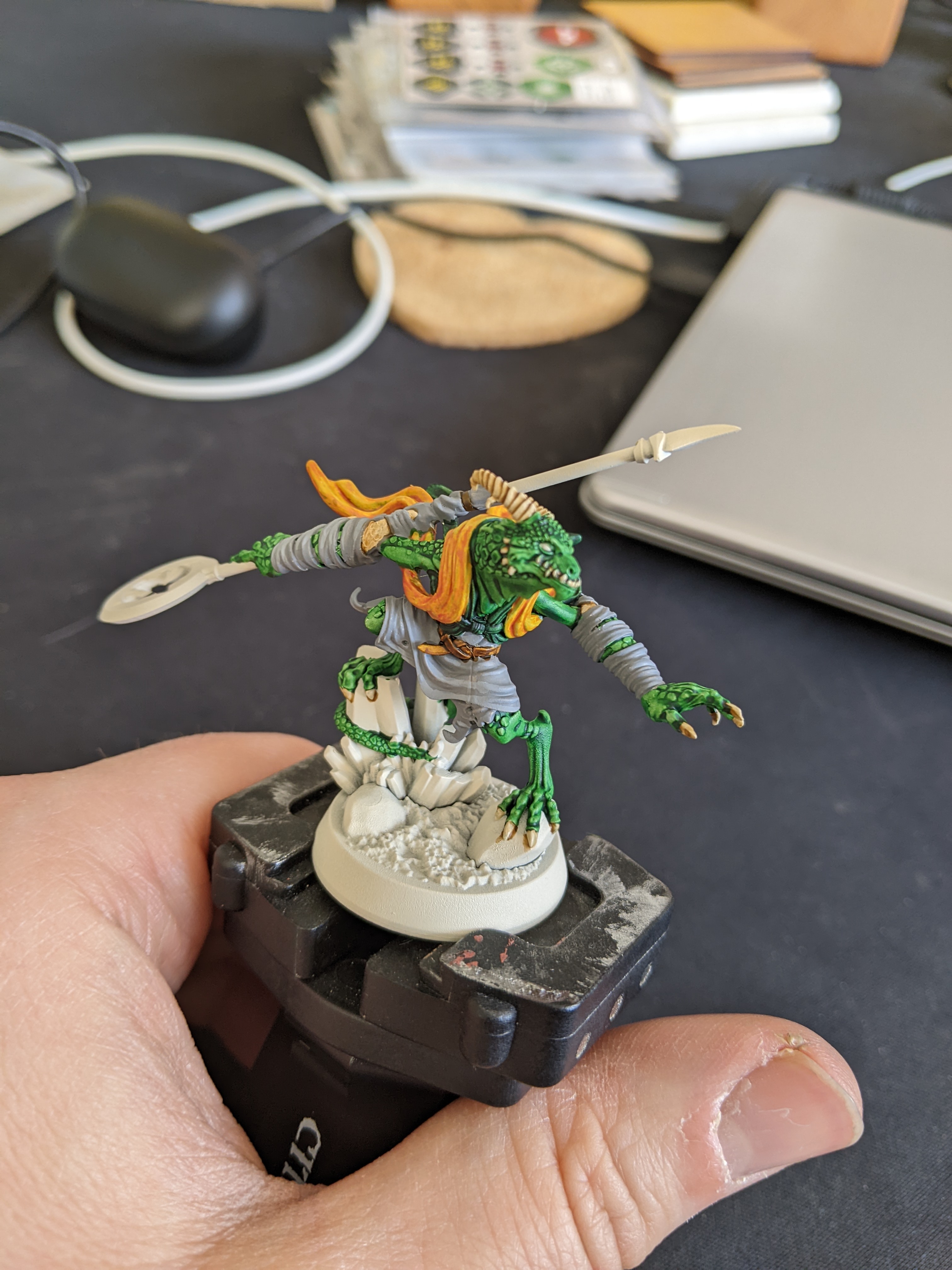
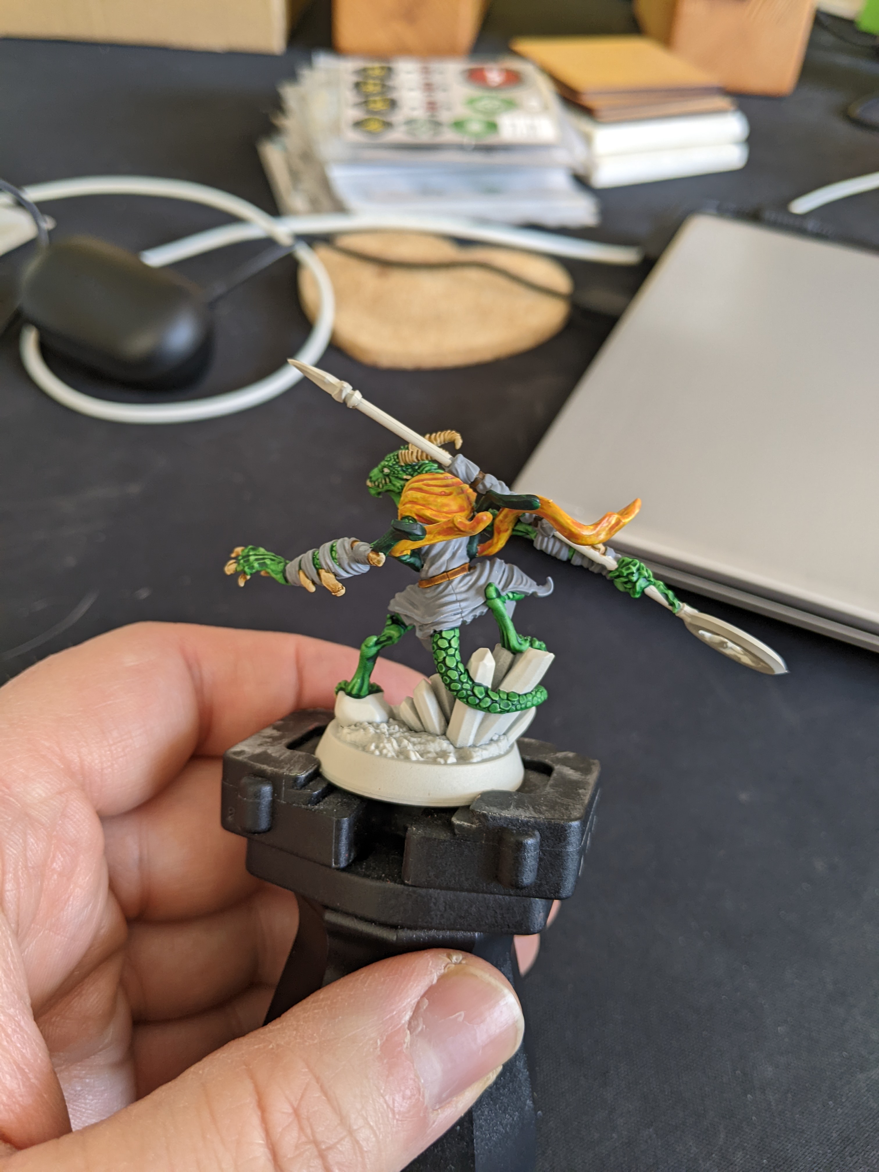
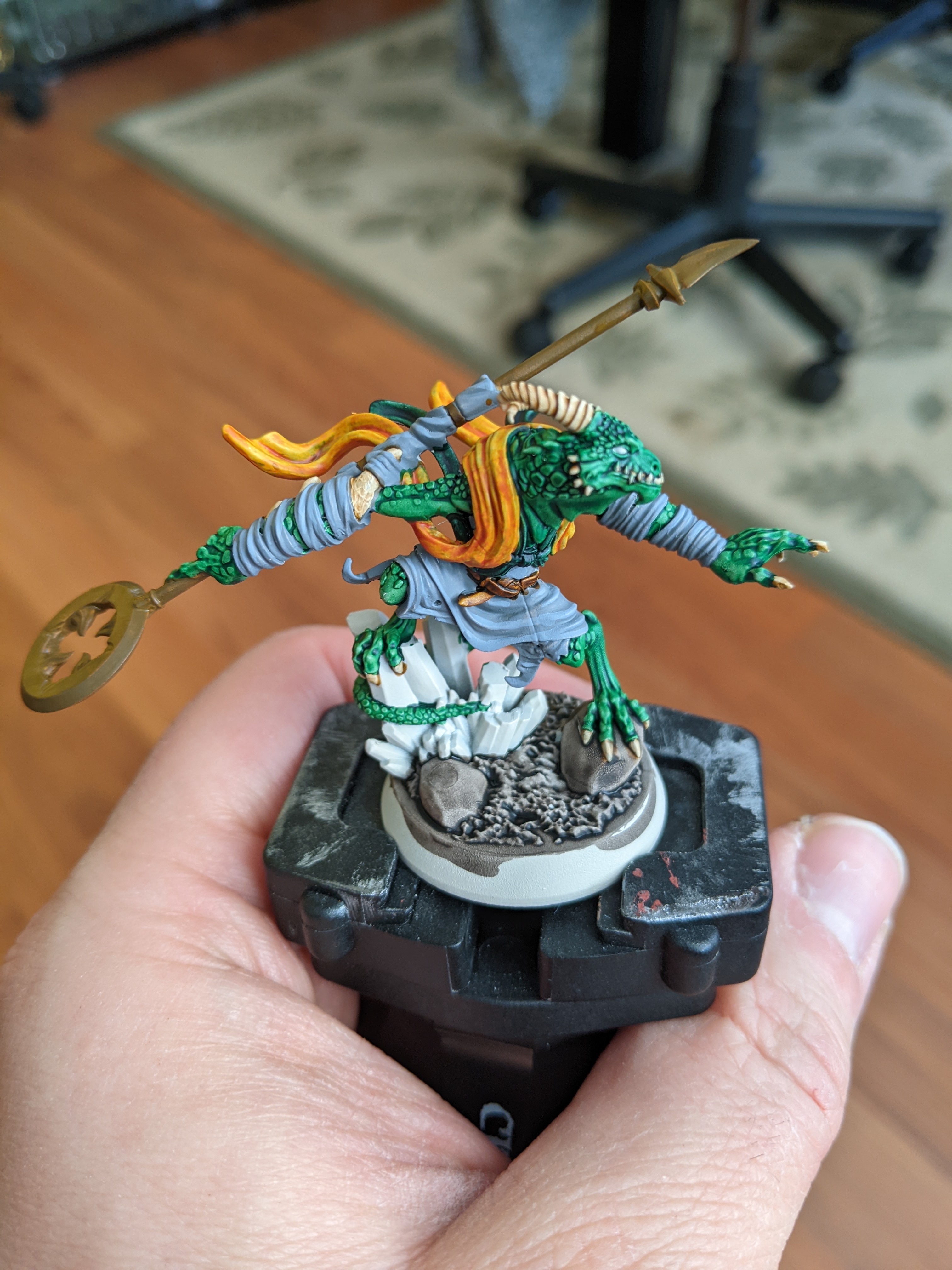
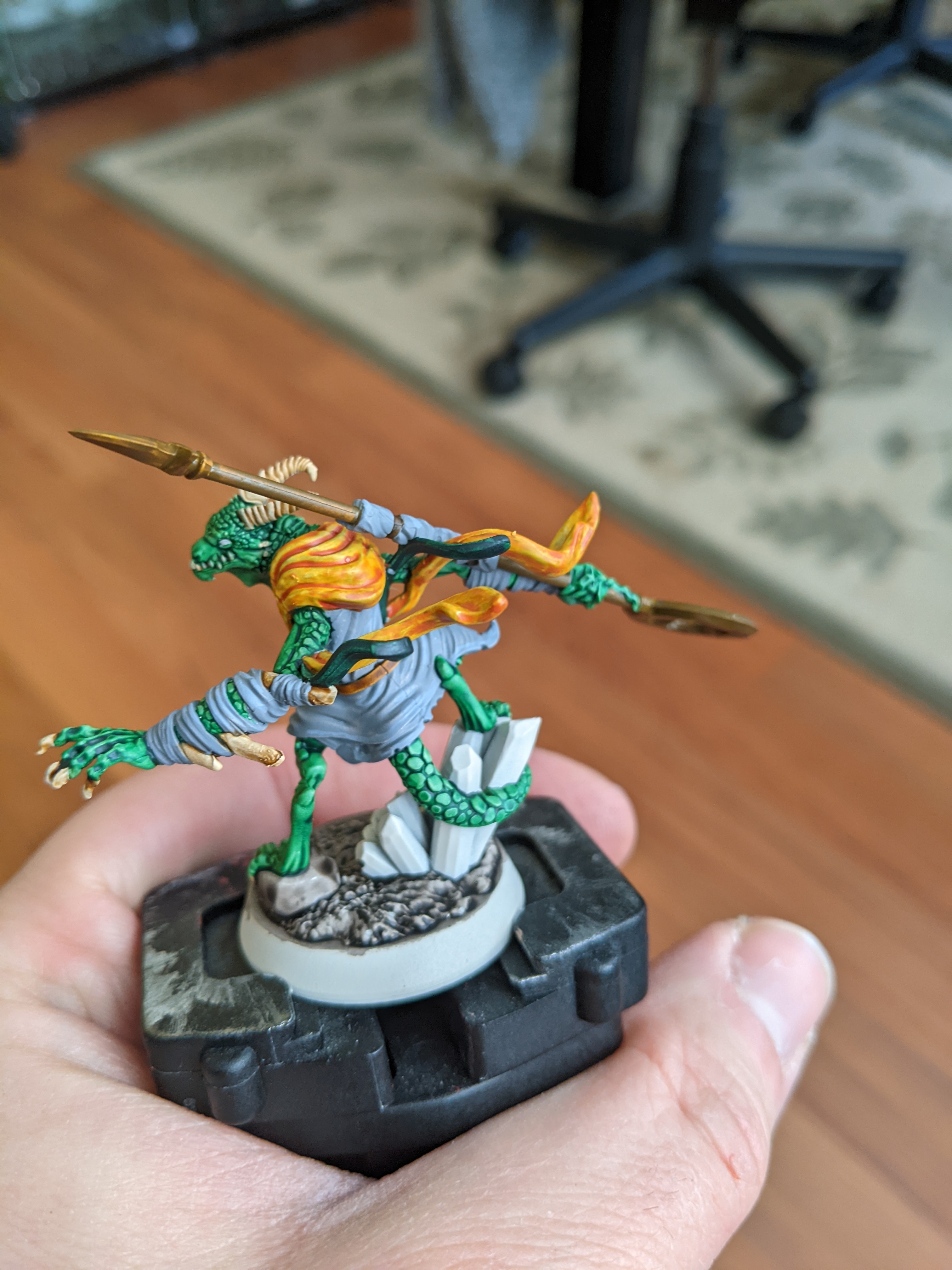
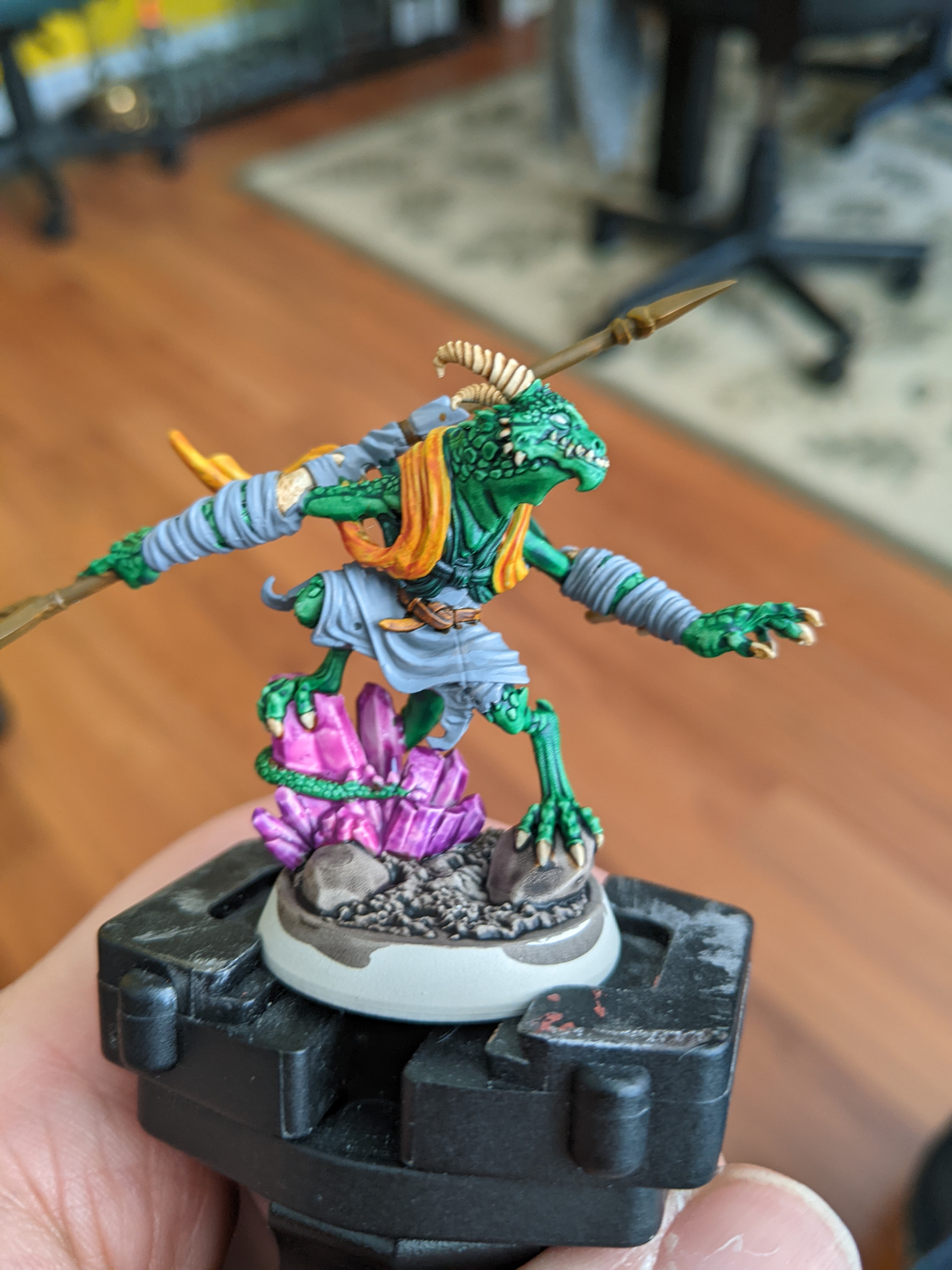
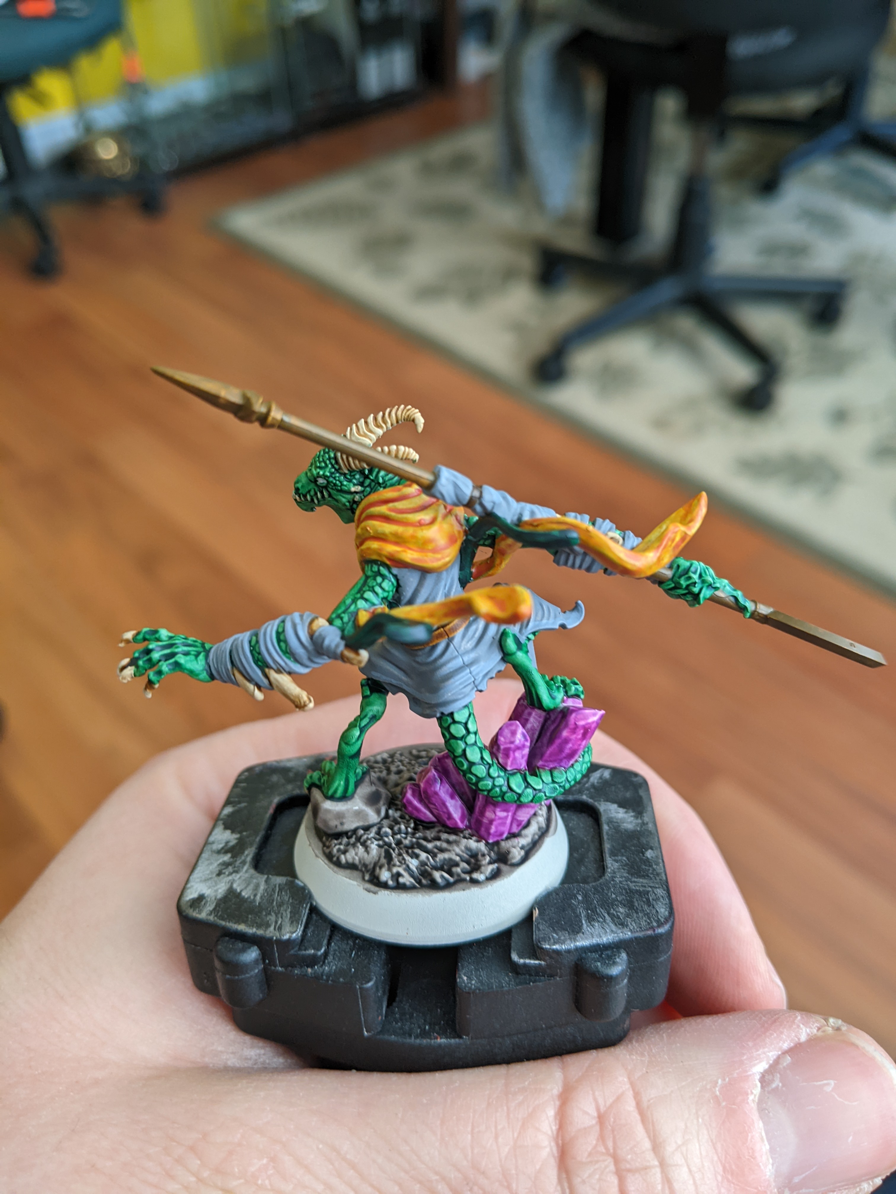
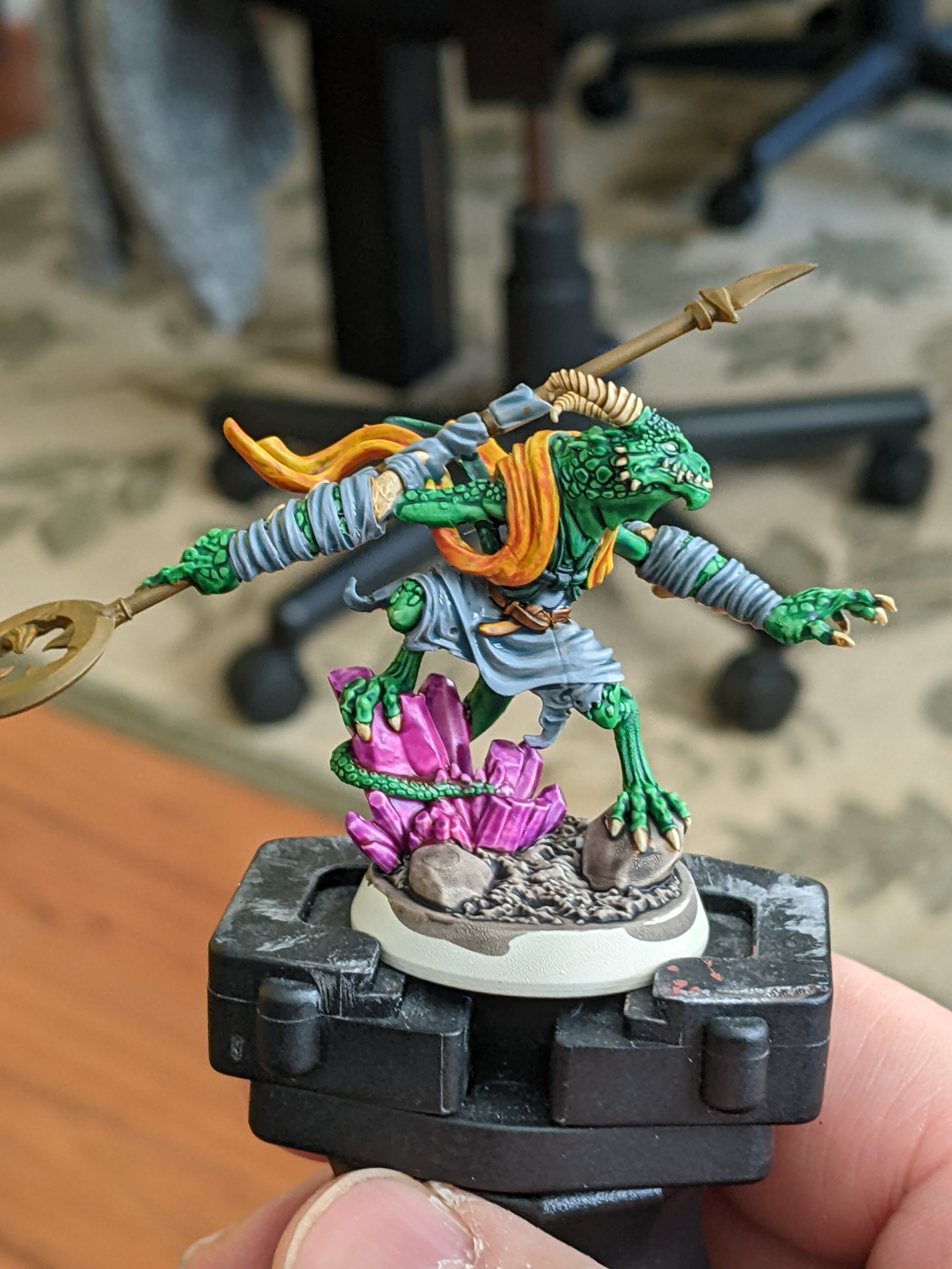
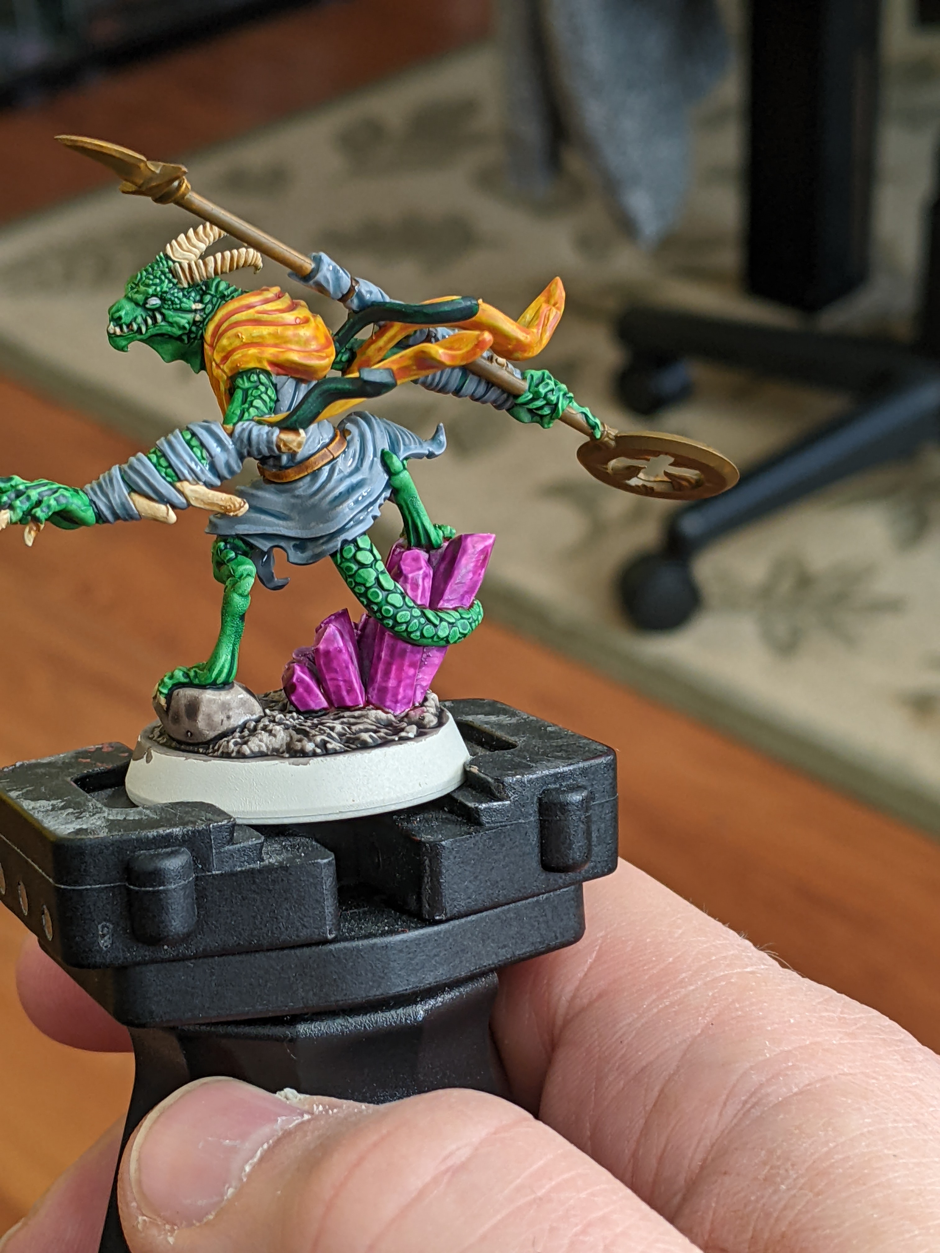
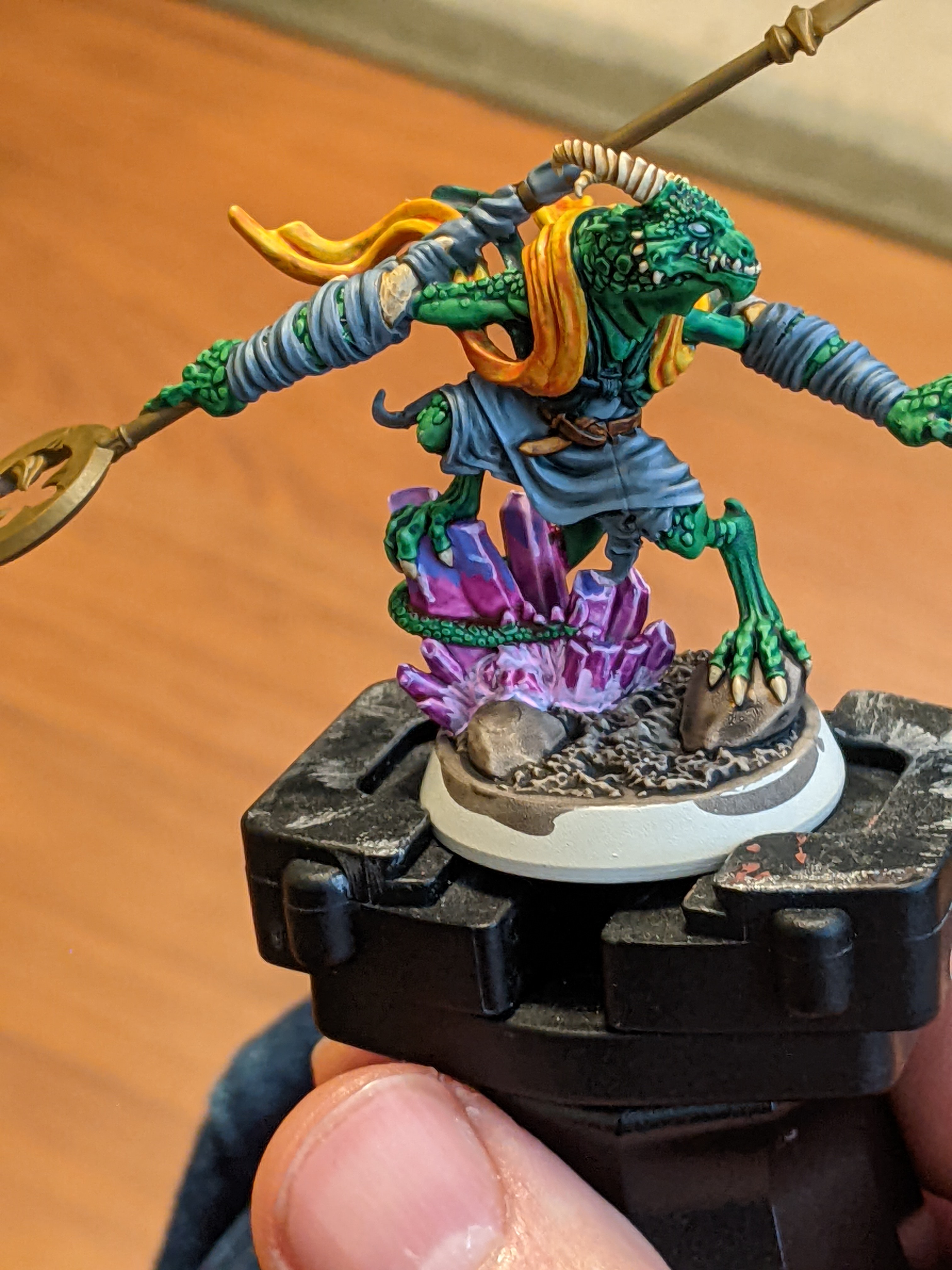
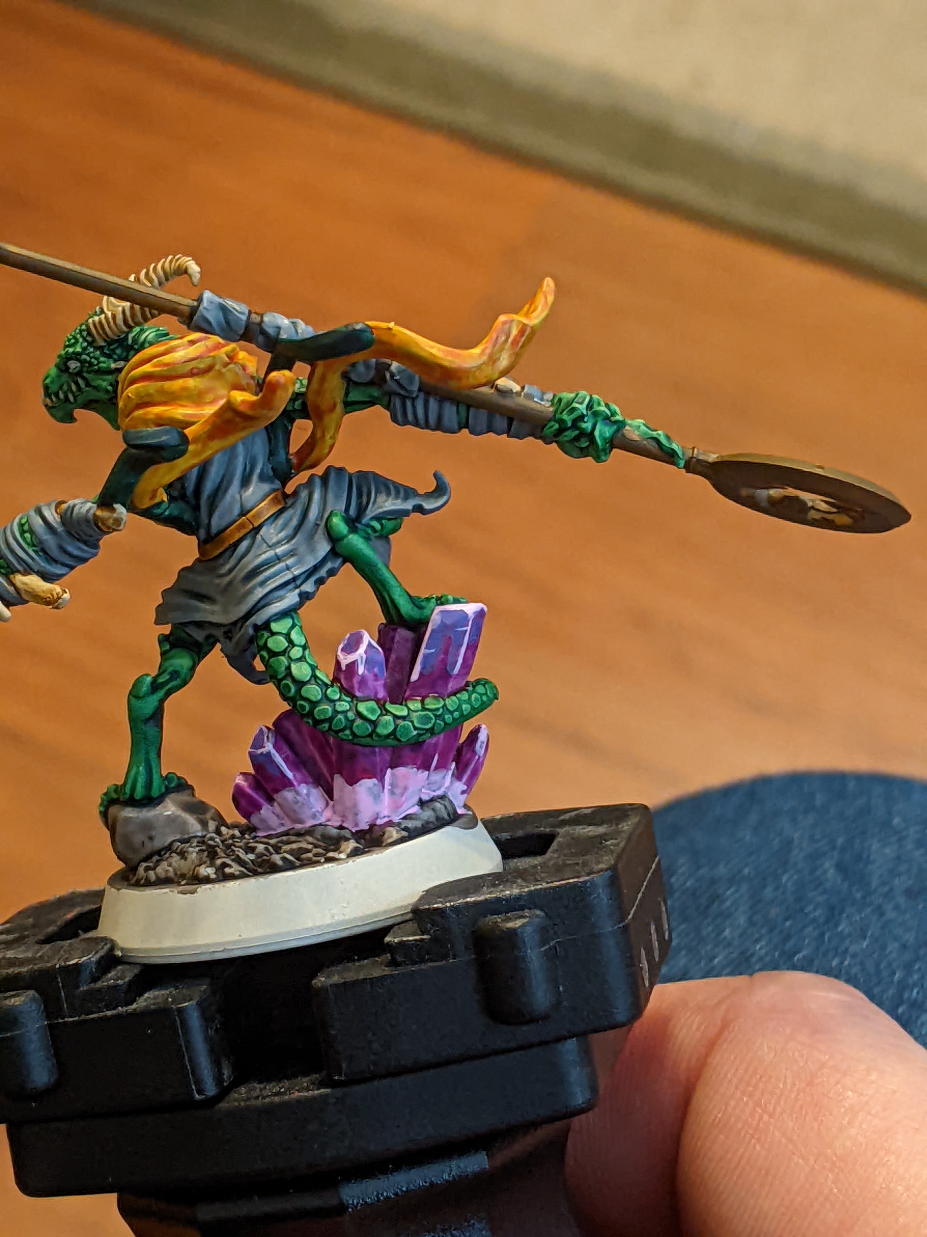
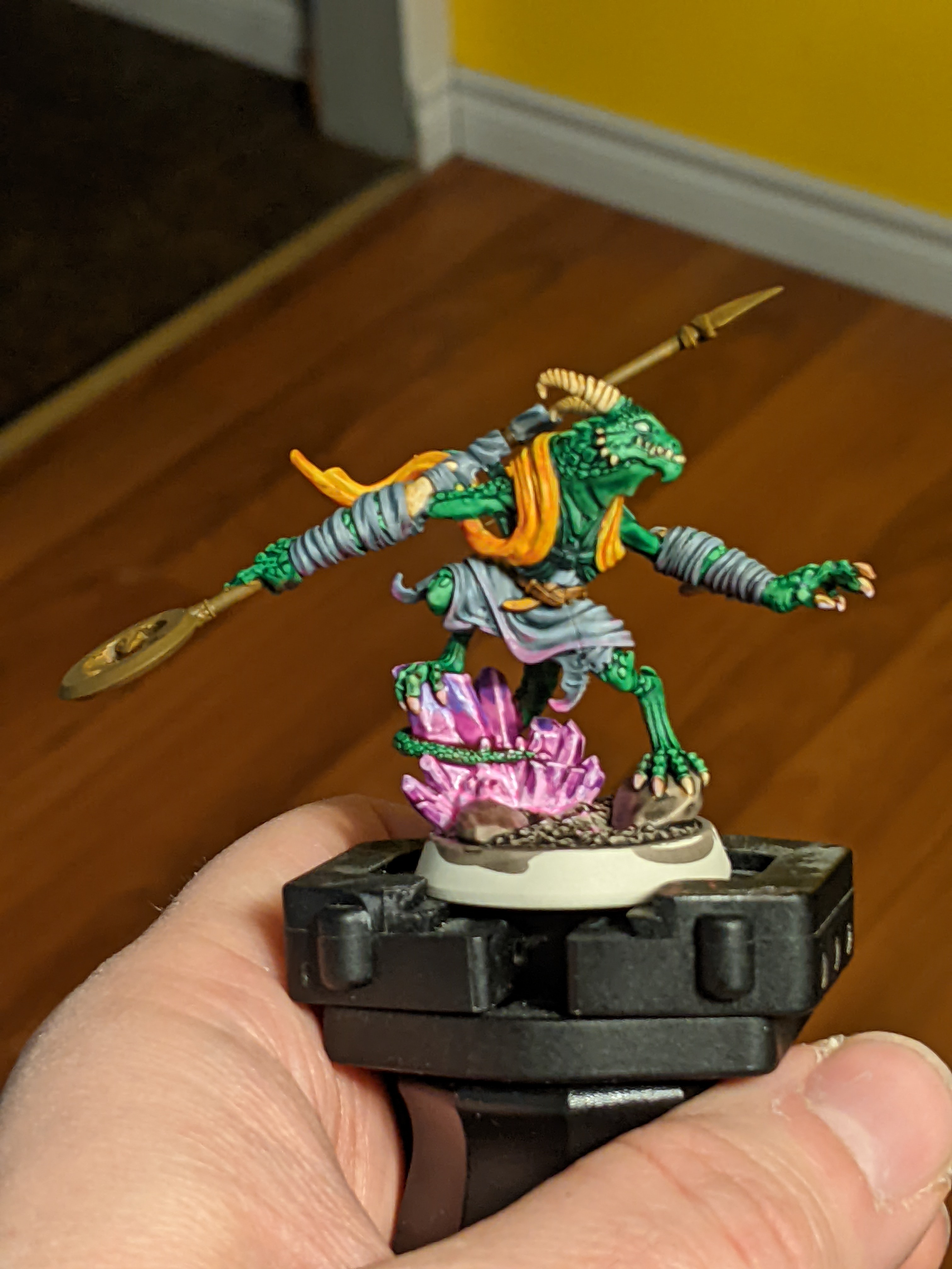
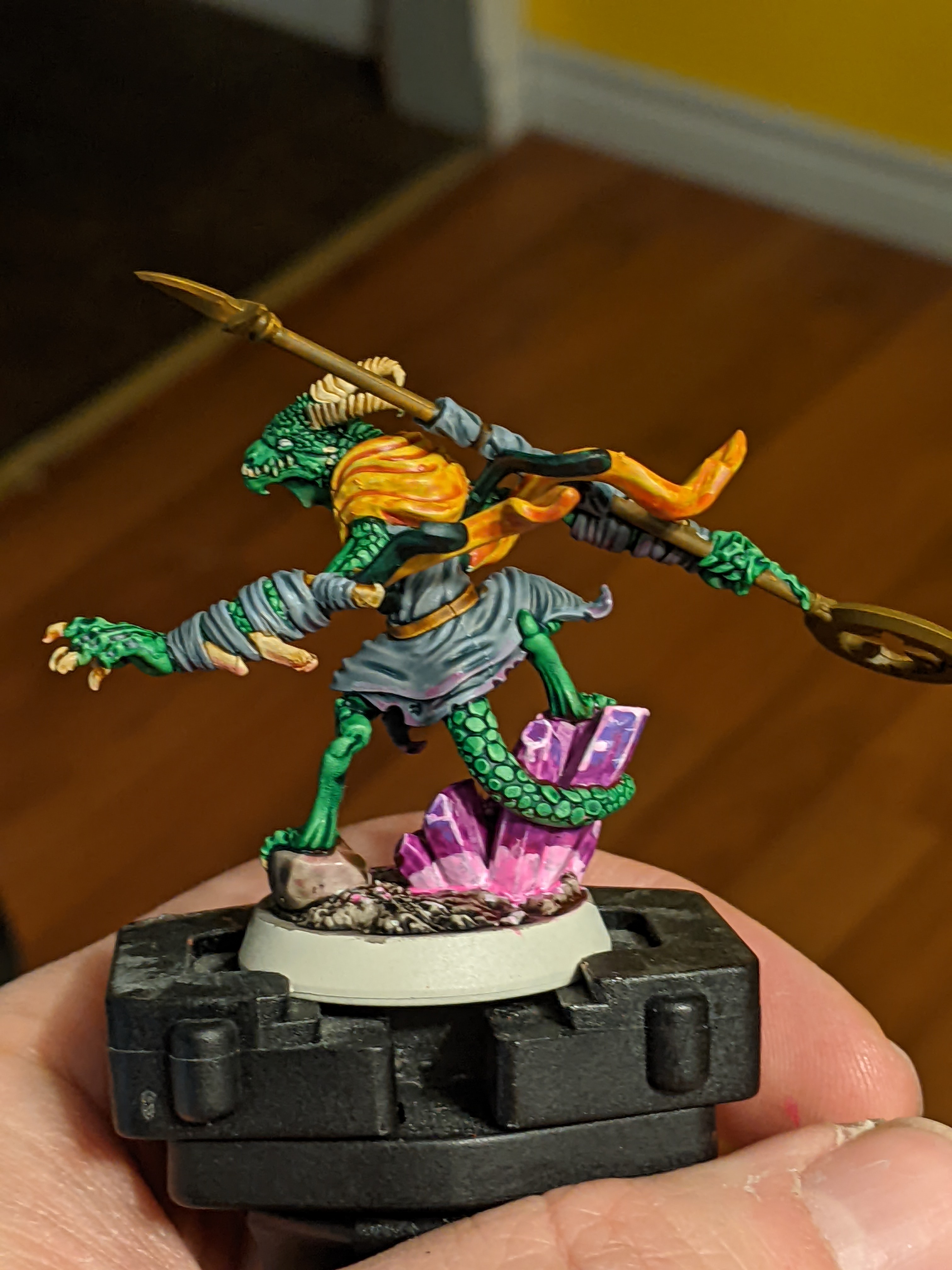
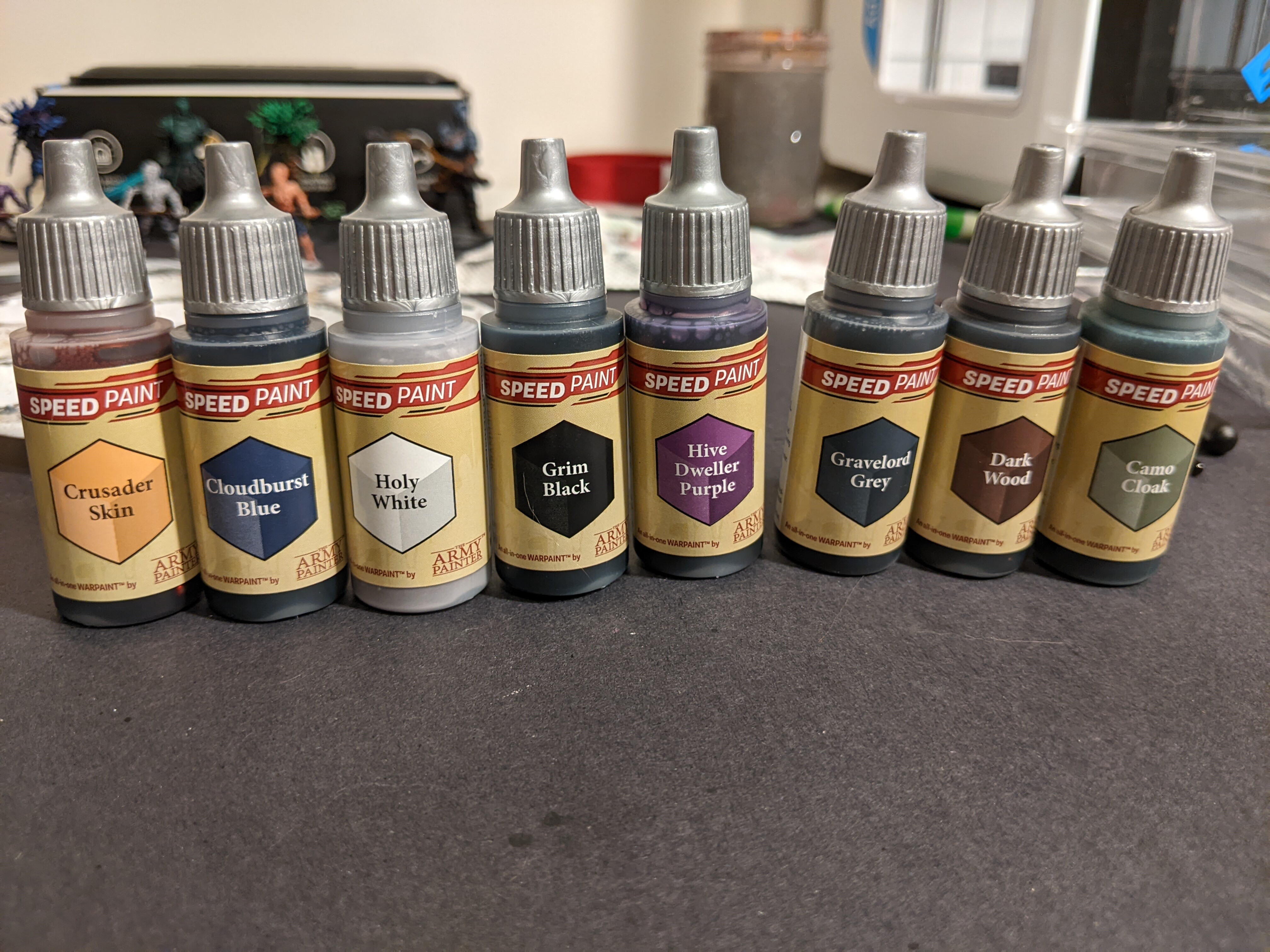
So I typed up a report on the Army Painter Speed Paints and didn’t really realize how long I went on for until I was done. I think it’ll be helpful for anyone thinking about using them in the future. Sorry about the novel.

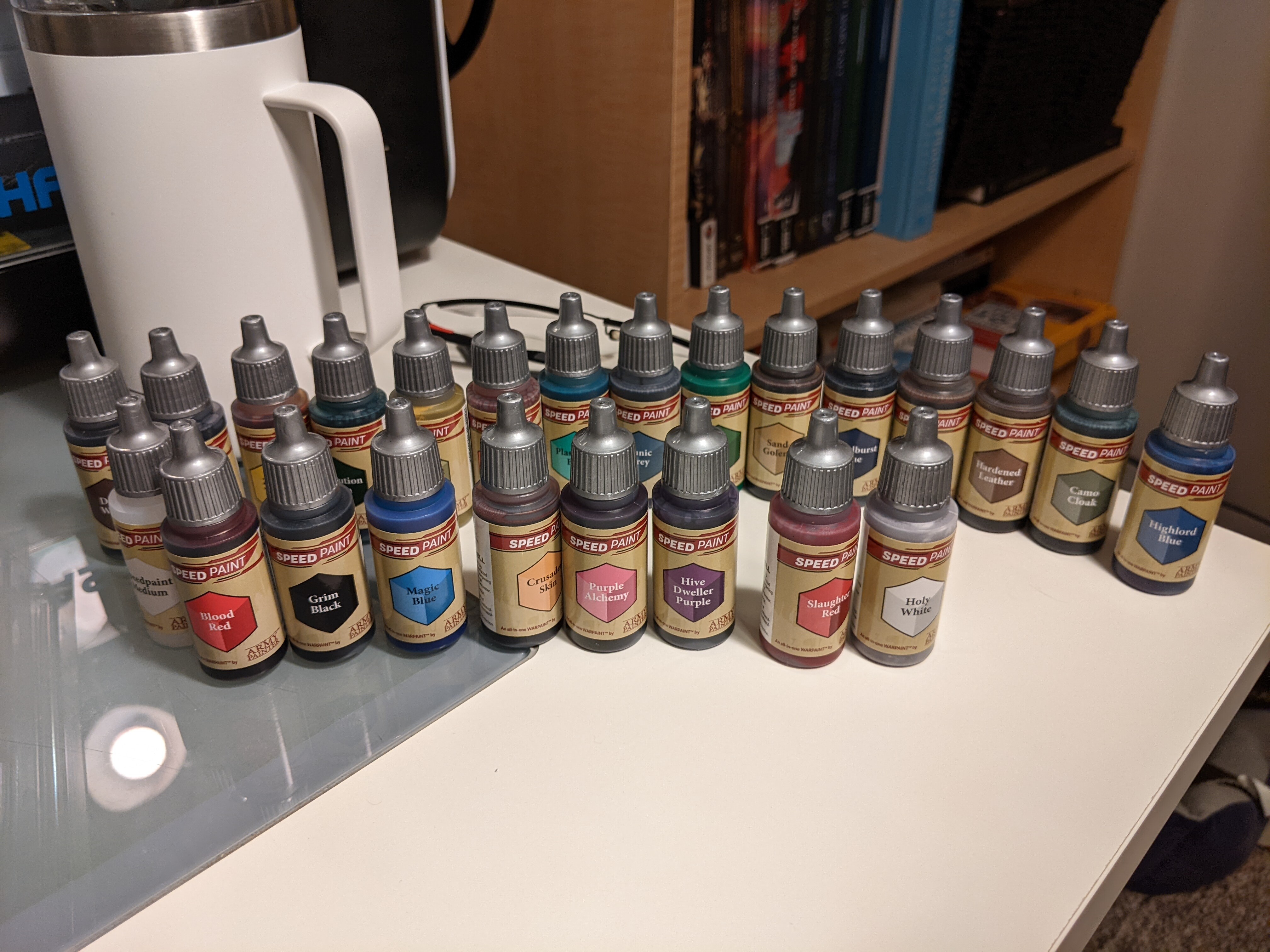
Okay so I got onboard the hype train for the new Army Painter Speed Paints and picked up the Mega set to try them all out. Mostly at this point I’m hoping they help expedite the painting of boardgame minis to a tabletop standard easily.
So I did some test models and here are my findings.
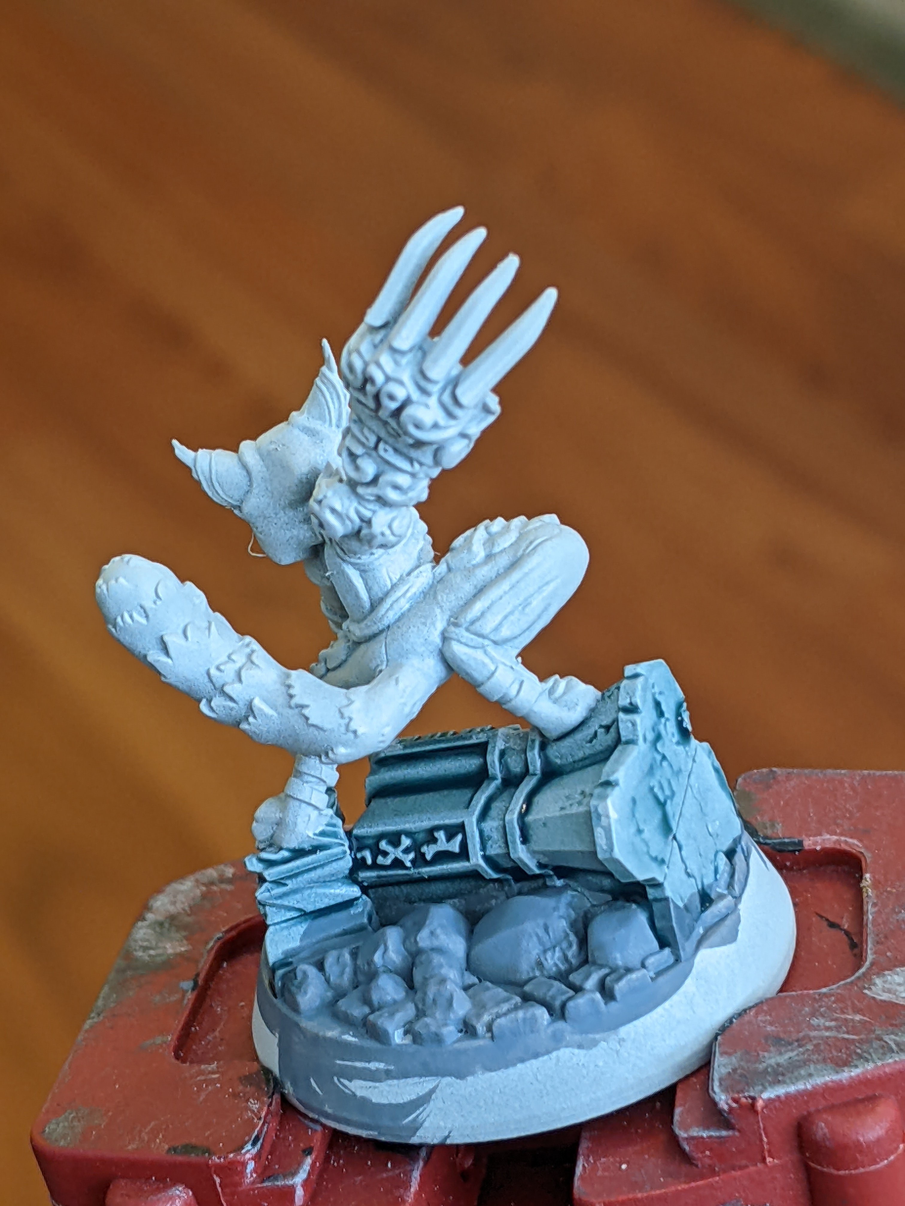
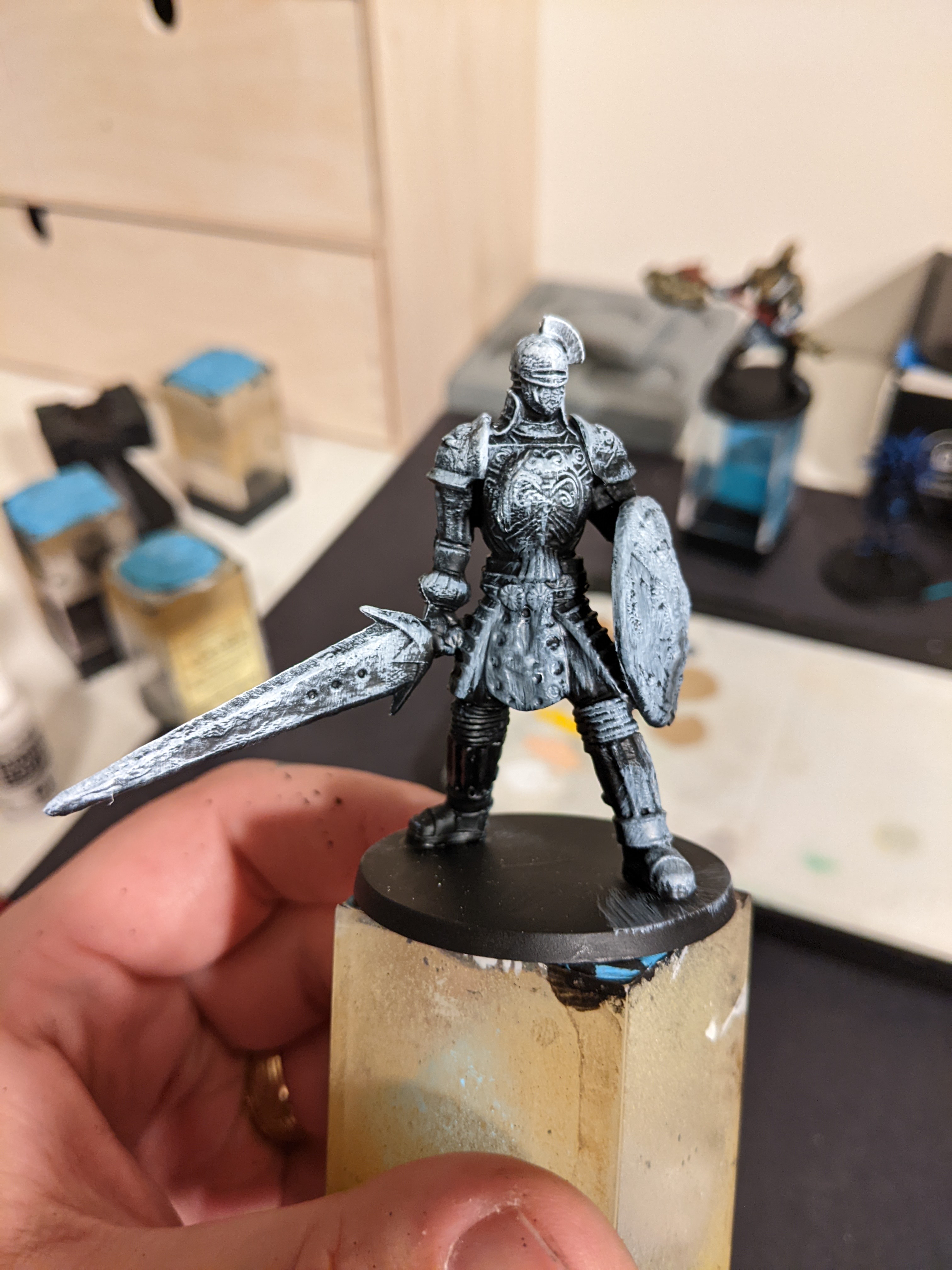
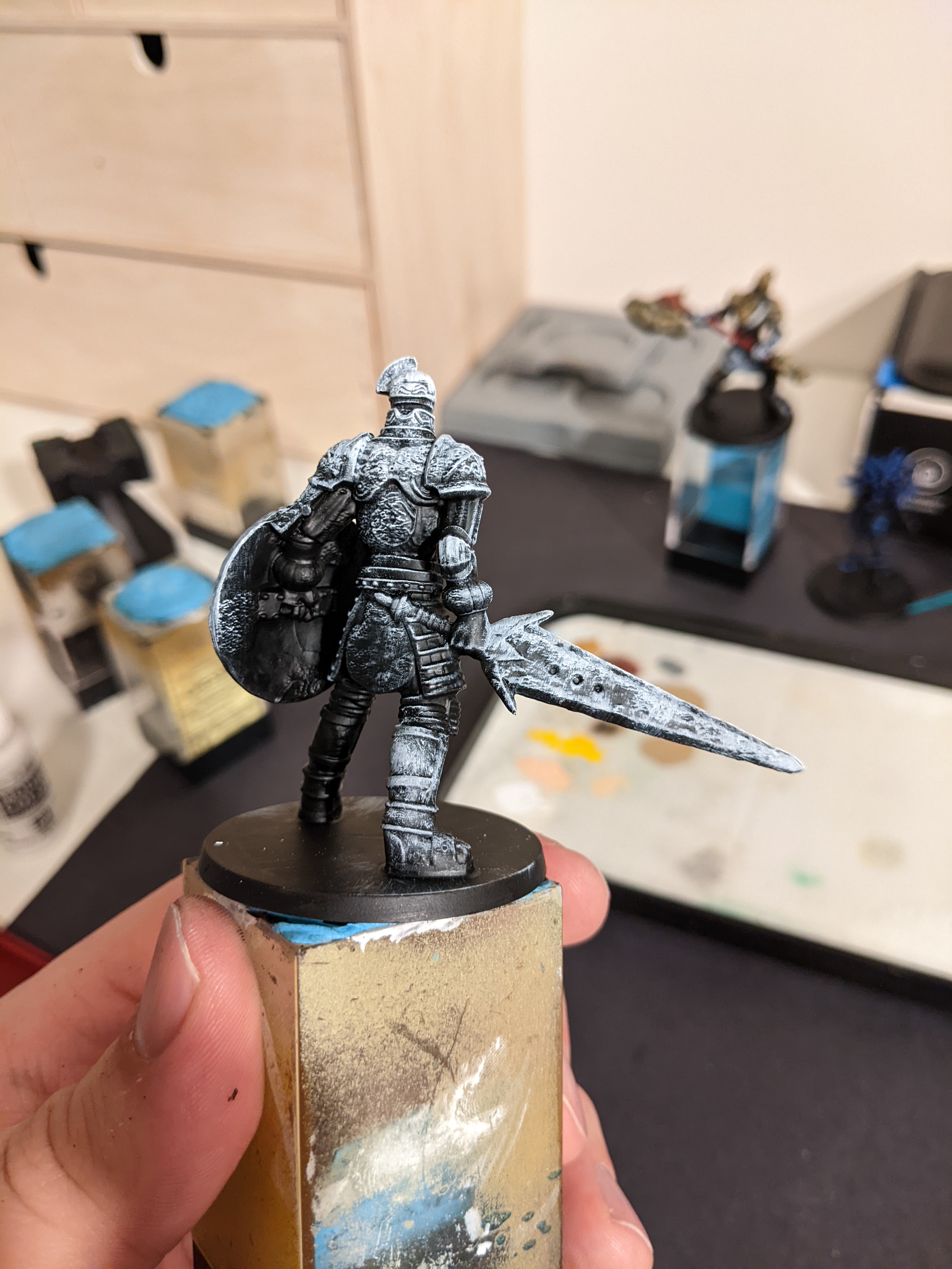
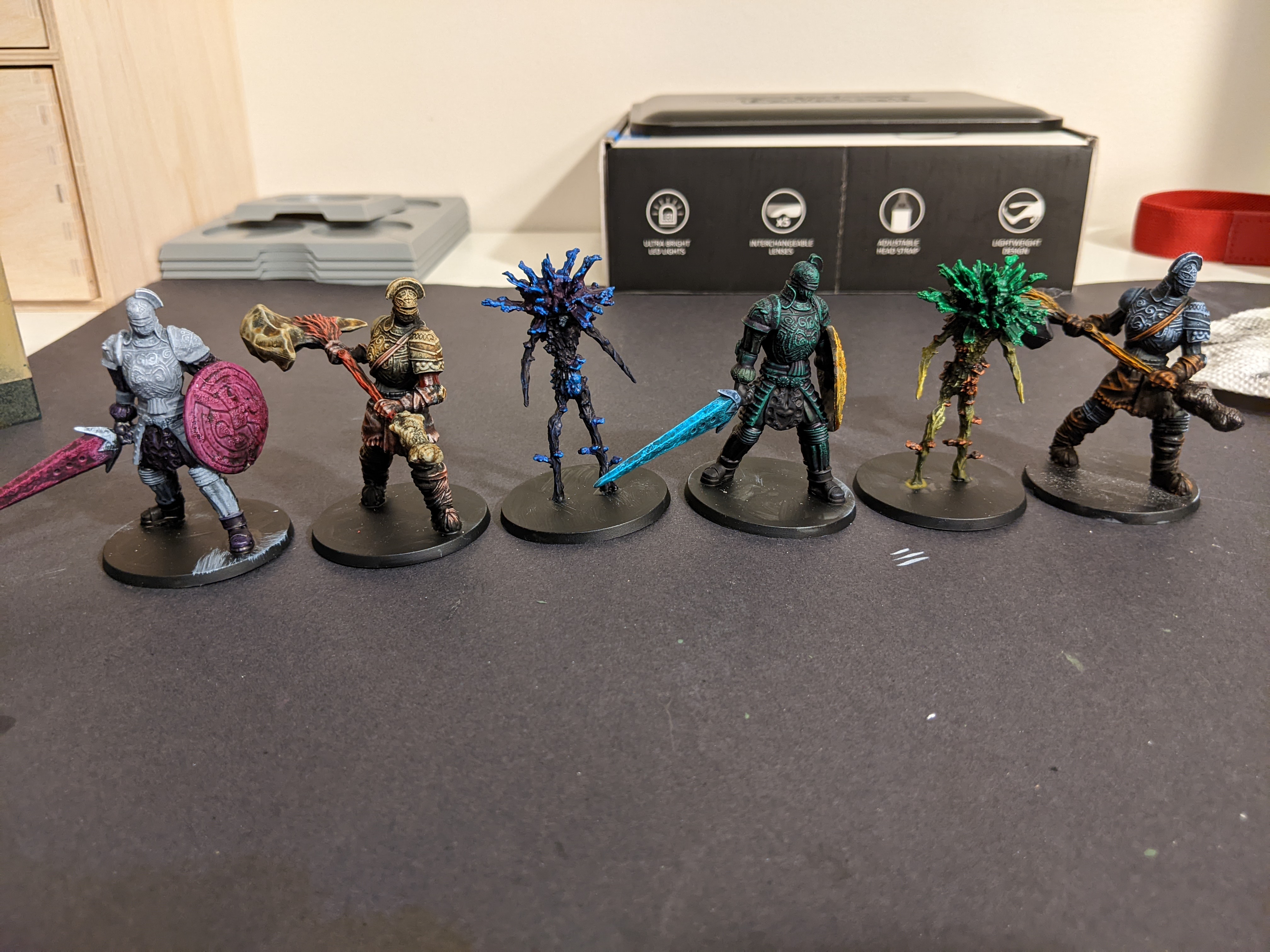
I had some extra Darks Souls the boardgame minis because I got the set to paint a couple of my buddies favourite characters for him and had these left over so they became the test subjects.


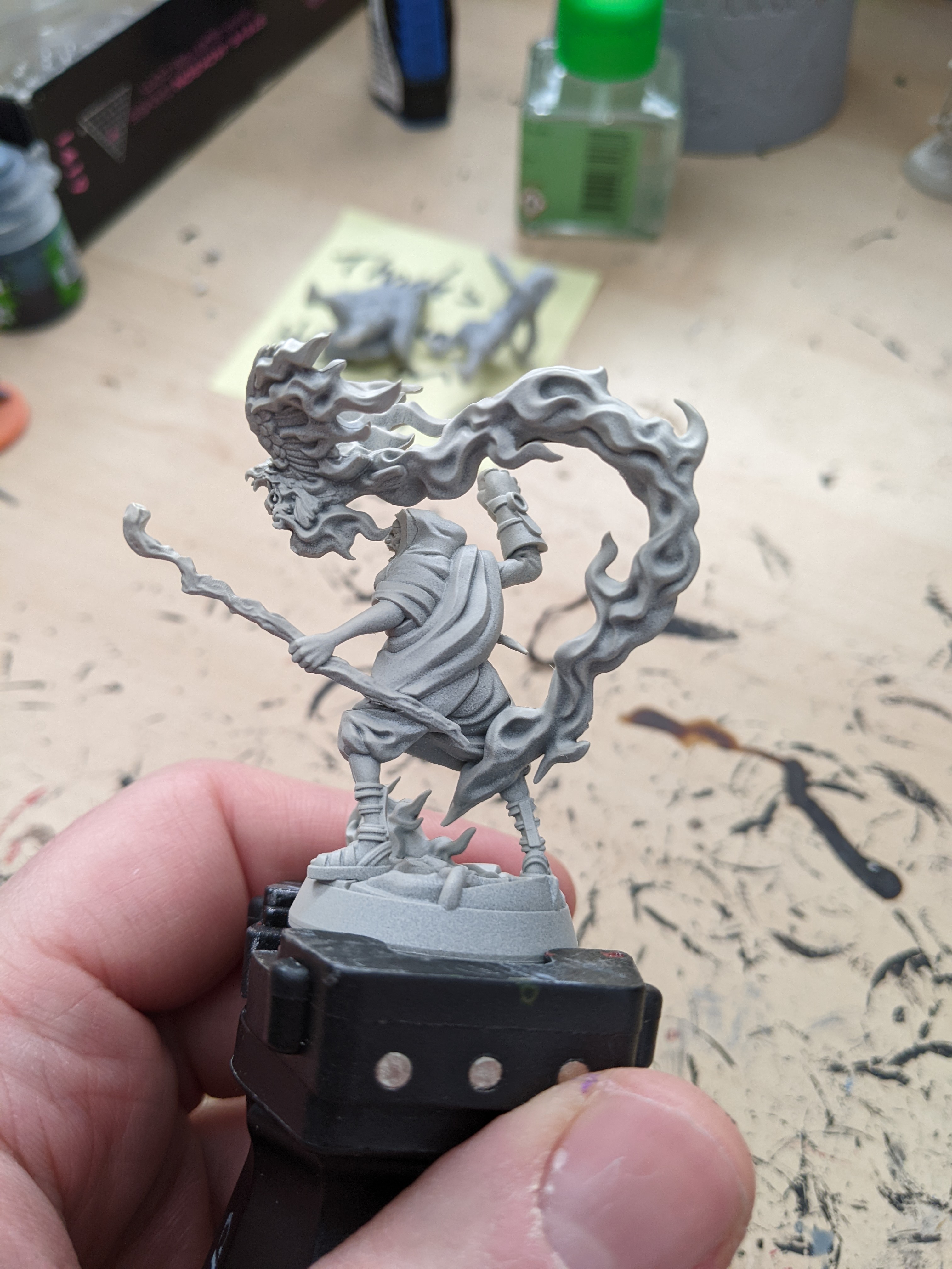
Firstly I primed them all in black then drybrushed a zenithal highlight of white. I actually usually do this when I paint minis anyway because I think it helps with contrast of the mini a bit but mostly it helps me see all the details better while I paint them.

So with that under layer I set out to test all of the 23 colours ( I didn’t really touch the medium yet)
So I did a few colours on each of the 6 minis not really planning things out so a couple of the colours schemes aren’t great.

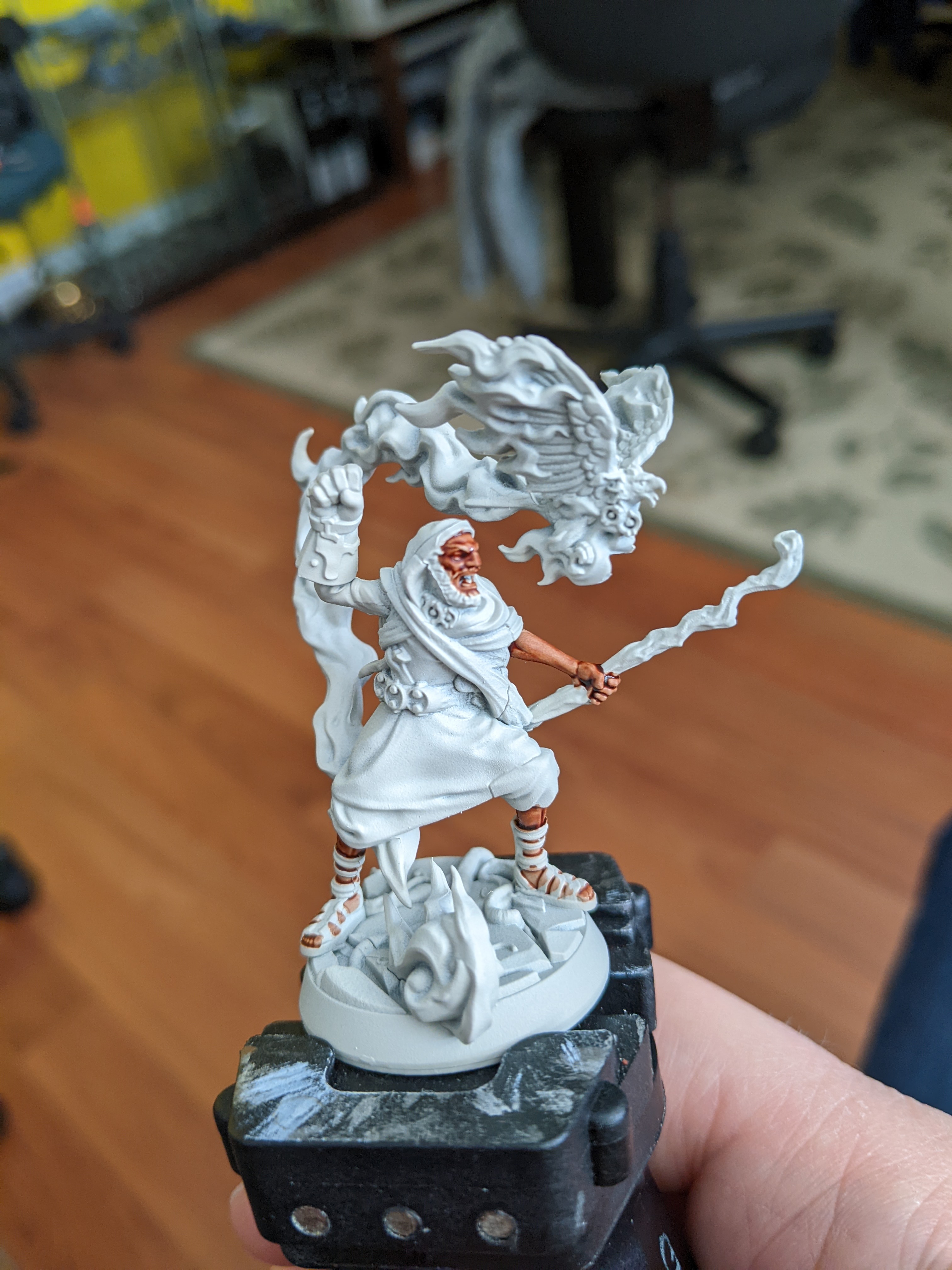
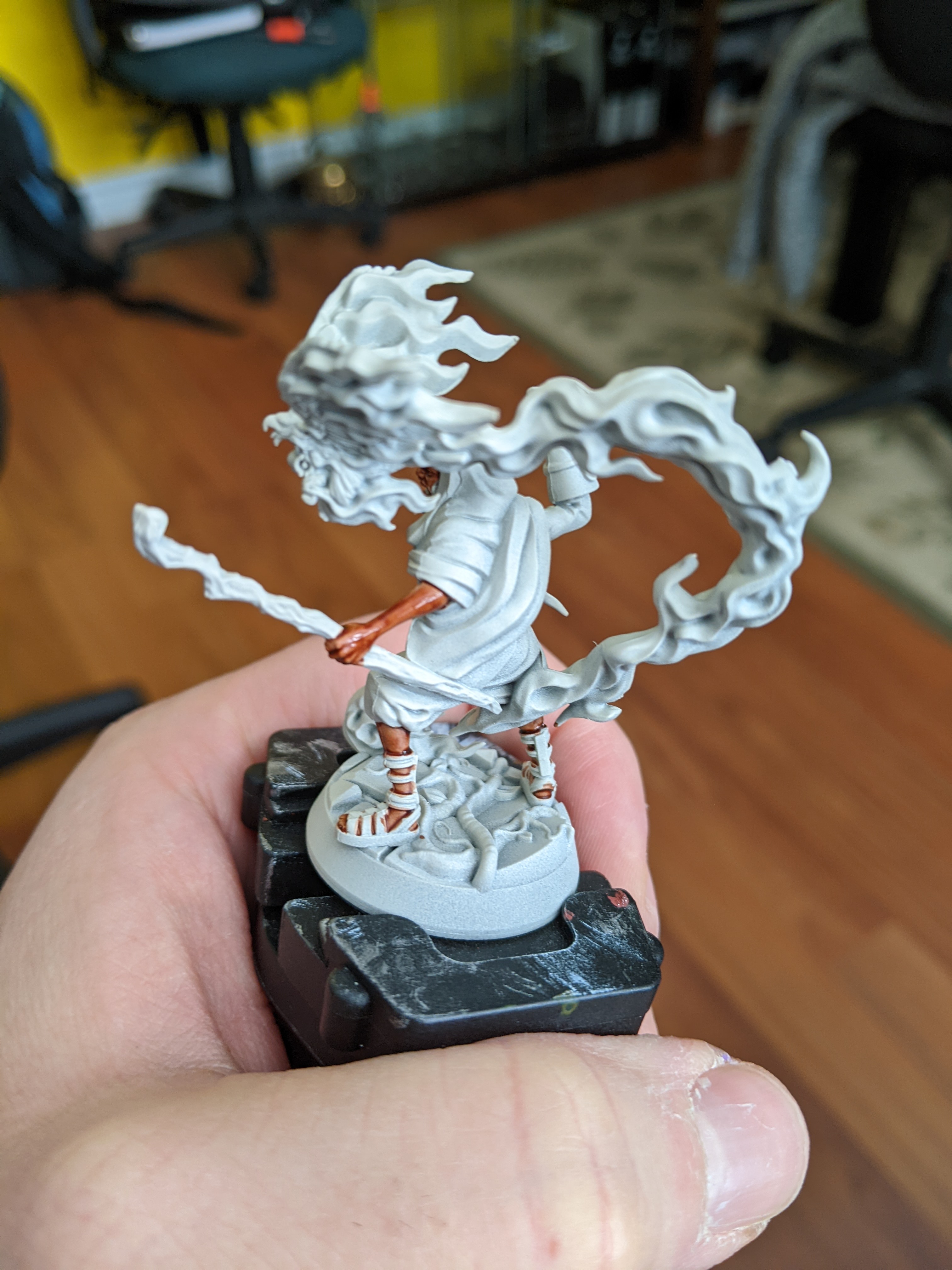
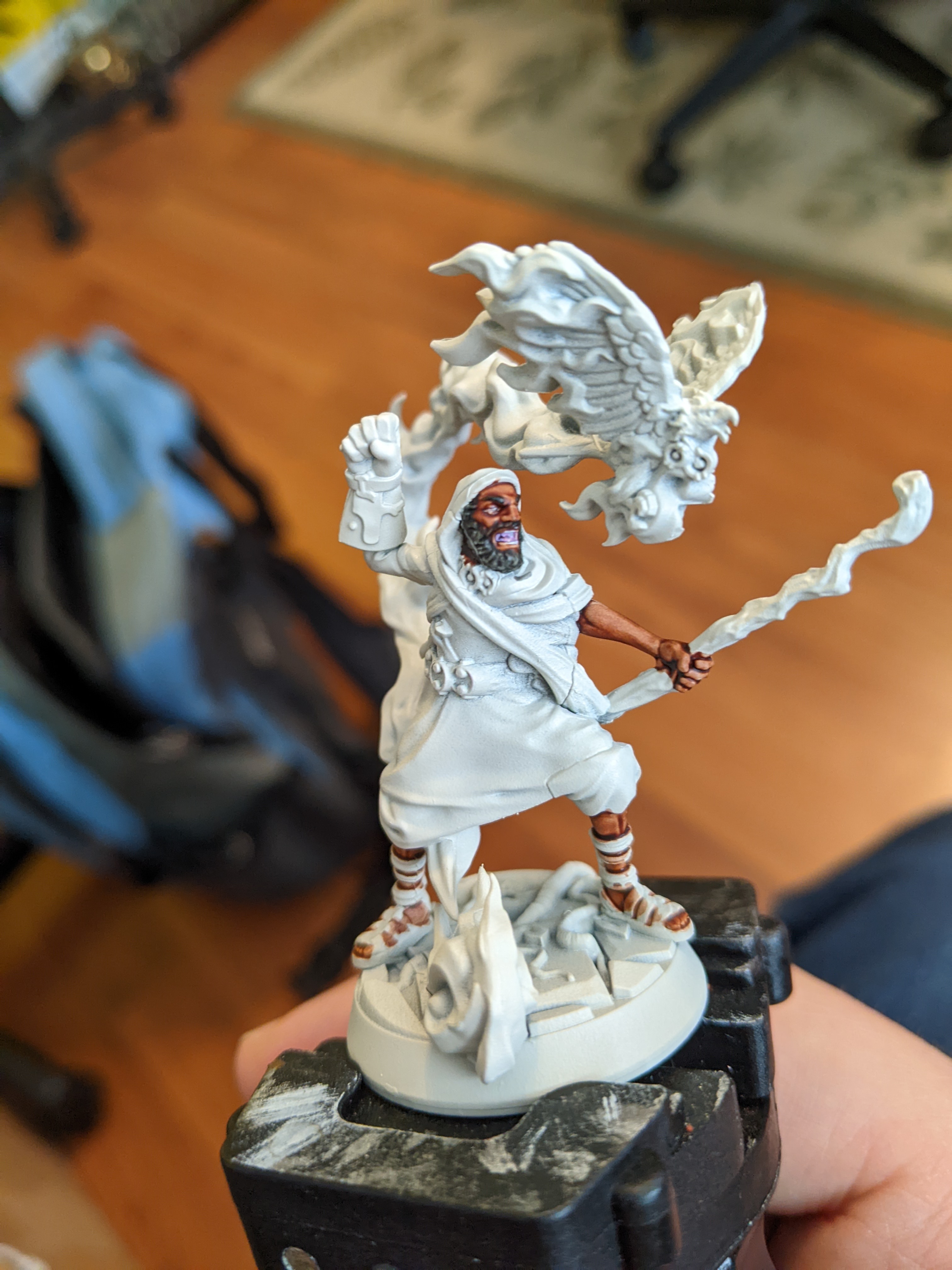
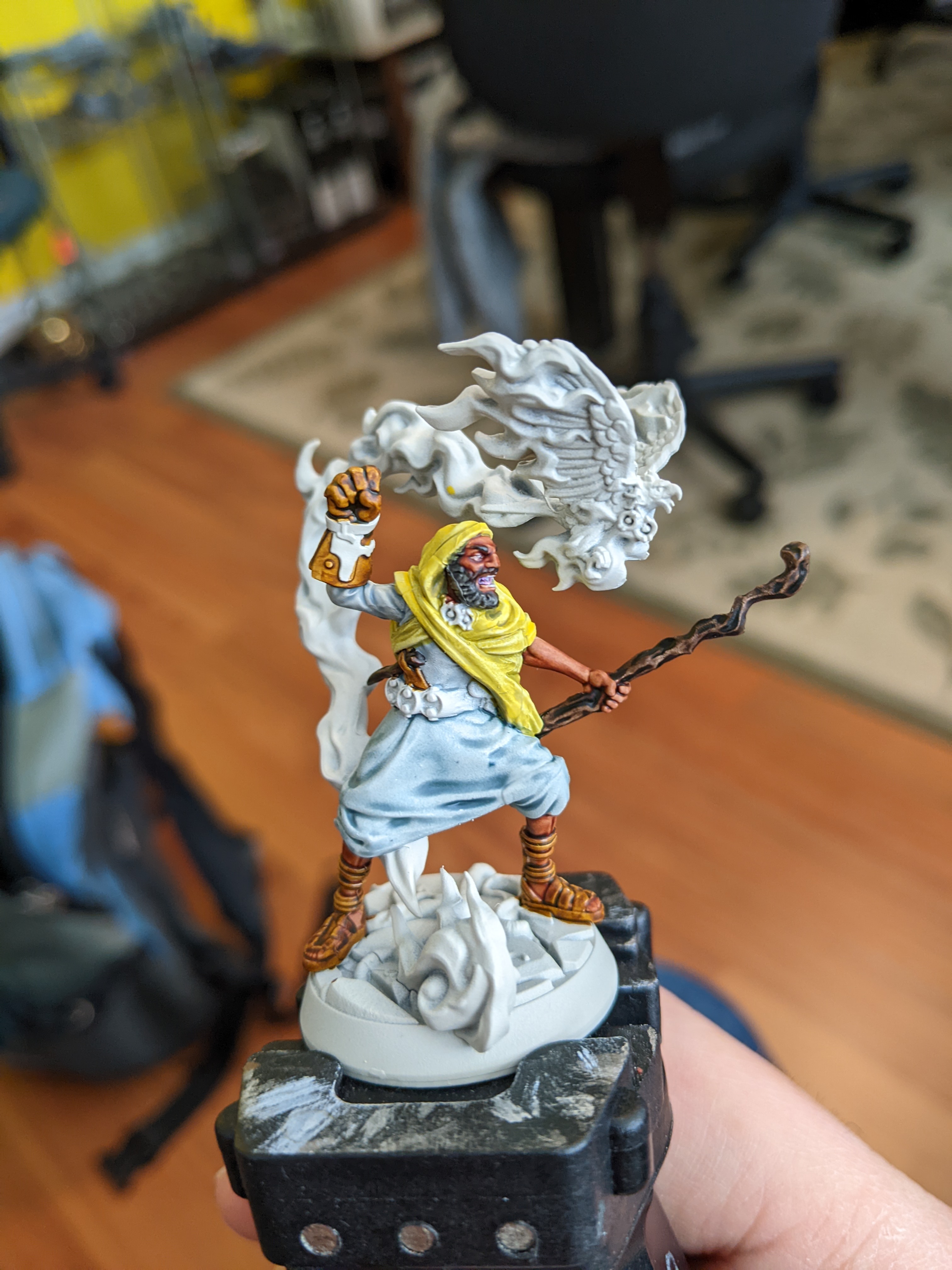
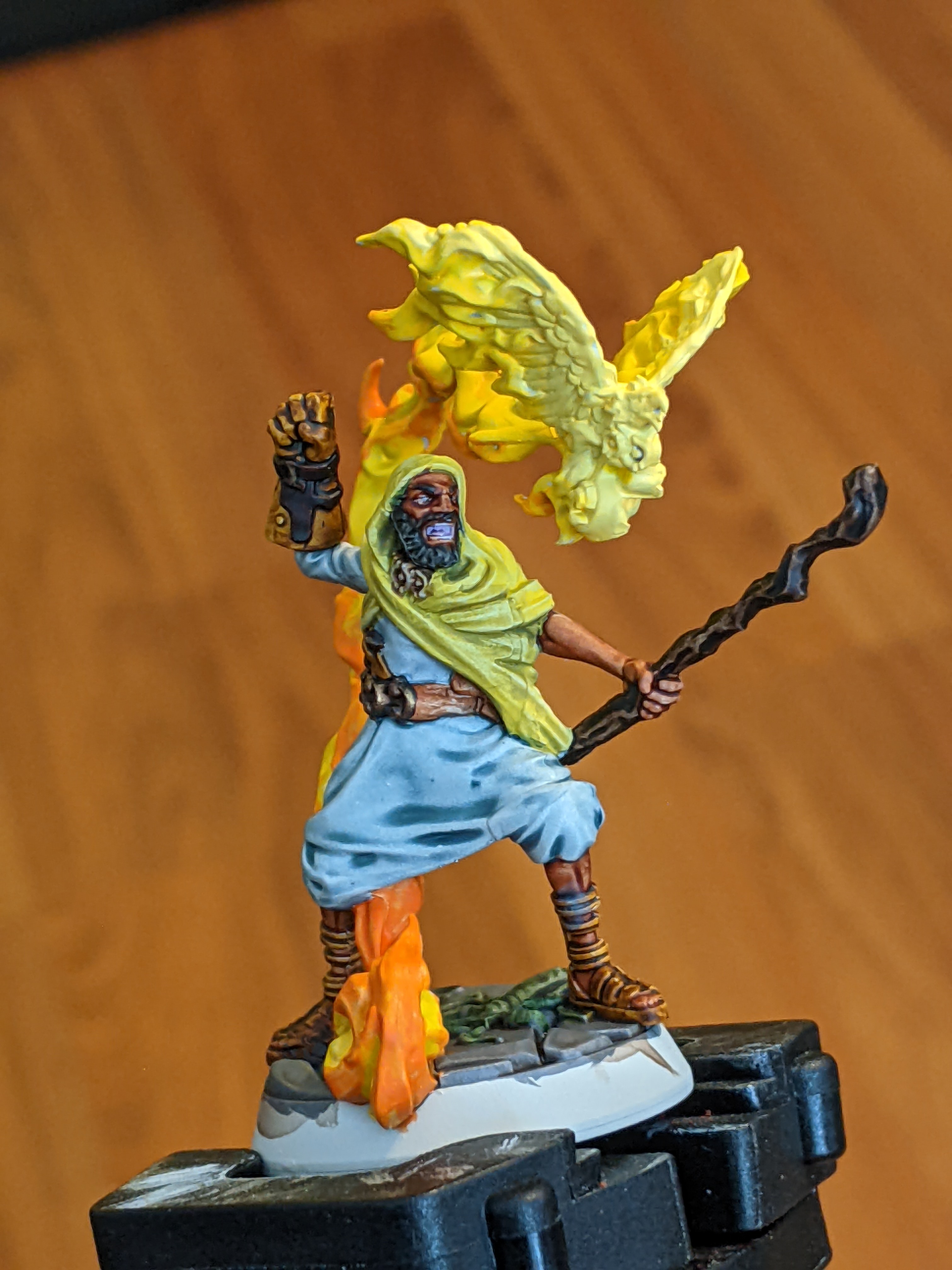
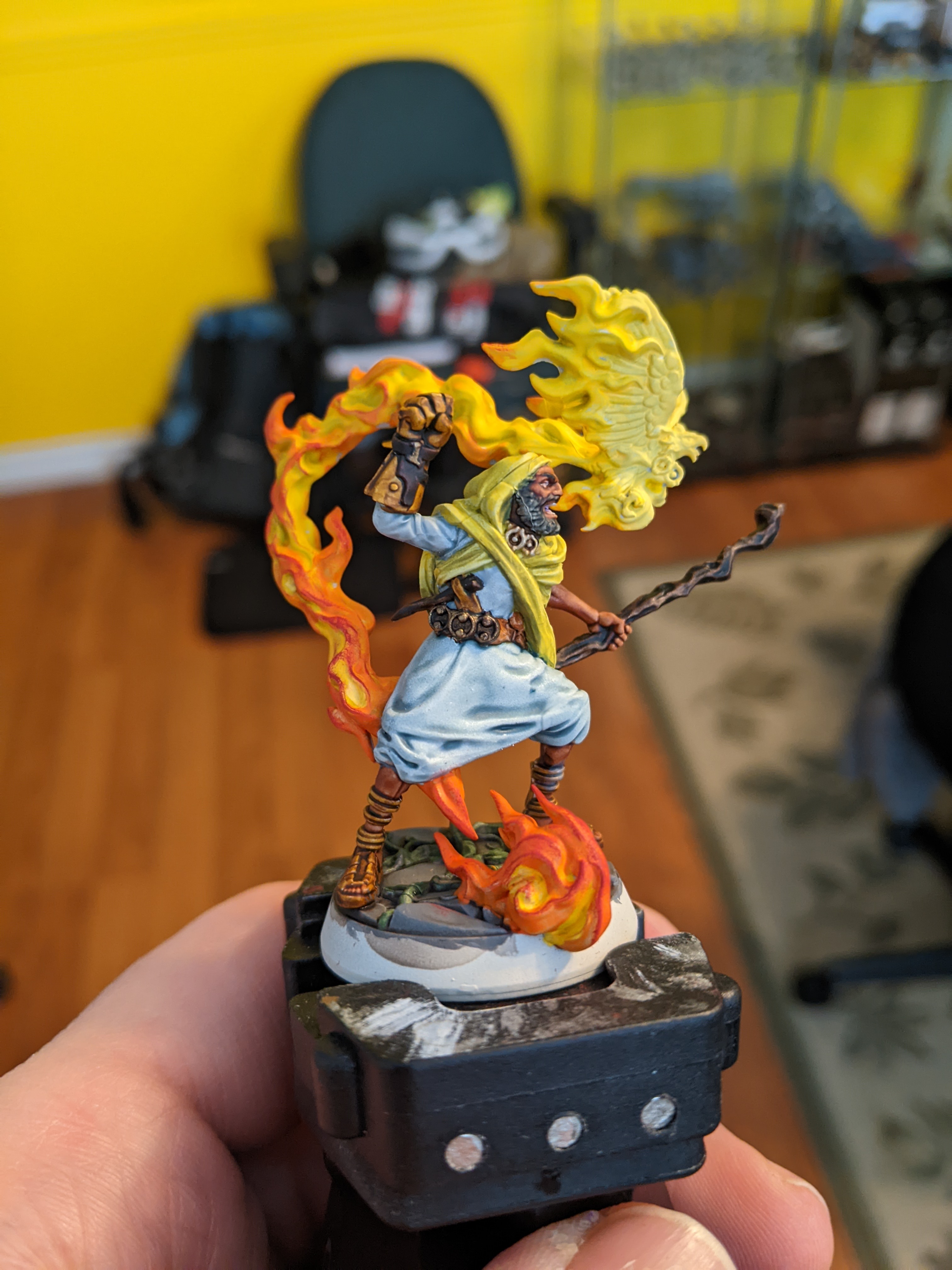
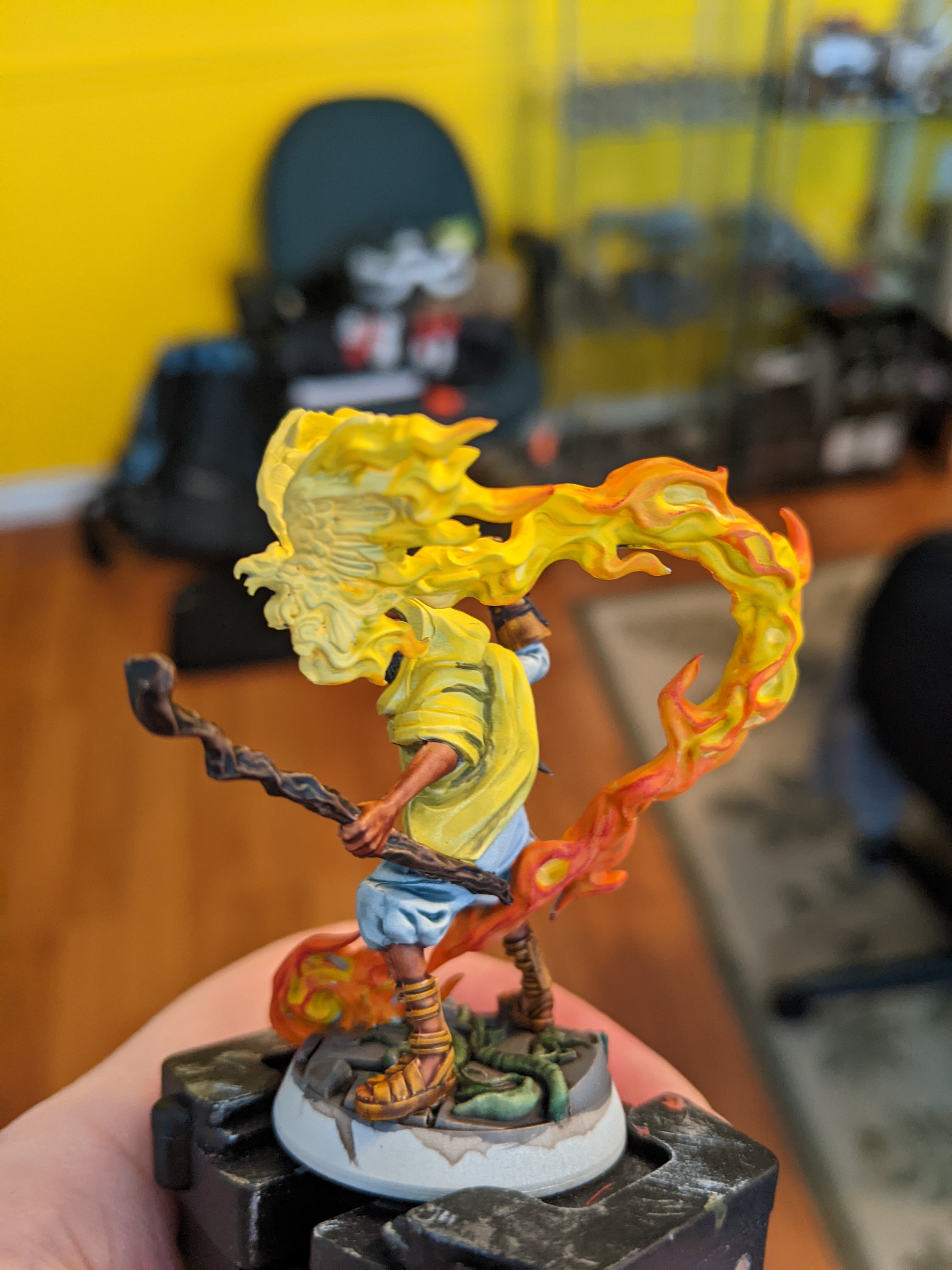
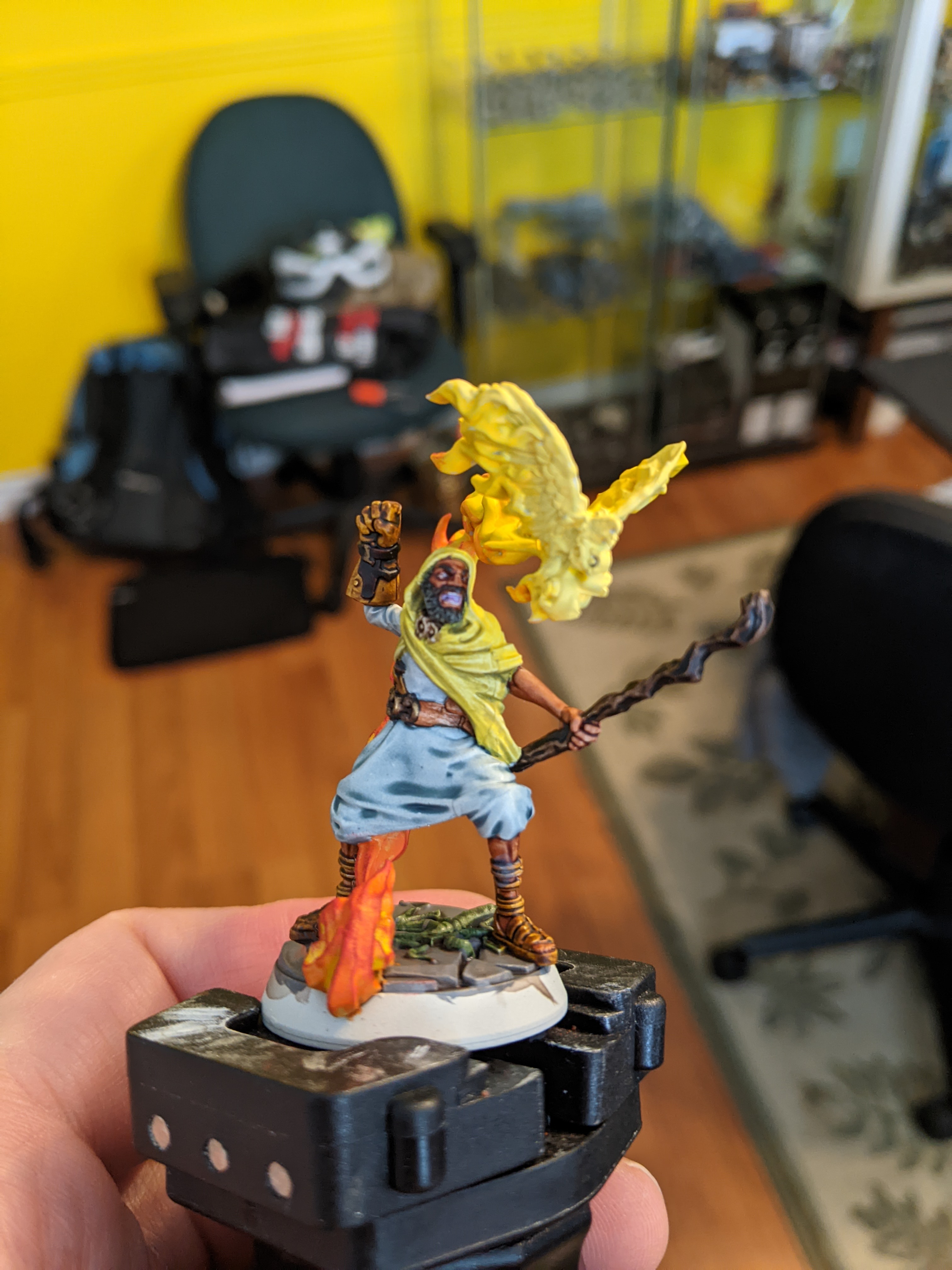
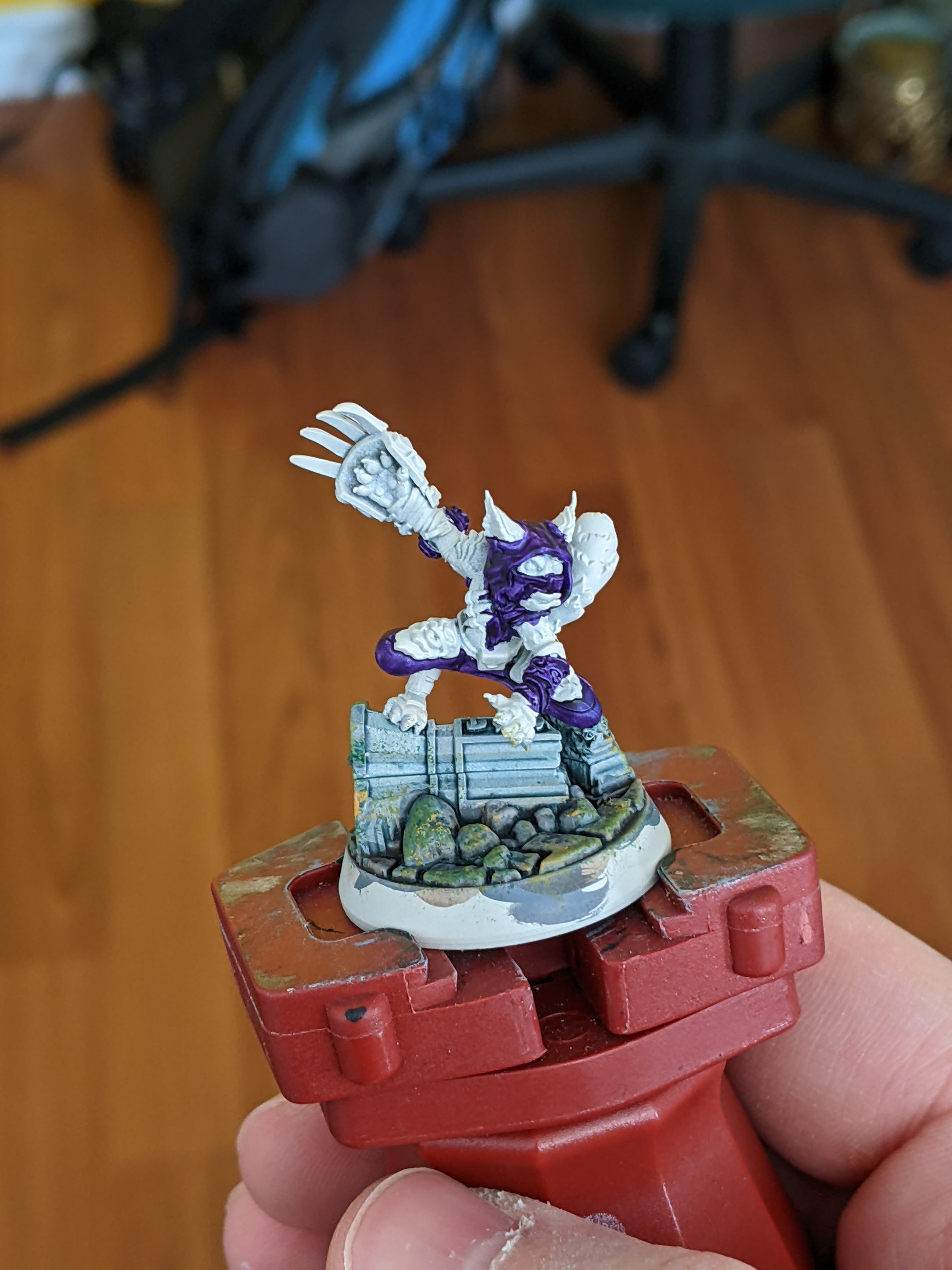
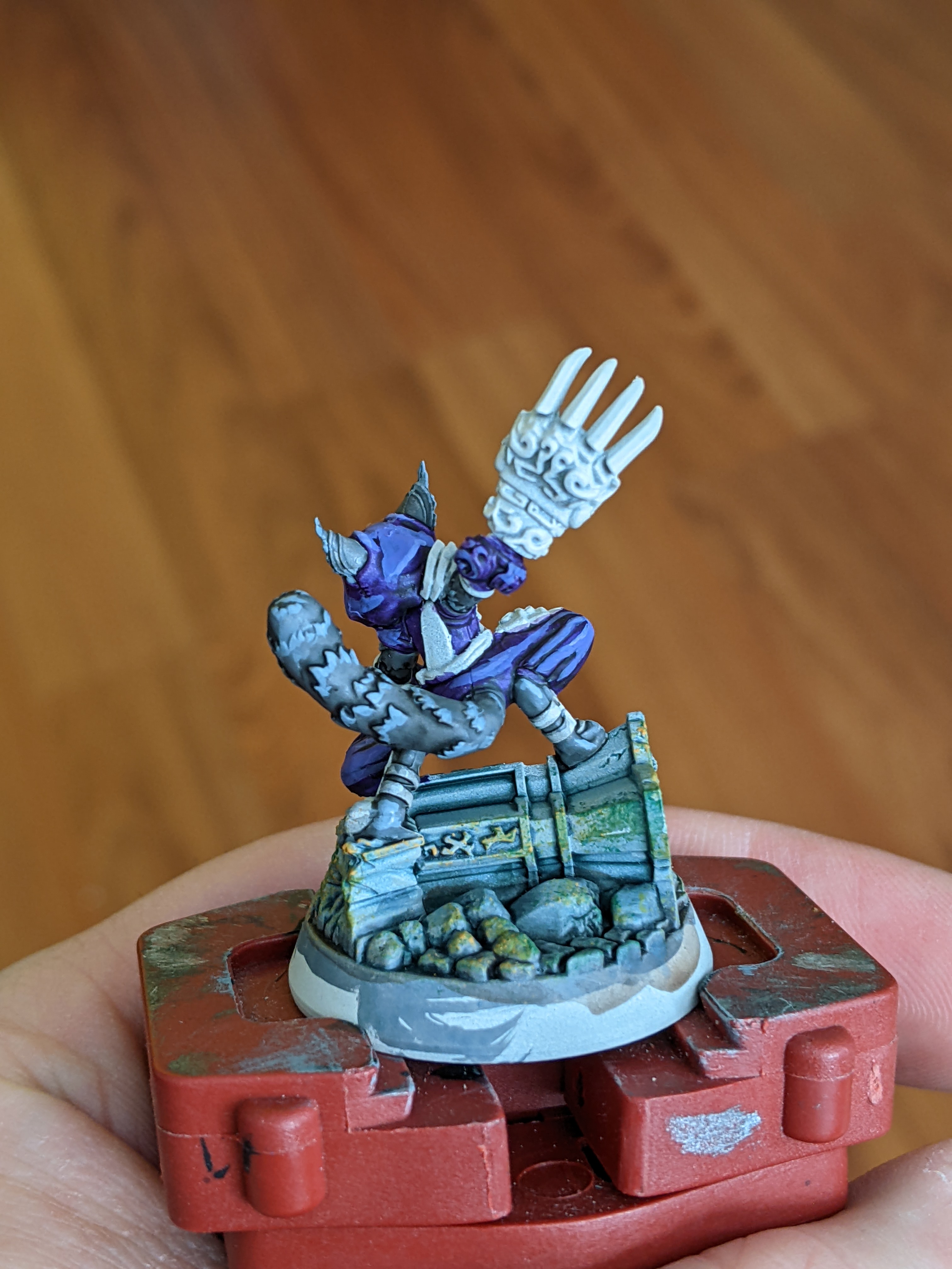
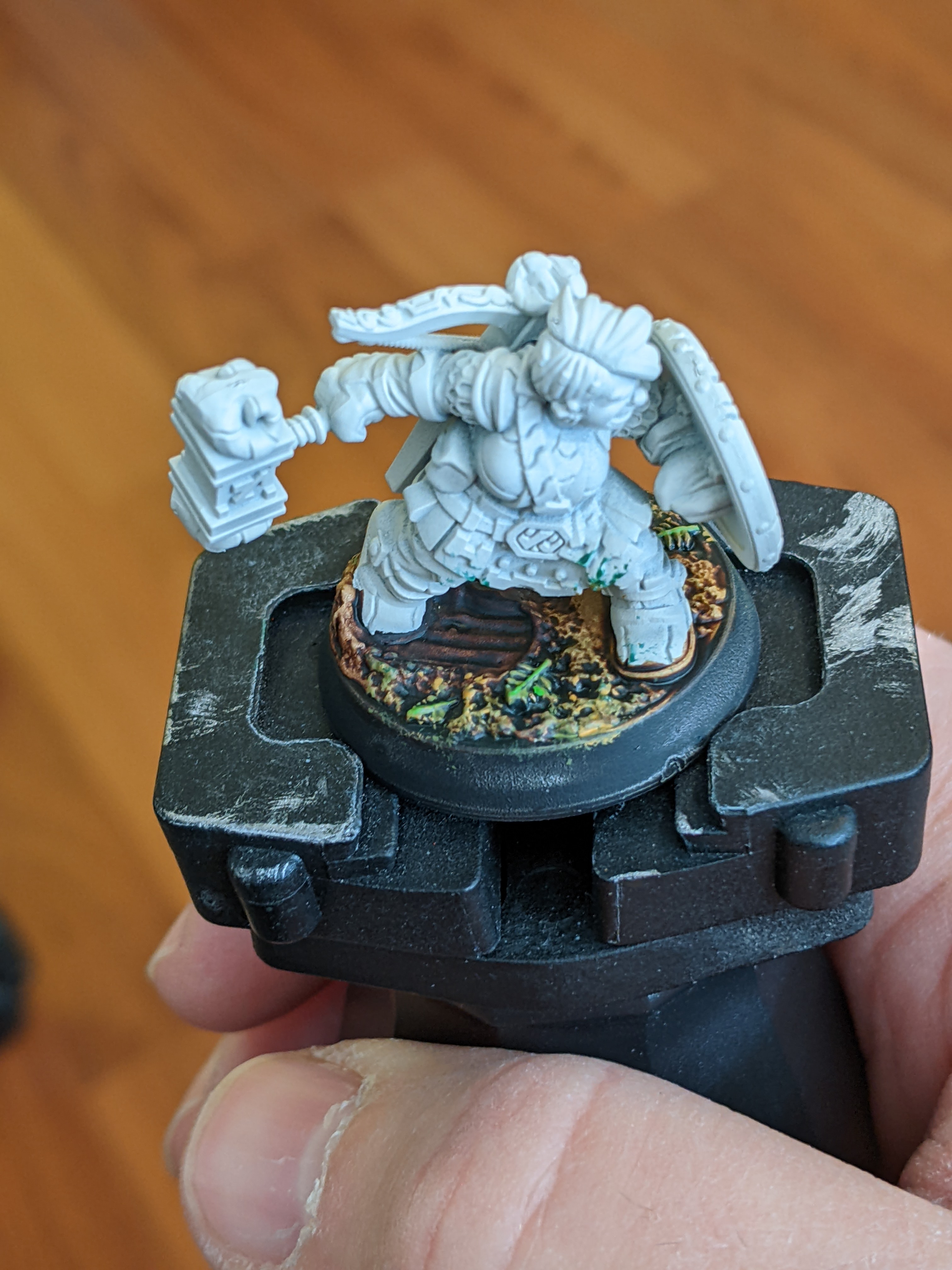
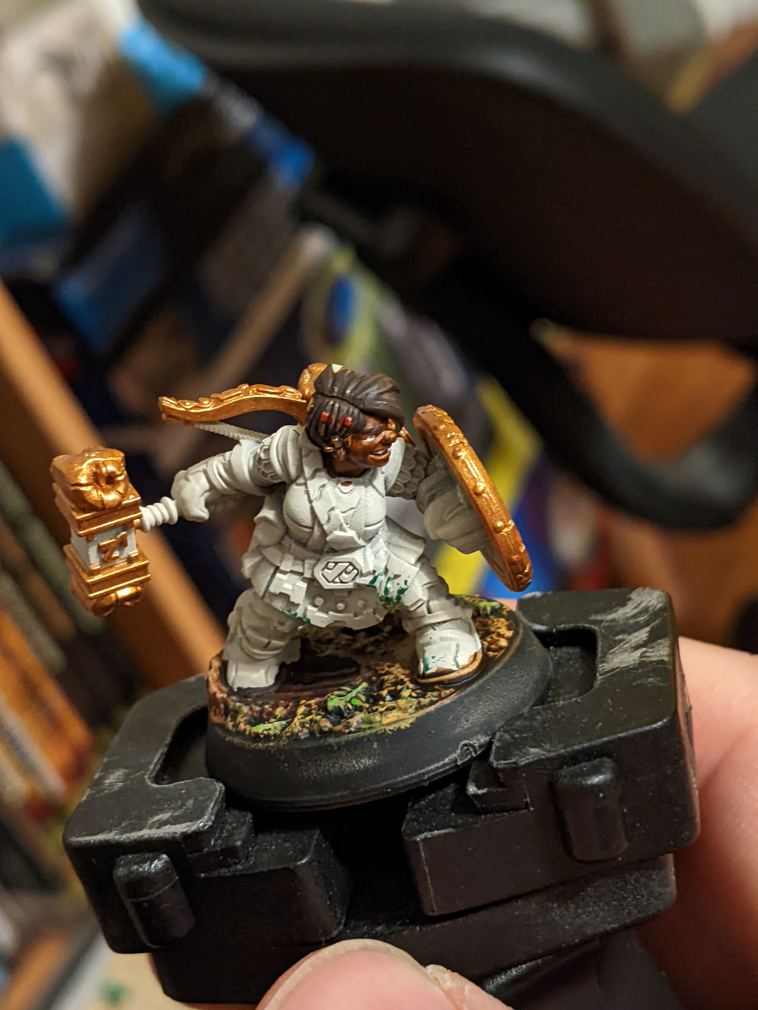
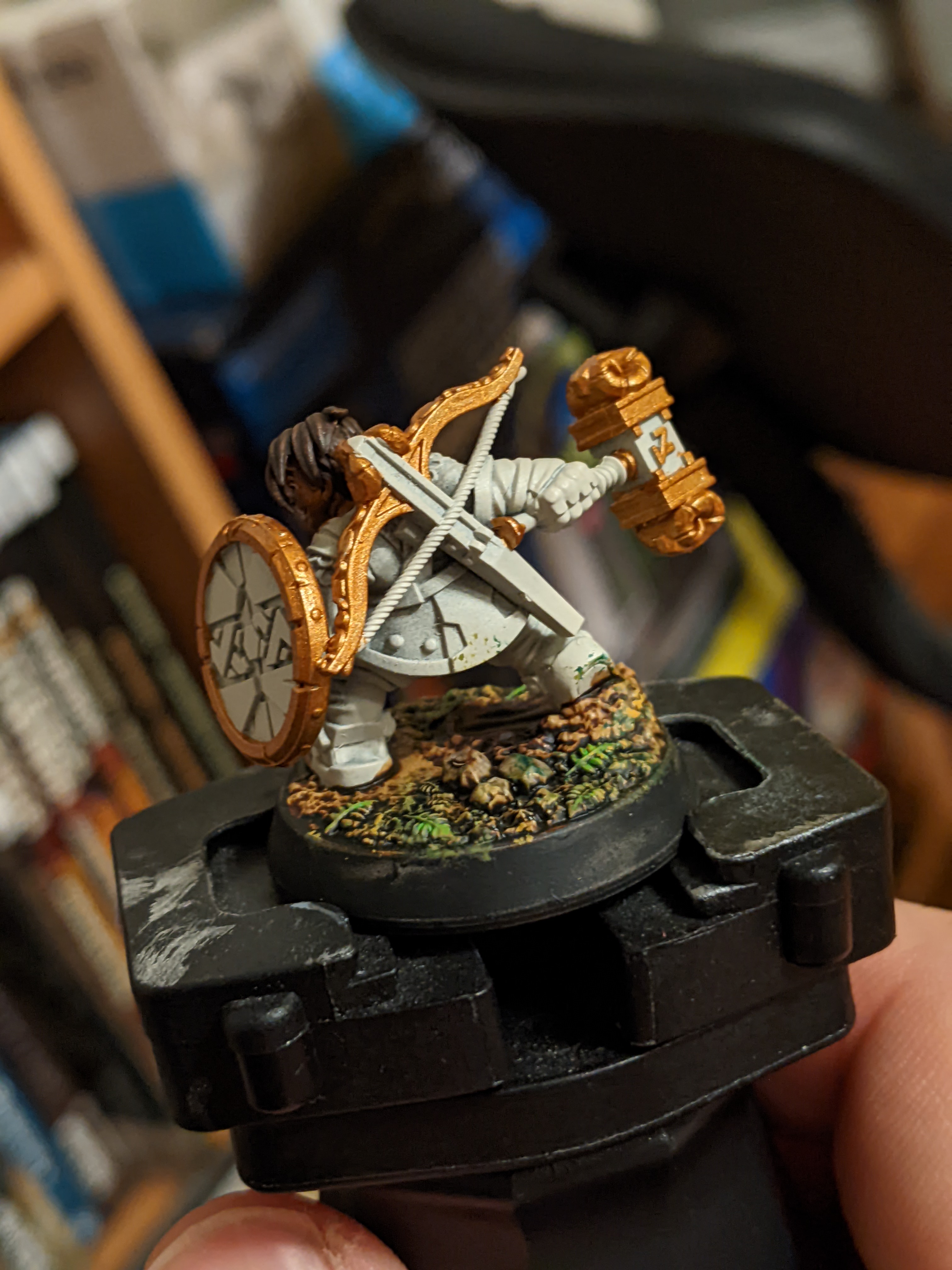
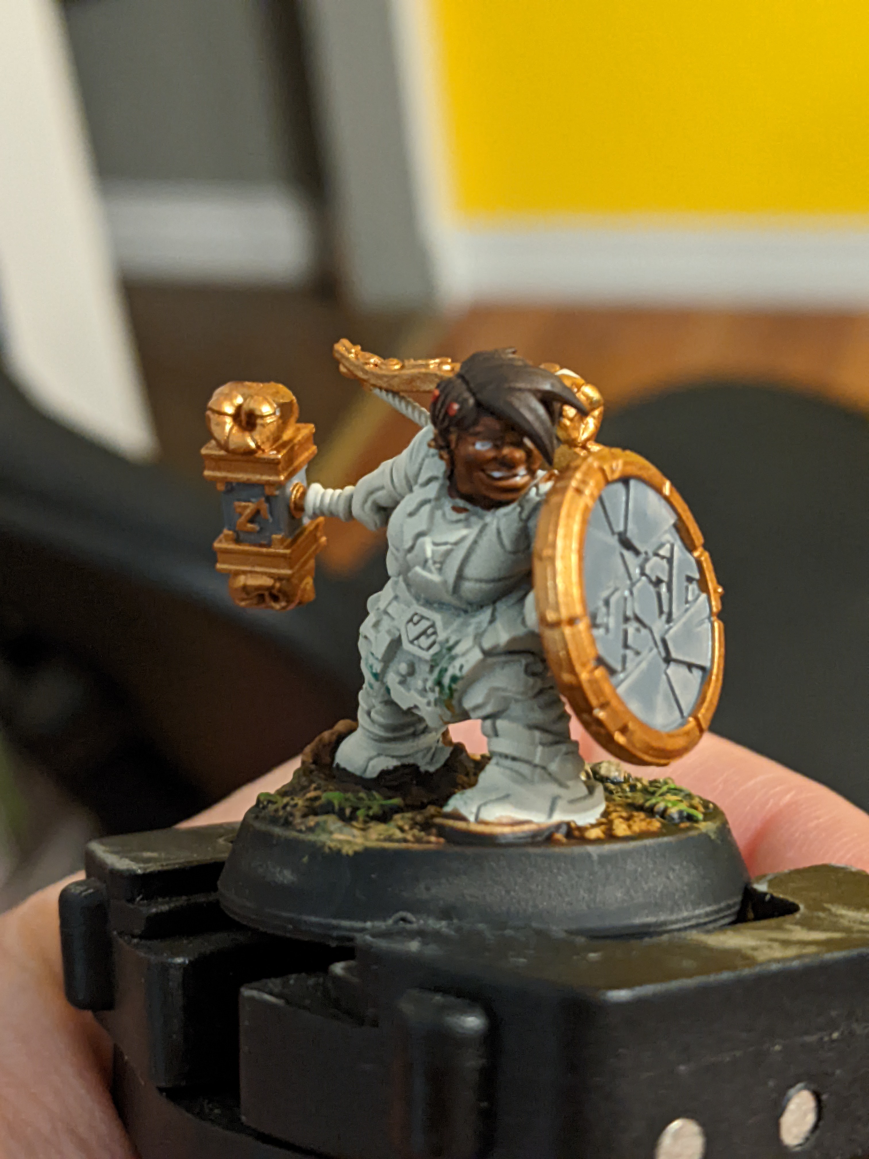
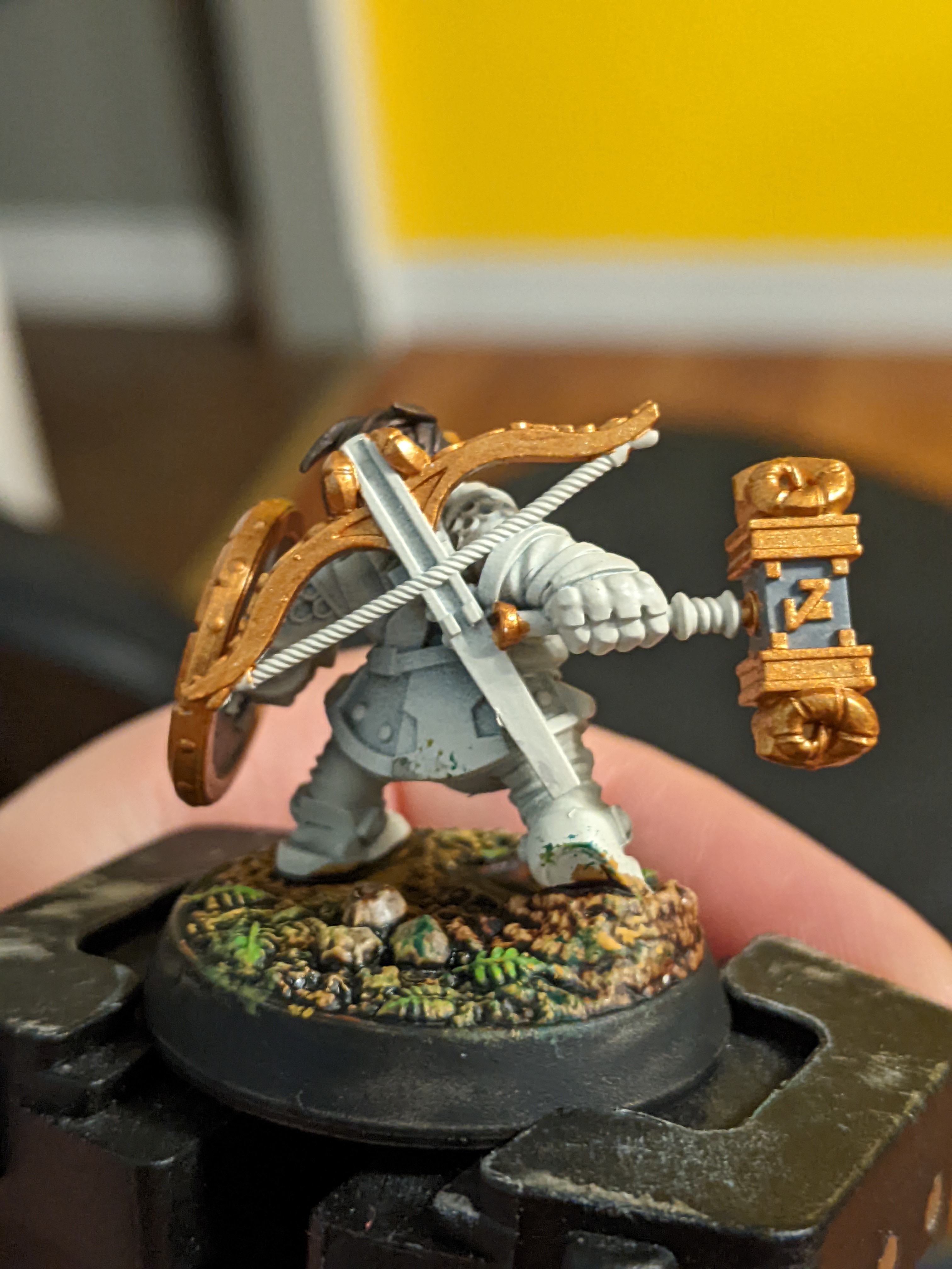
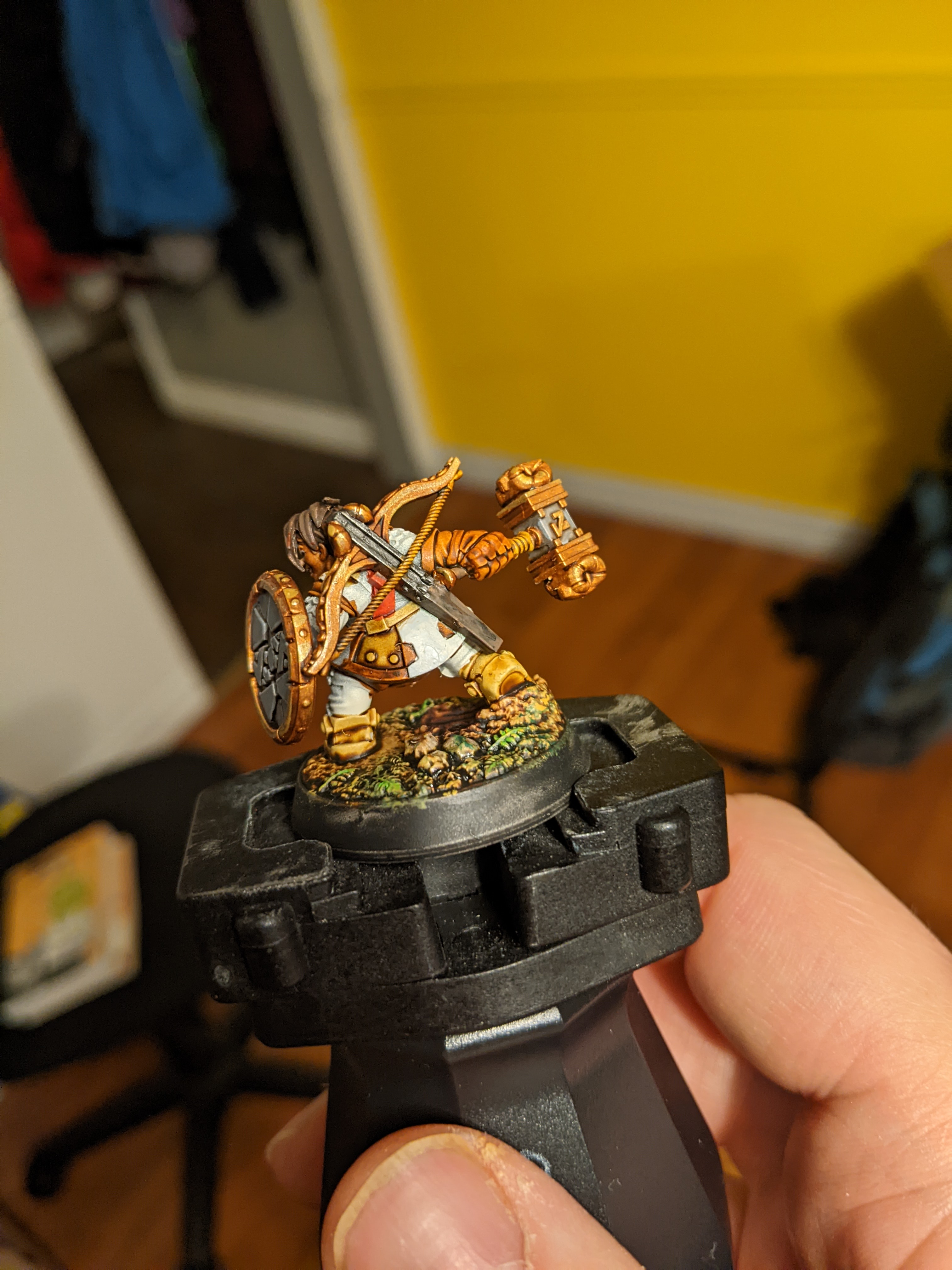
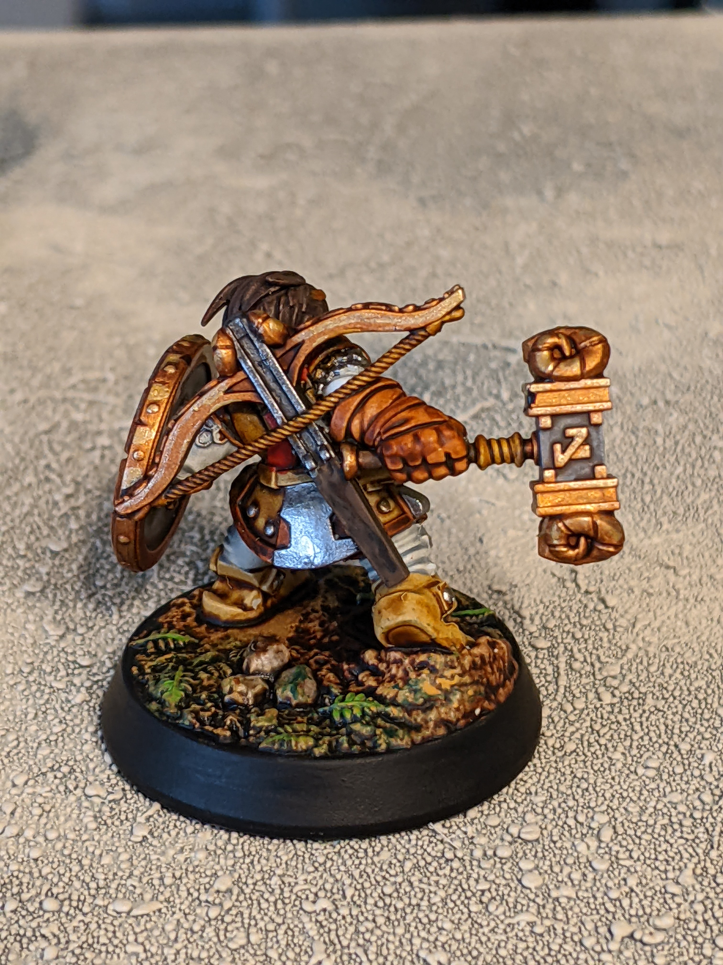
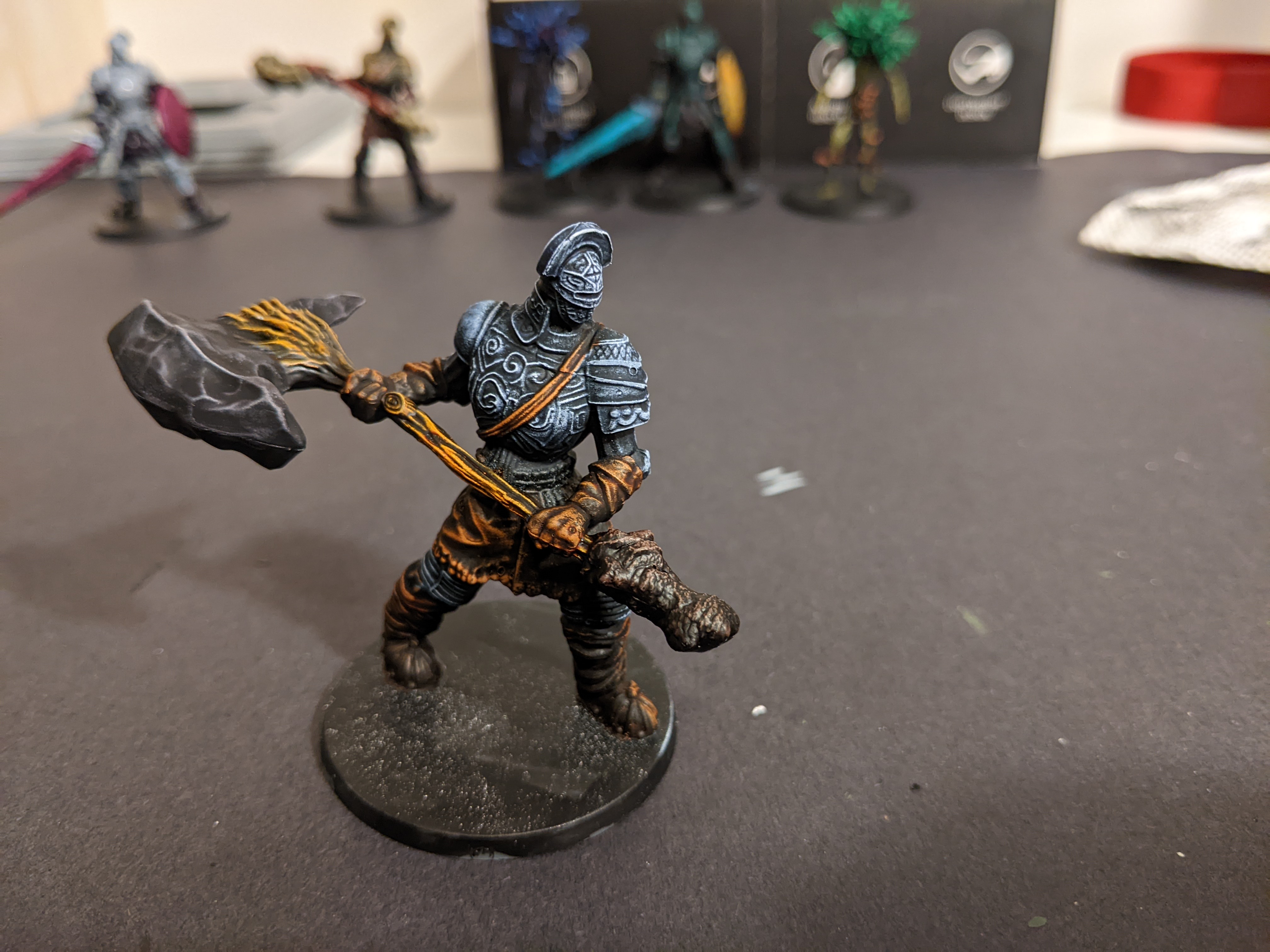
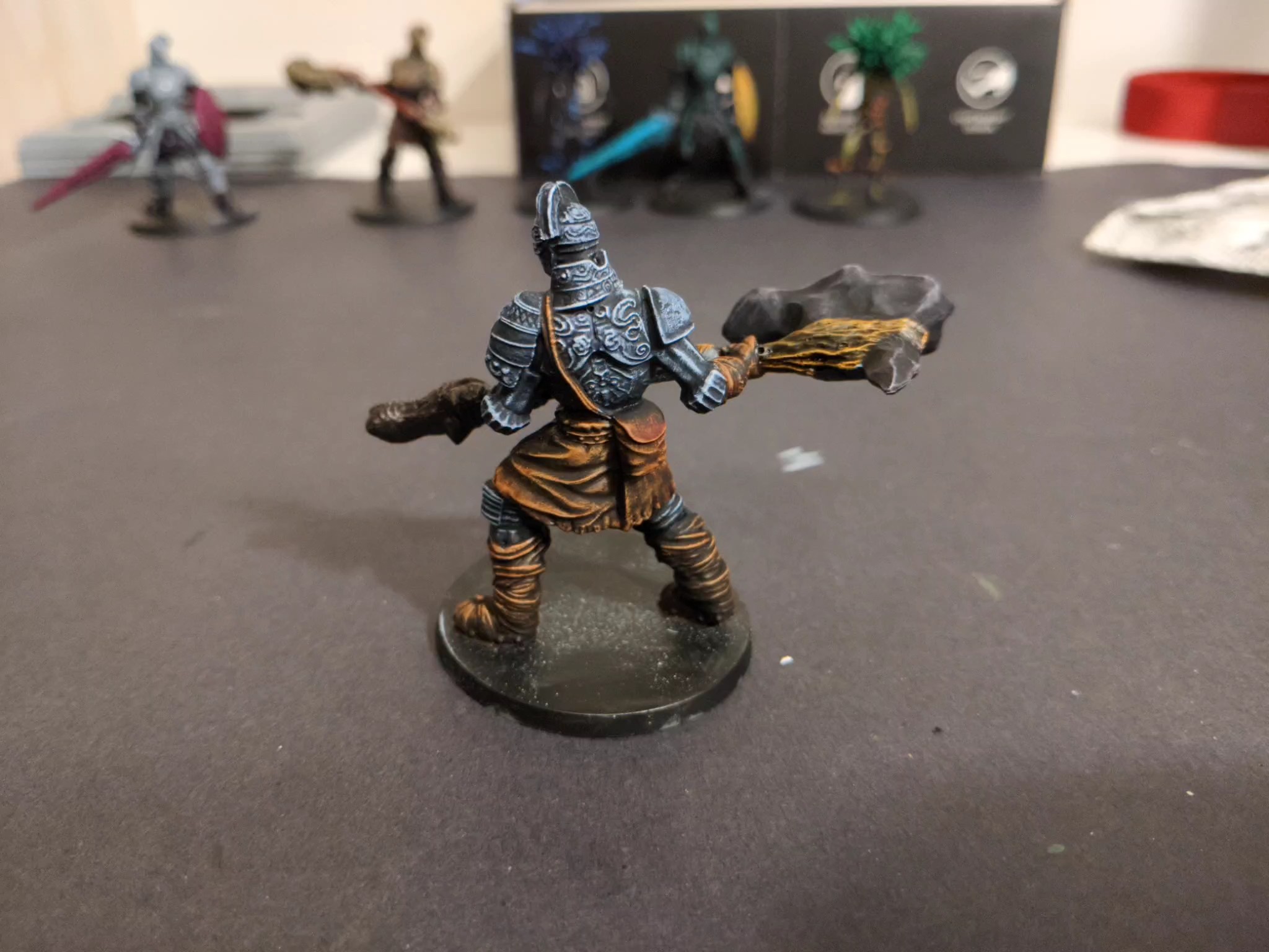
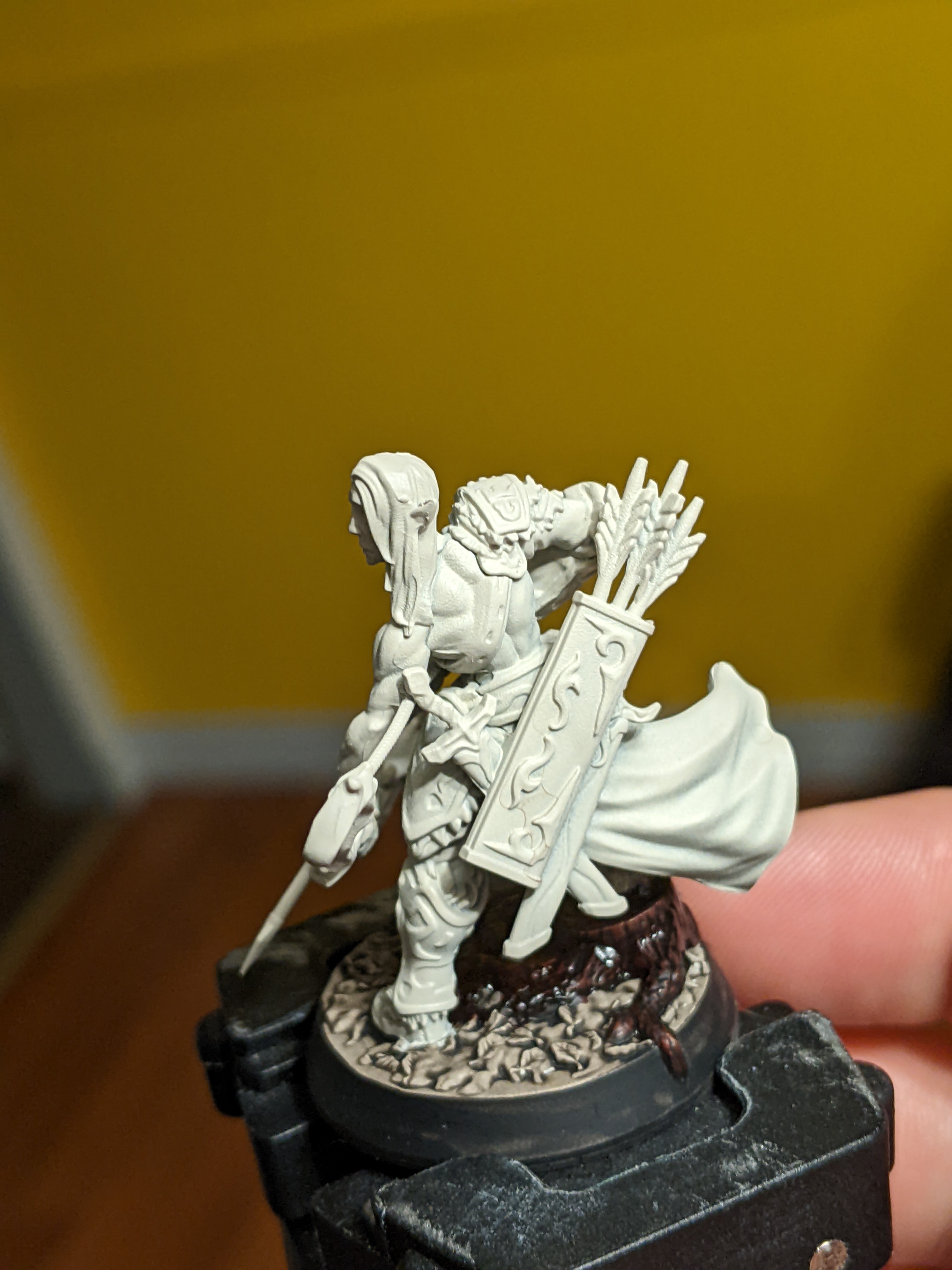
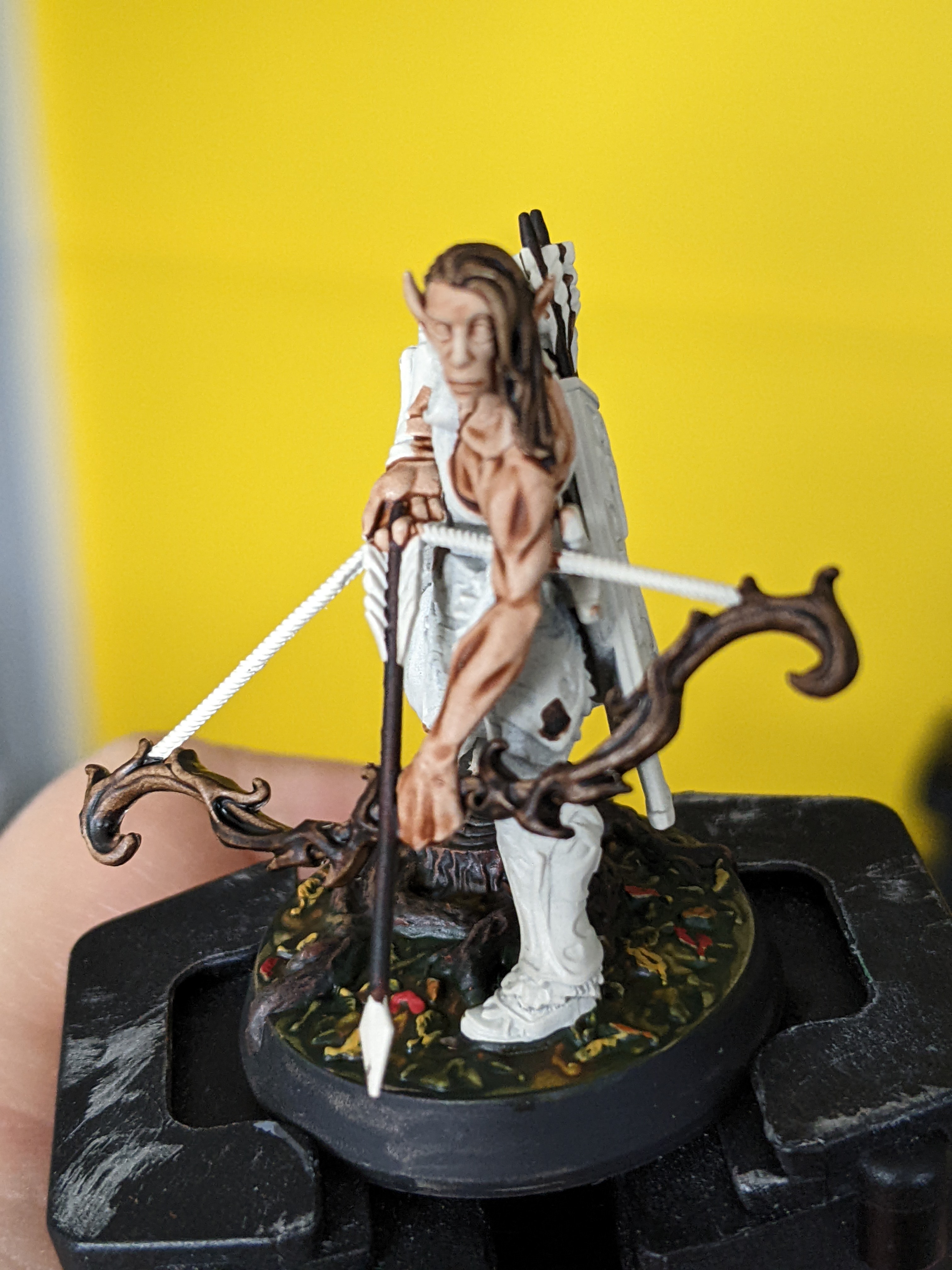
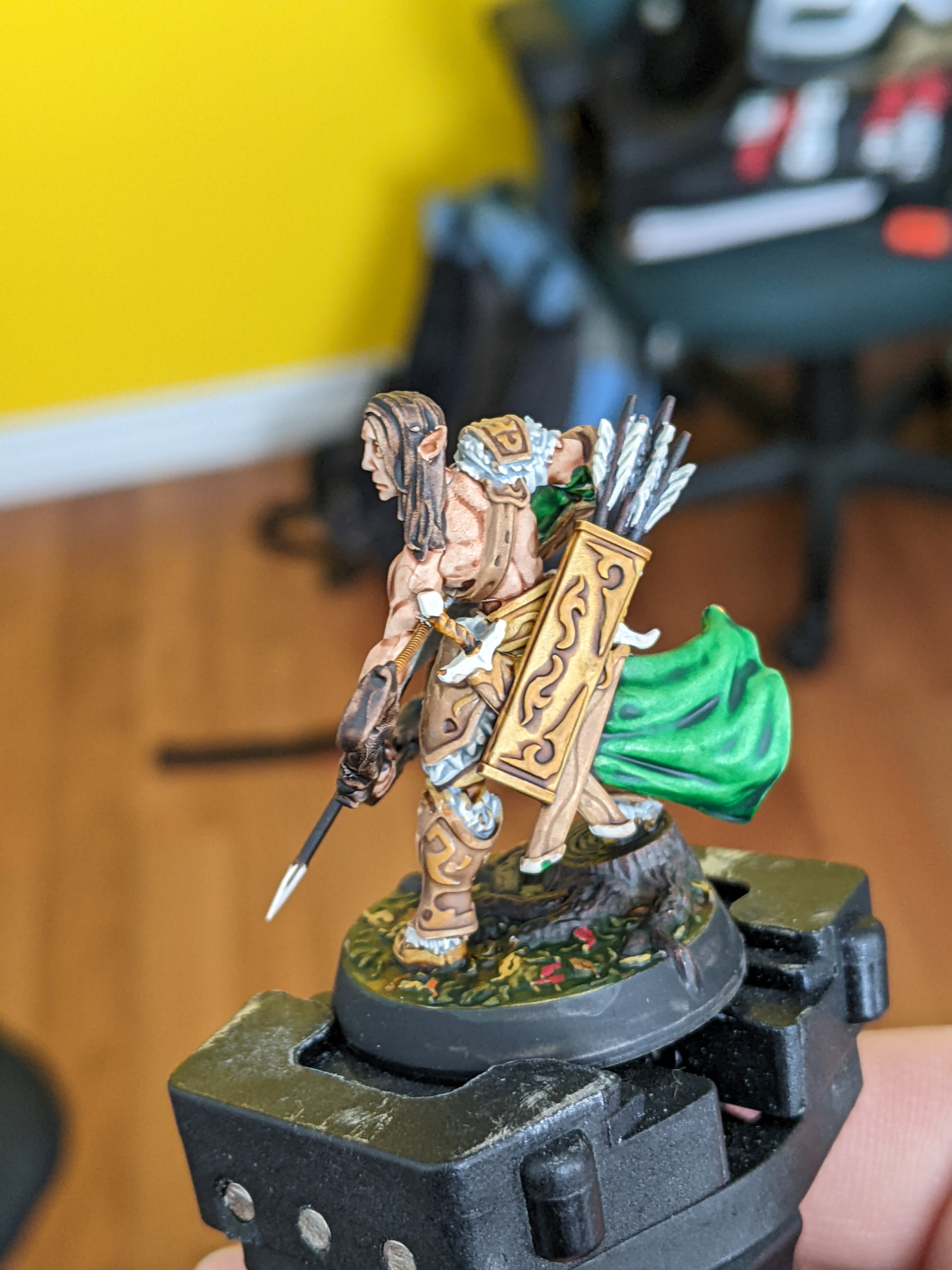
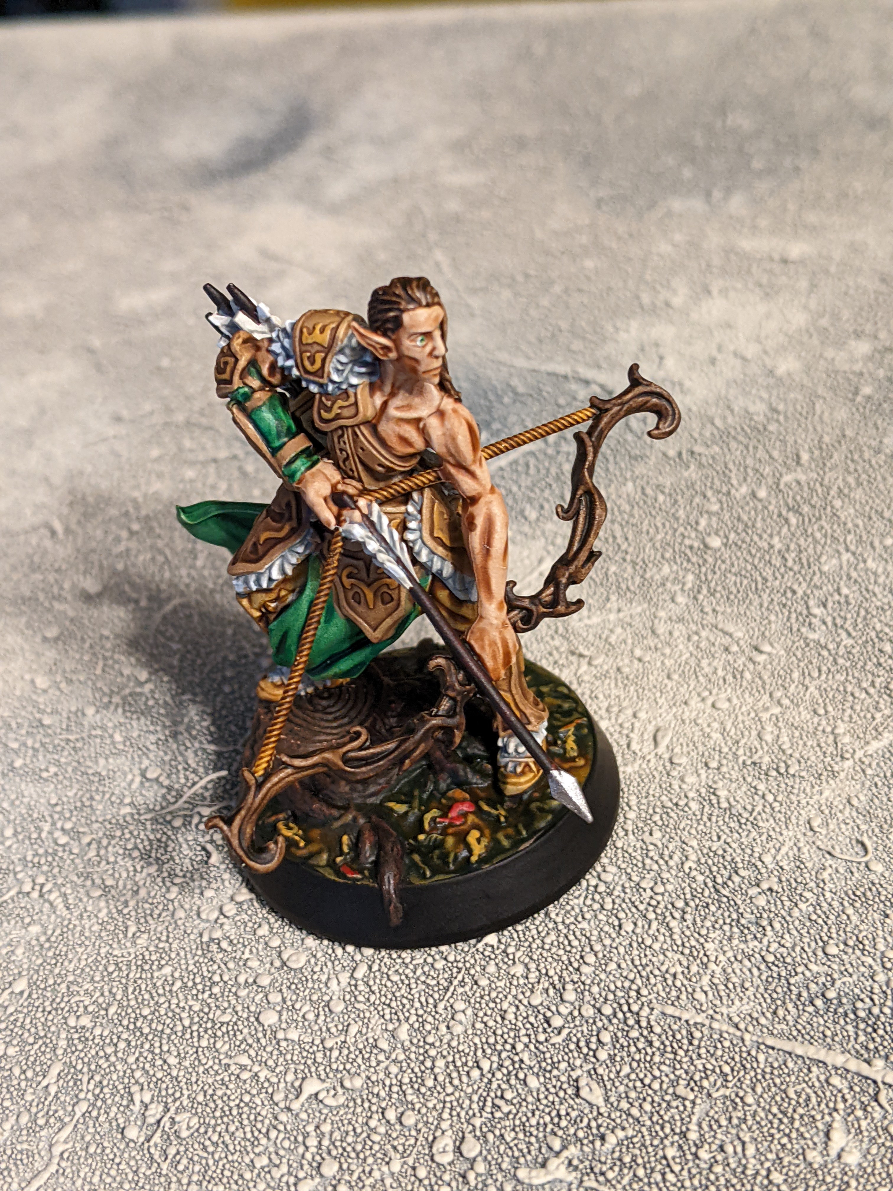
Here’s the first one


So this one uses Runic Grey for the body/armour, Gravelord Grey for the rock hammer, Hardened Leather for all the leather that’s being worn, Dark Wood for the roots of the tree, and Sand Golem for the handle.
This one came out pretty well, the Dark Wood turned really dark but the leather grey and sandstone all worked out great. The sandstone is more of a warmer light wood sort of colour but that’s not a bad thing at all. The leather is a bit more orange than I would like but that could also be just the contrast with the blueish runic grey. Also they Gravelord Grey worked great as a rock.
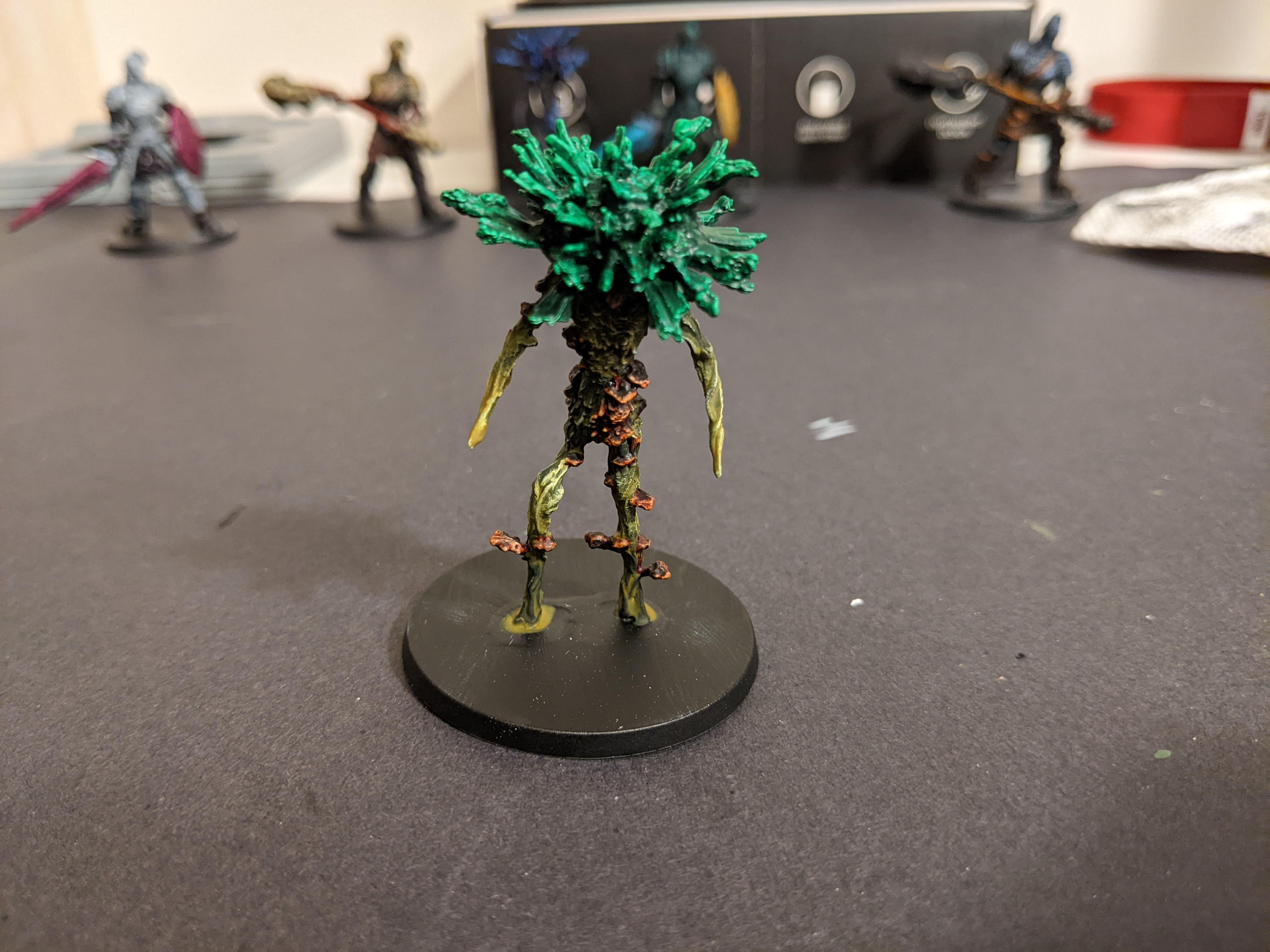
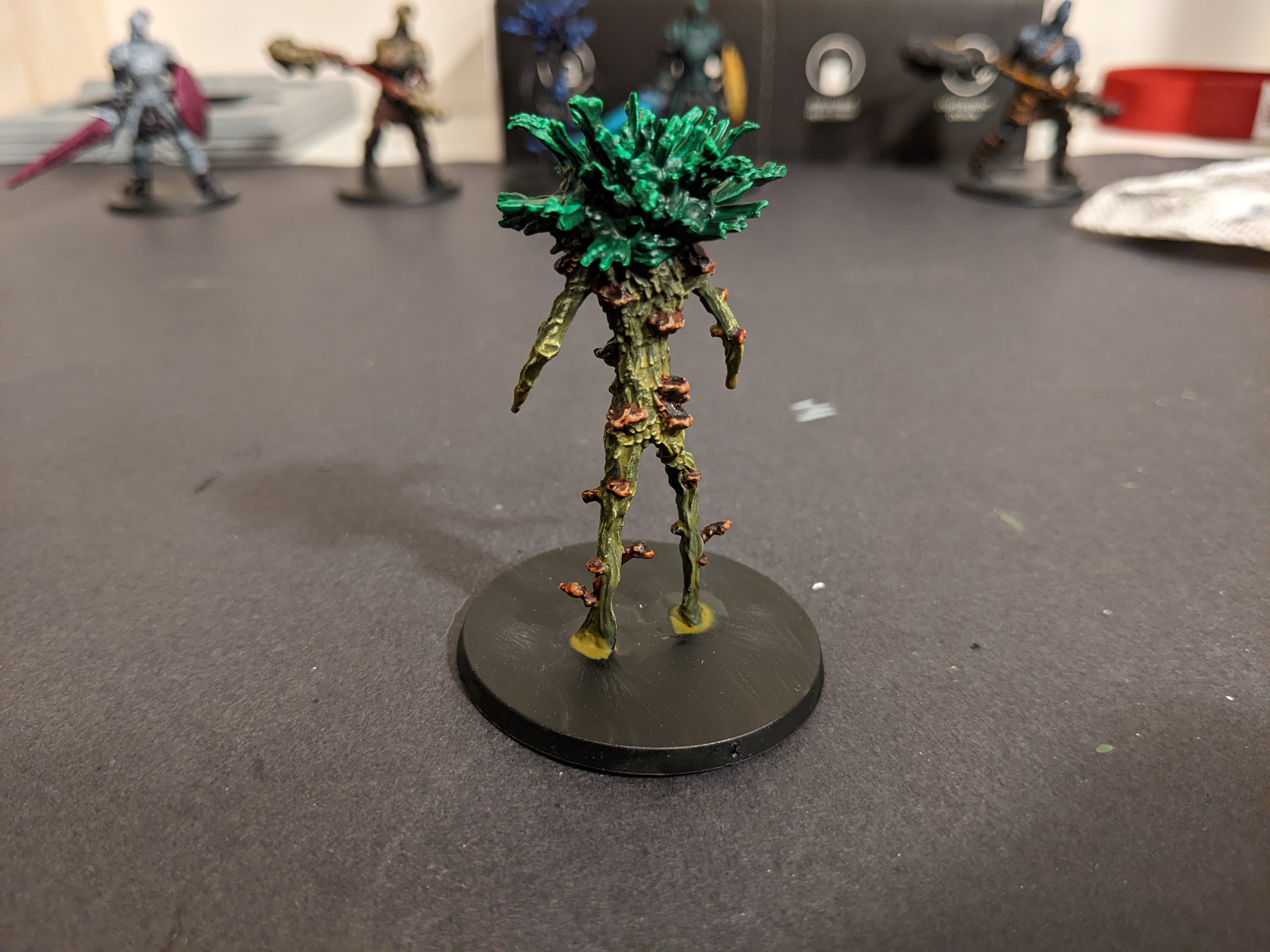
Okay next one


So these twiggy plant guys came in the set and I thought the different texture would be good for the test but I don’t know if they did great with the zenithal.
This one has Orc Skin for the top, Malignant Green for the body, and Fire Giant Orange for the fungus clumps.
And first off wow is that Orc Skin green vibrant, it actually brightened up and pulled away from the edges as it dried which was interesting. Apart from that the more grounded green and orange for the body looks and worked great.
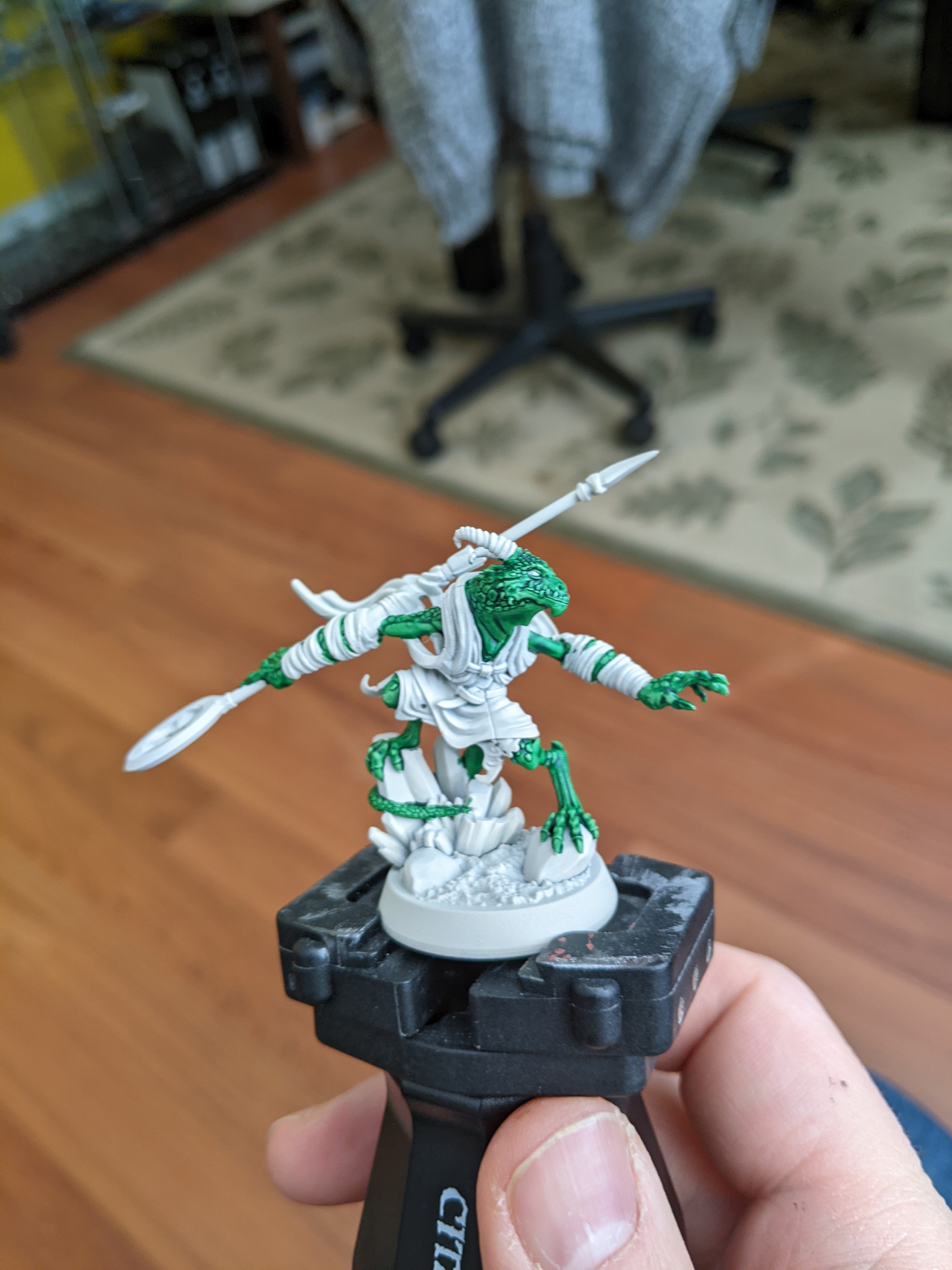
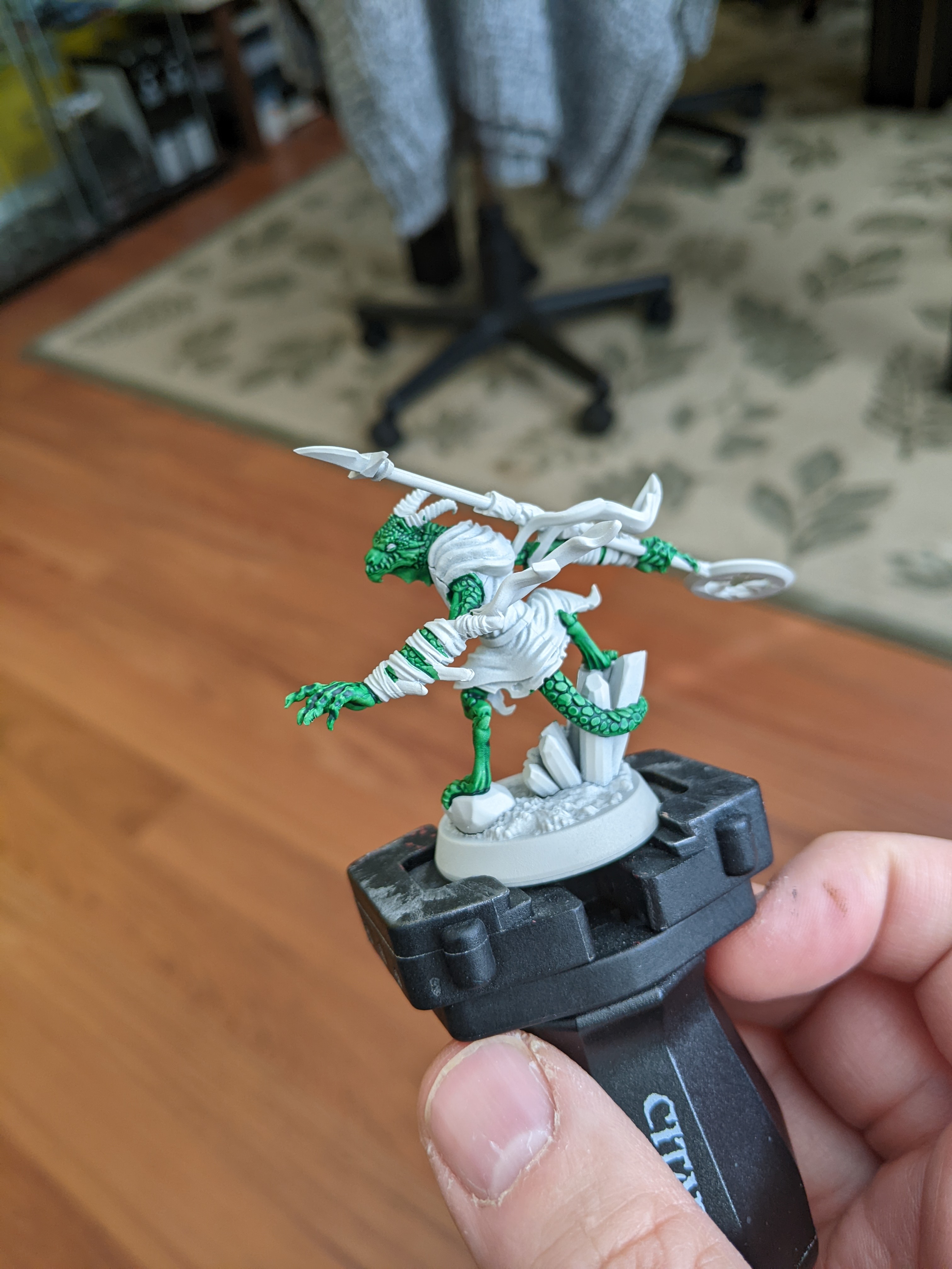
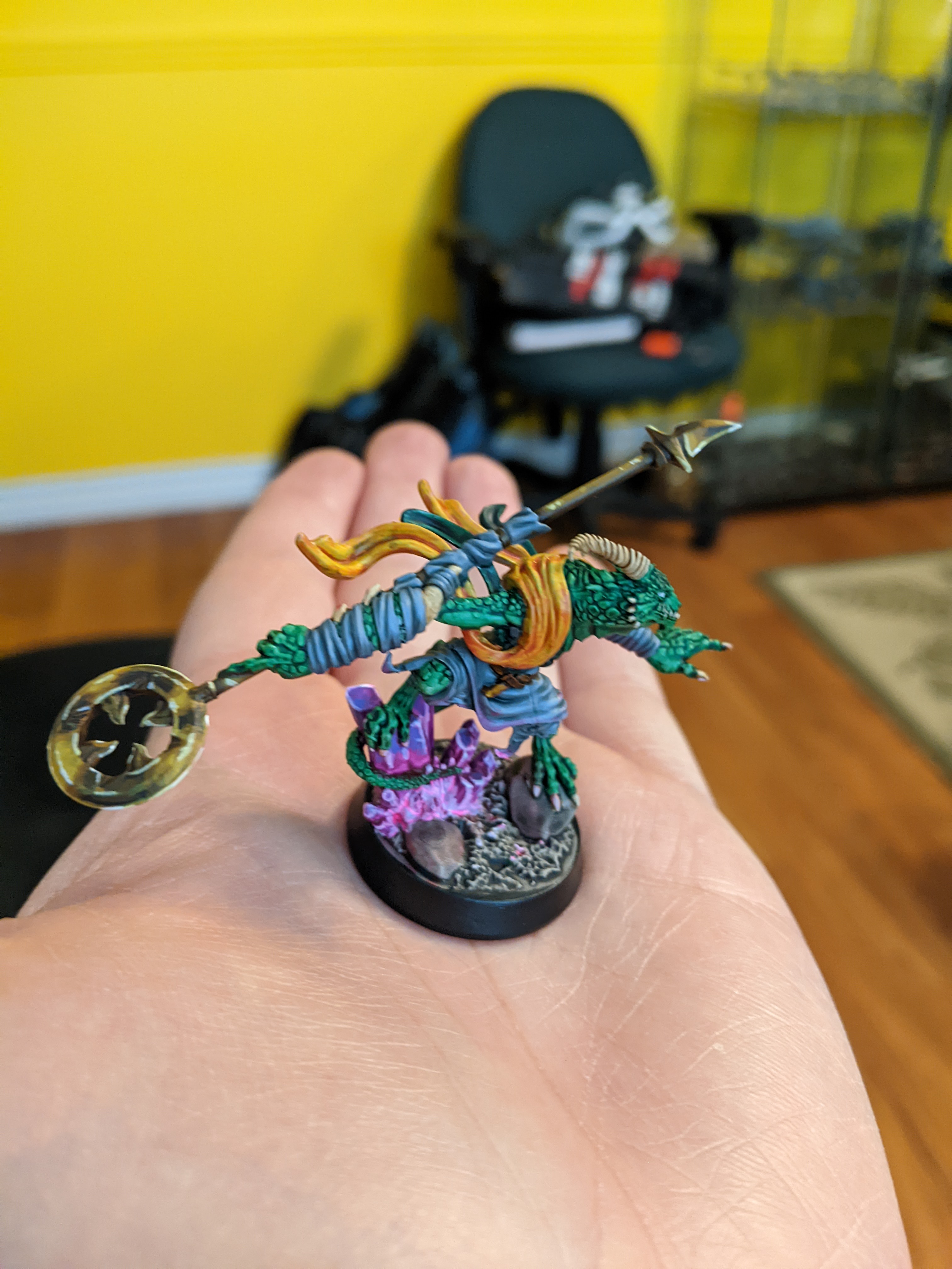
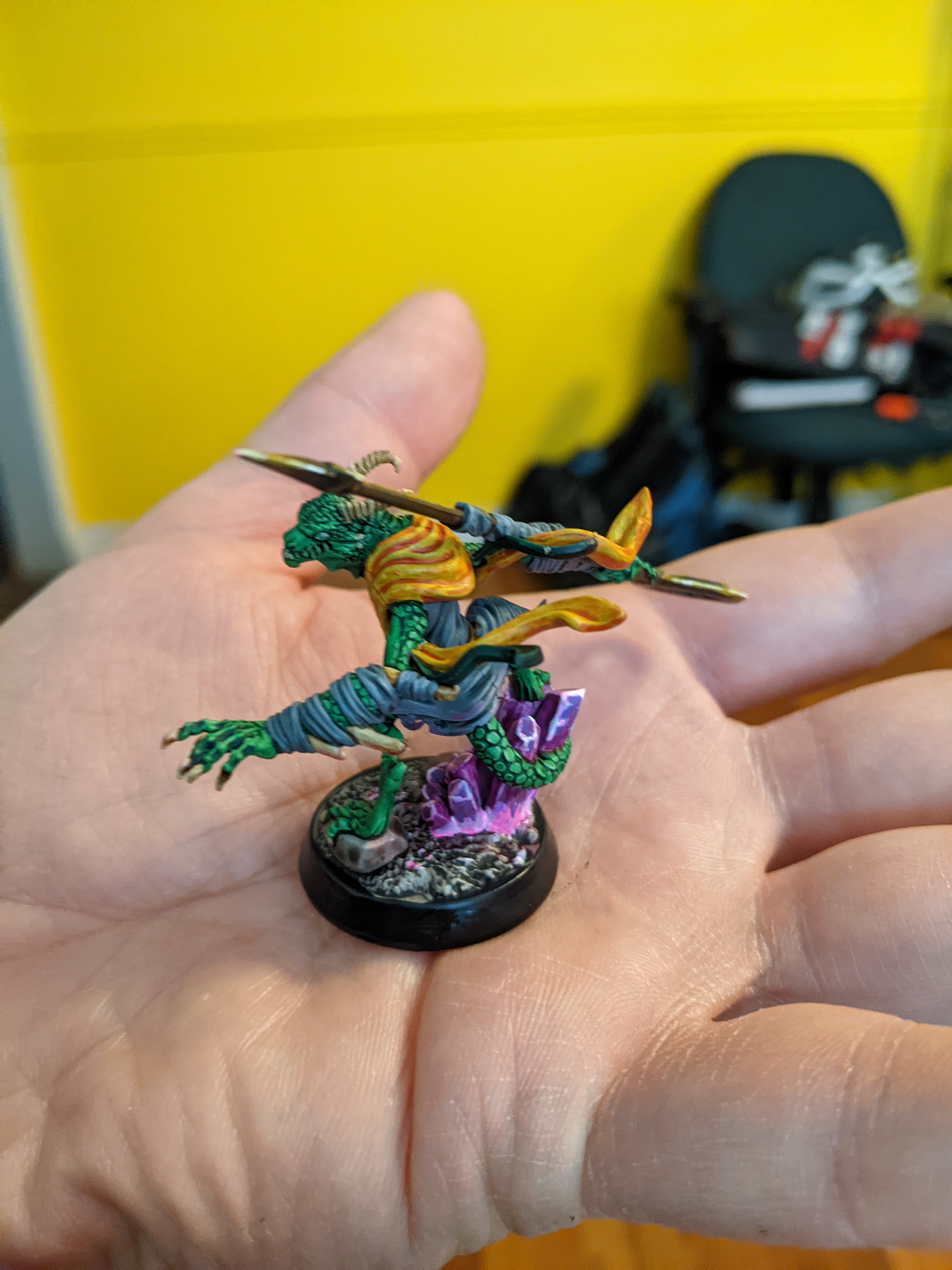
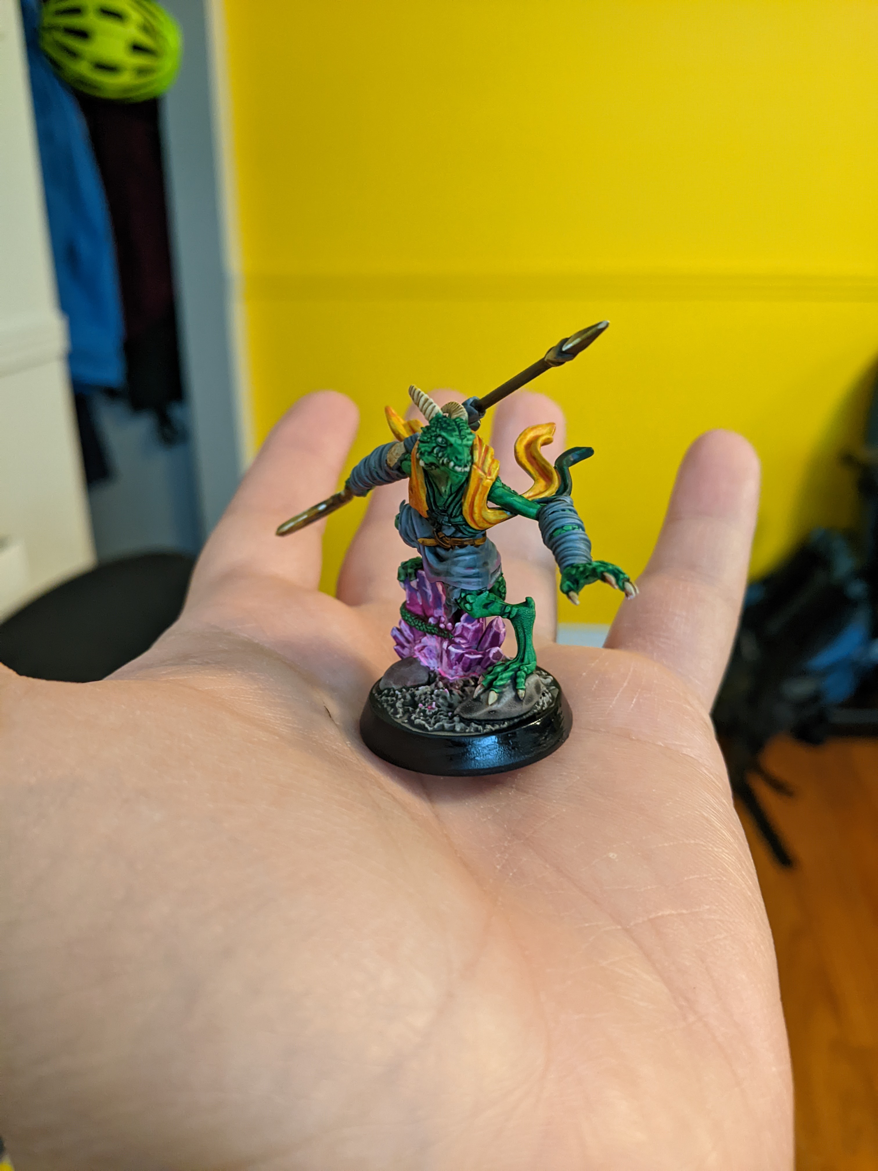
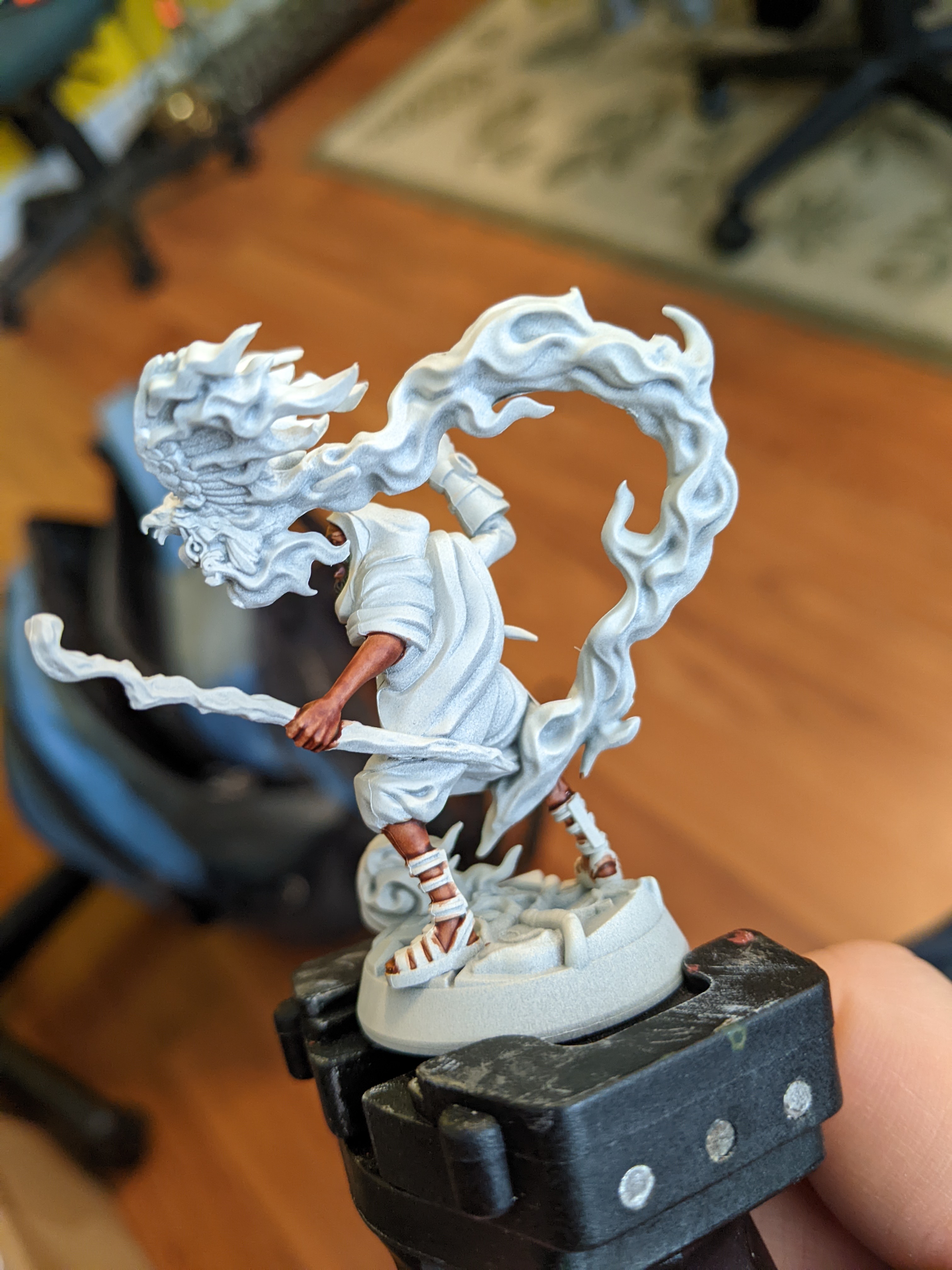
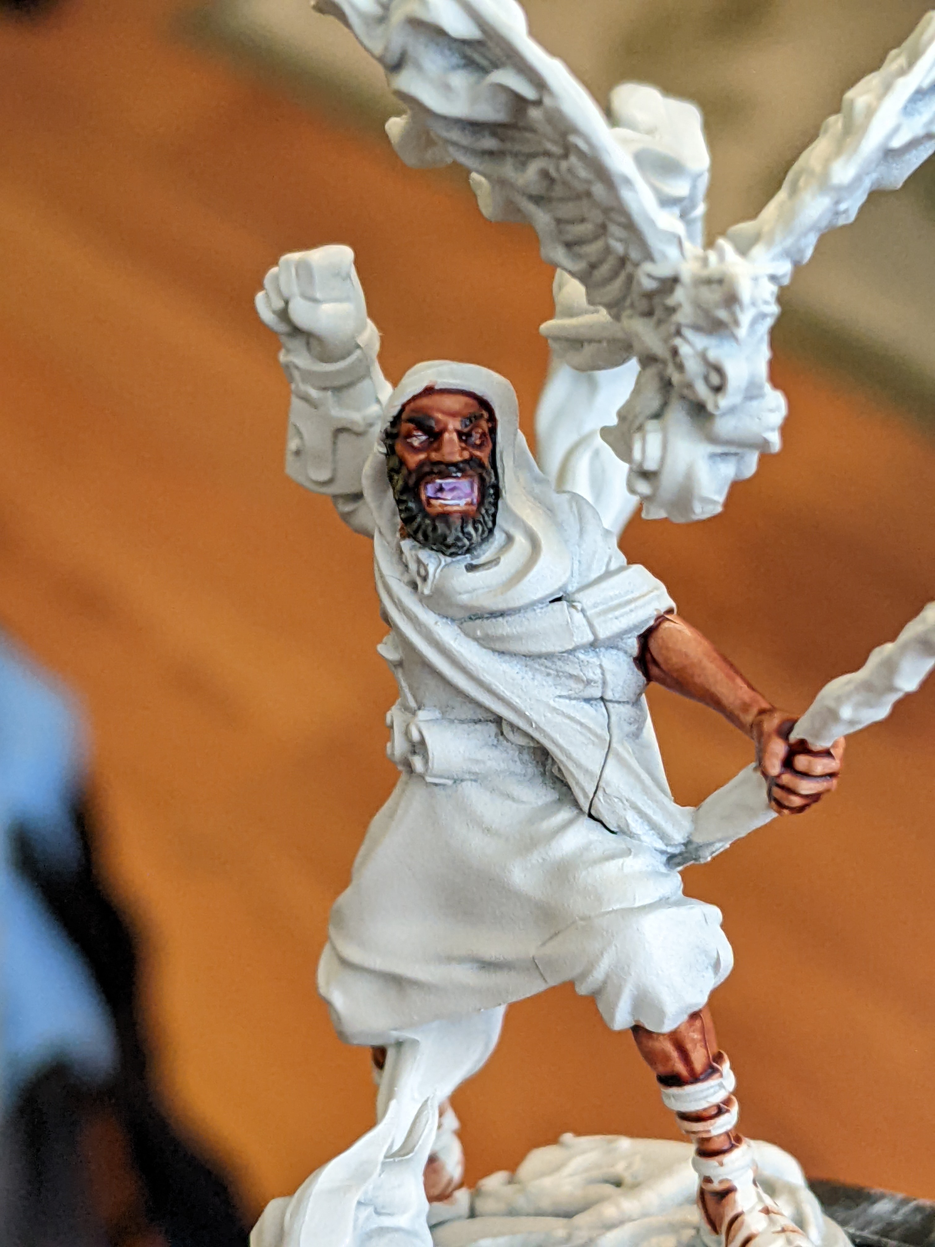
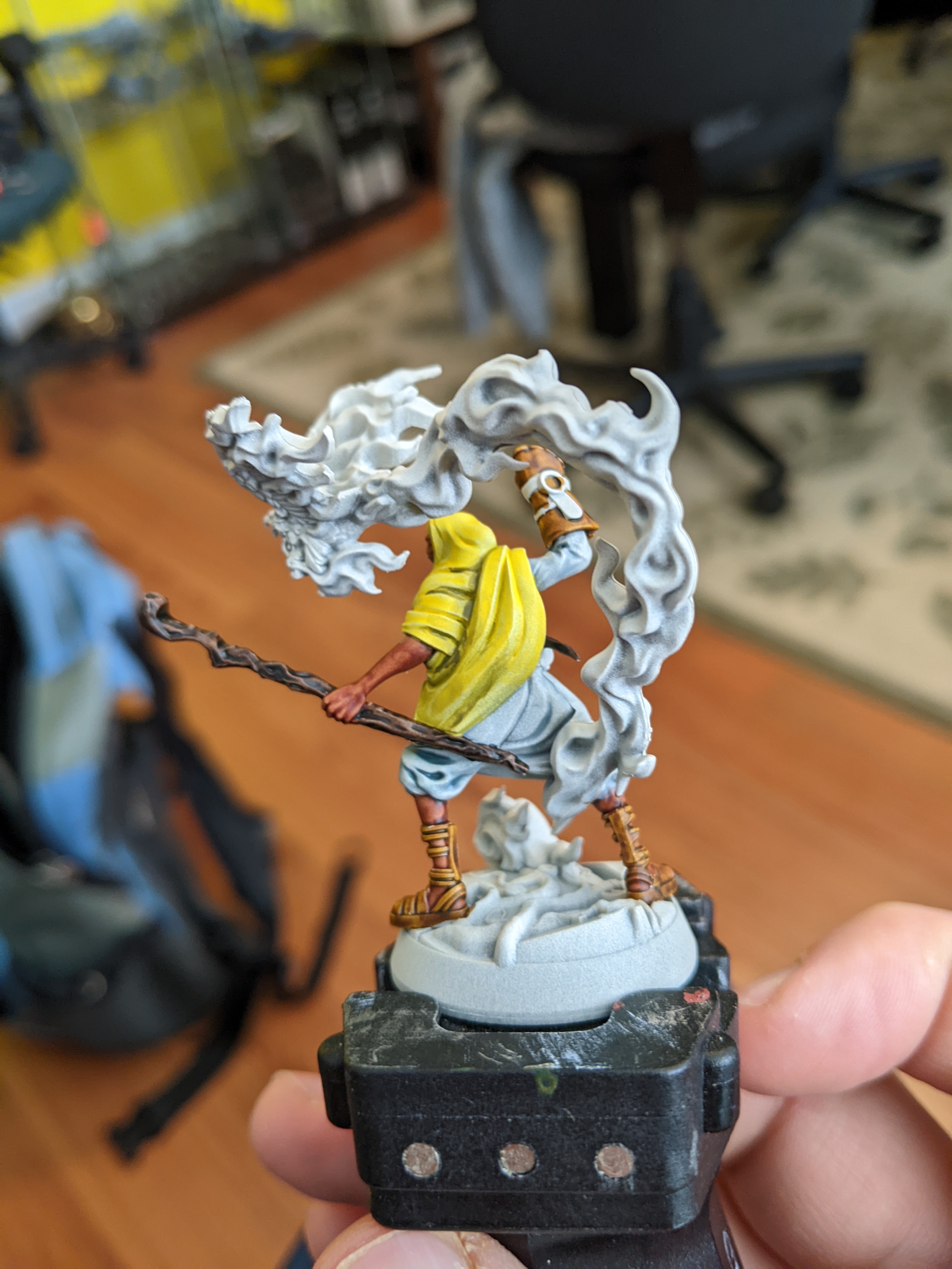
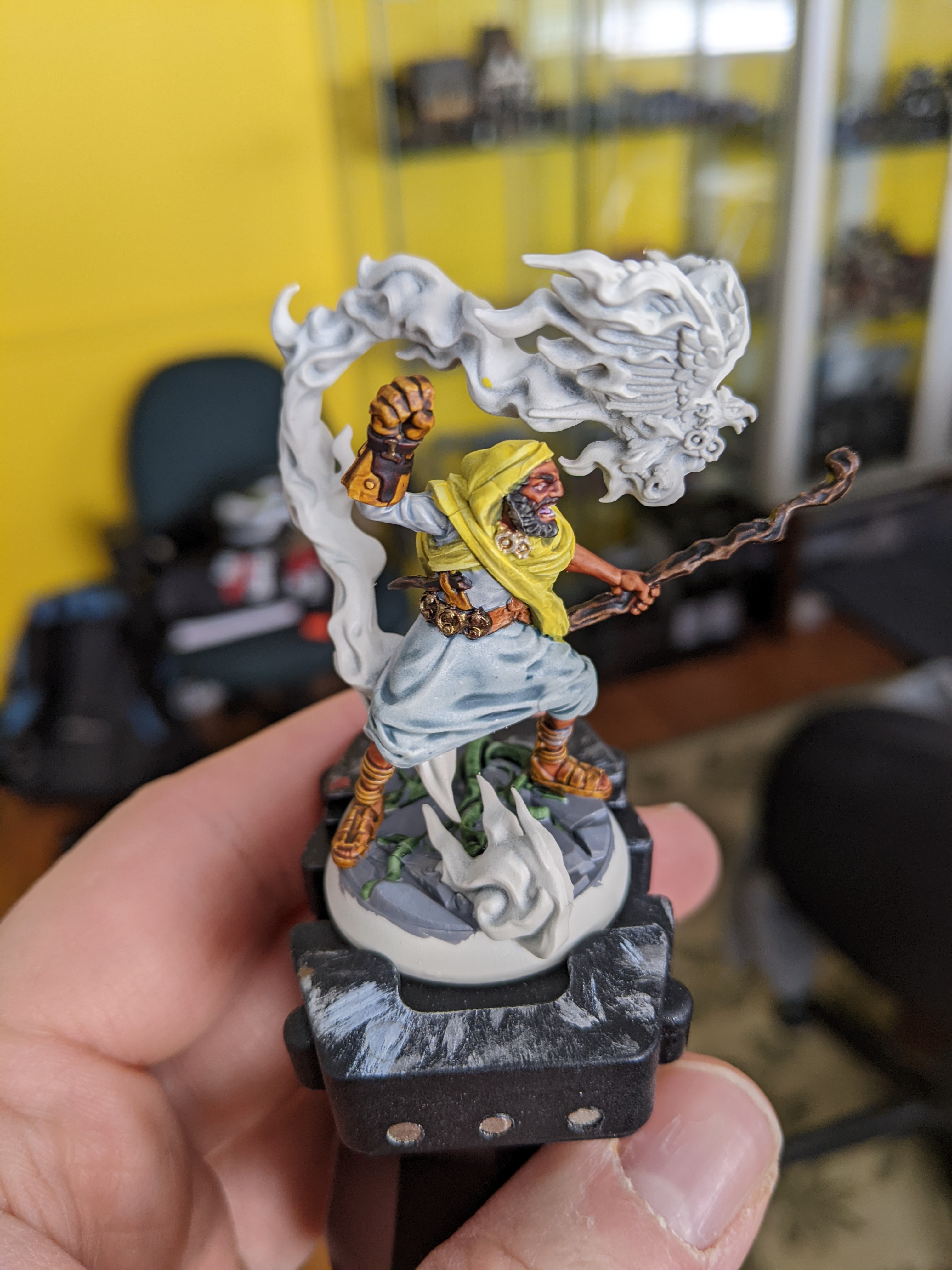
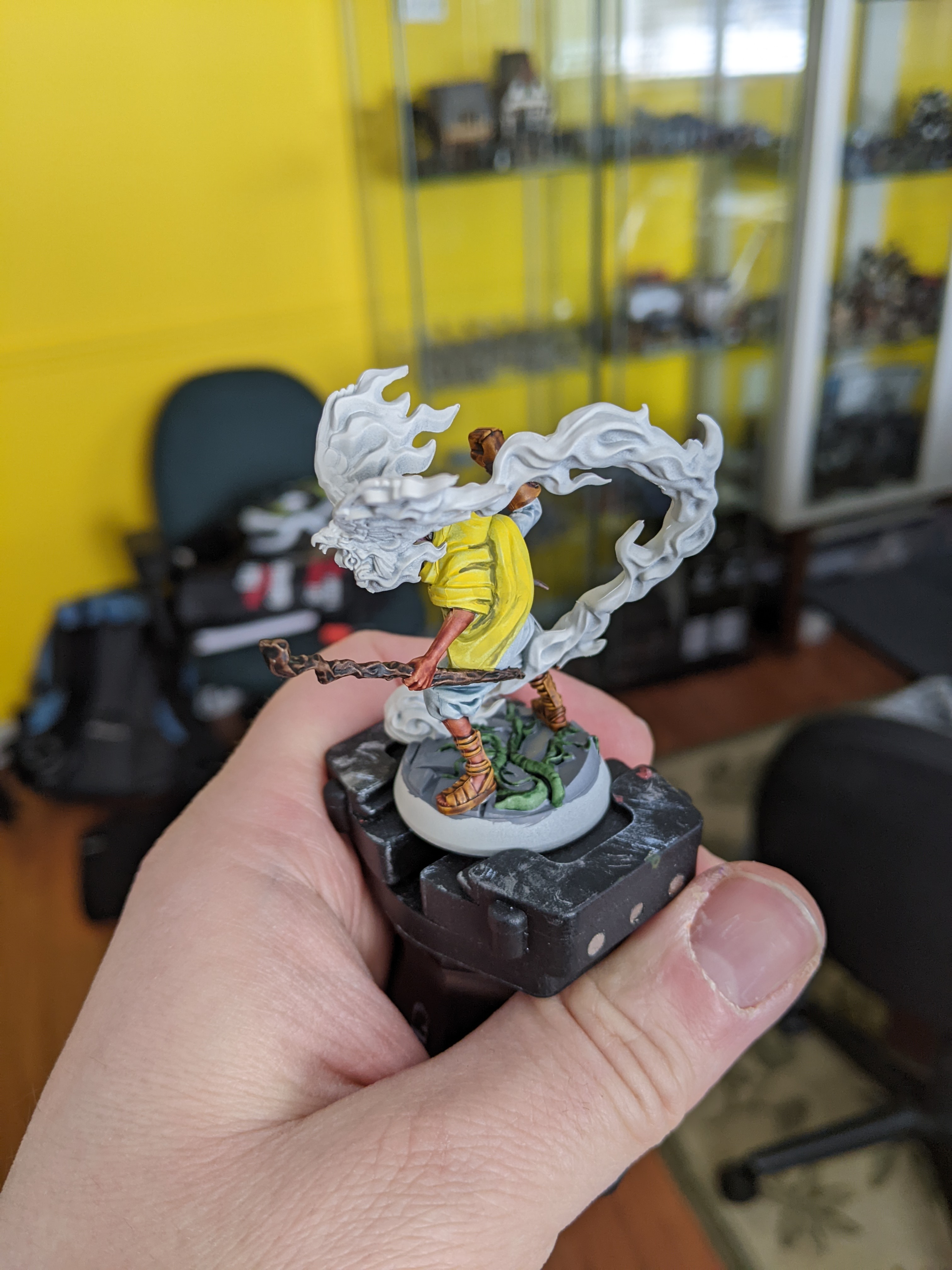
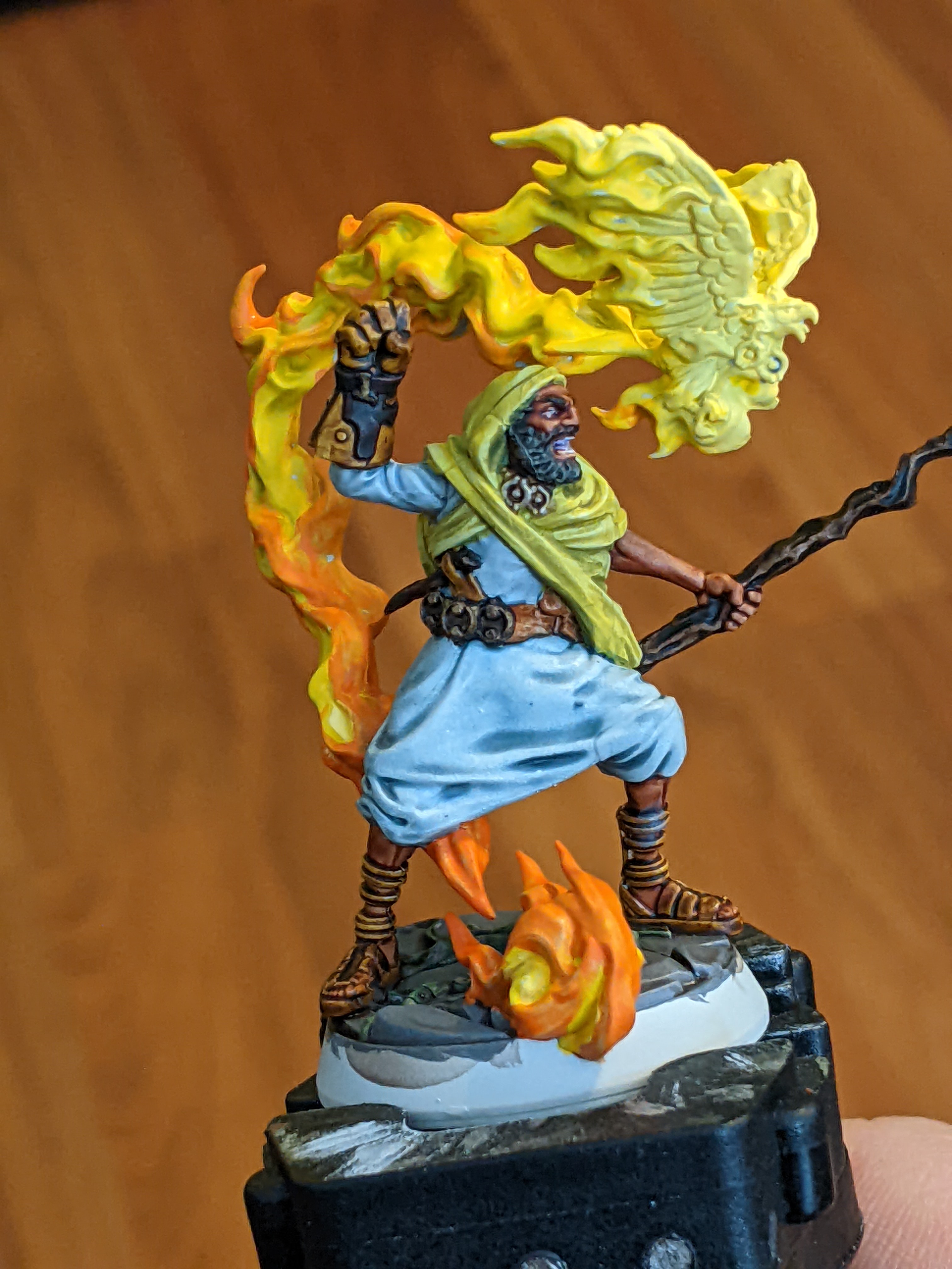
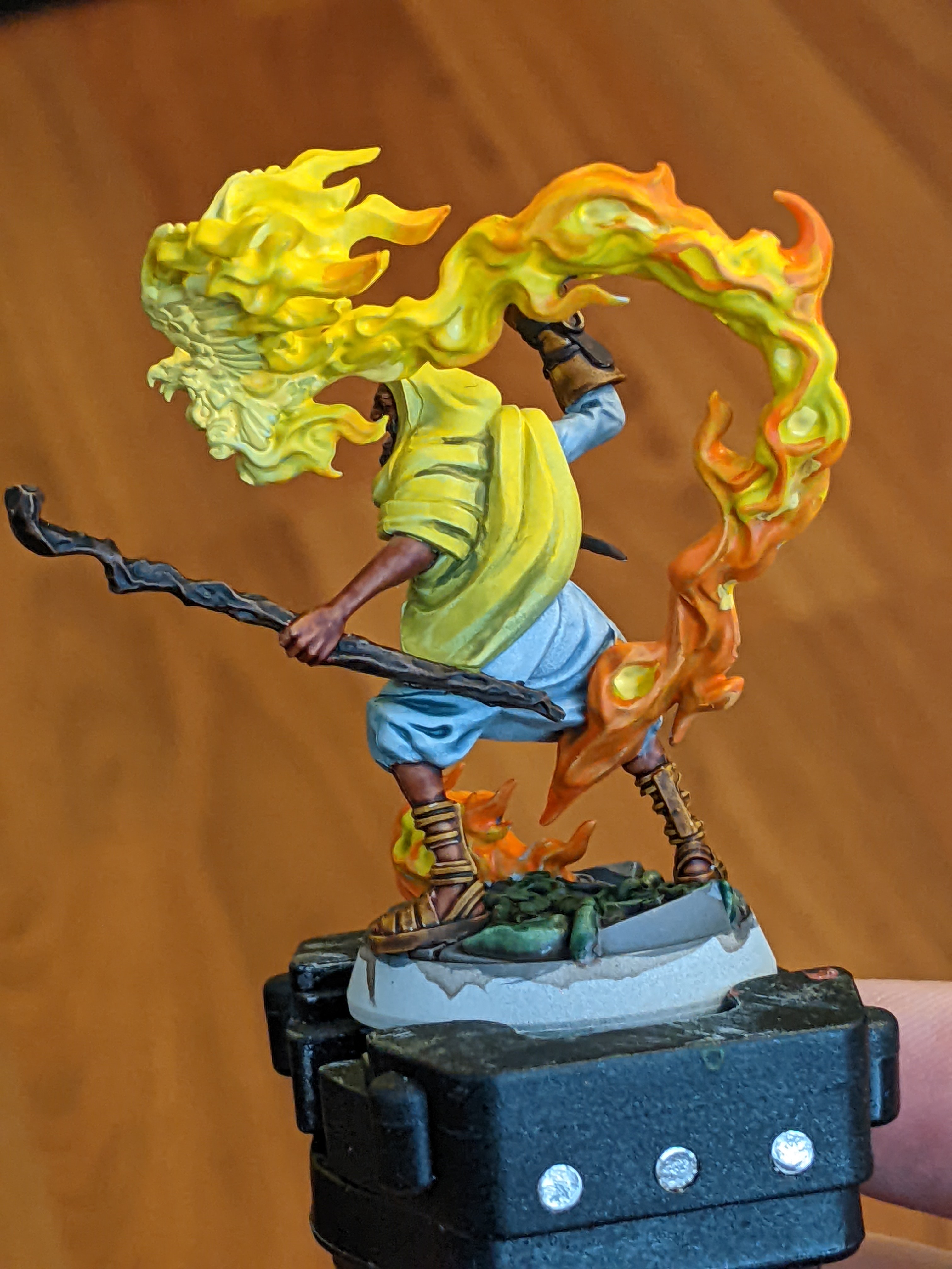
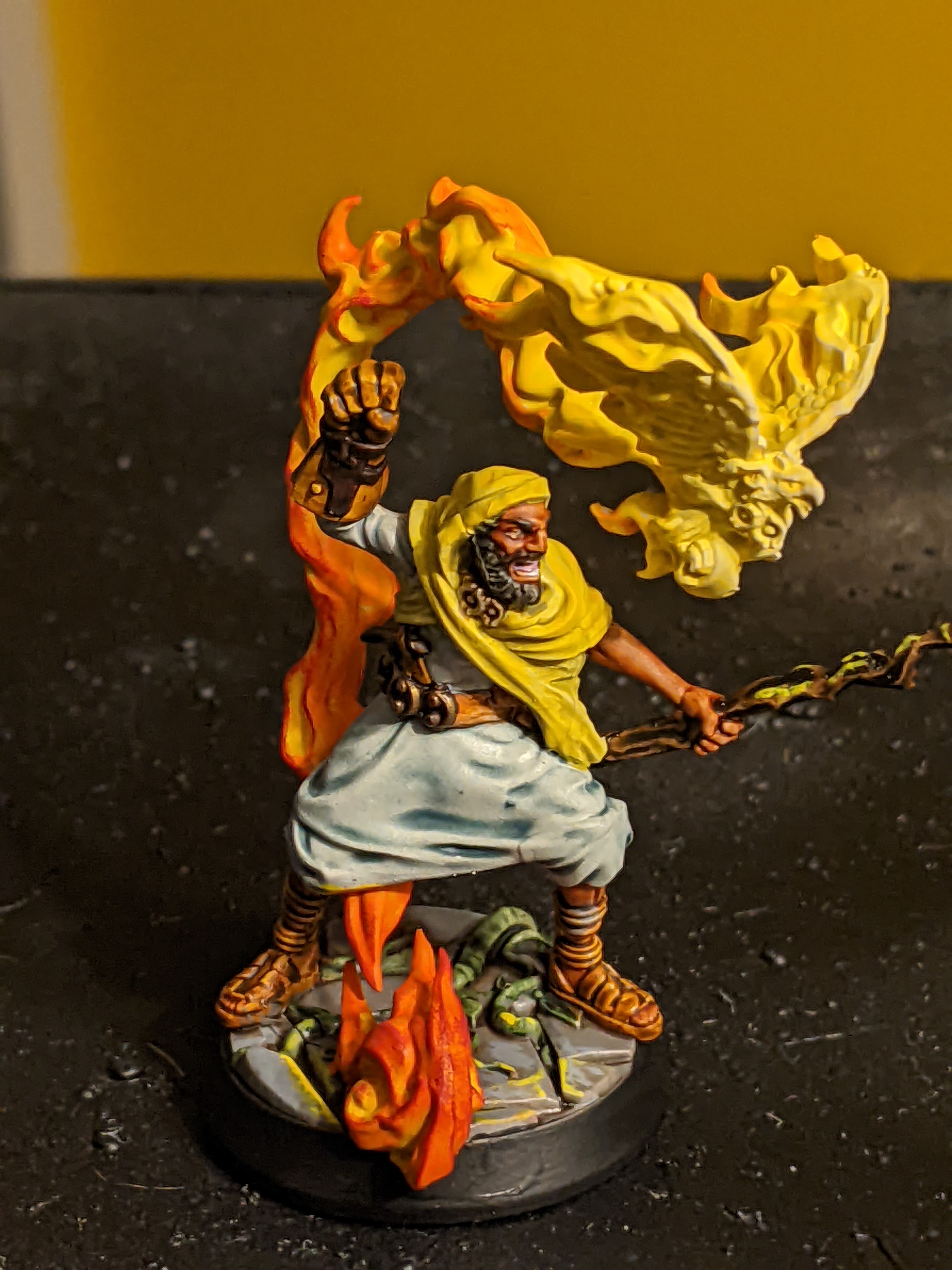
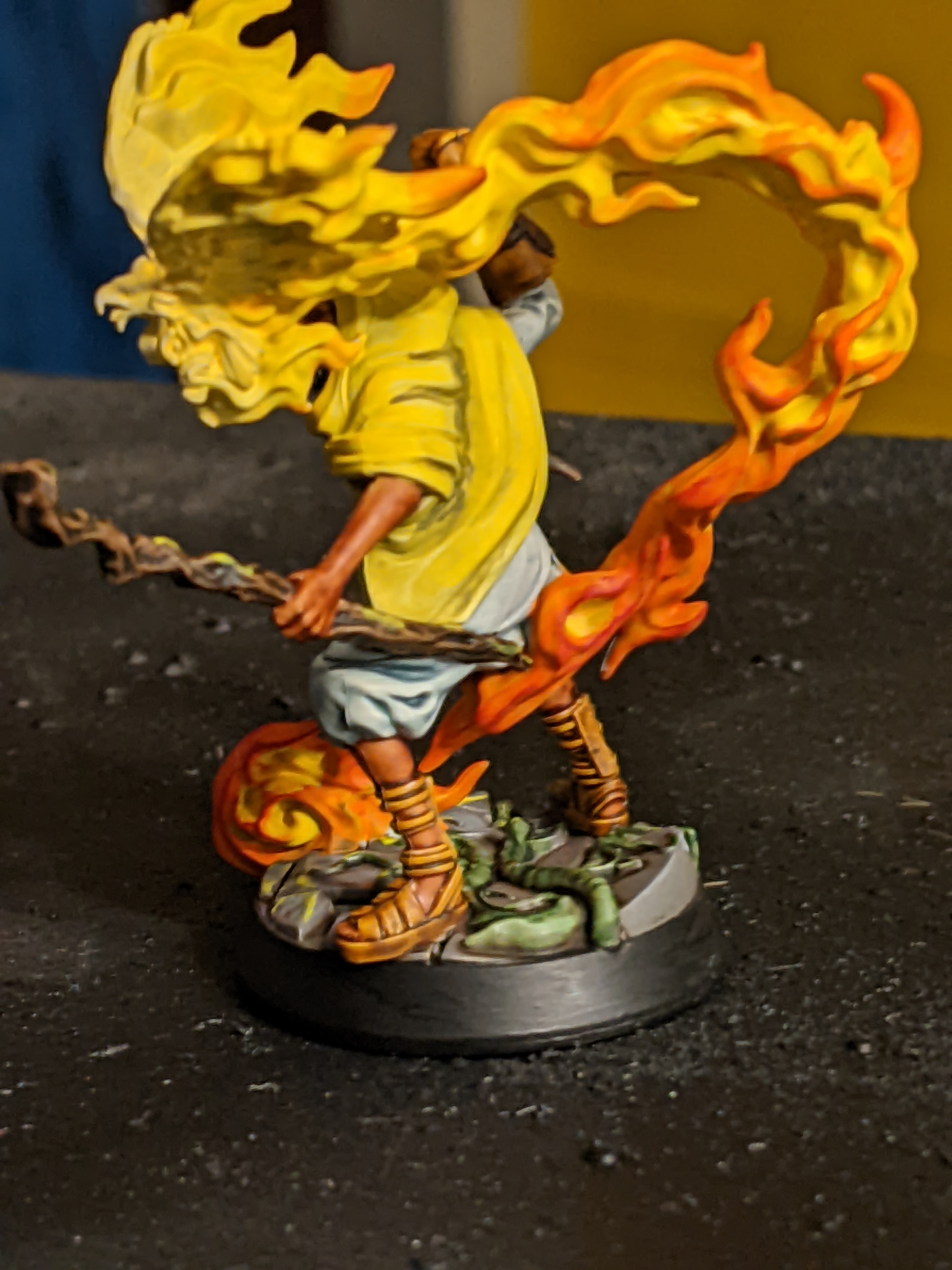
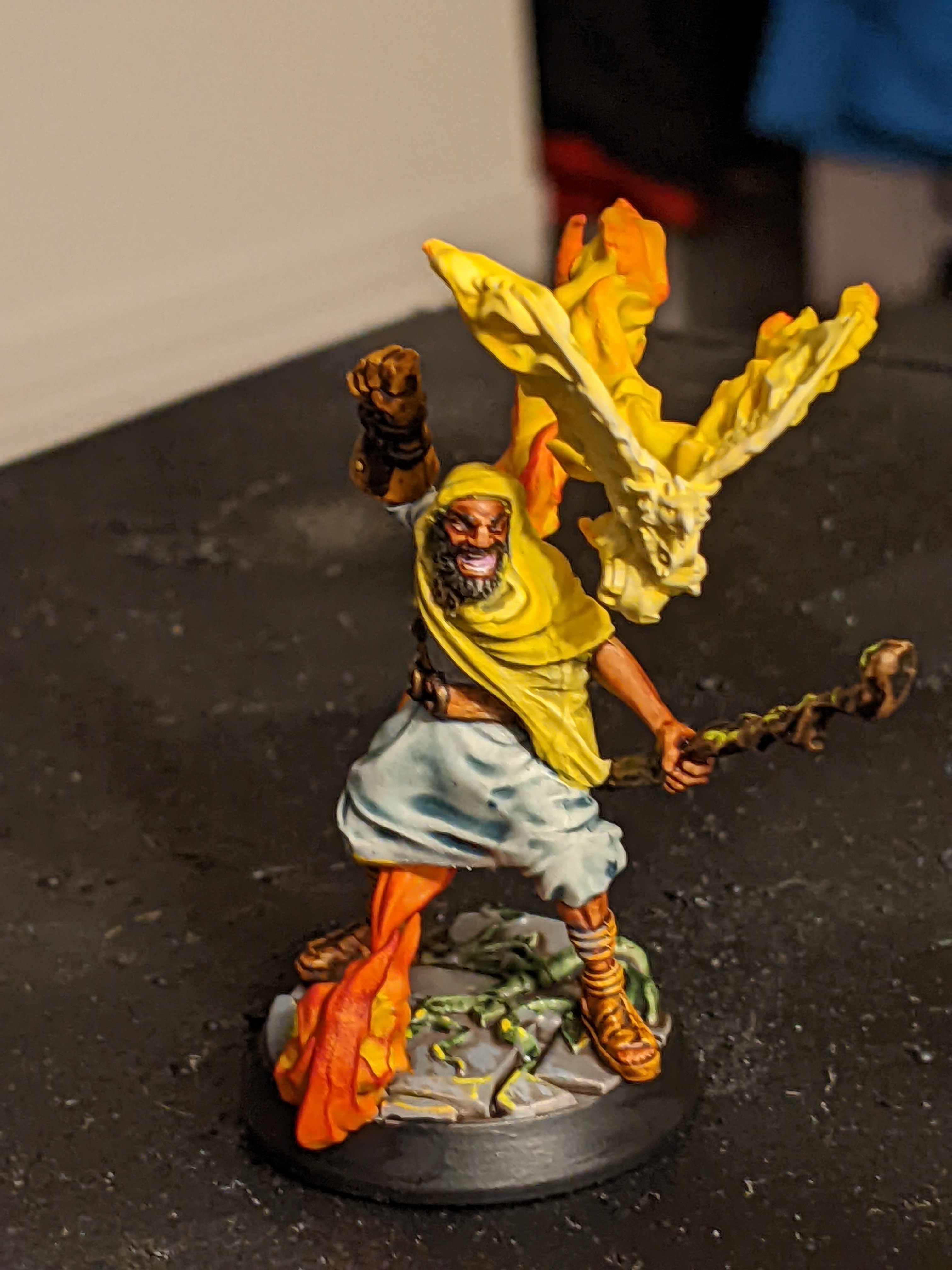
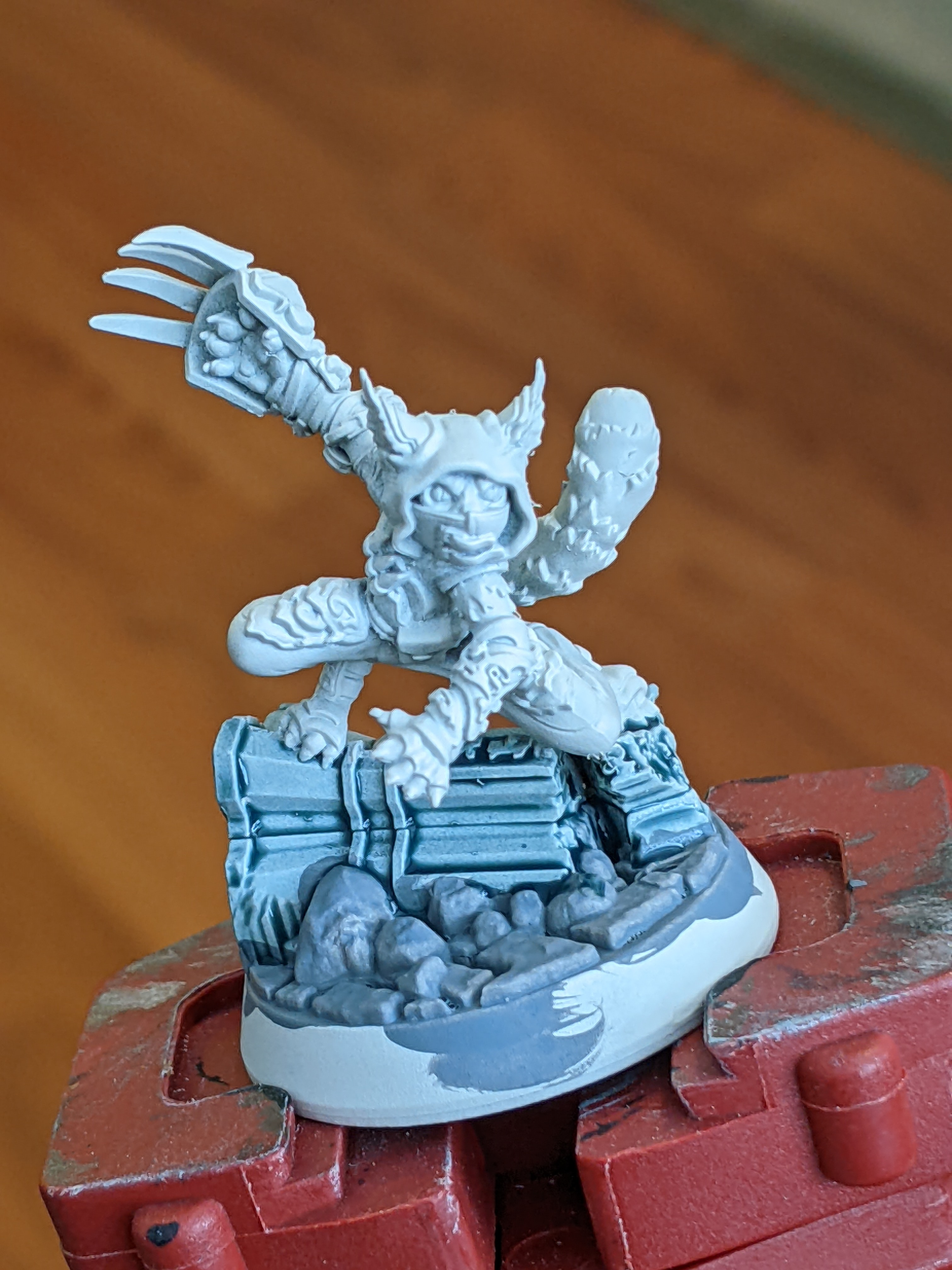
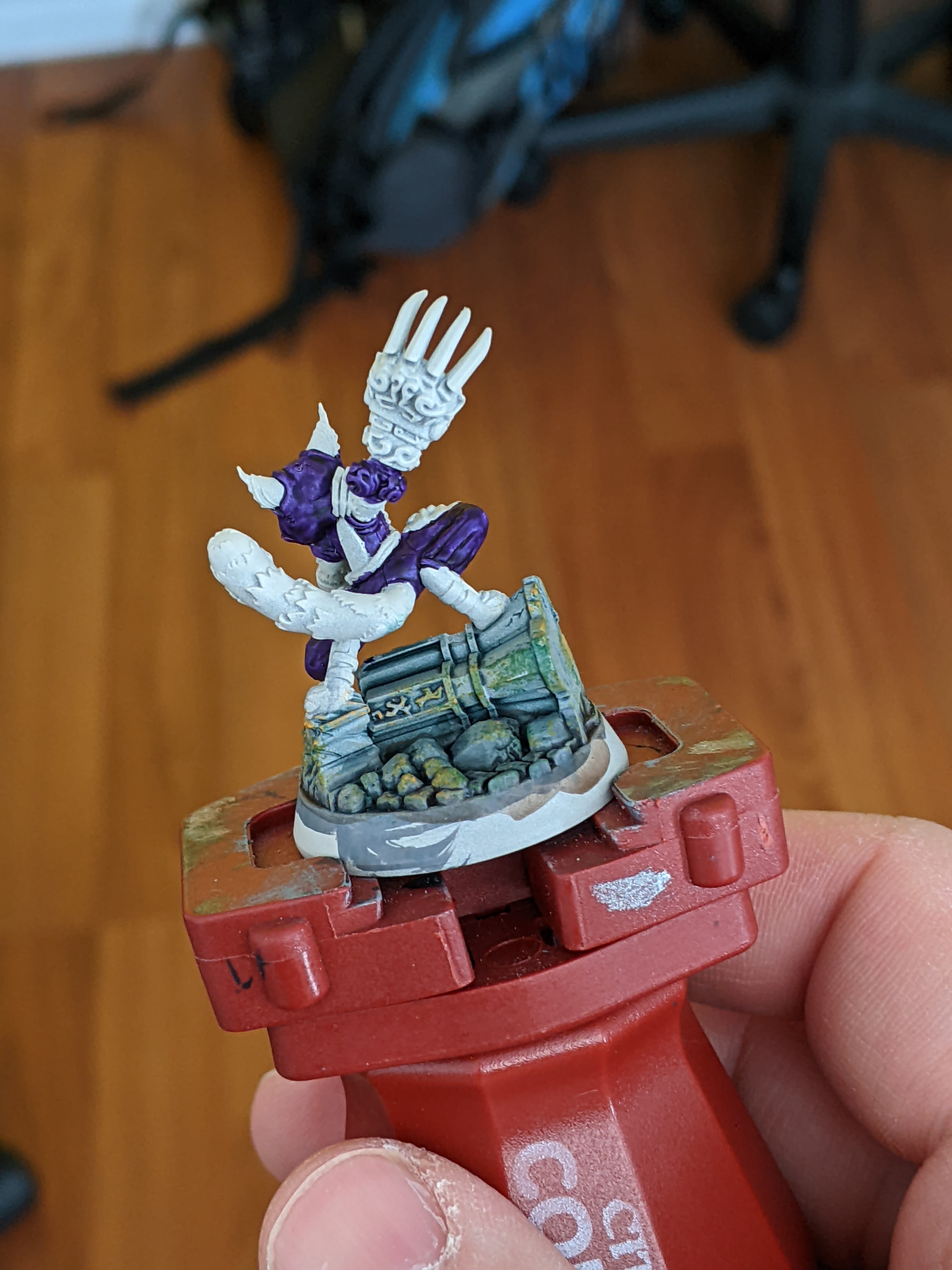
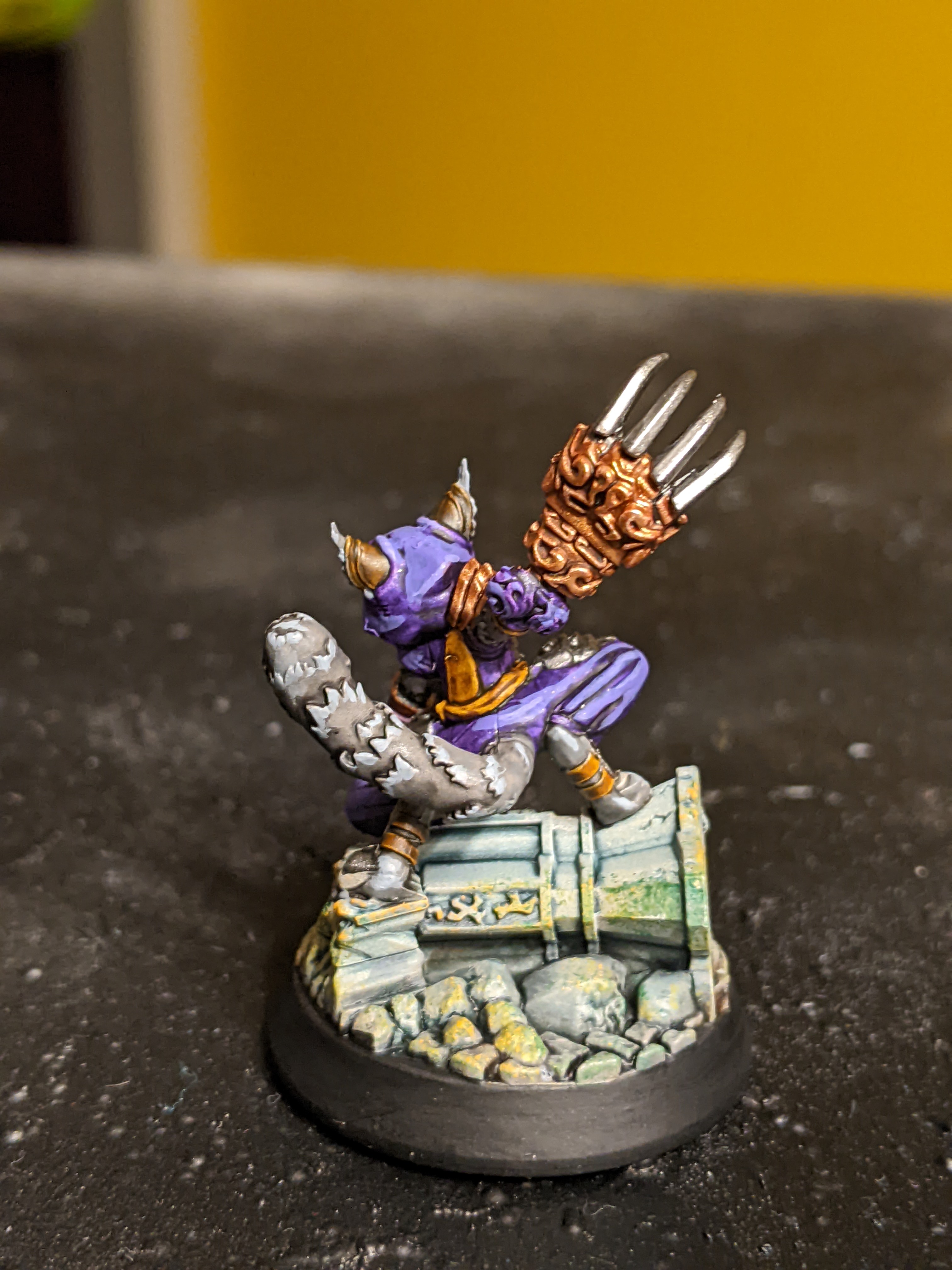
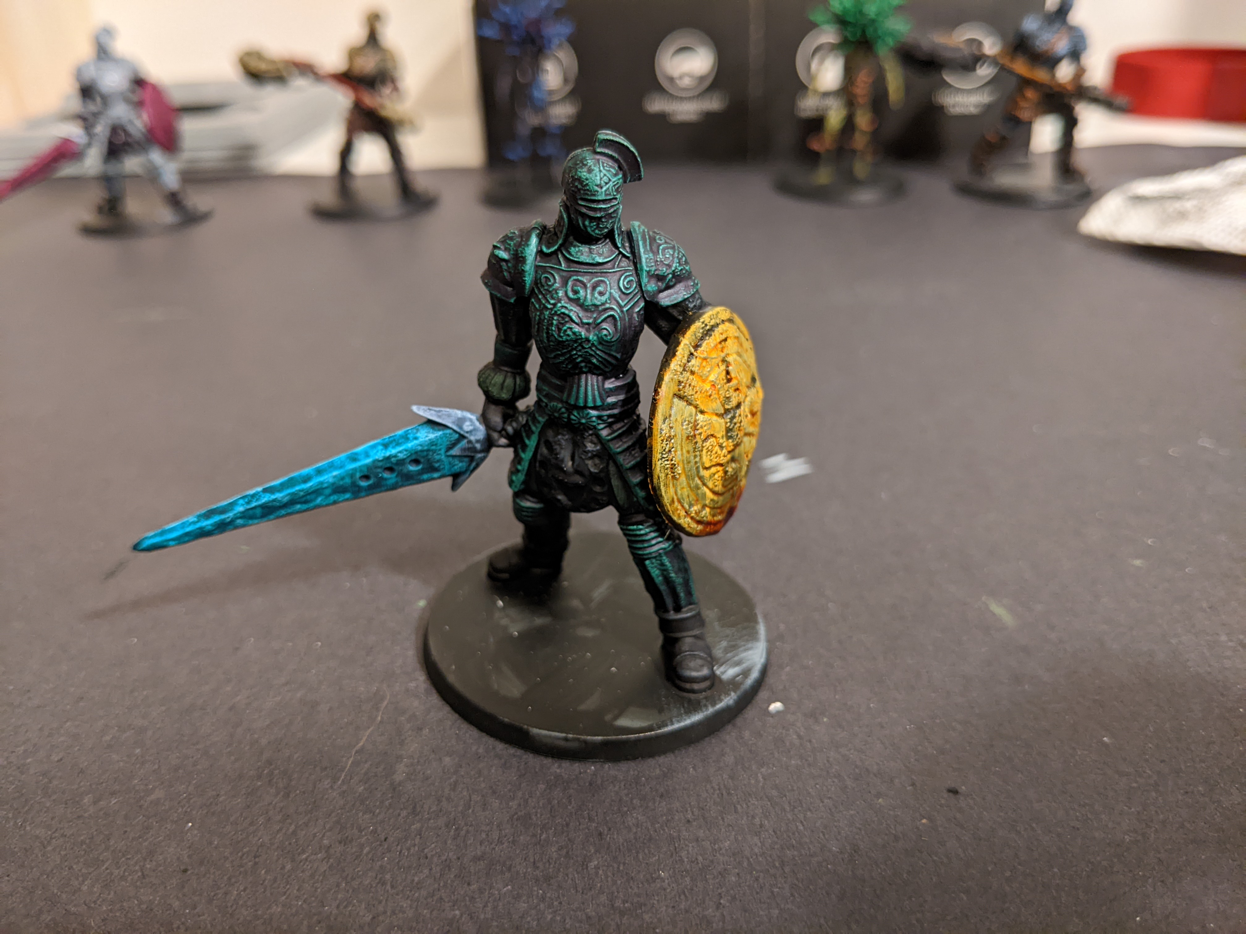
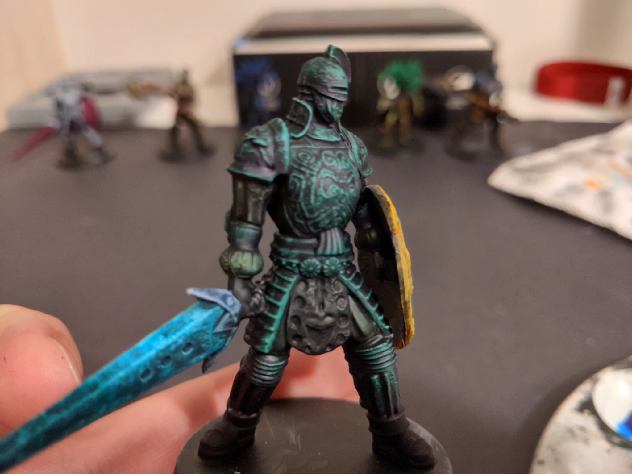
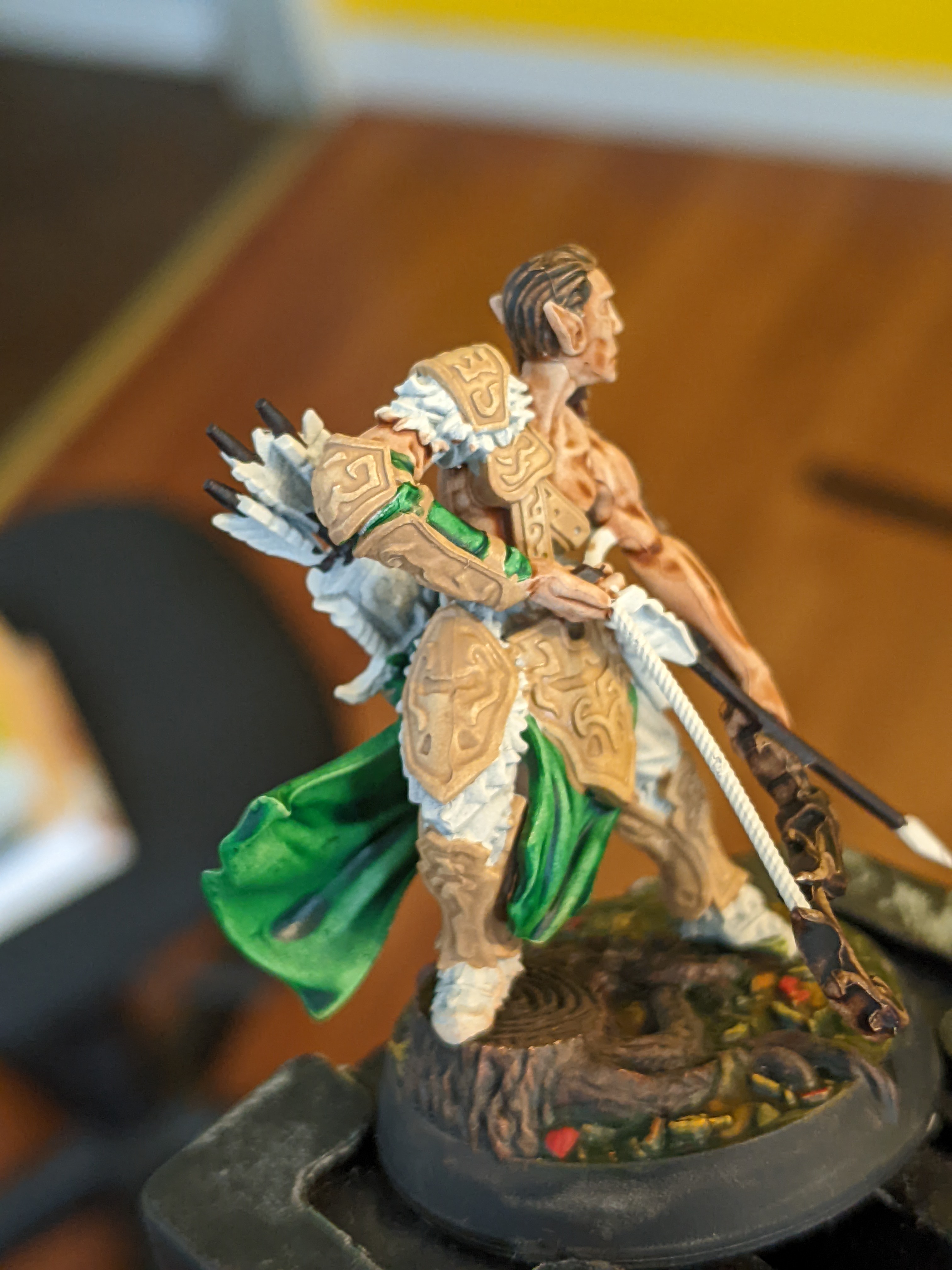
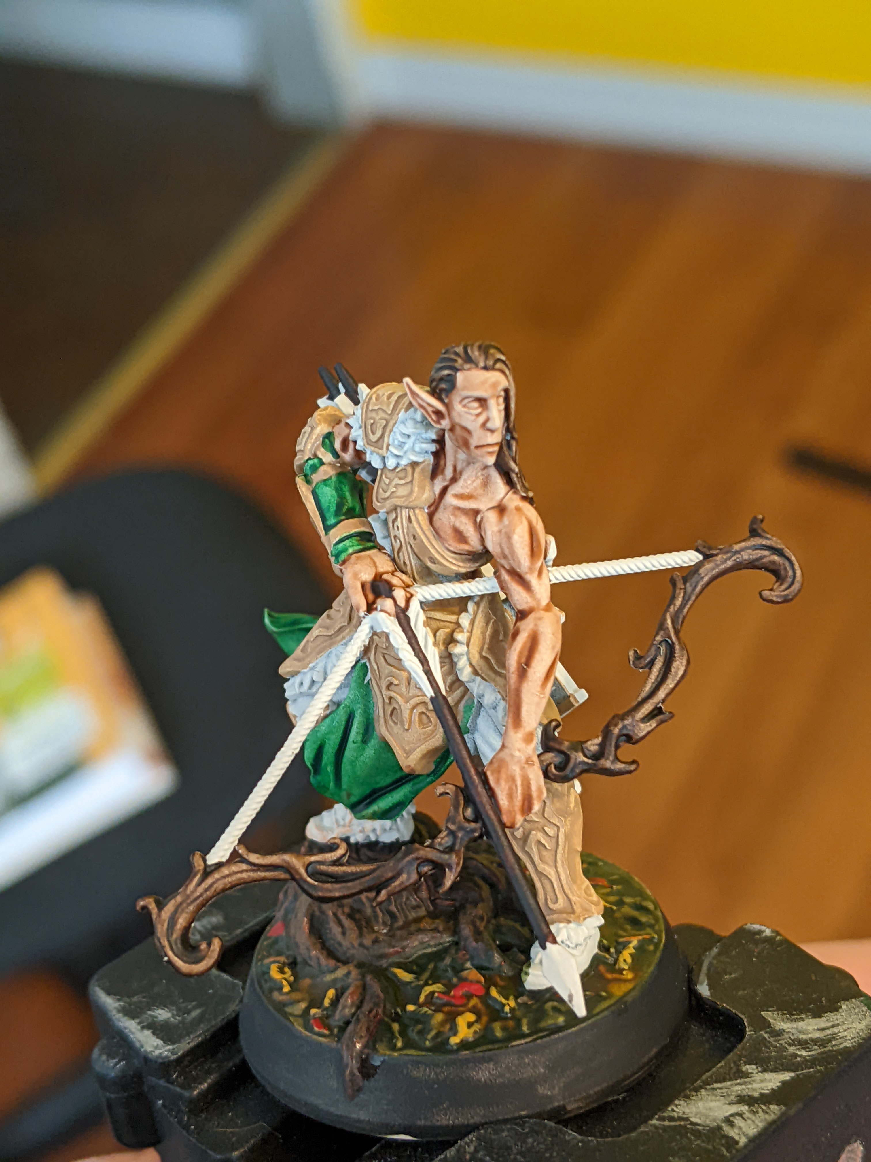
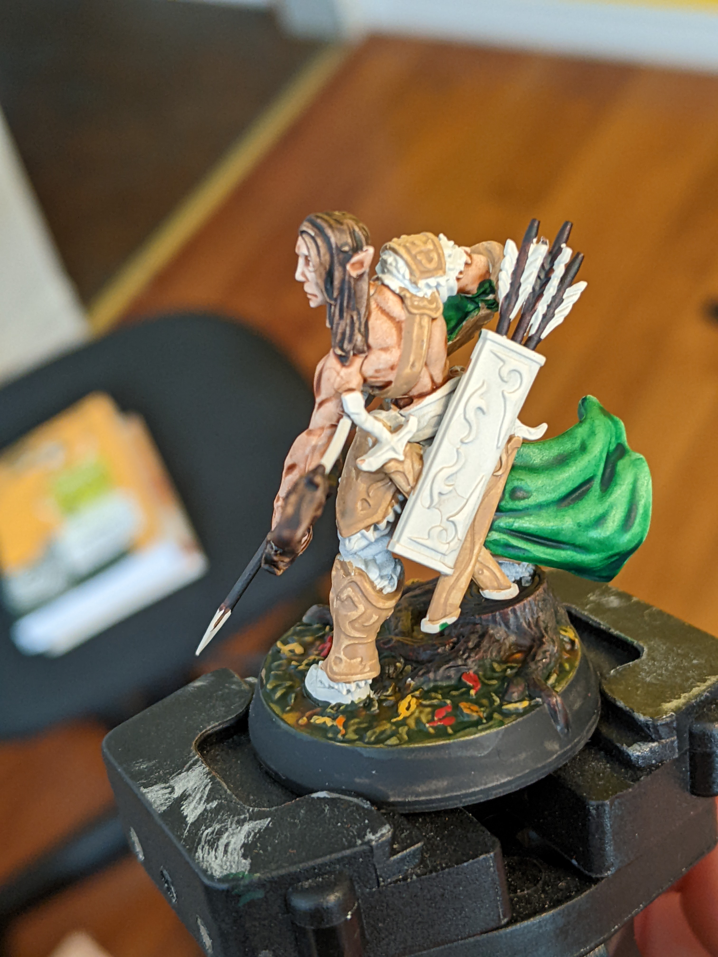
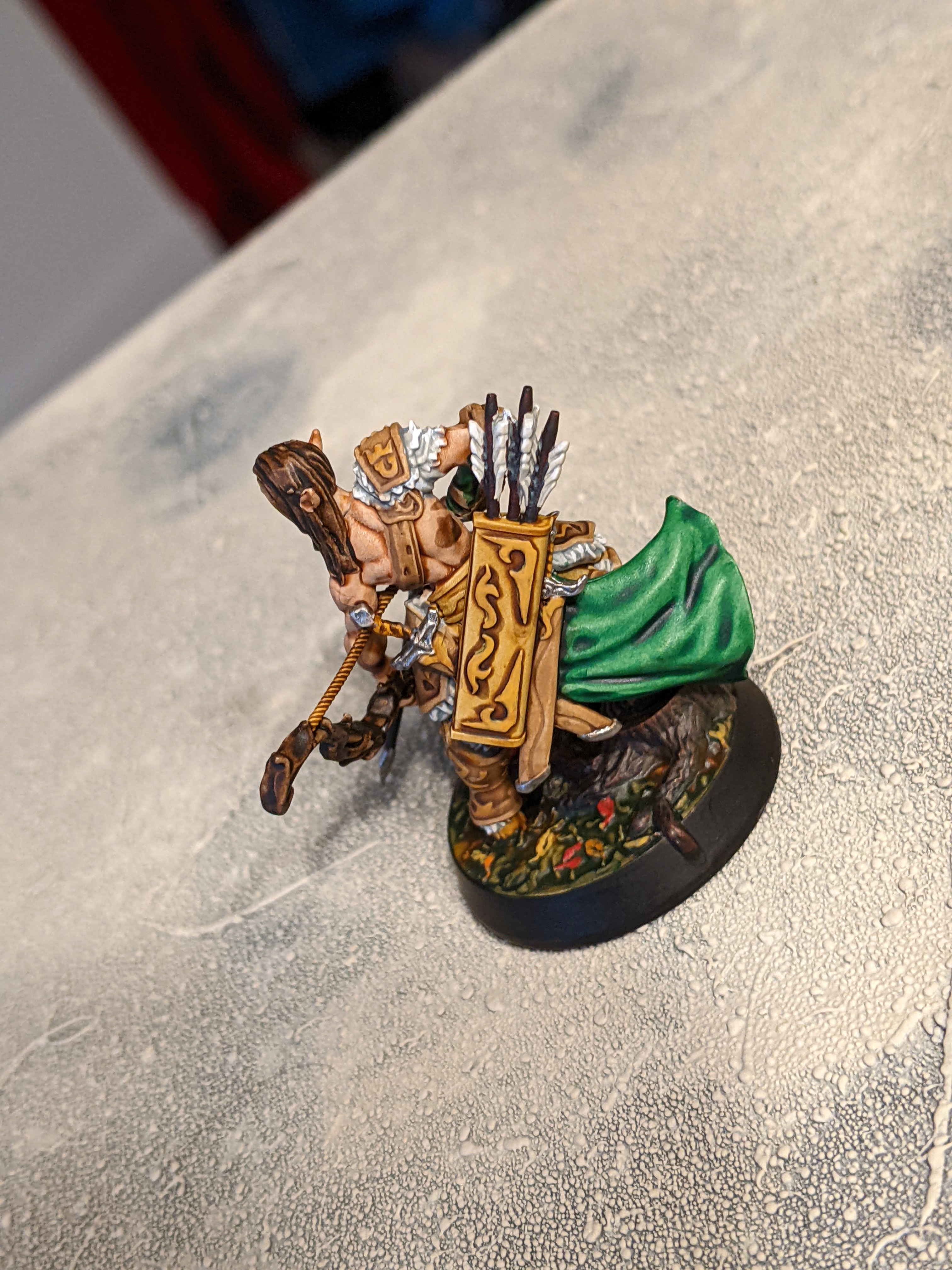
Model number 3!


This is the third sculpt of the 6 models (two of each).
It uses Absolution Green for the Armour, Camo Cloak for the under fabric, Grim Black for the gloves and crotch piece, Plasmatic Bolt for the sword, and Zealot Yellow for the shield.
So the colour scheme of this one didn’t really work too many bright different colours but that I learned so worth it I guess.
The Plasmatic Bolt for a magic glowy sword worked pretty well very bright and vibrant. The Yellow for the shield worked pretty well but to be fair to it I rushed the drybrushing on it so its highlight was kind of smeared around and didn’t look great before the speed paint. And at the bottom it kind of collected and turned orange so something to watch out for. The two greens were kind of too close and dark to differentiate so in the second picture you kinda make out that arm poof piece has the camo colour but it’s pretty hard to see them. And the black really turned black like way to dark no contrast black. Which I mean I guess I should have predicted. Overall mistake were made but lessens were learned.
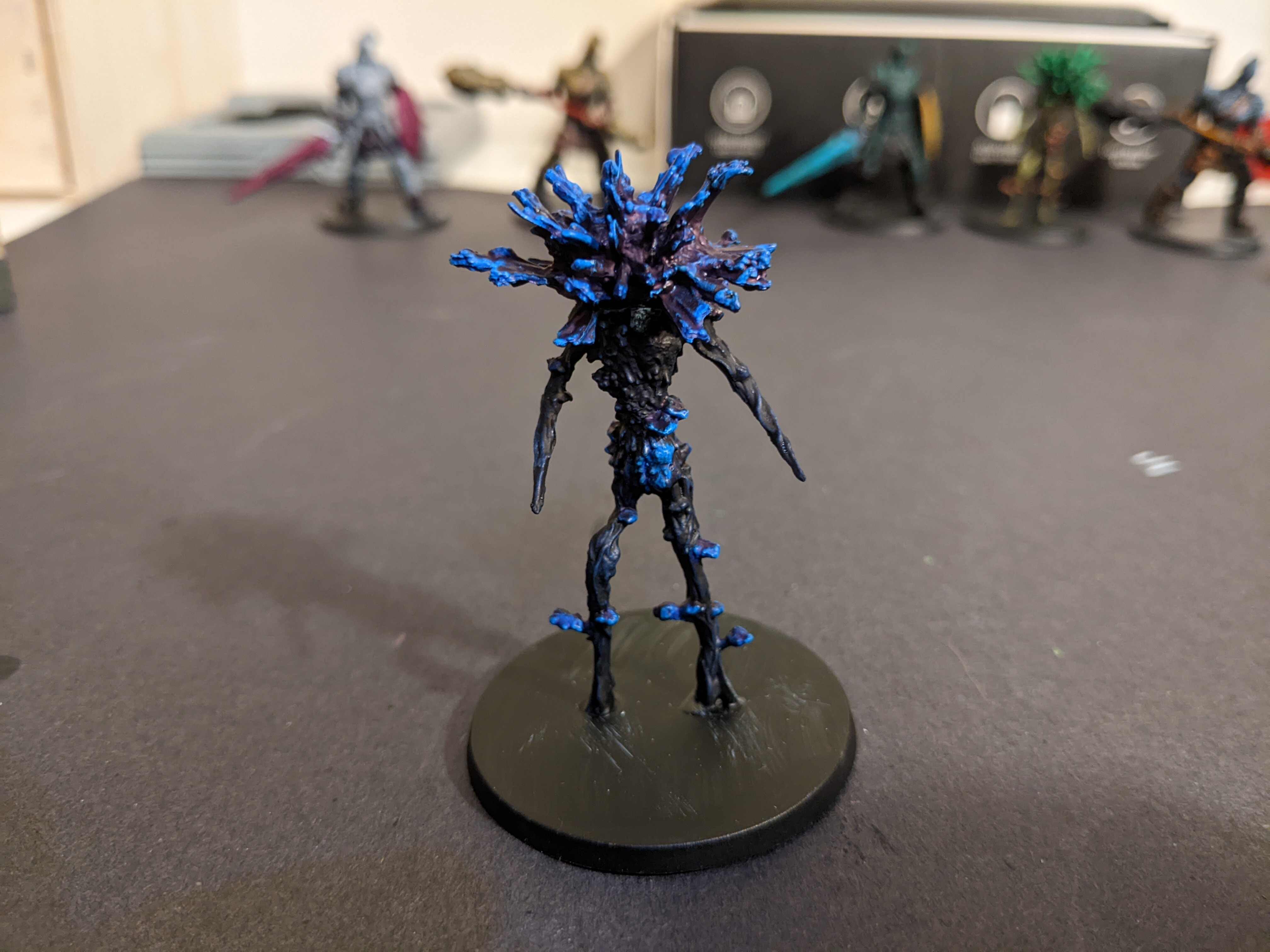
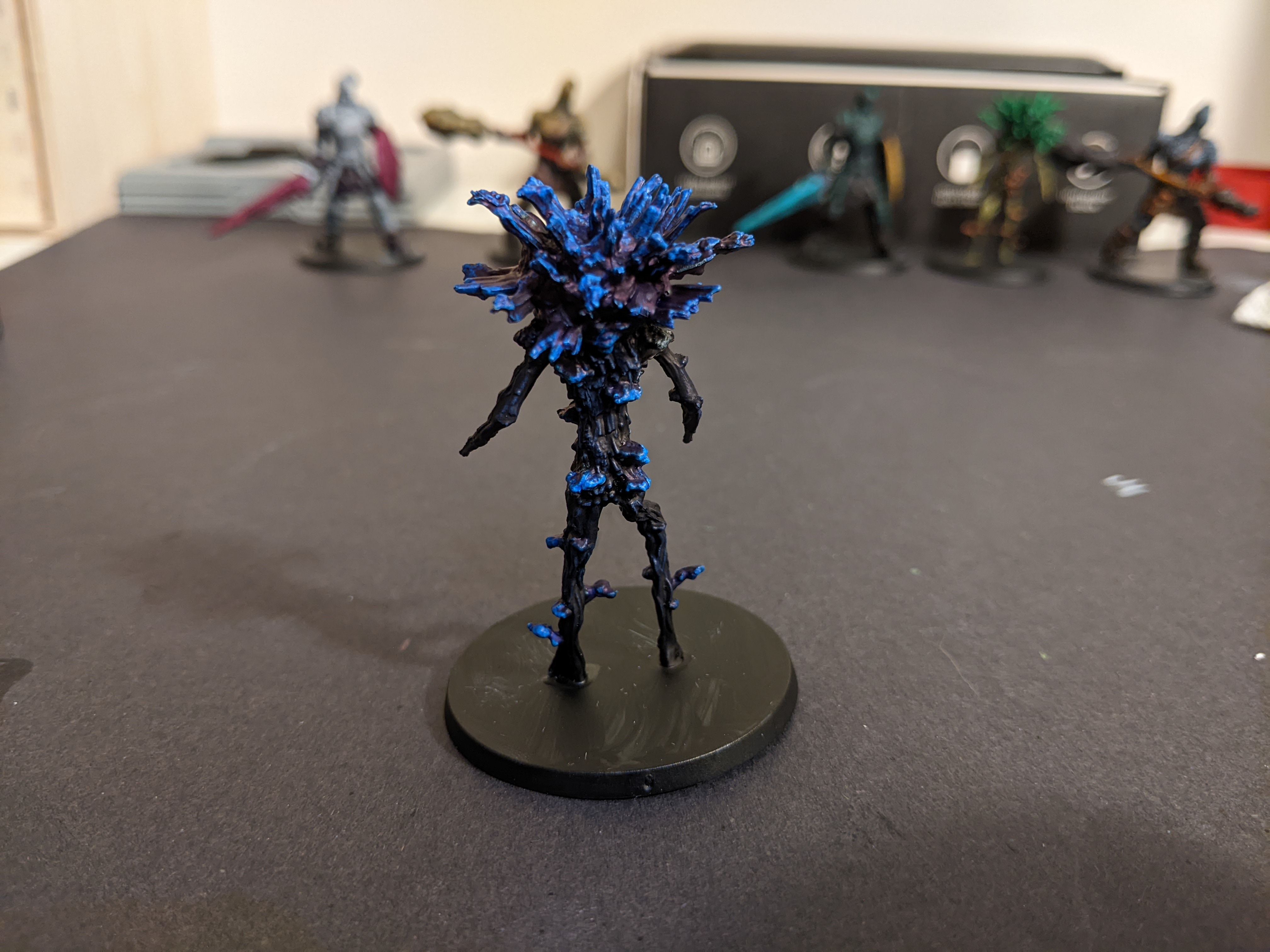
Model 4


Okay now the other bush guy
Here I used Magic Blue for the top, Cloudburst Blue for the body, and Highlord Blue for the fungus clumps.
I went for an all blue because I thought I would do something different from the first and go for a more magic plant thing. Again wow the colour pops on the top part with the magic Blue and again as it dried it really pulled back from the points of the model getting brighter as it did. The blue fungus is fine if a bit similar to the top but the body with the Cloudburst Blue went way to dark.
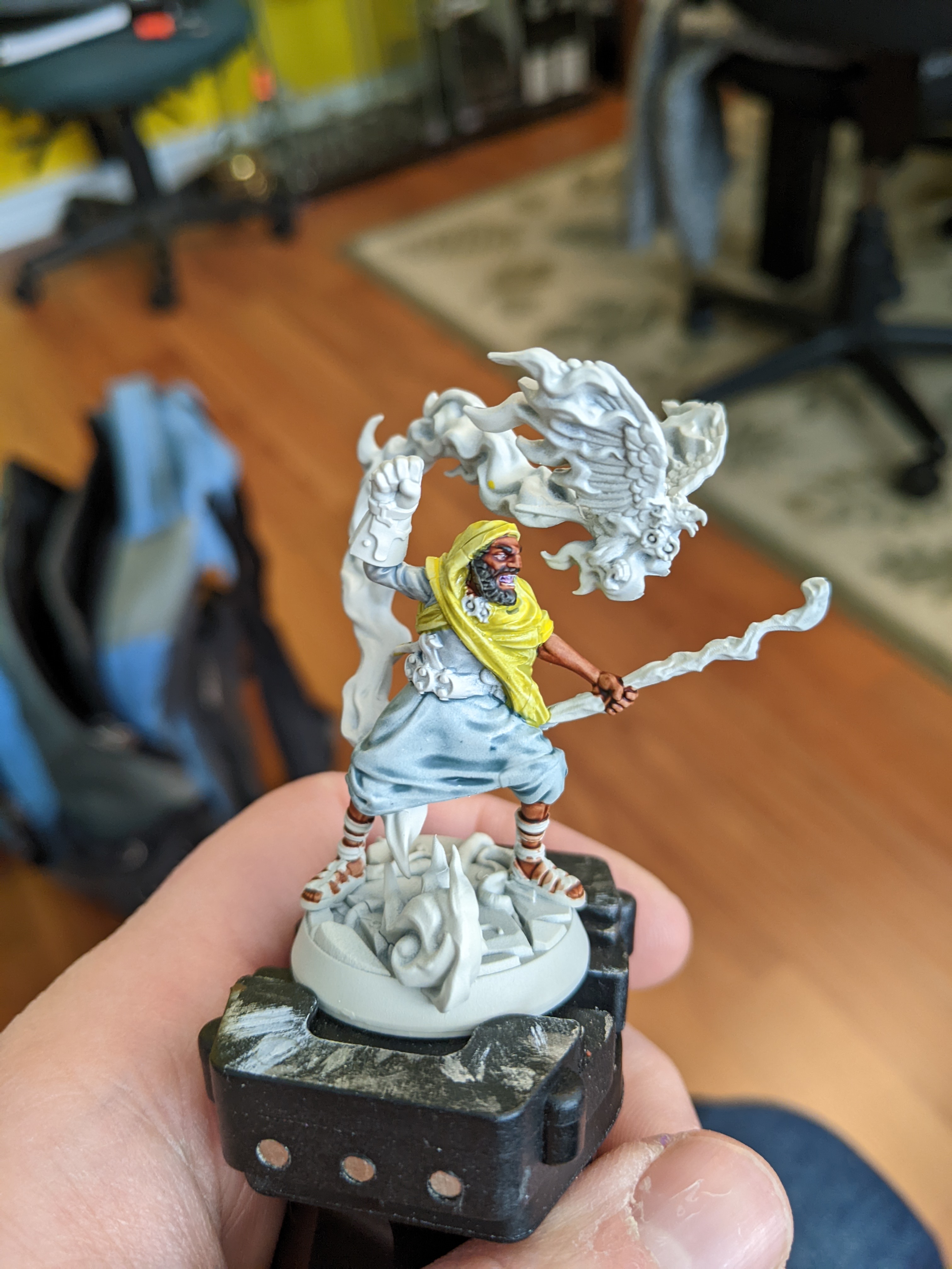
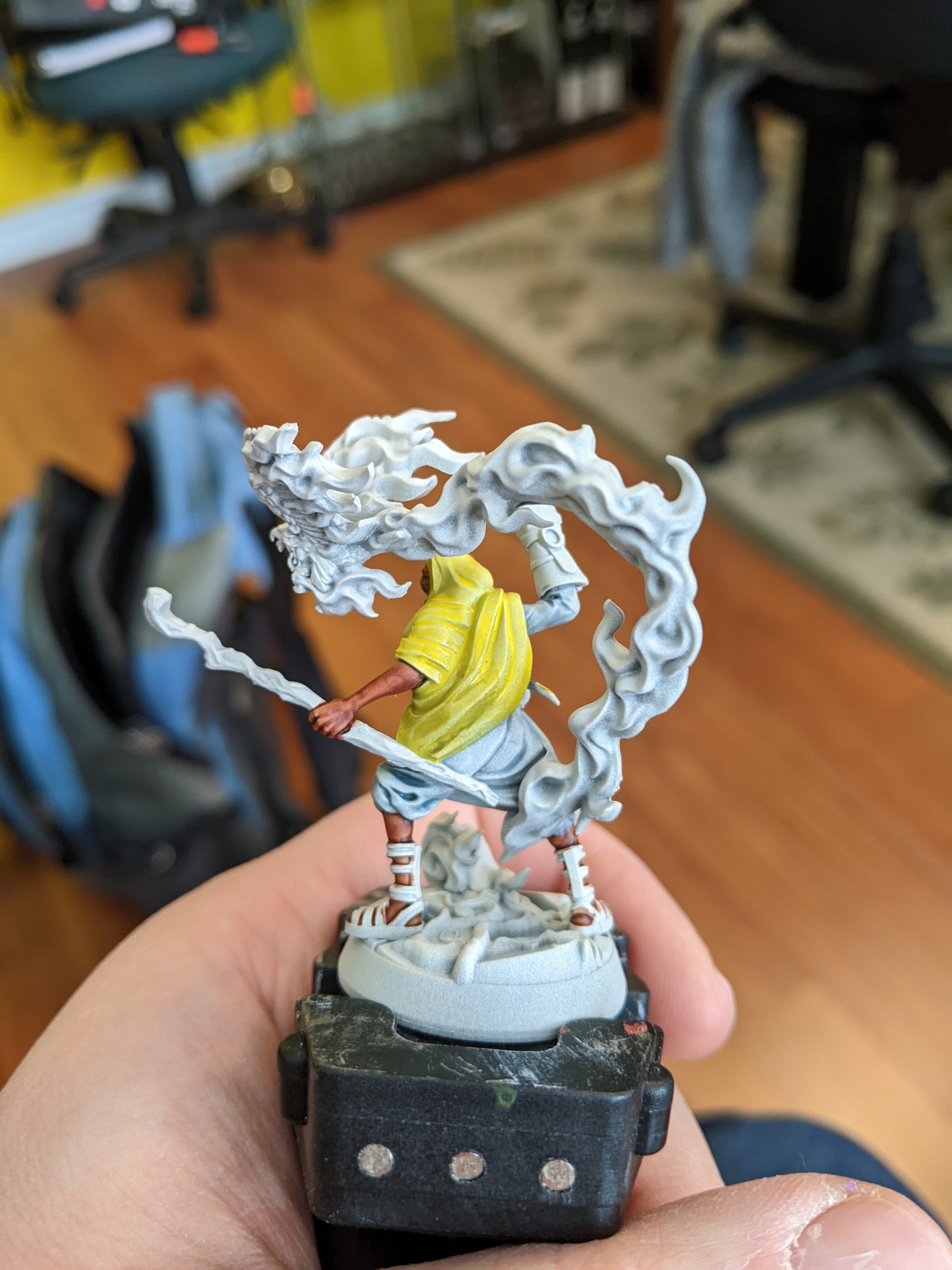
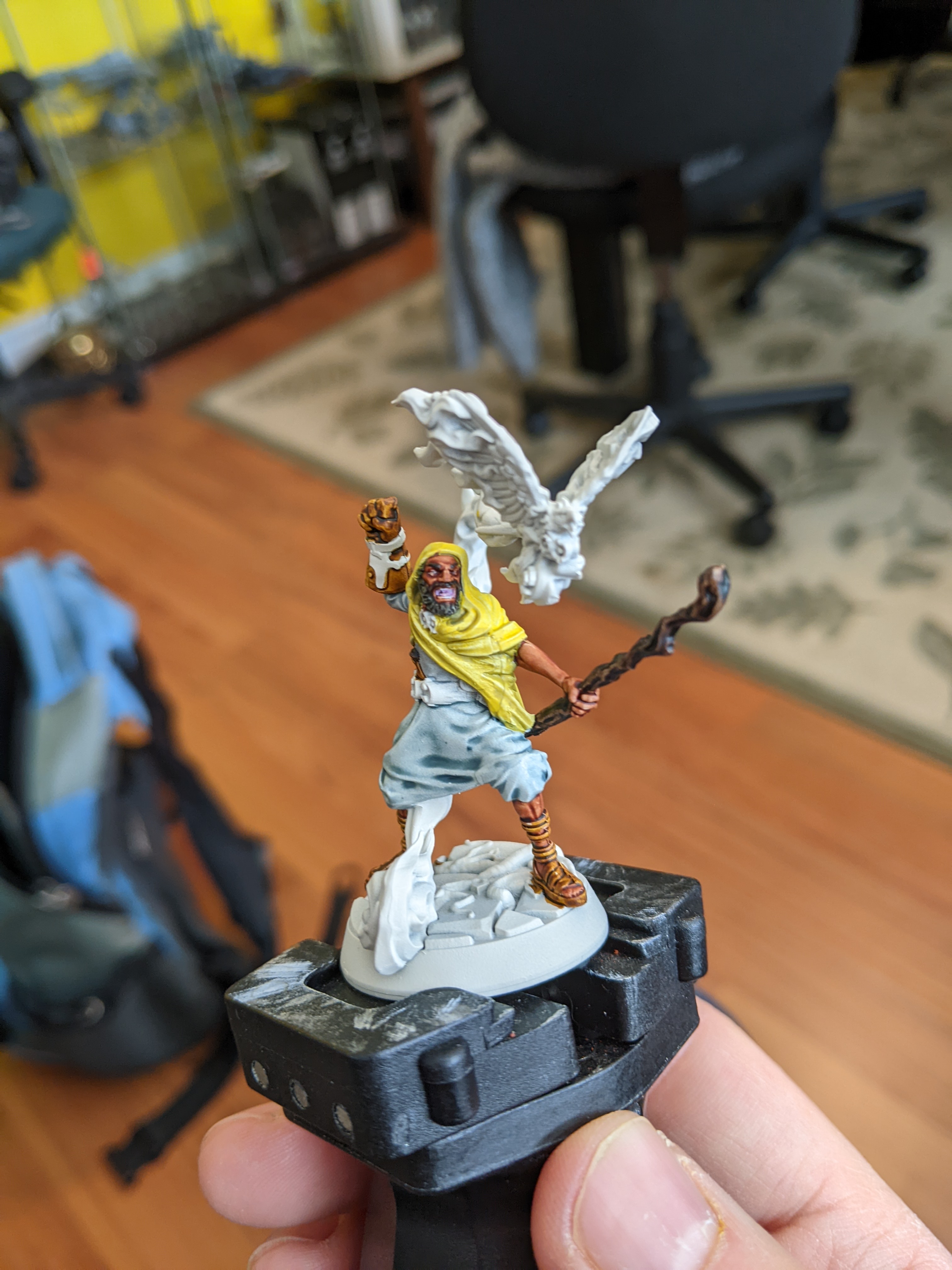
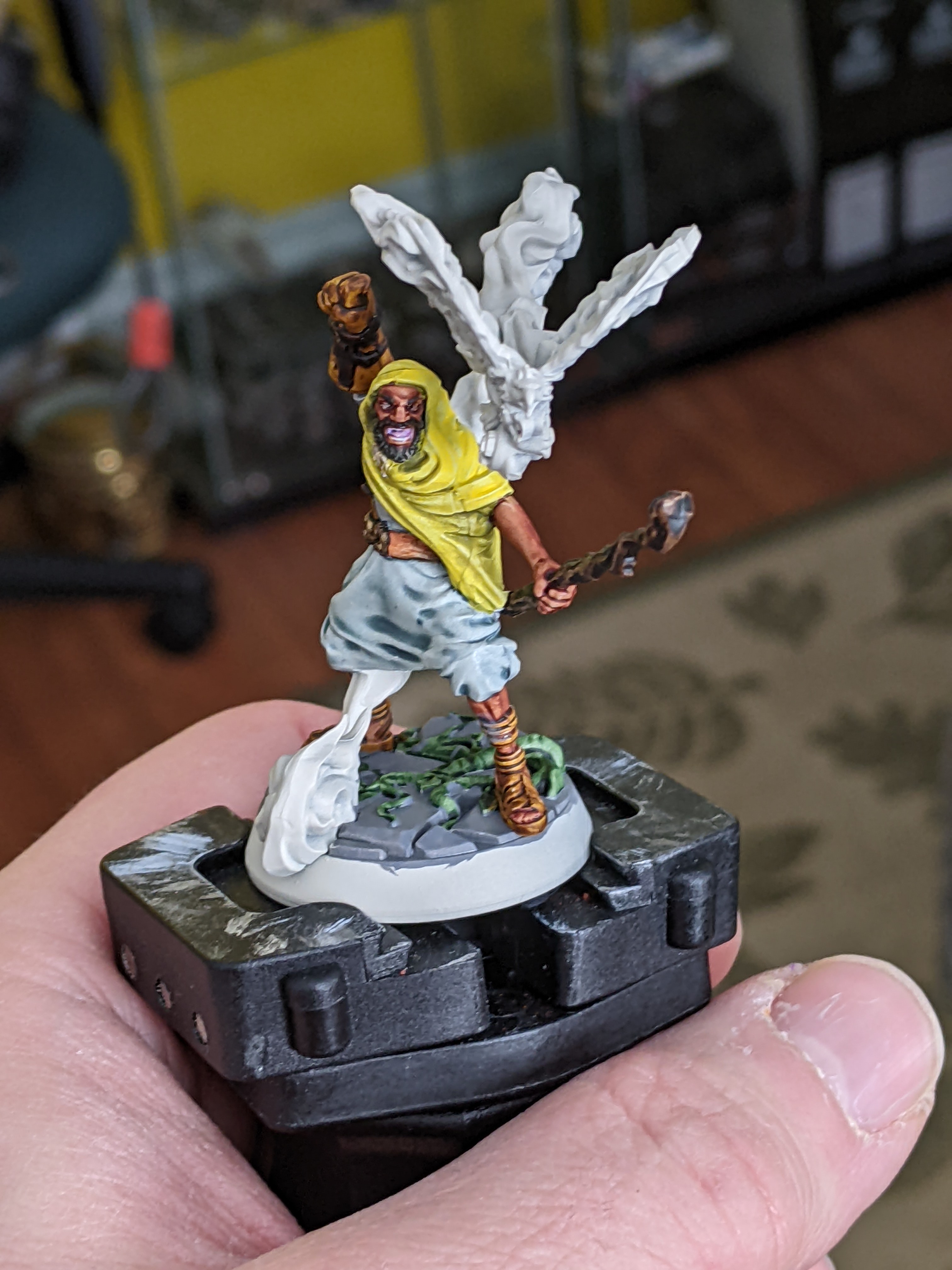
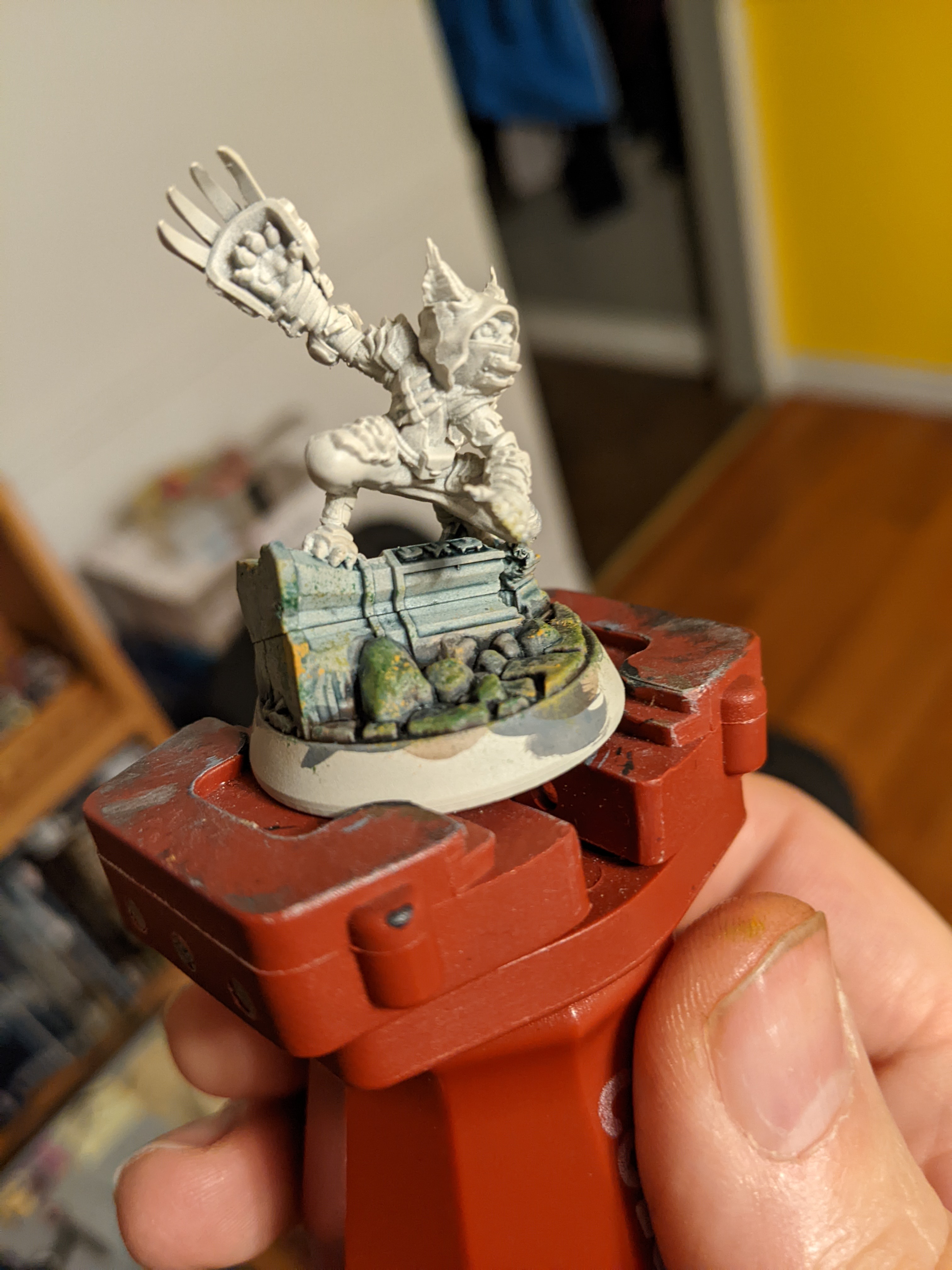
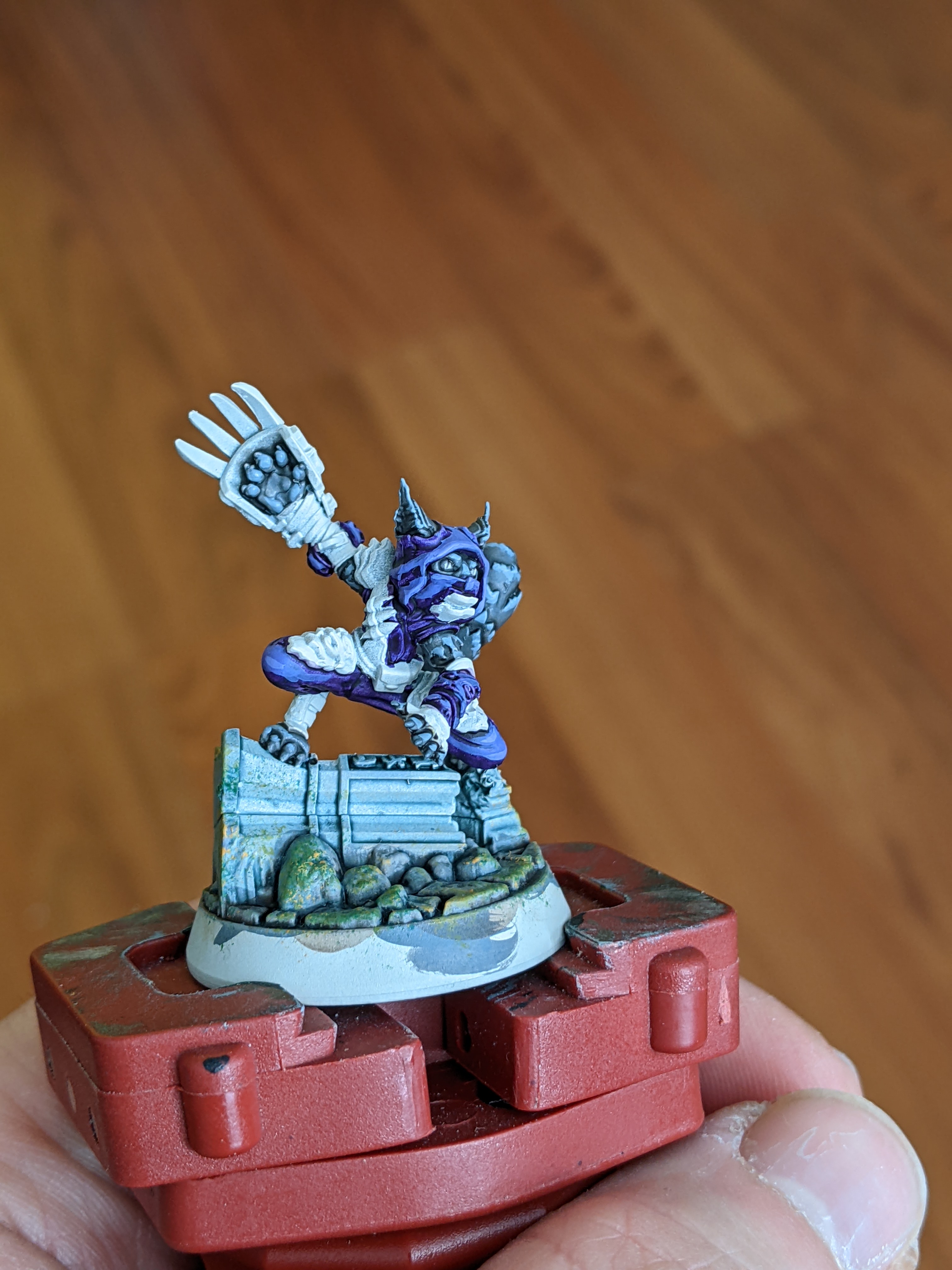
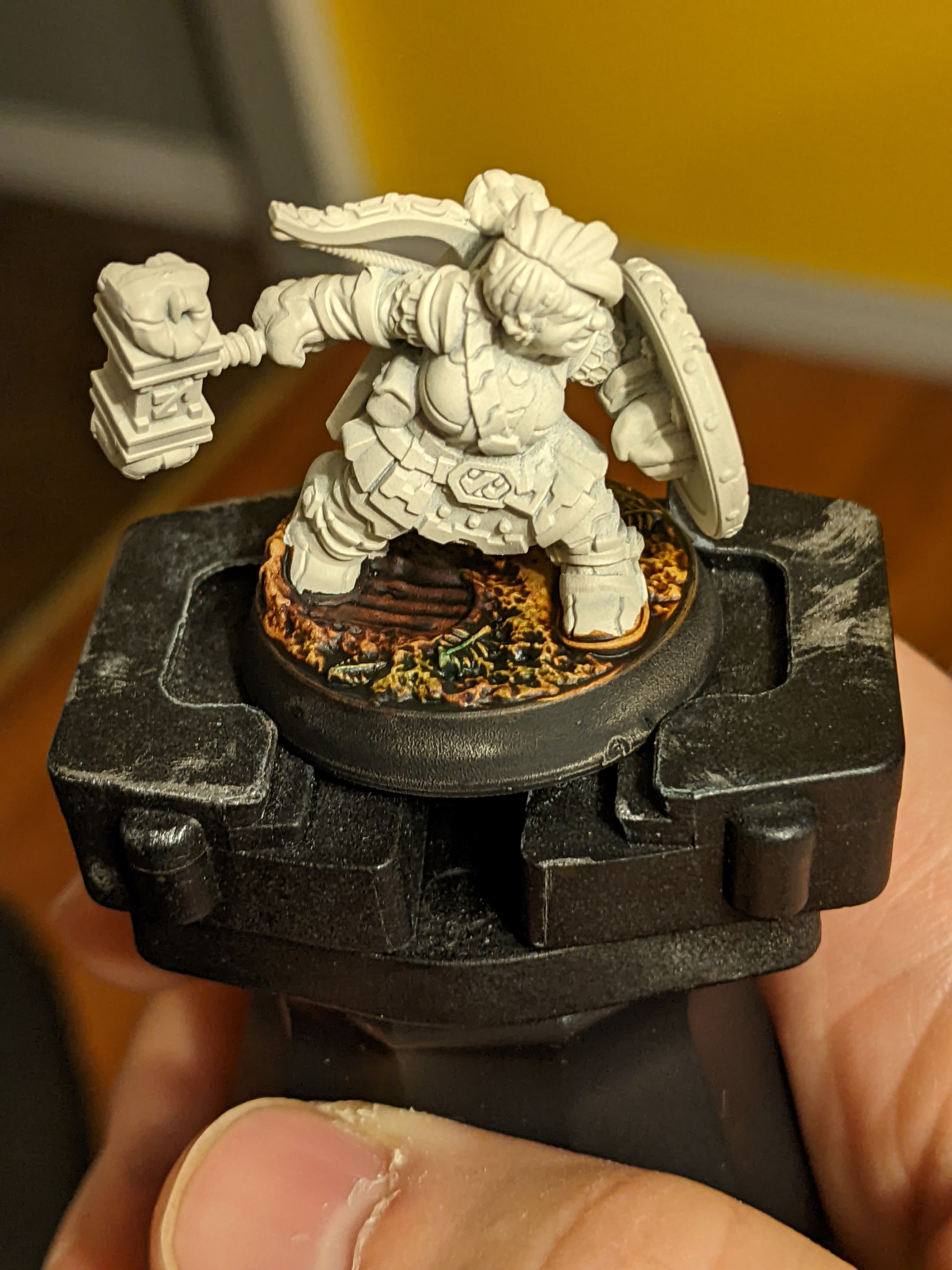
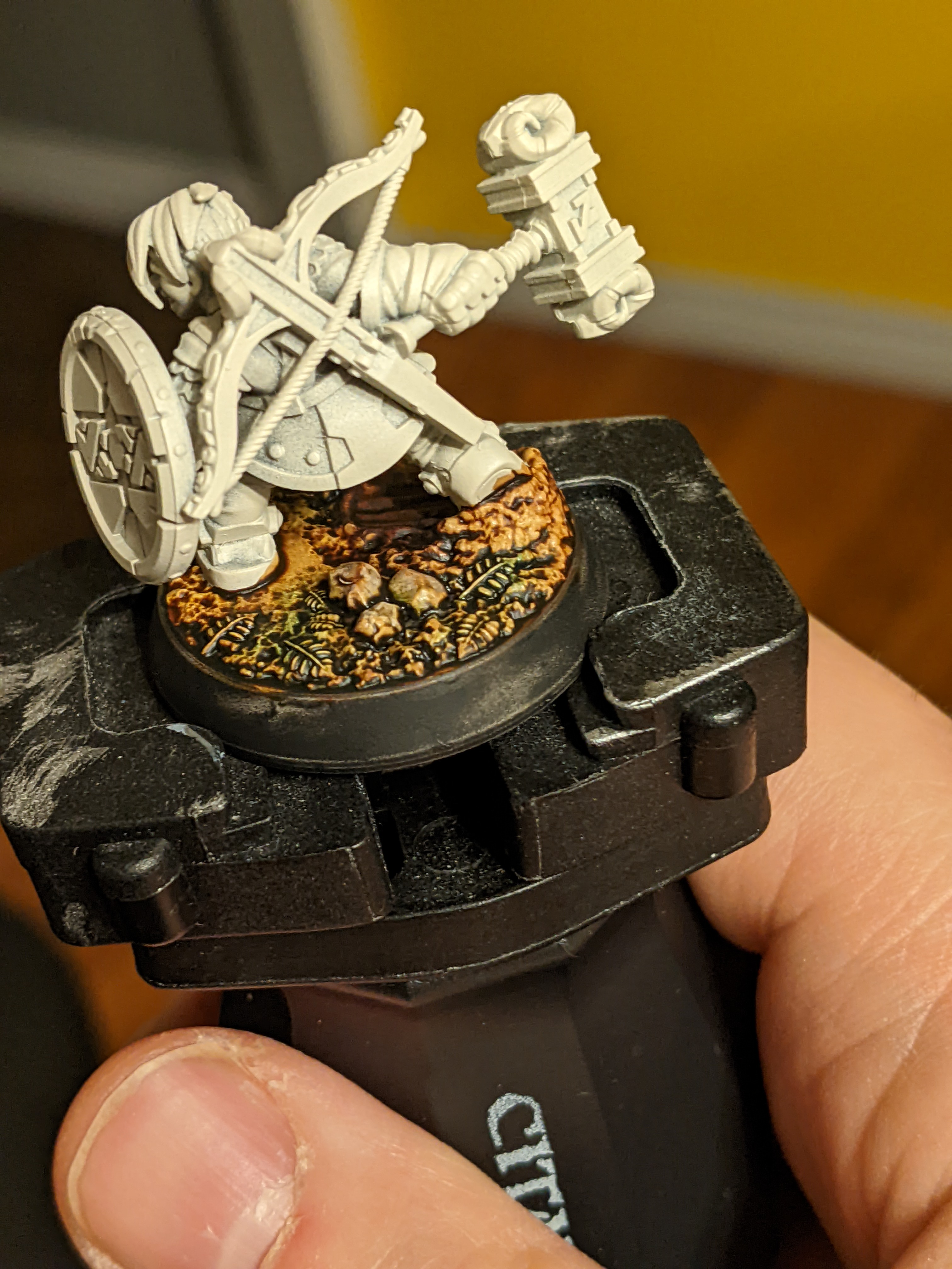
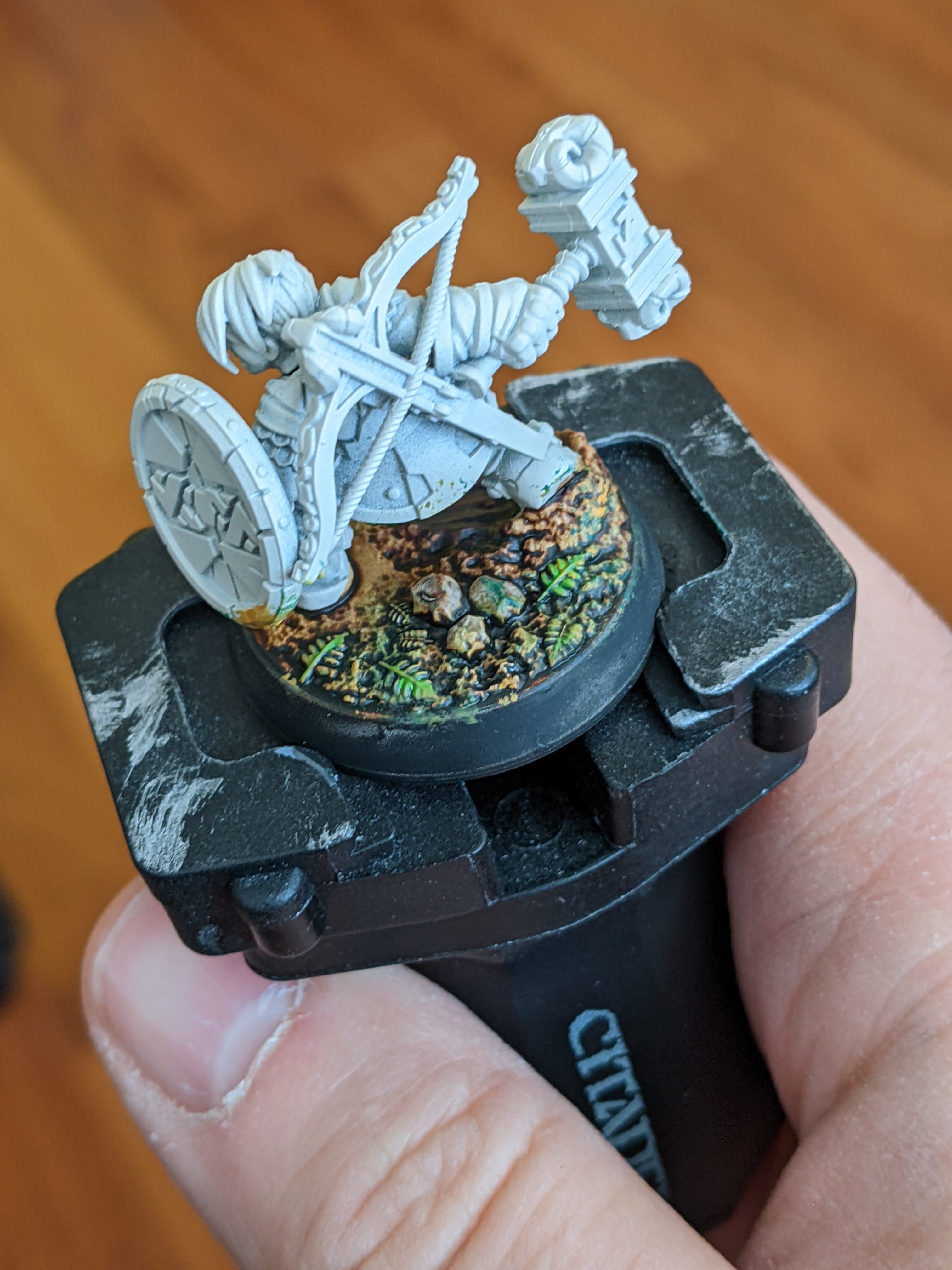
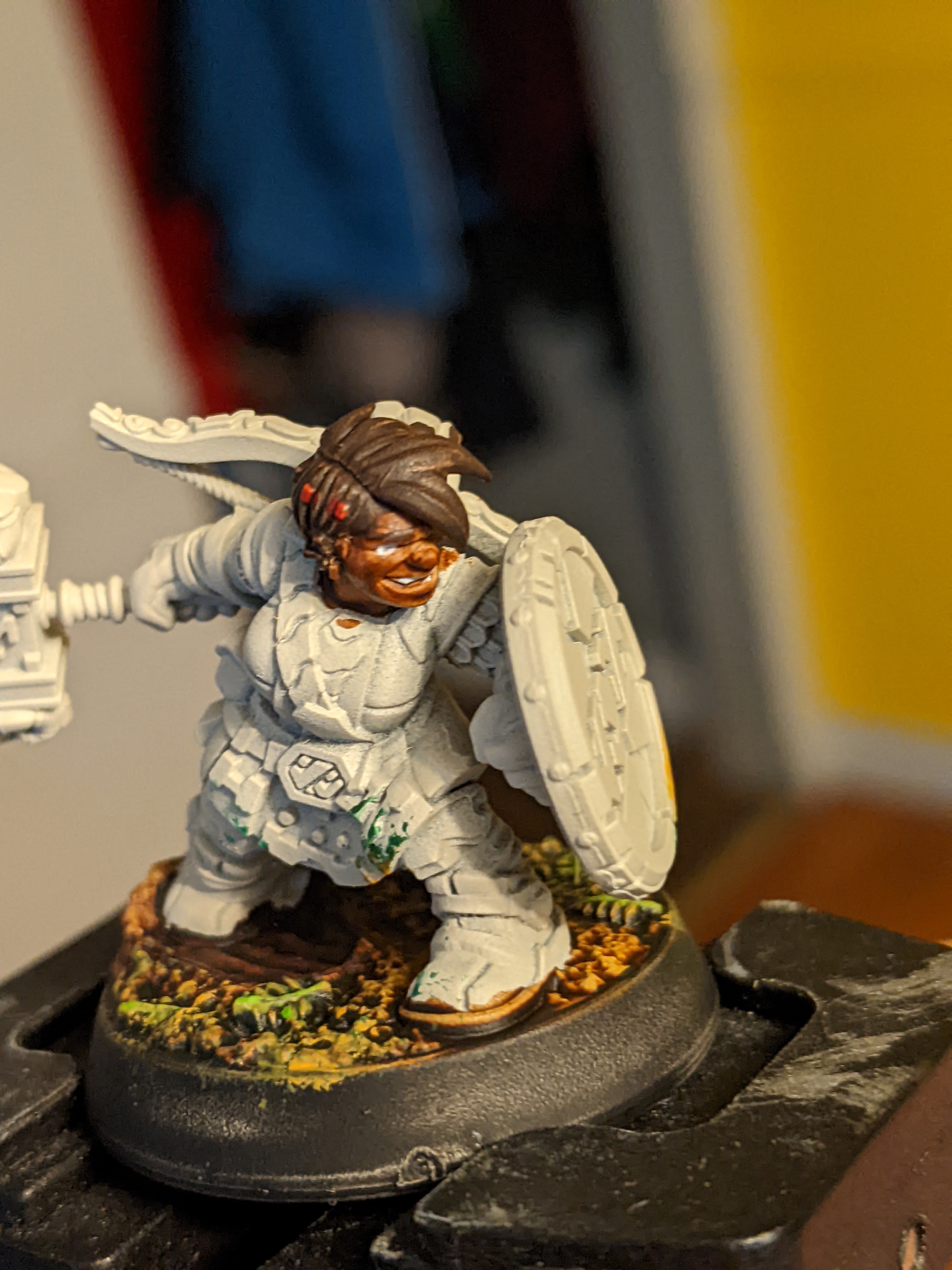
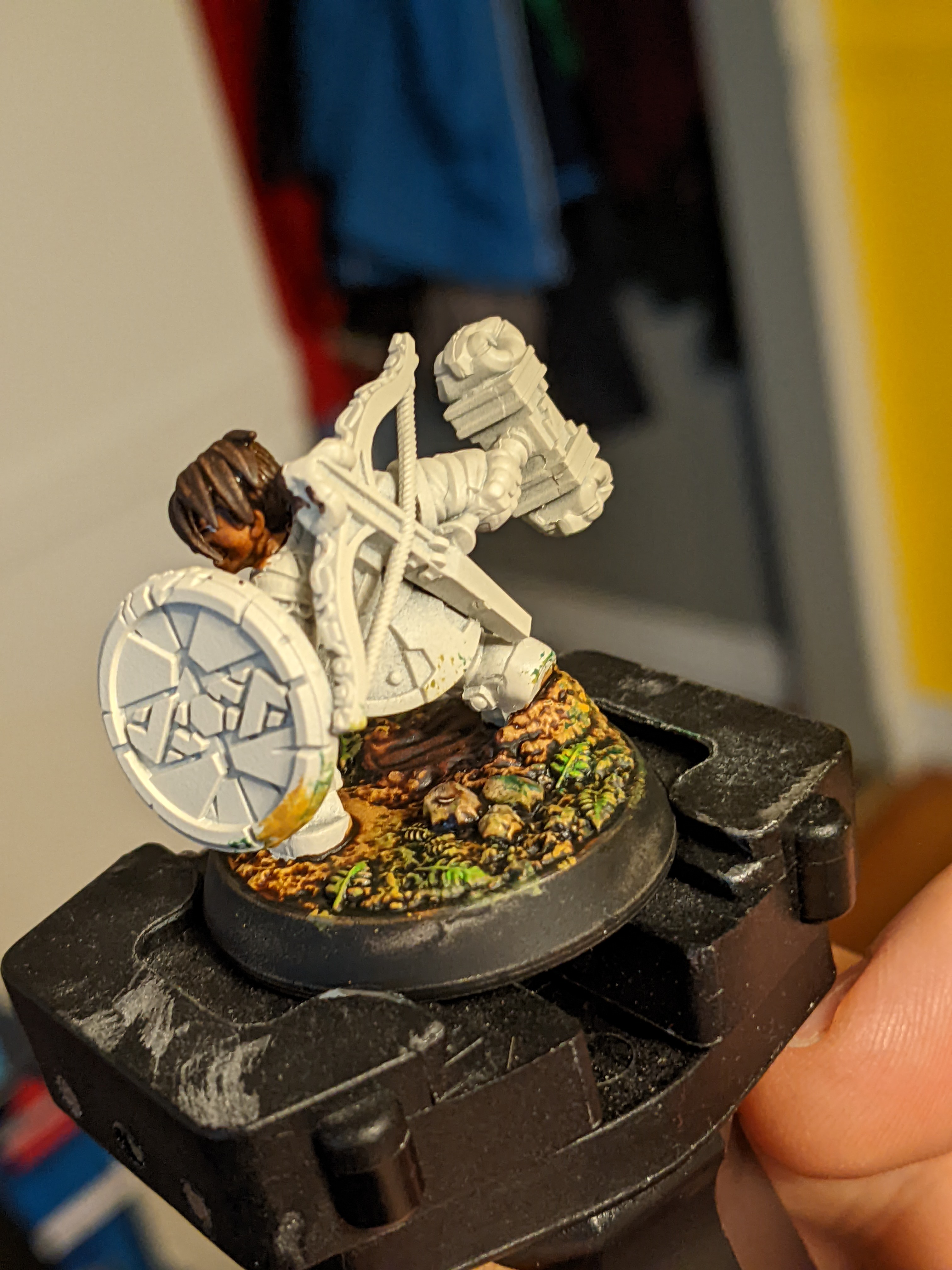
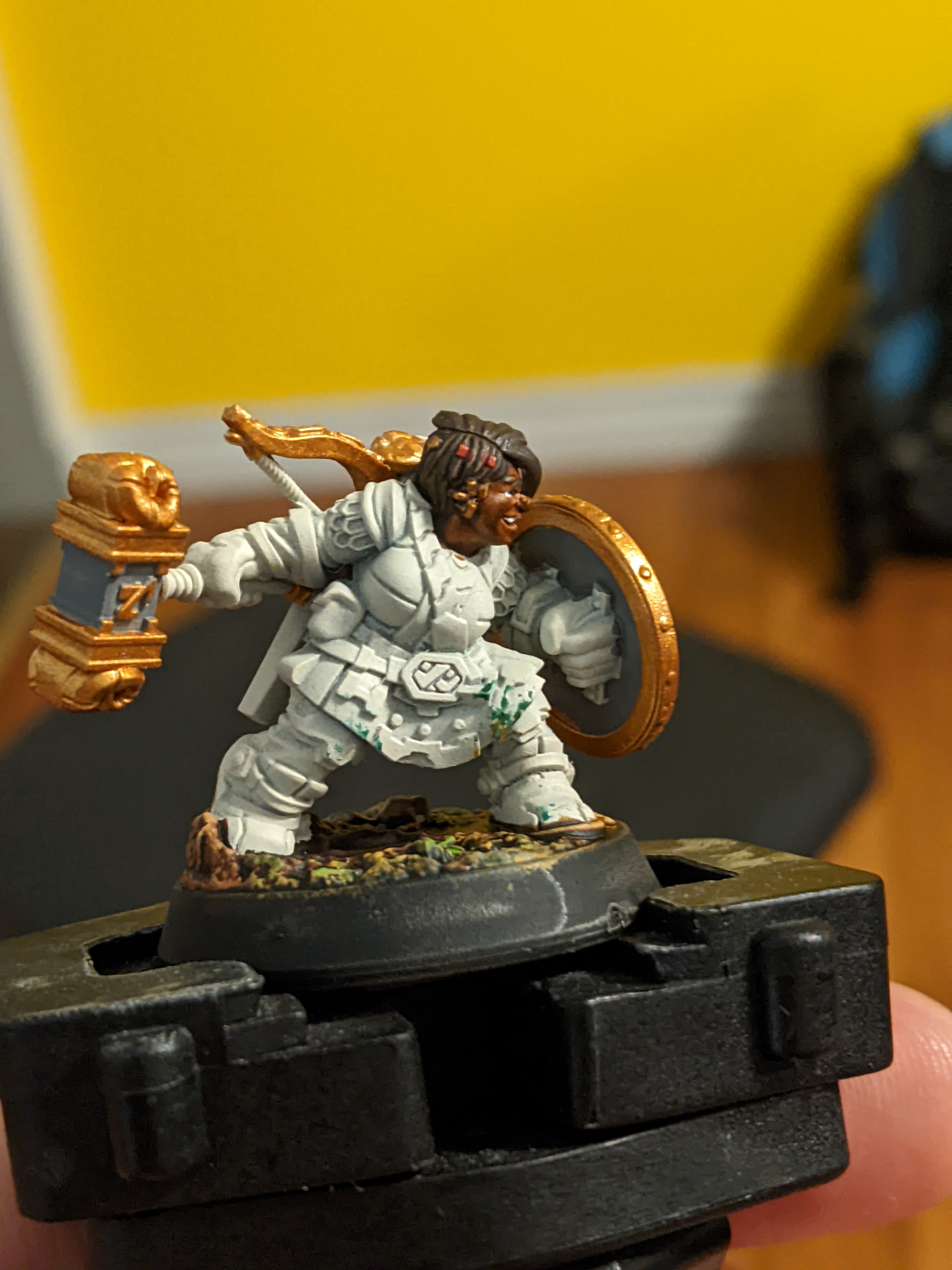
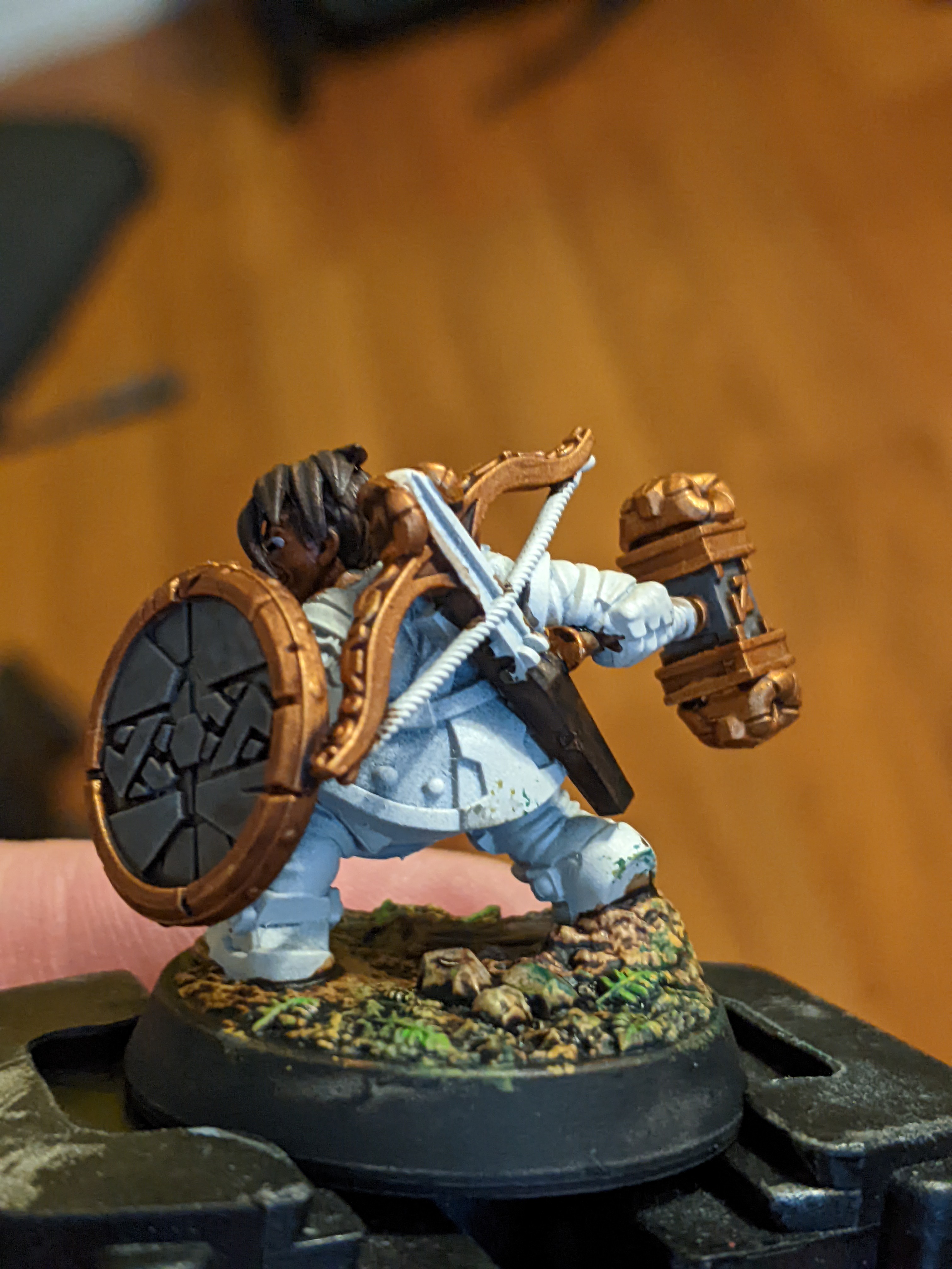
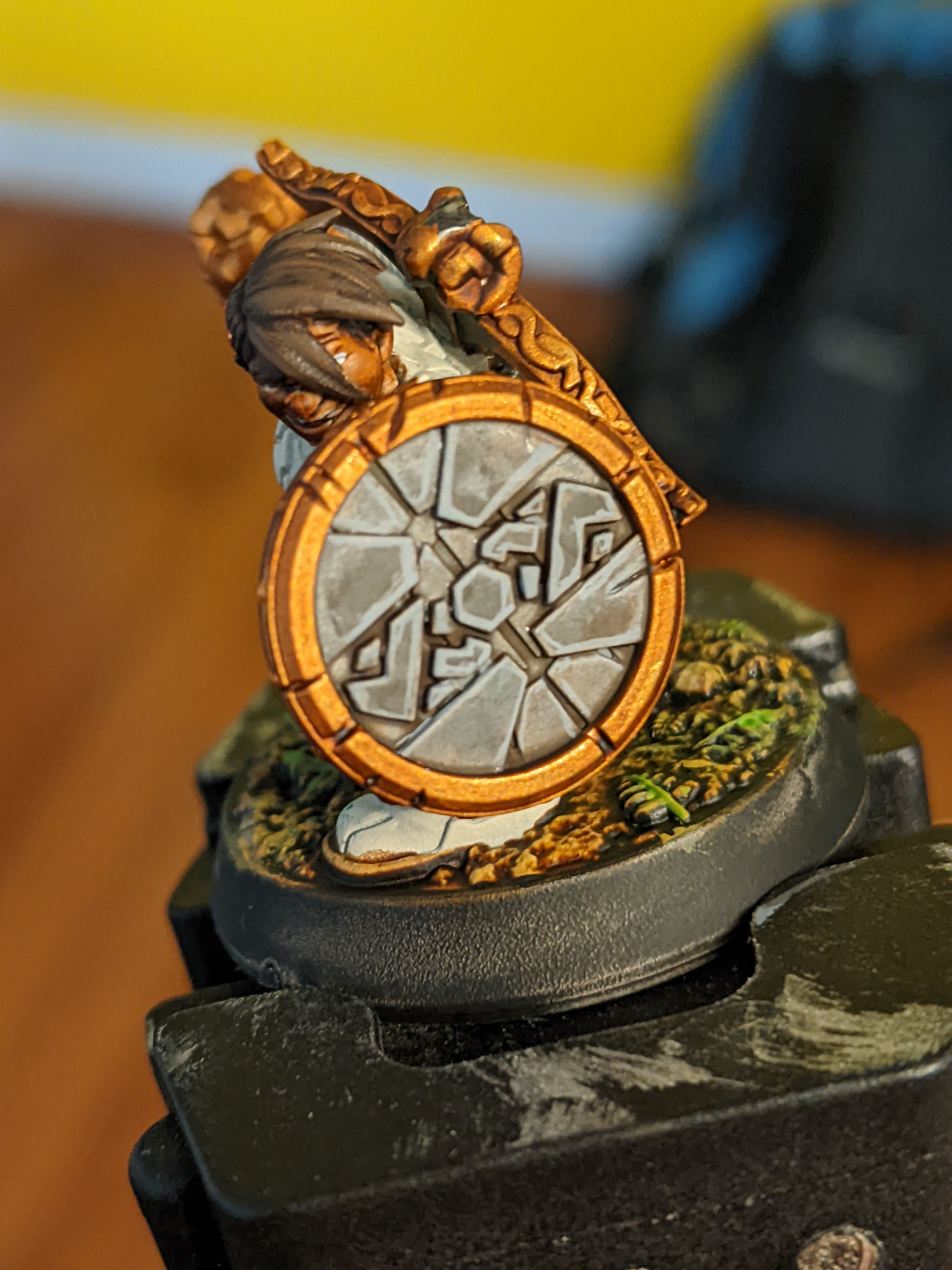
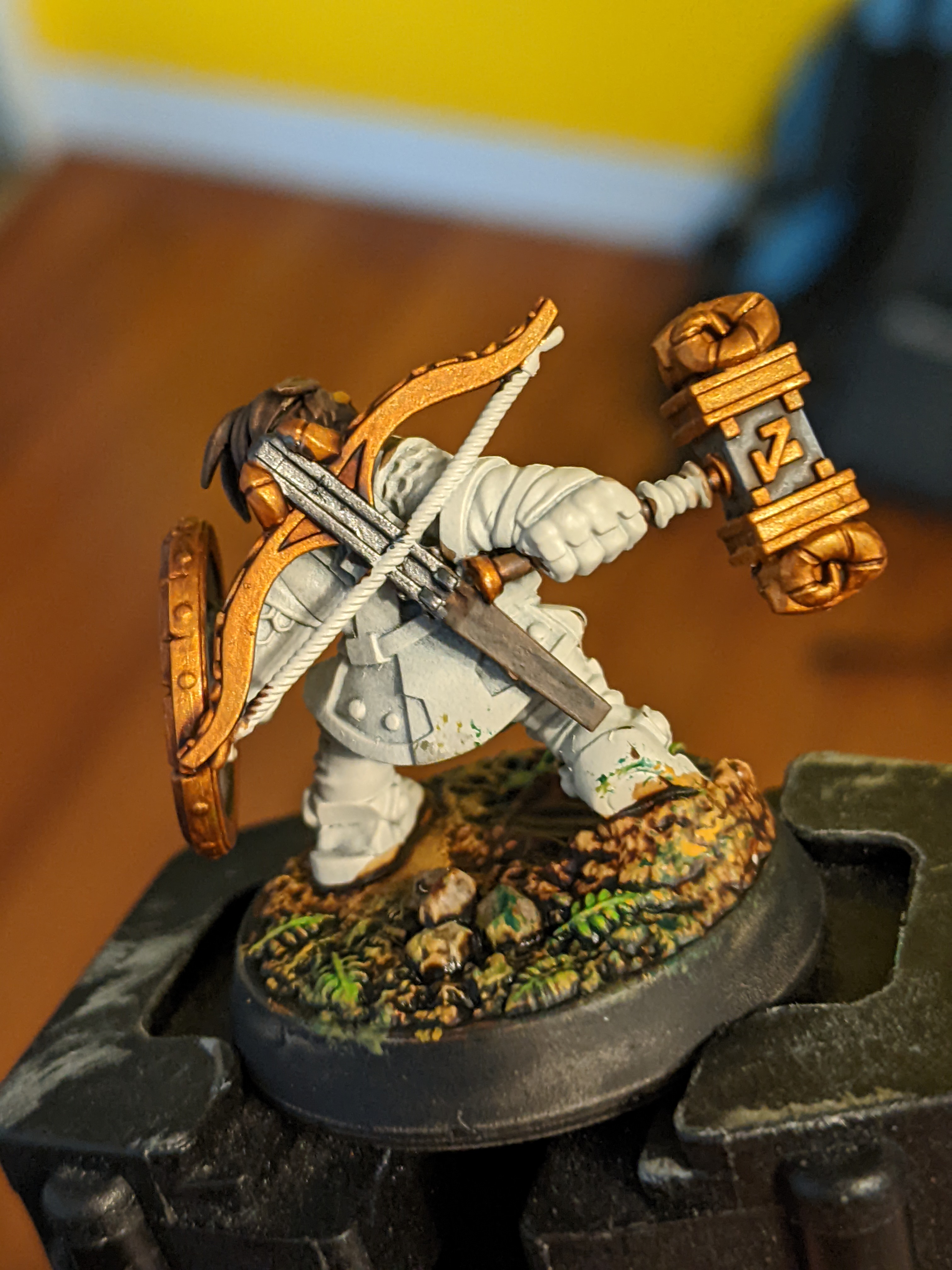
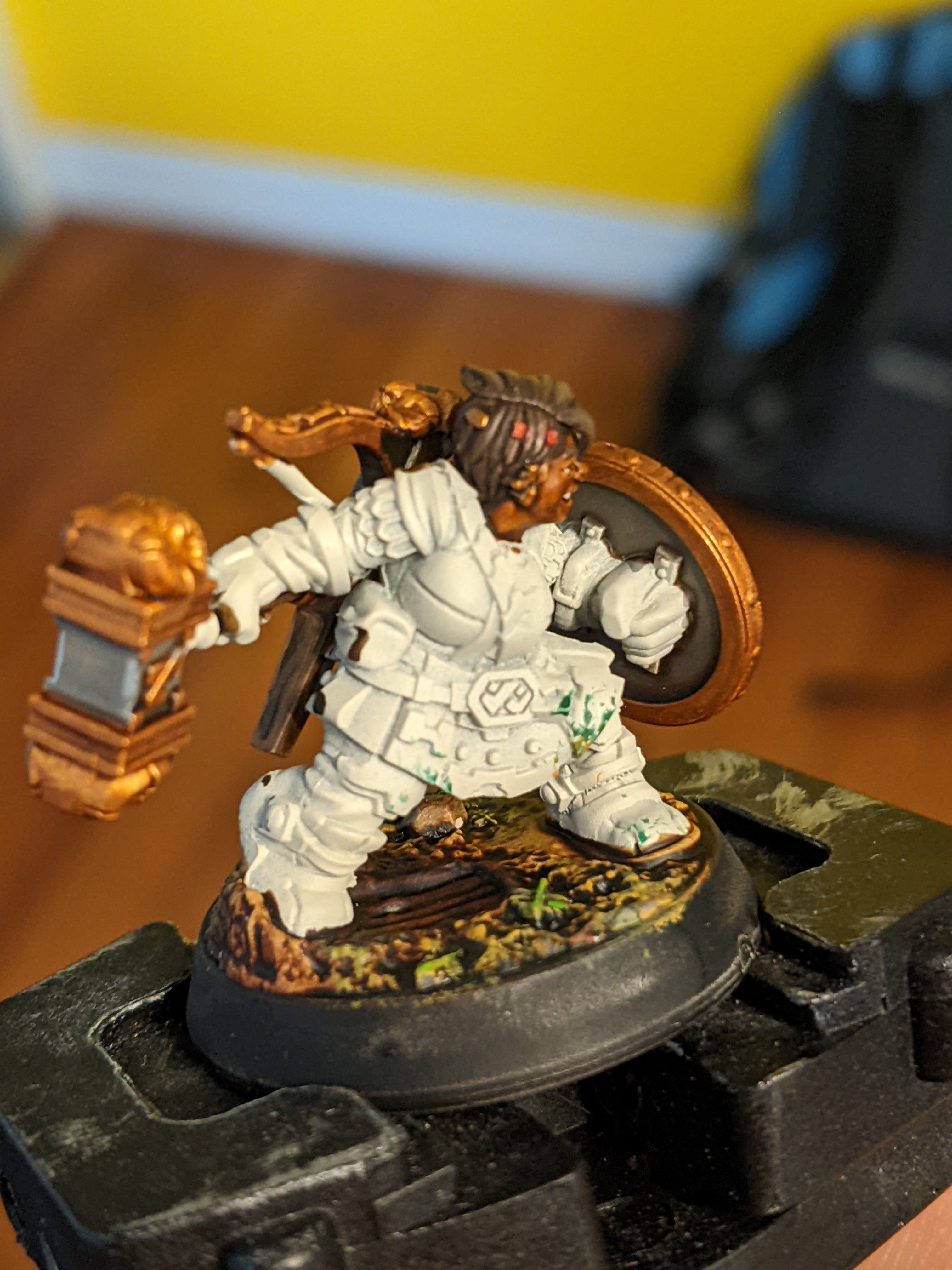
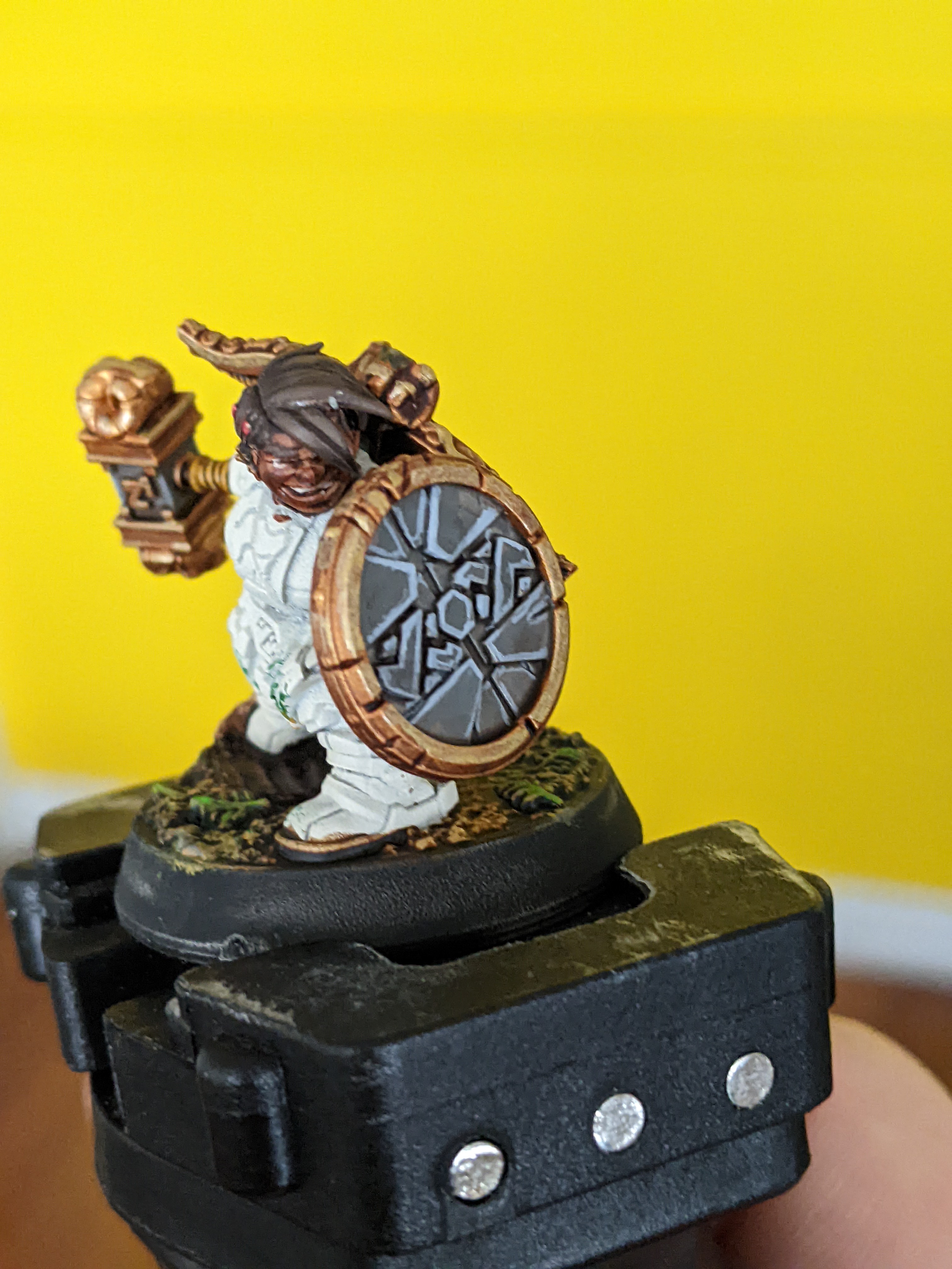
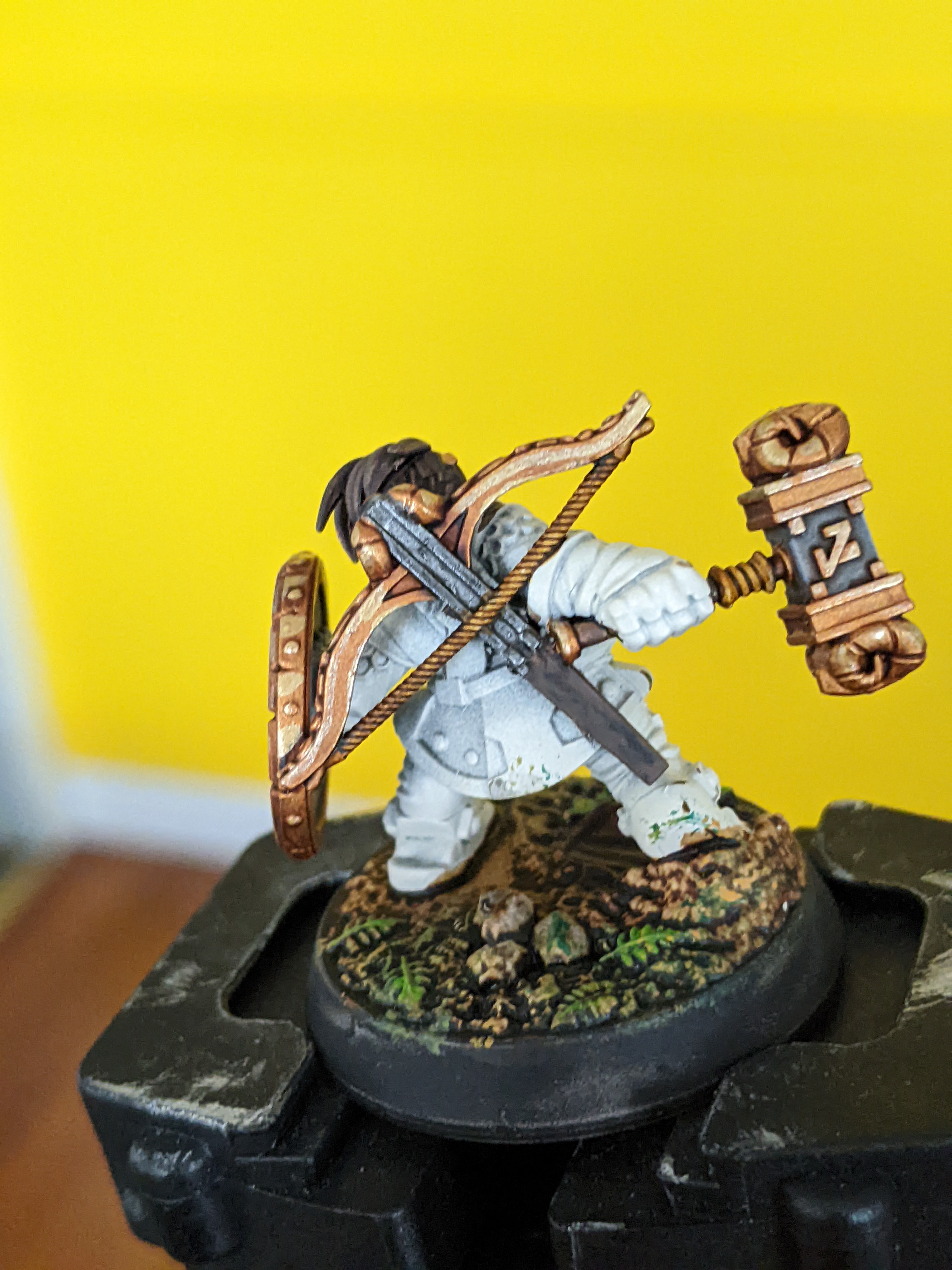
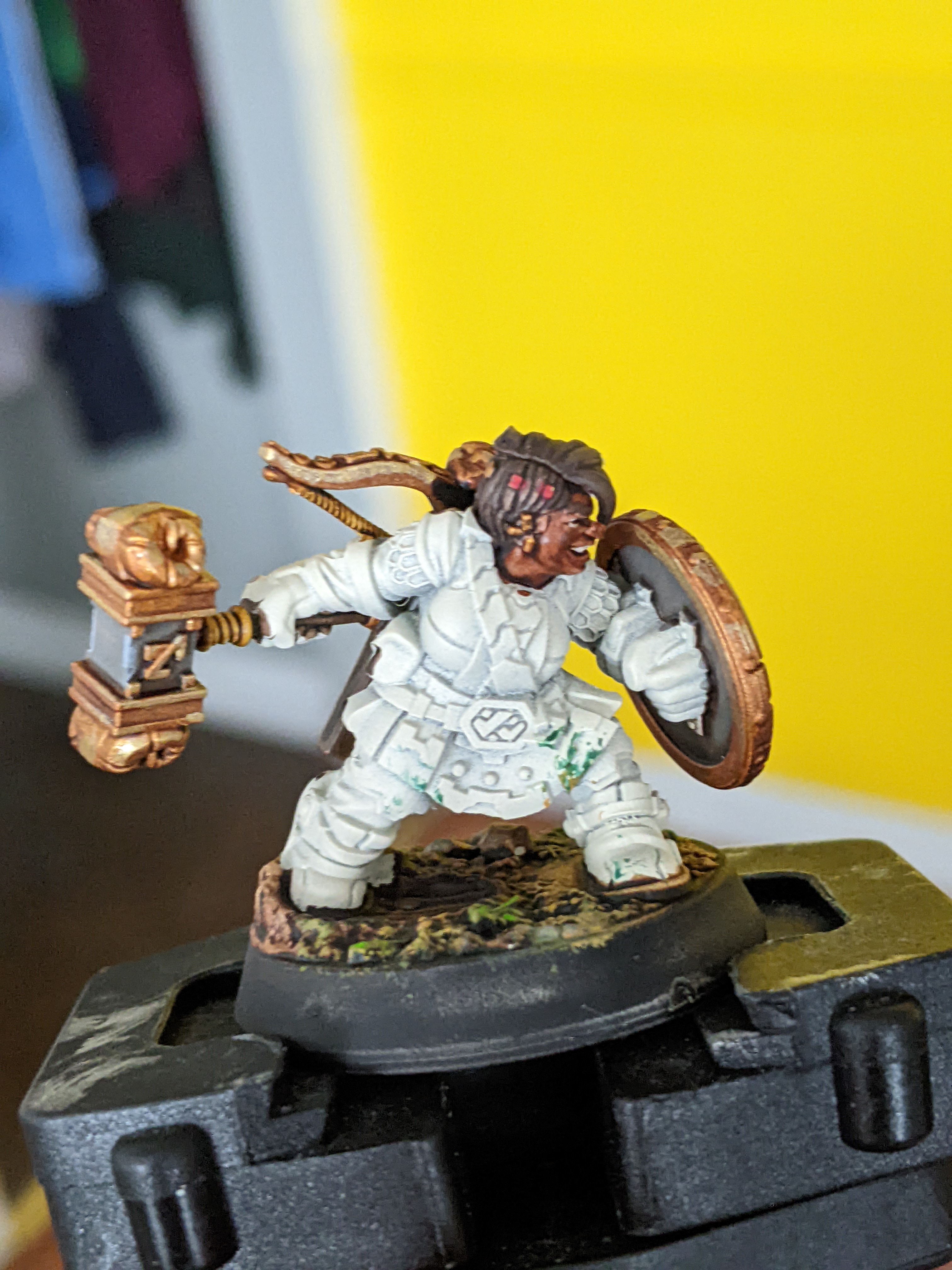
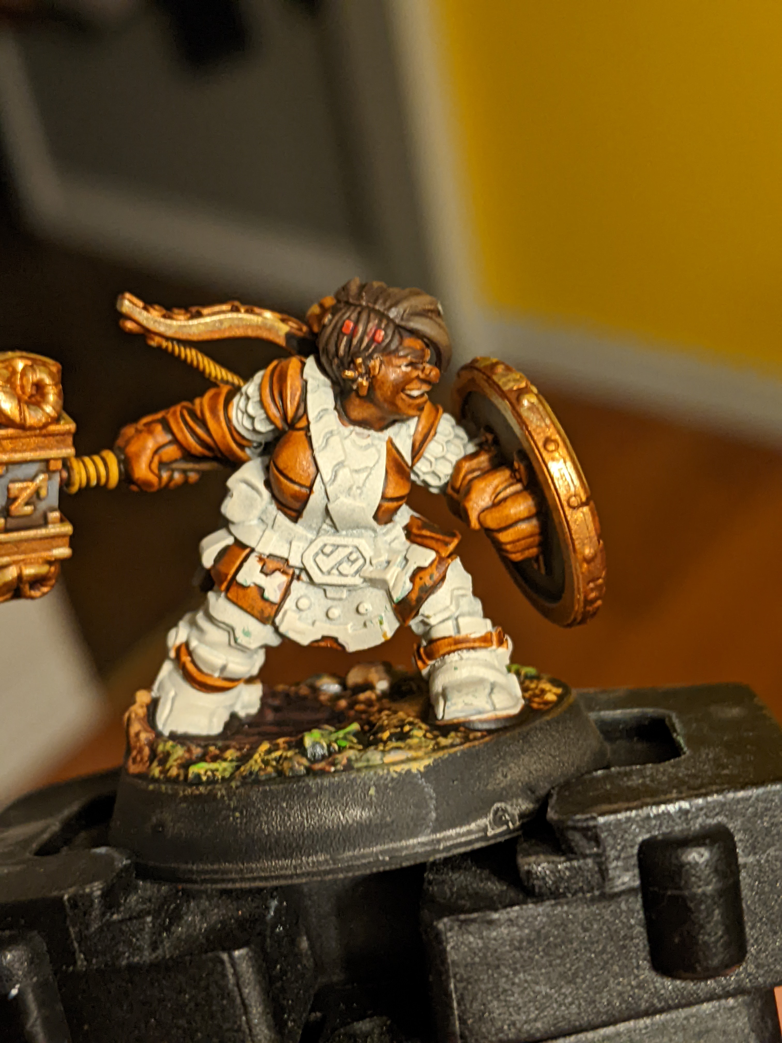
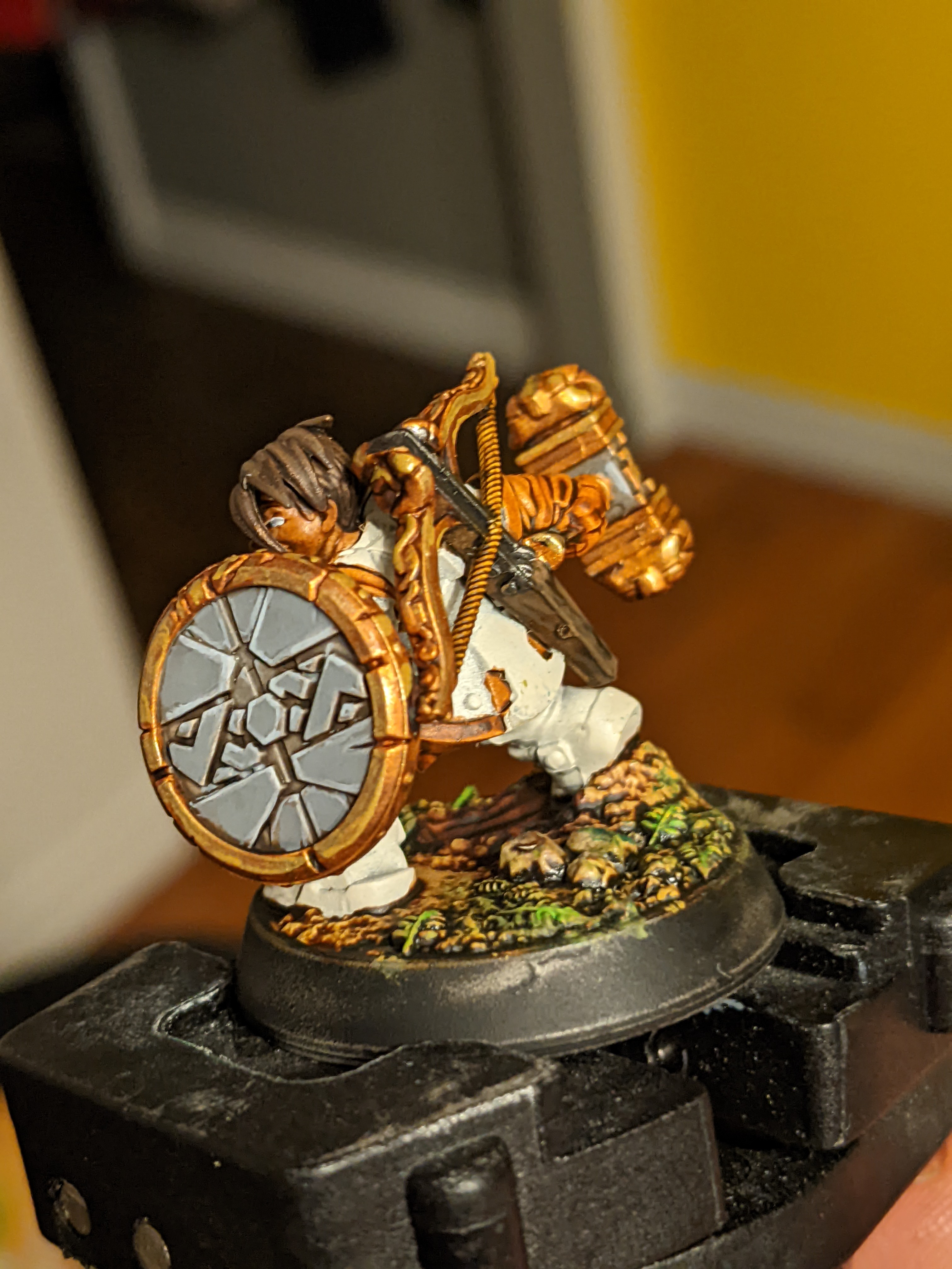
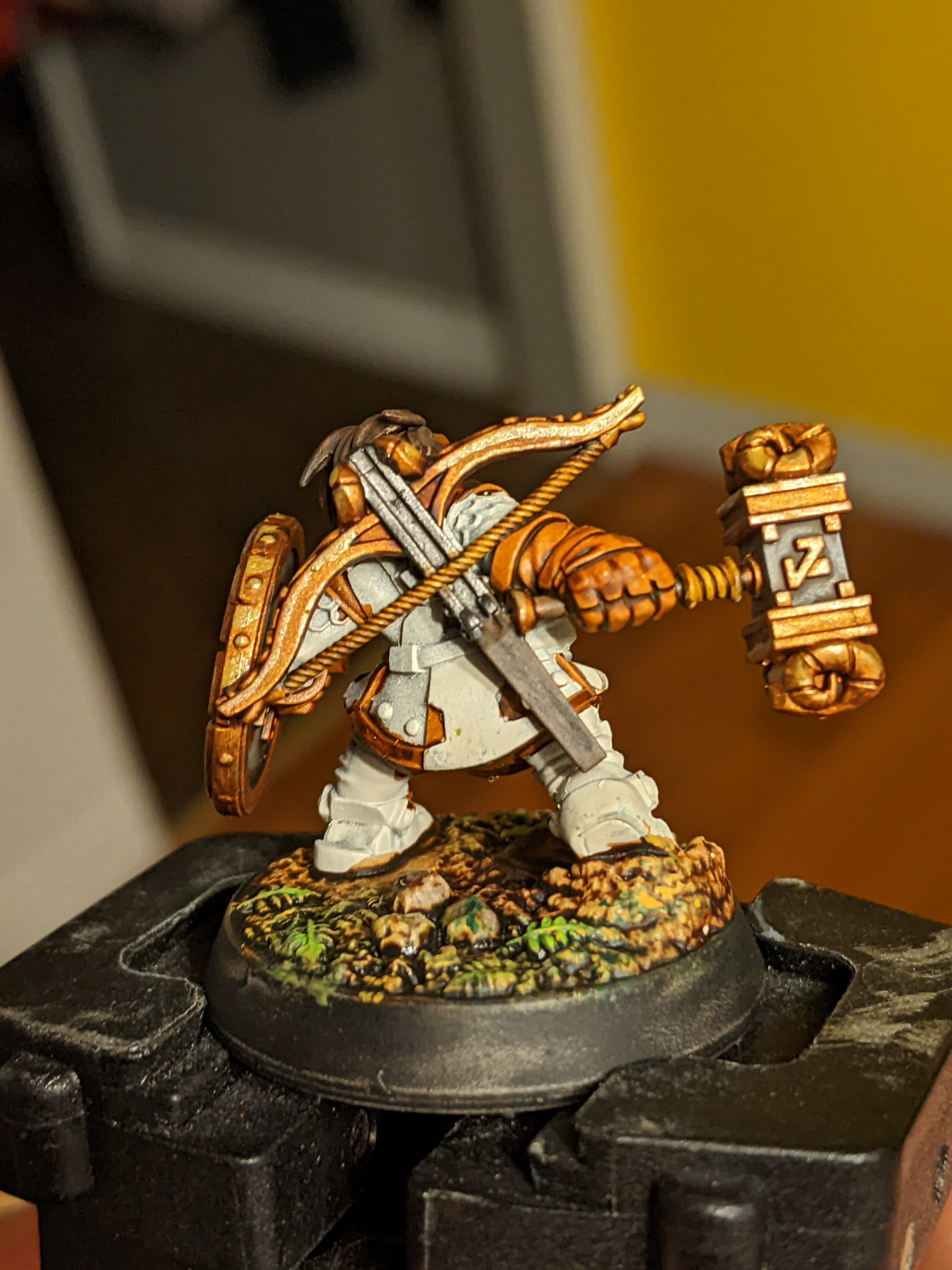
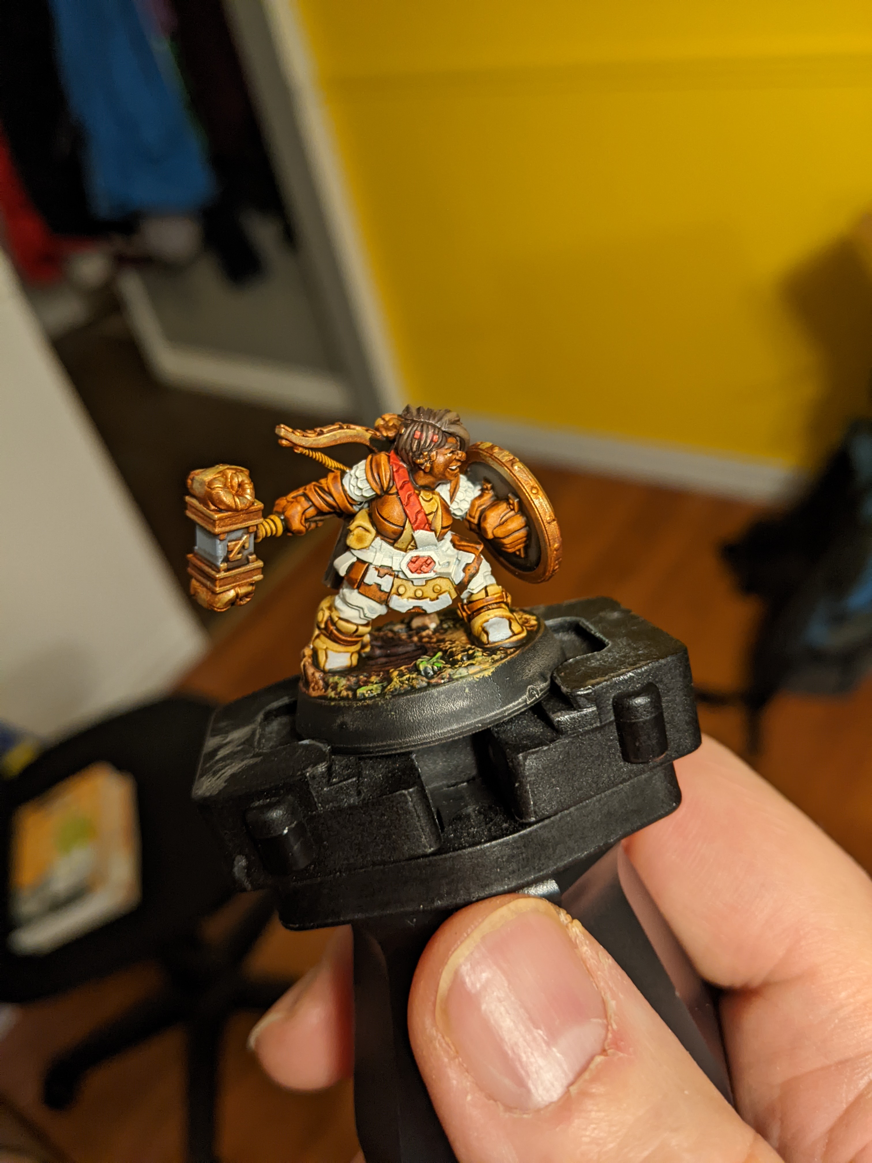
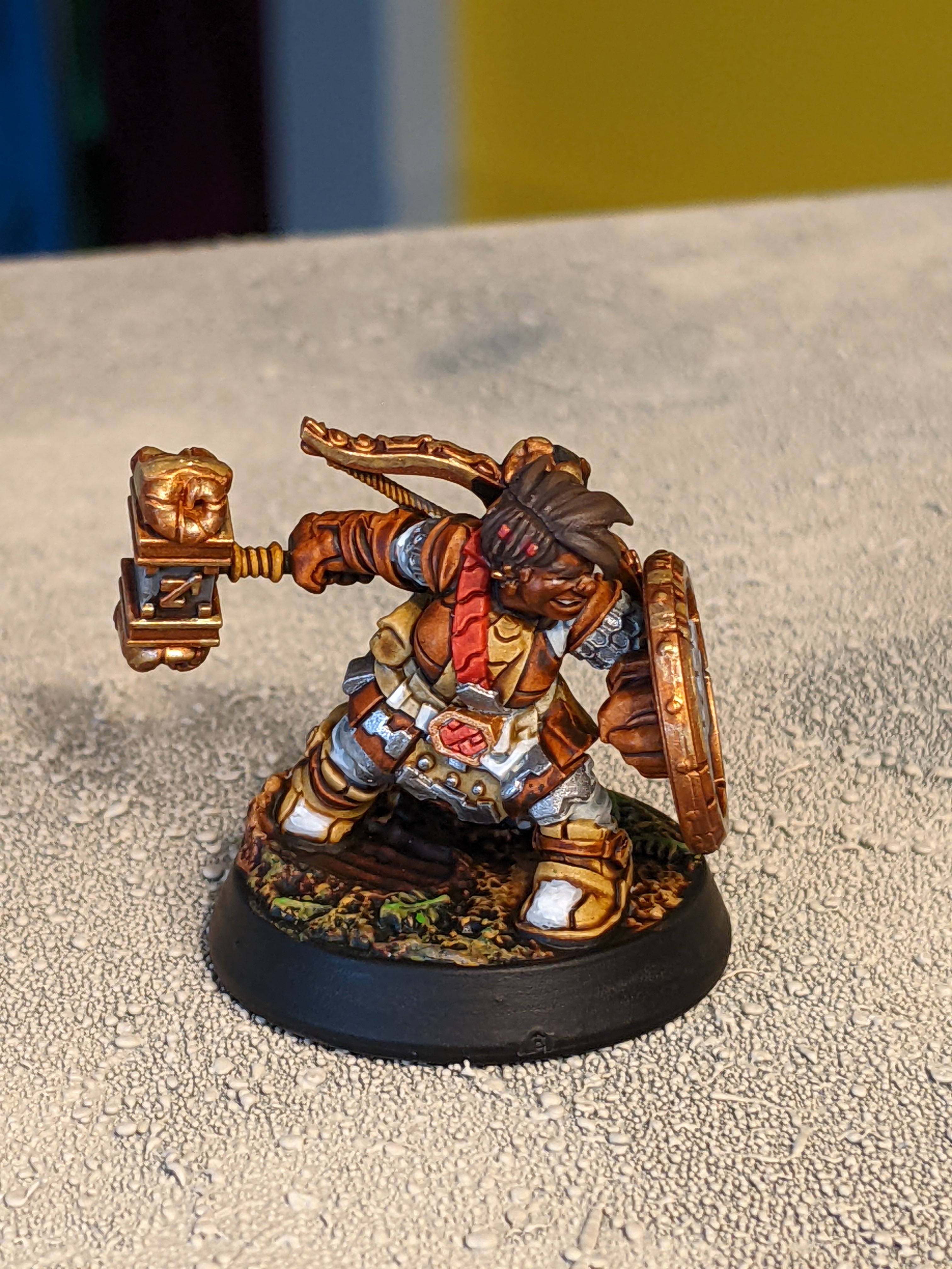
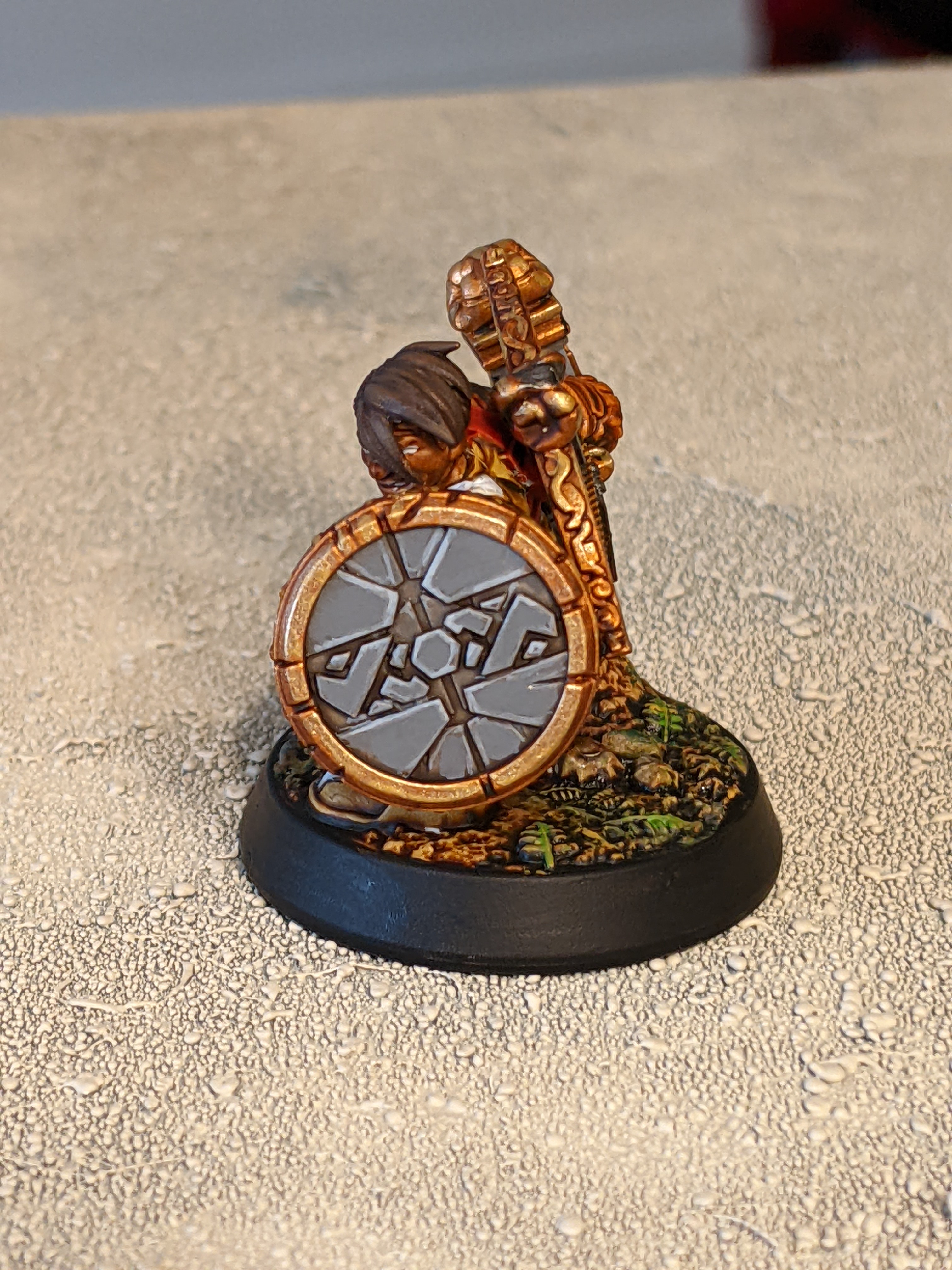
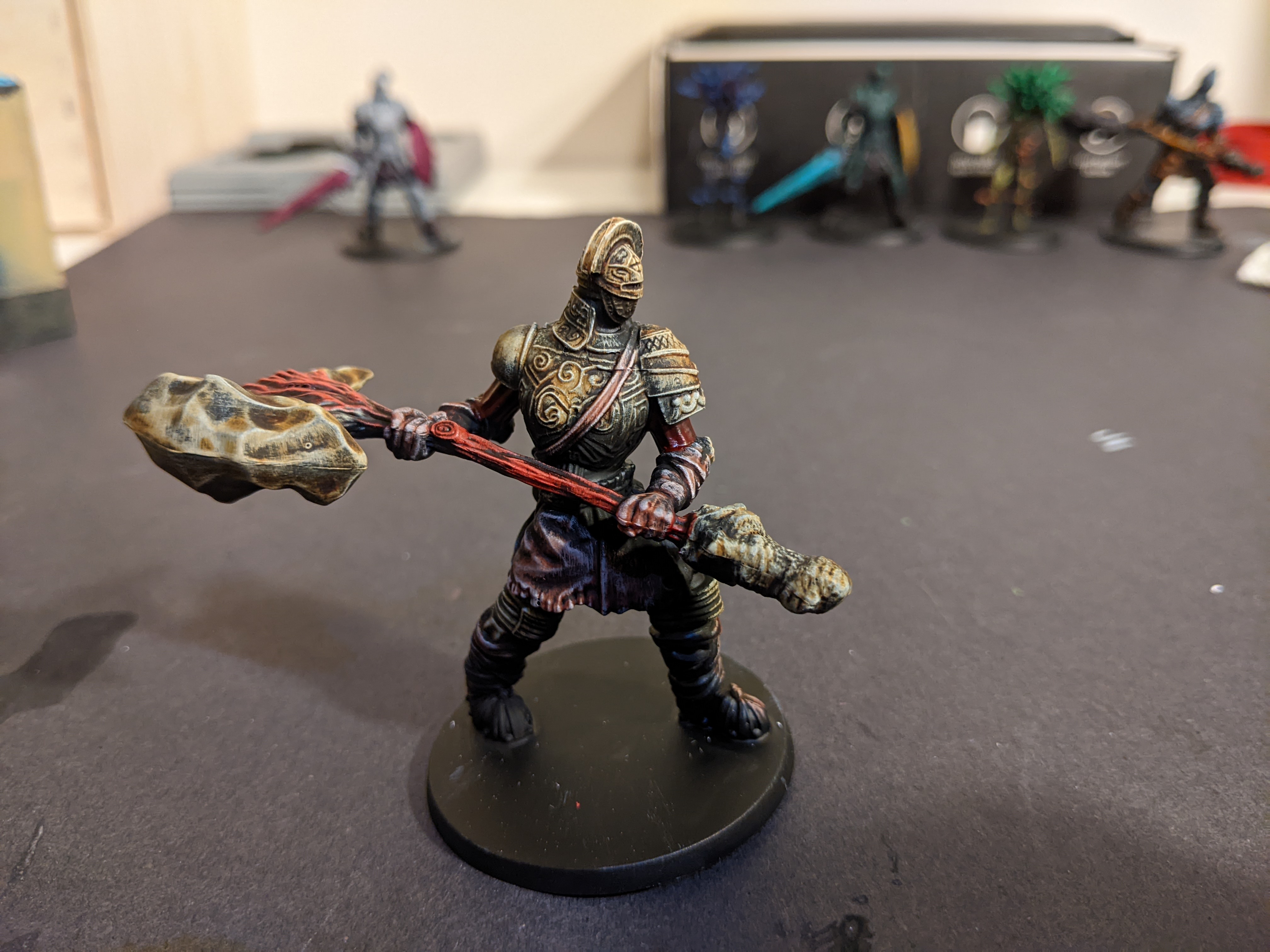
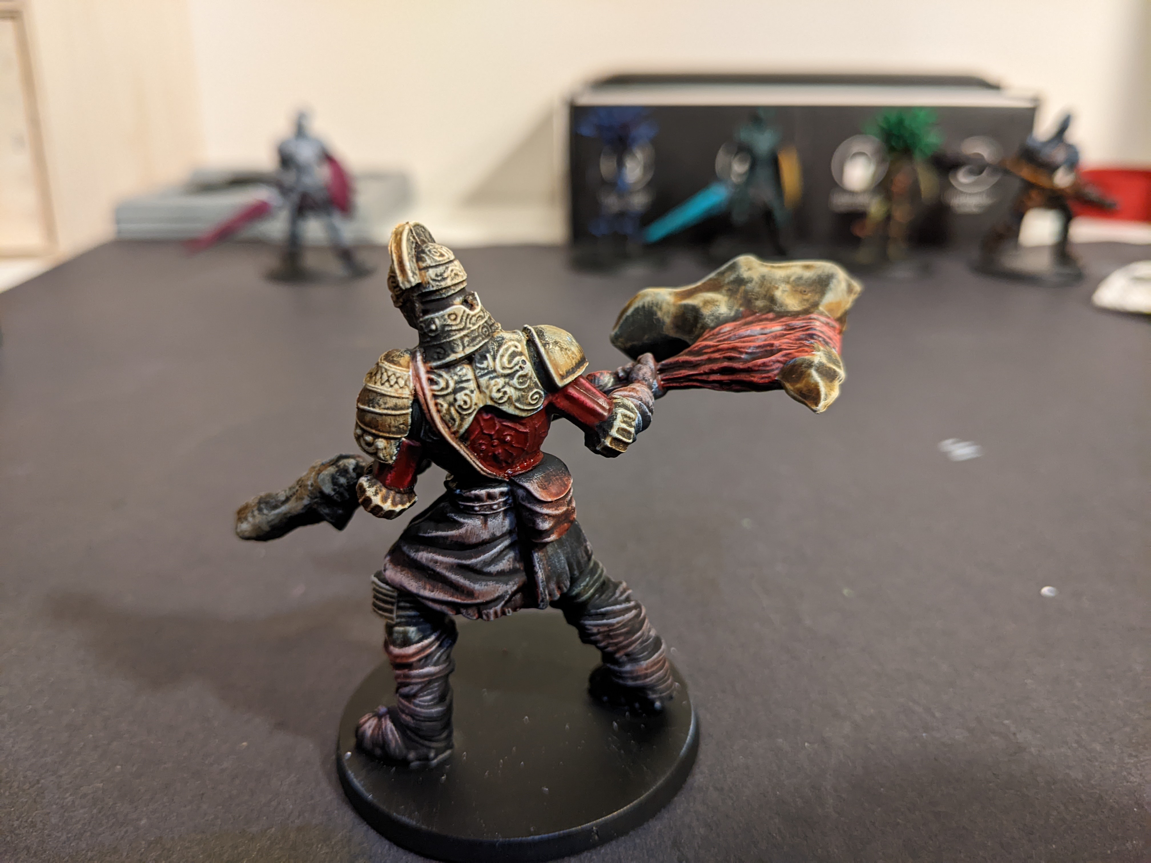
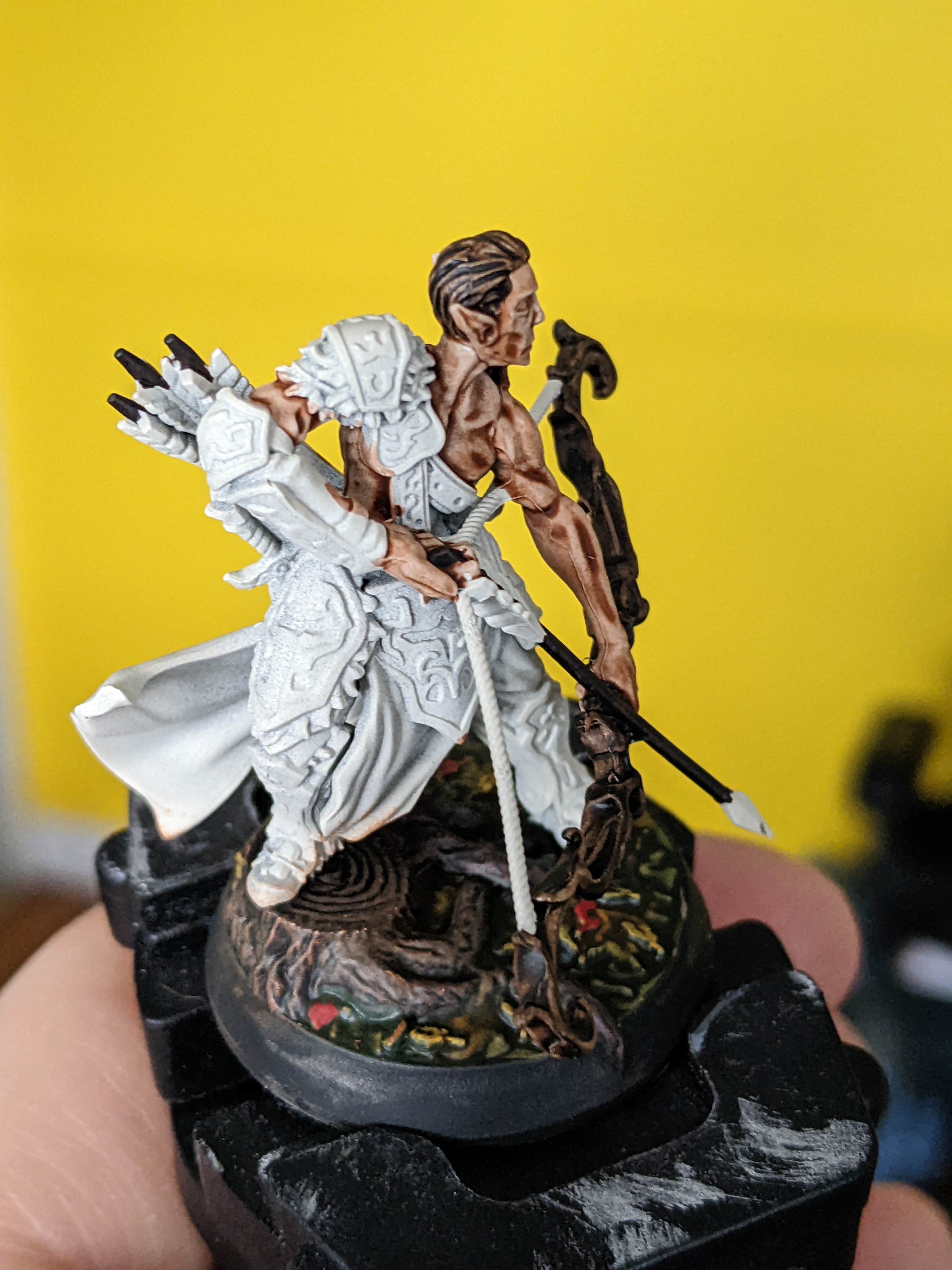
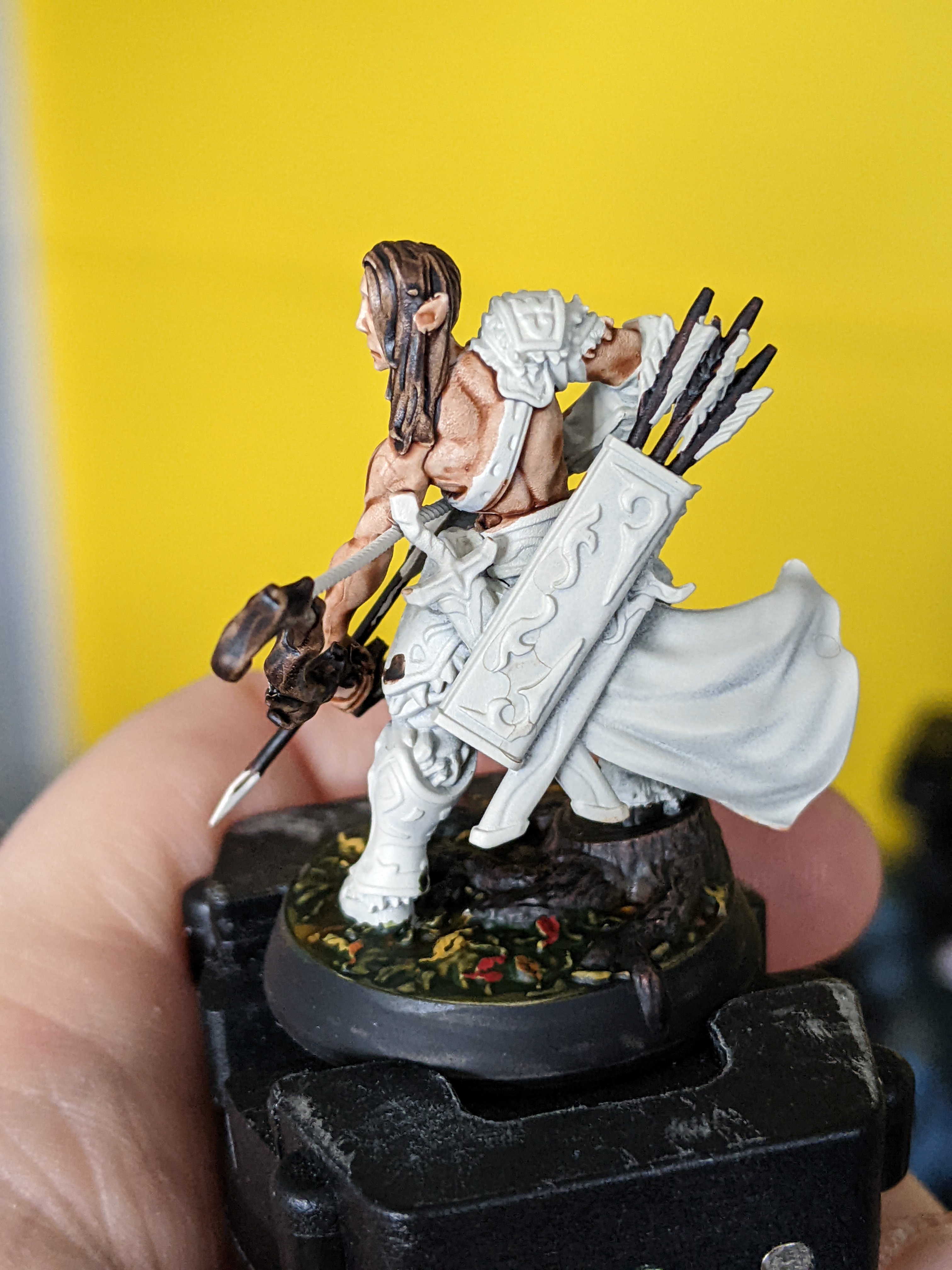
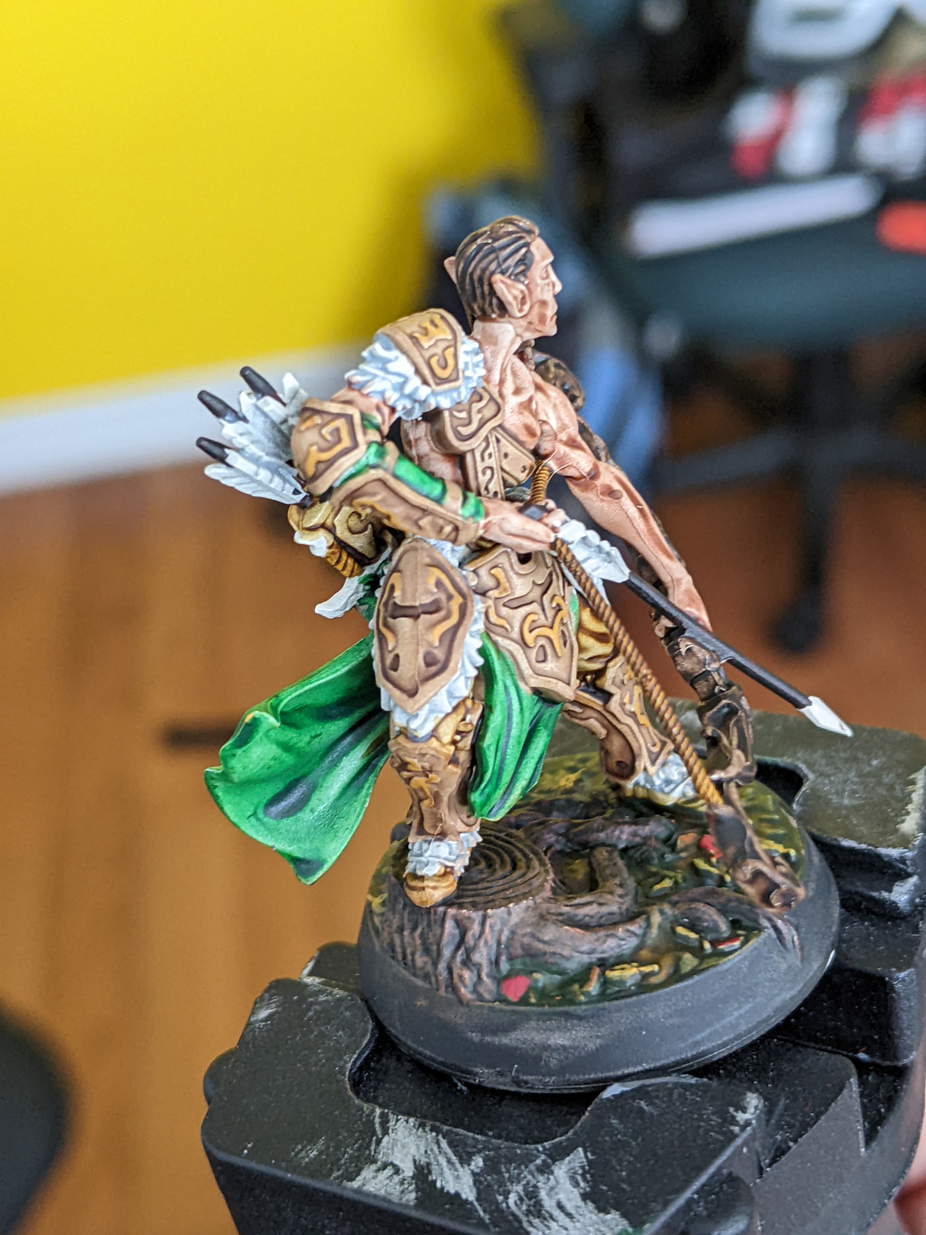
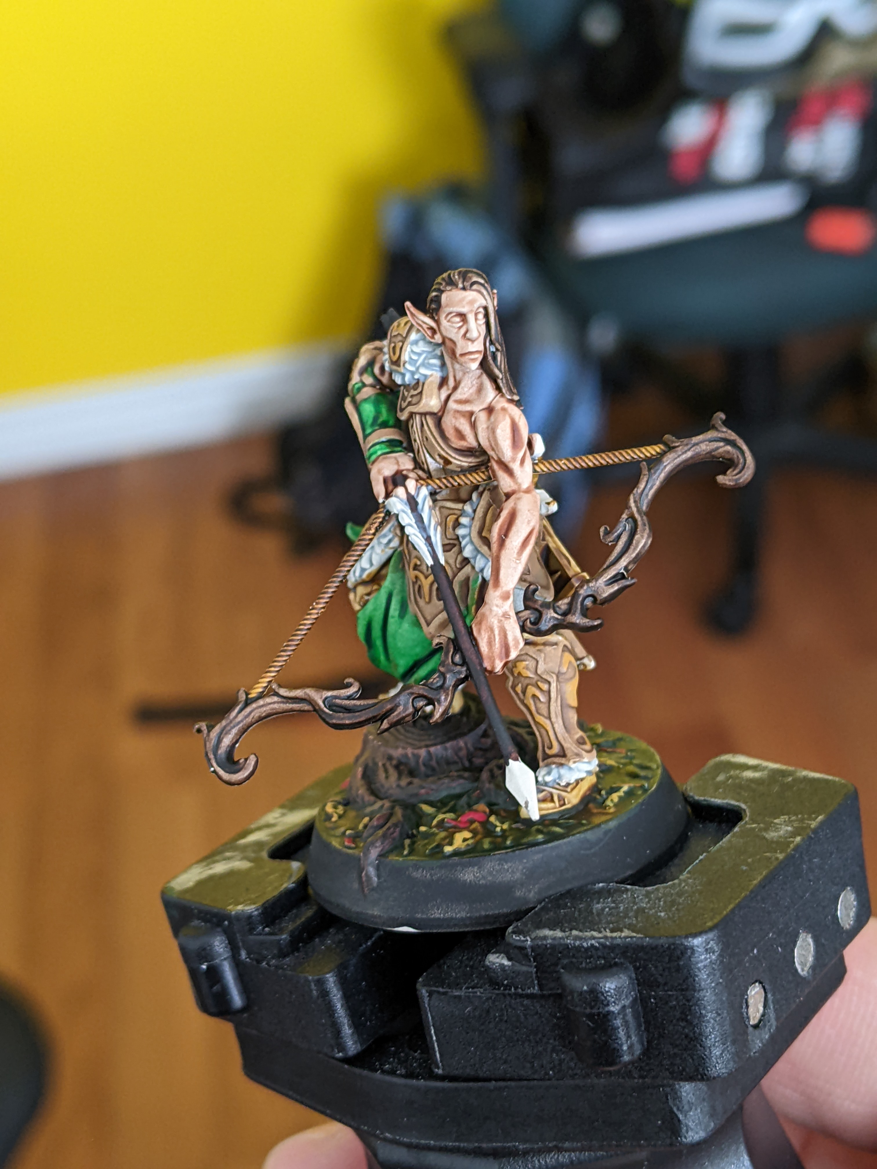
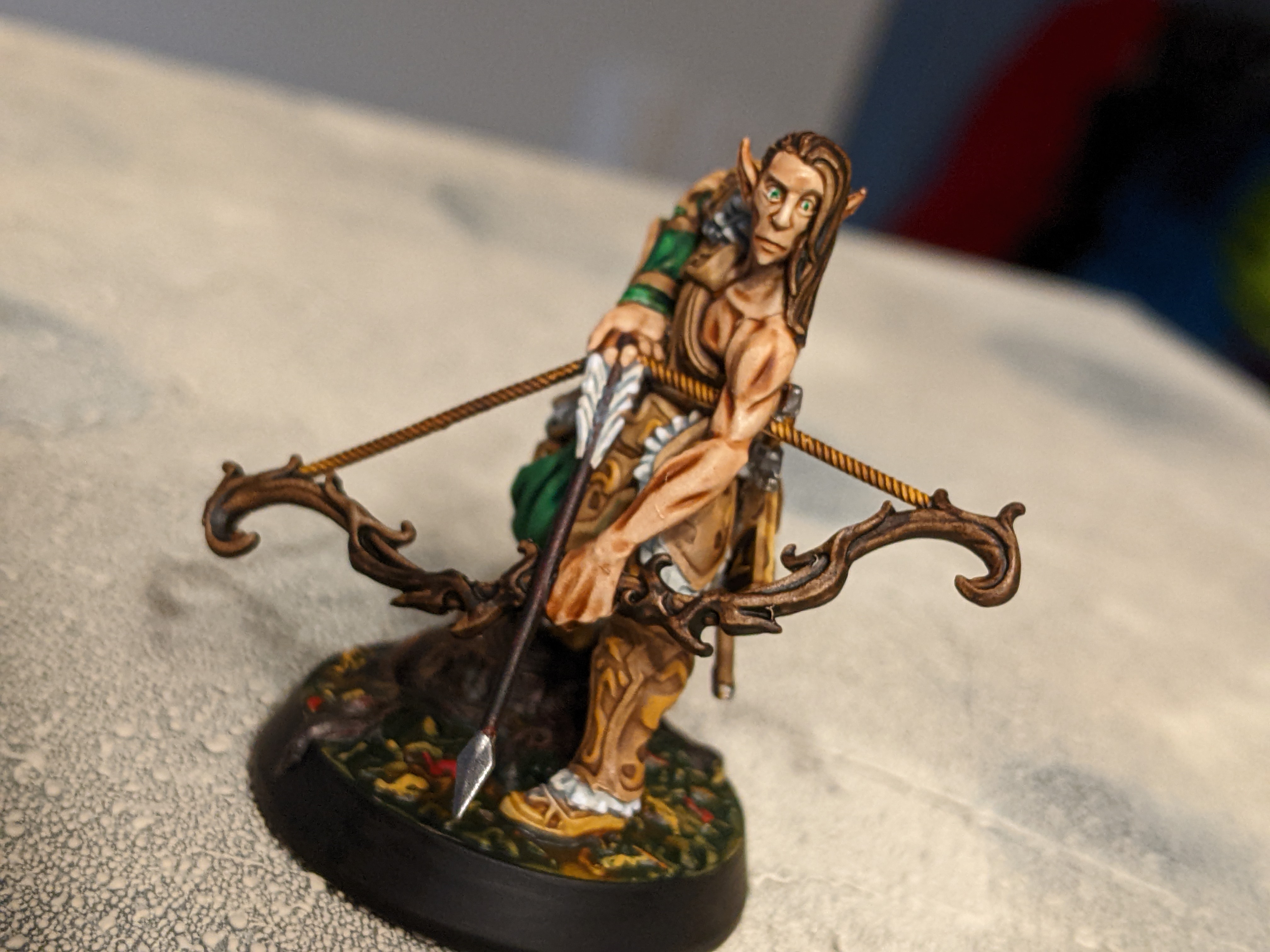
Model 5


Here we have the second hammer wielding knight.
Here I used Pallid Bone for the armor and hammer, Blood Red for the handle, Slaughter Red for the under clothes, and Crusader Skin for all the leather stuff.
I deliberately went kind creepy flesh tones for this guy and I think it came out pretty well. The bone colour is amazing and the Blood Red as a muscle handle worked really well. The Slaughter Red is reeeally red and looks pretty different from the other which is nice. The biggest failure here was the skin colour which really couldn’t handle the dark of the black white zenithal underlayer. Looks pretty good and creepy.
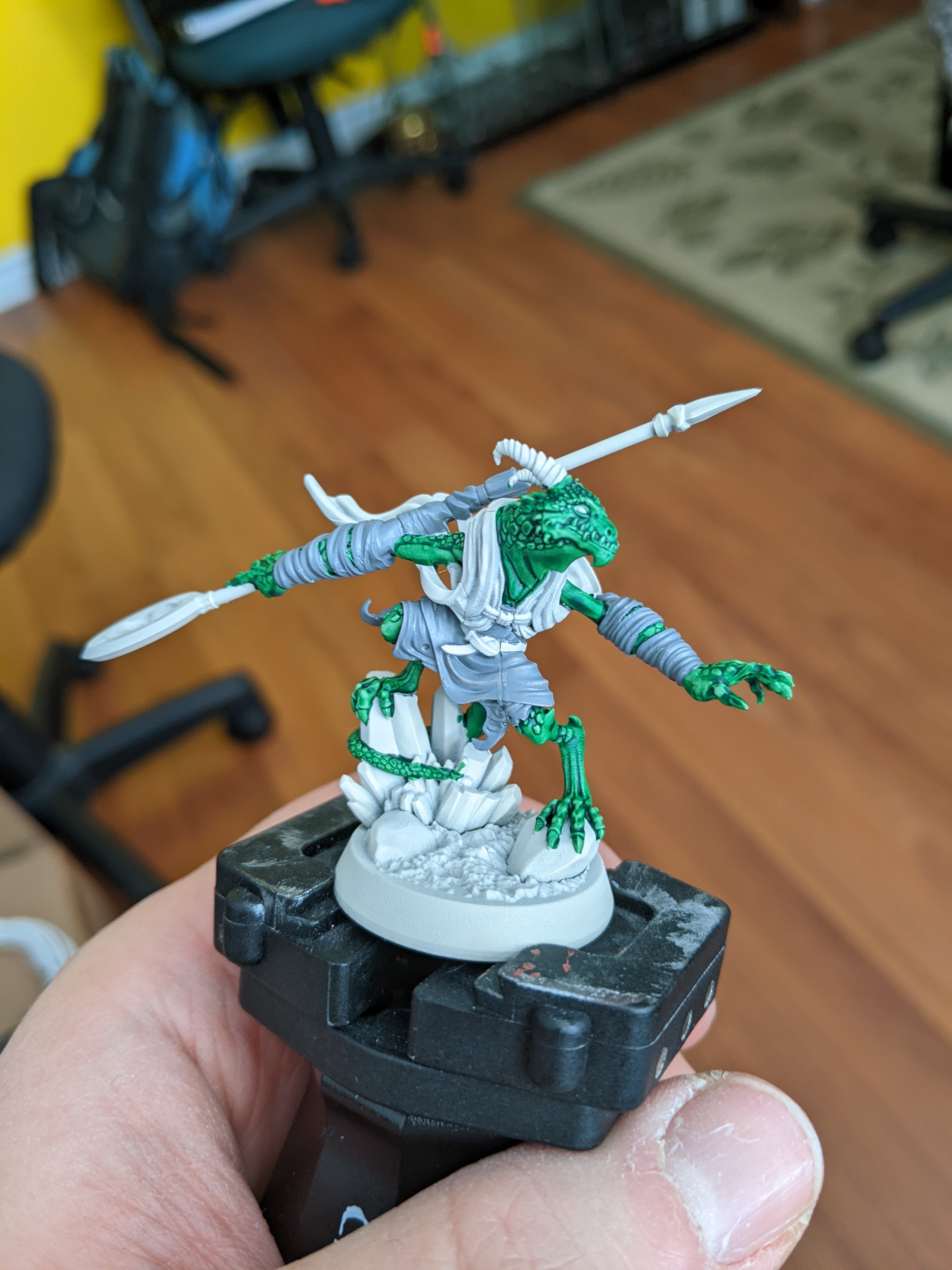
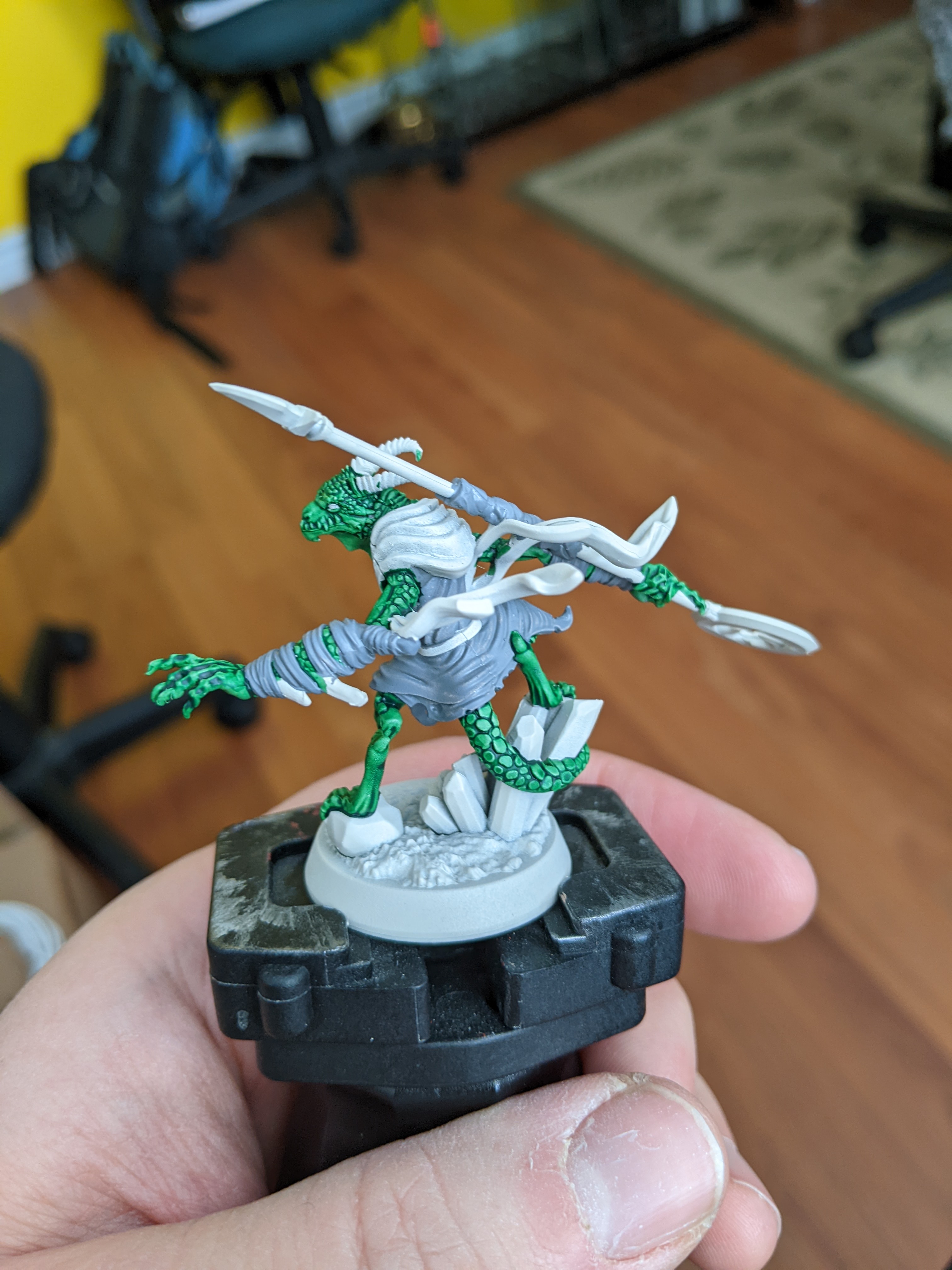
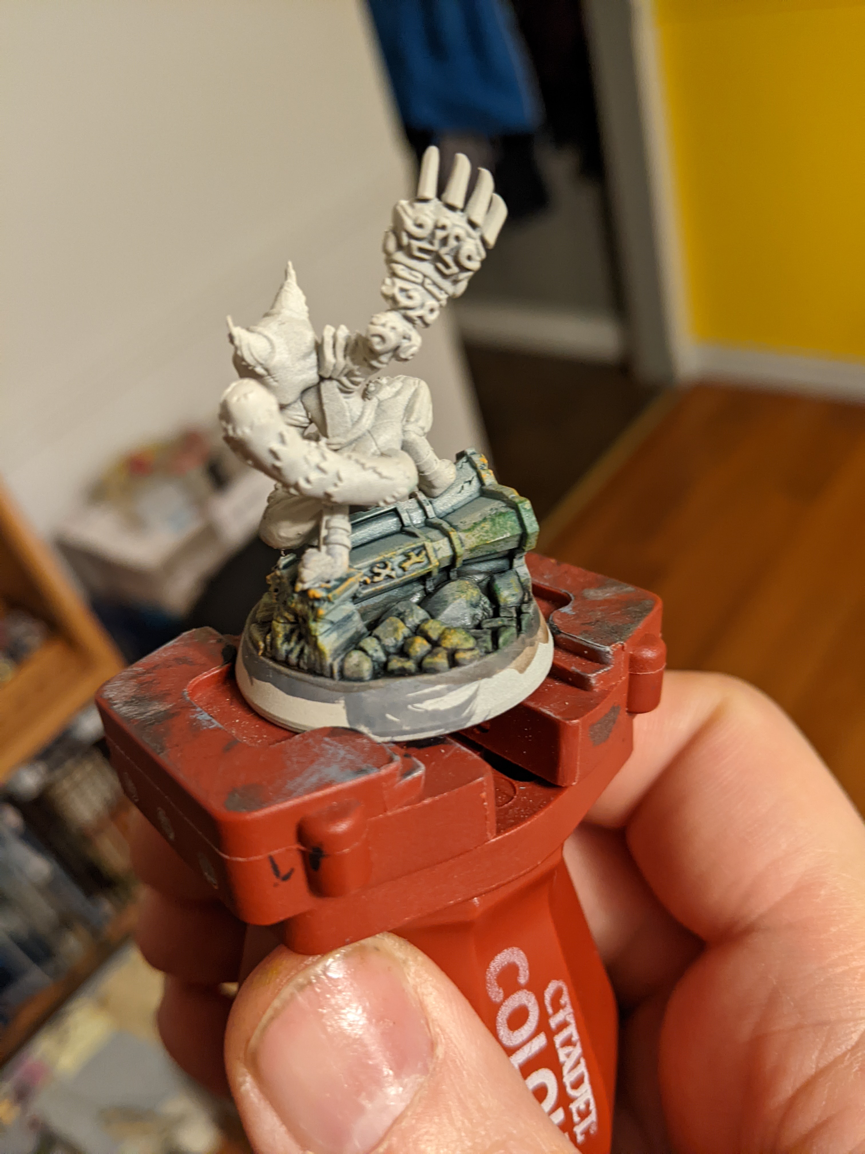
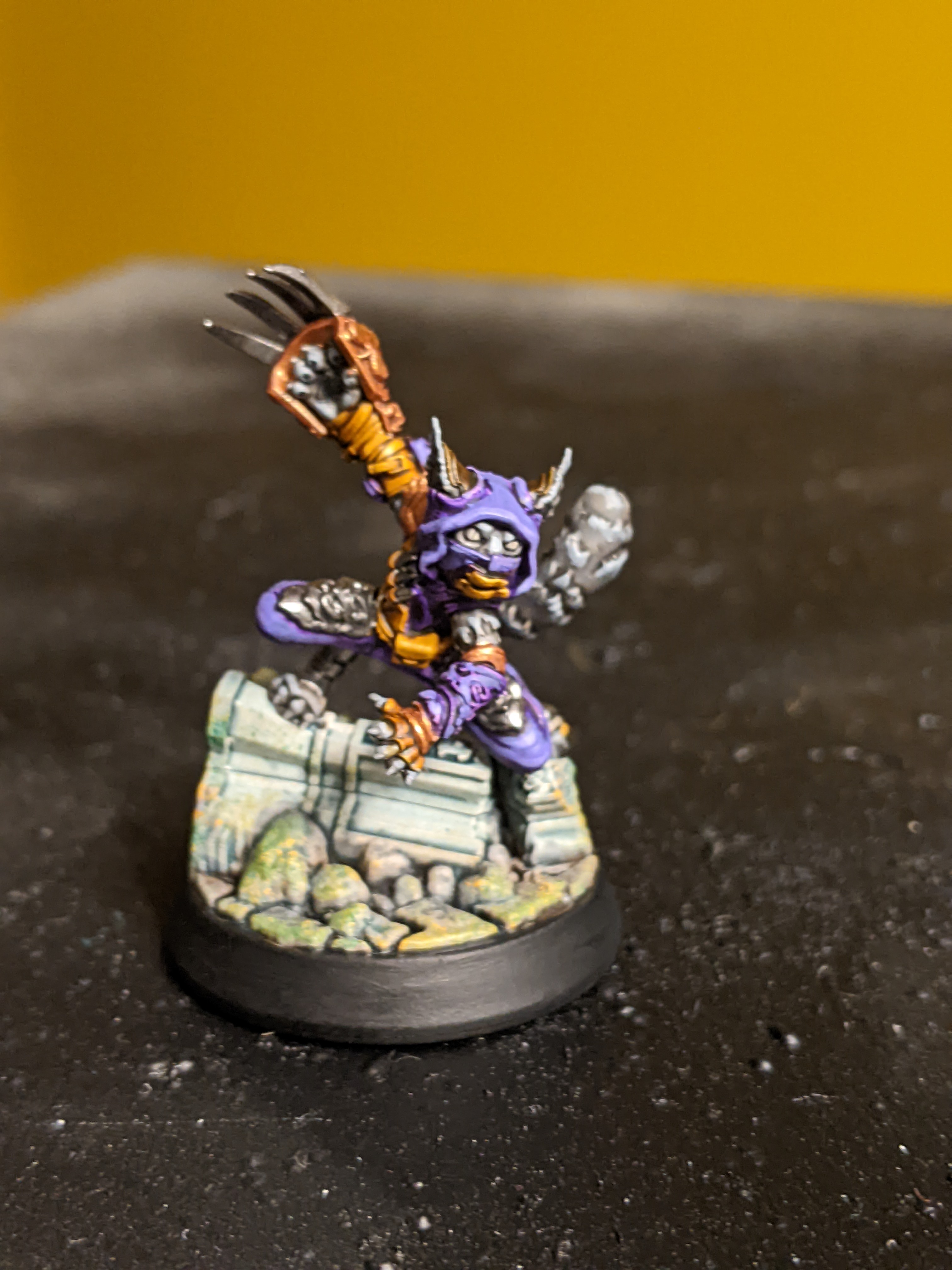
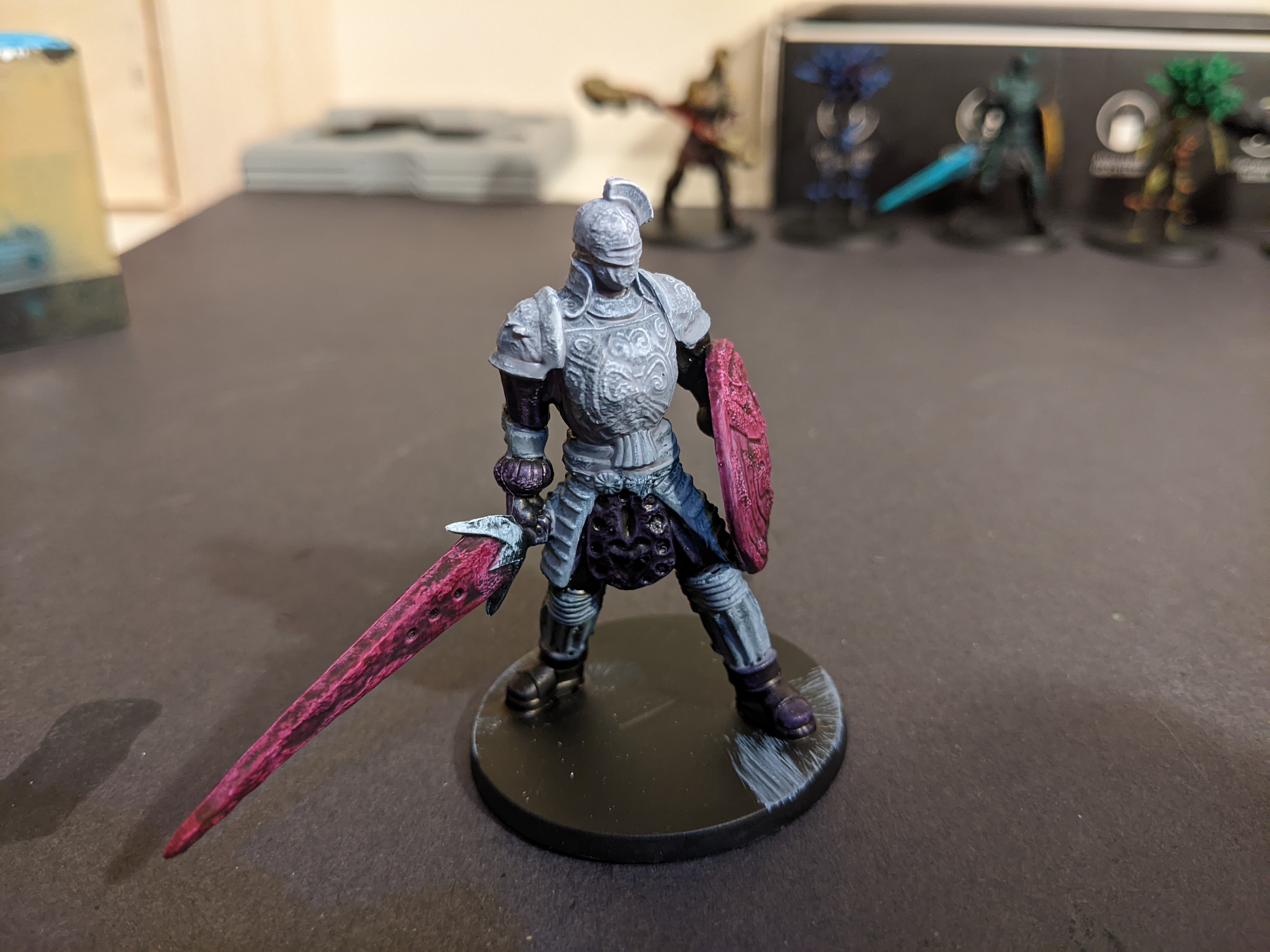
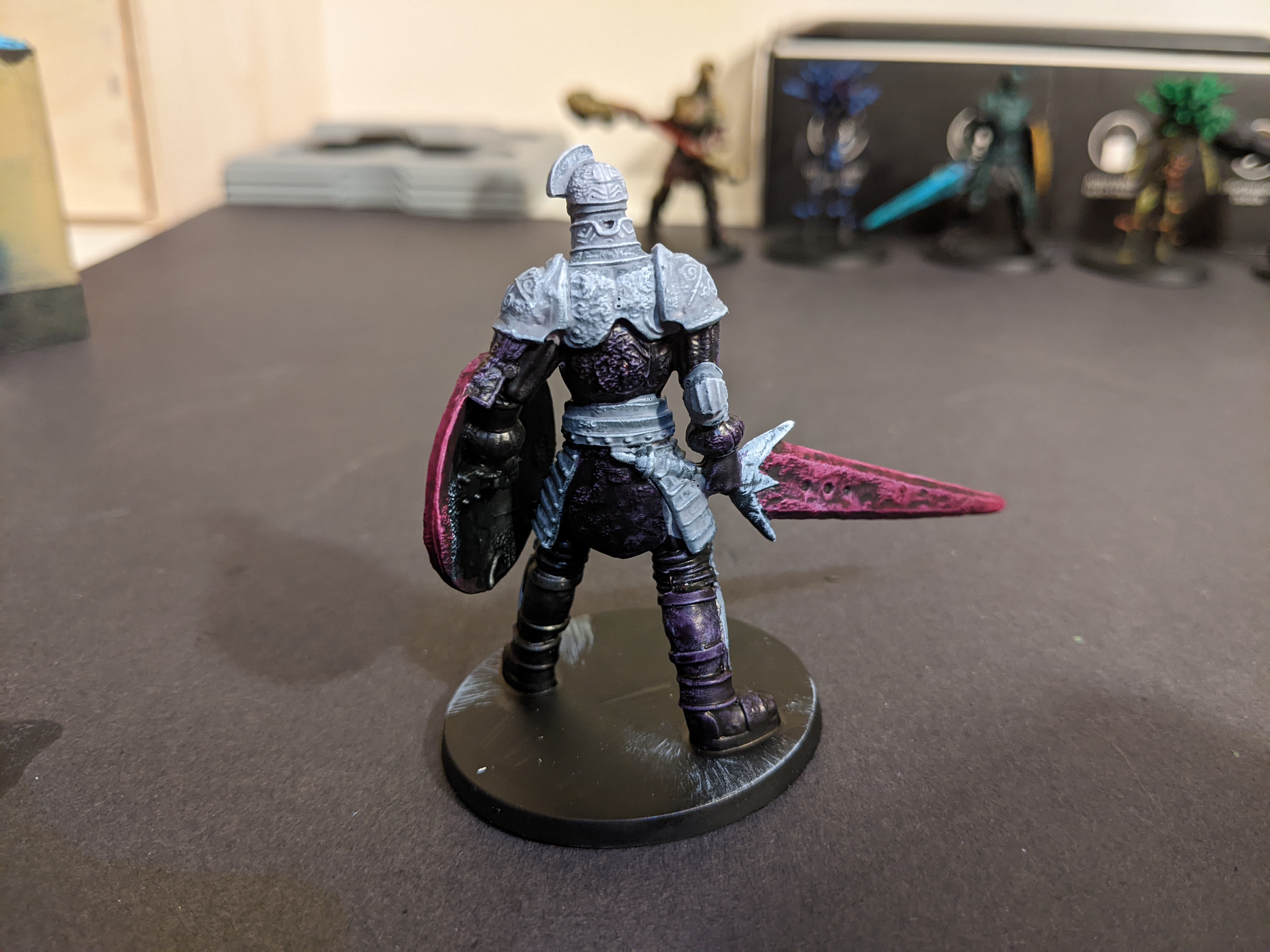
Model 6


Here’s the second sword and shield guy and with all the other colours used this guy got the leftover colours.
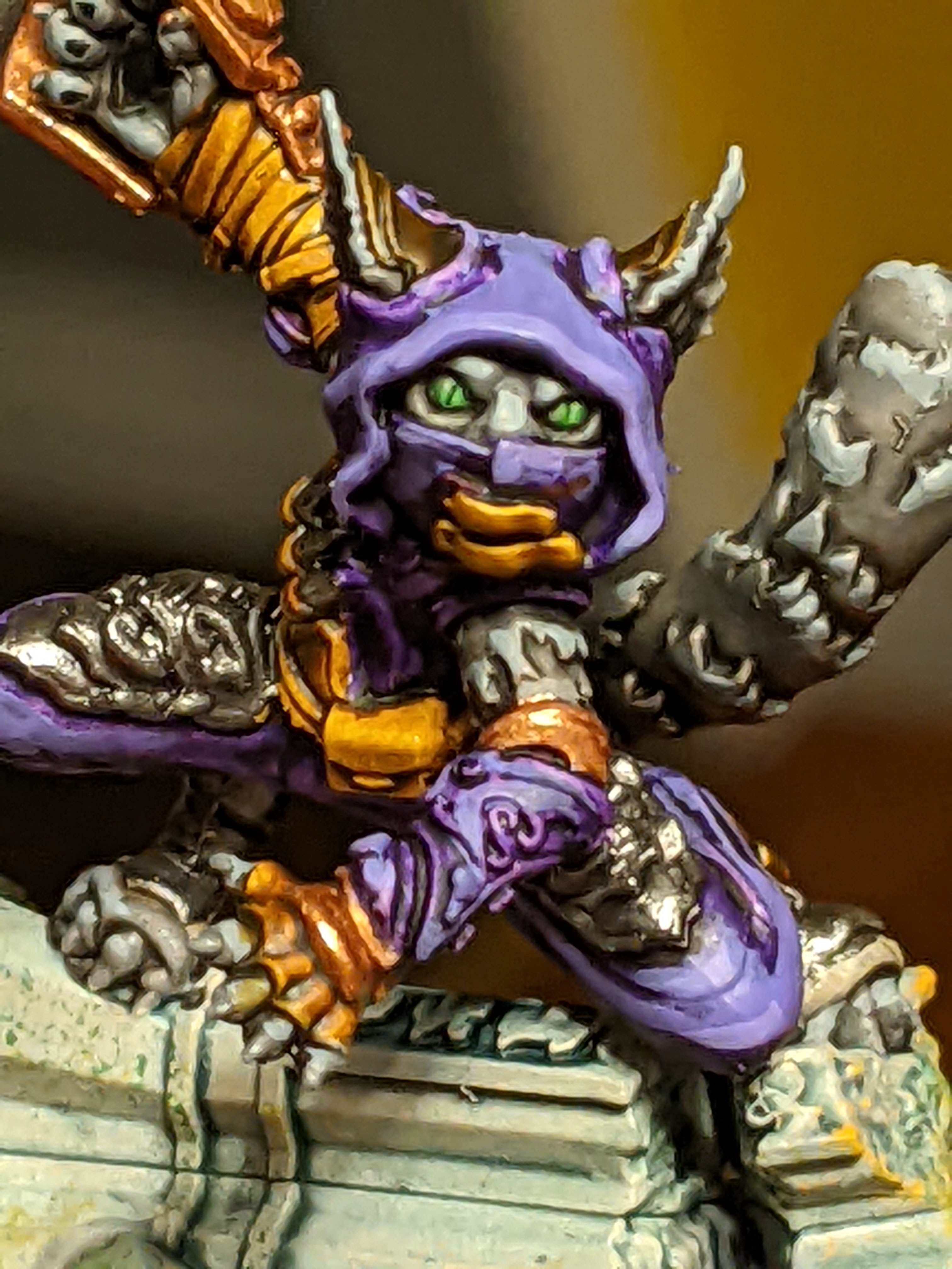
He has Holy White for the armour, Hive Dweller Purple for the sword and shield, and Purple Alchemy for the under clothes and leathers.
So this one’s a mess. The white did not work with the black of the undercoat. The Hive Dweller Purple is incredibly dark and should have been watered down with the medium. The Purple Alchemy looks pretty good as a pinkish magic sword but overall this one’s kind of a wash.

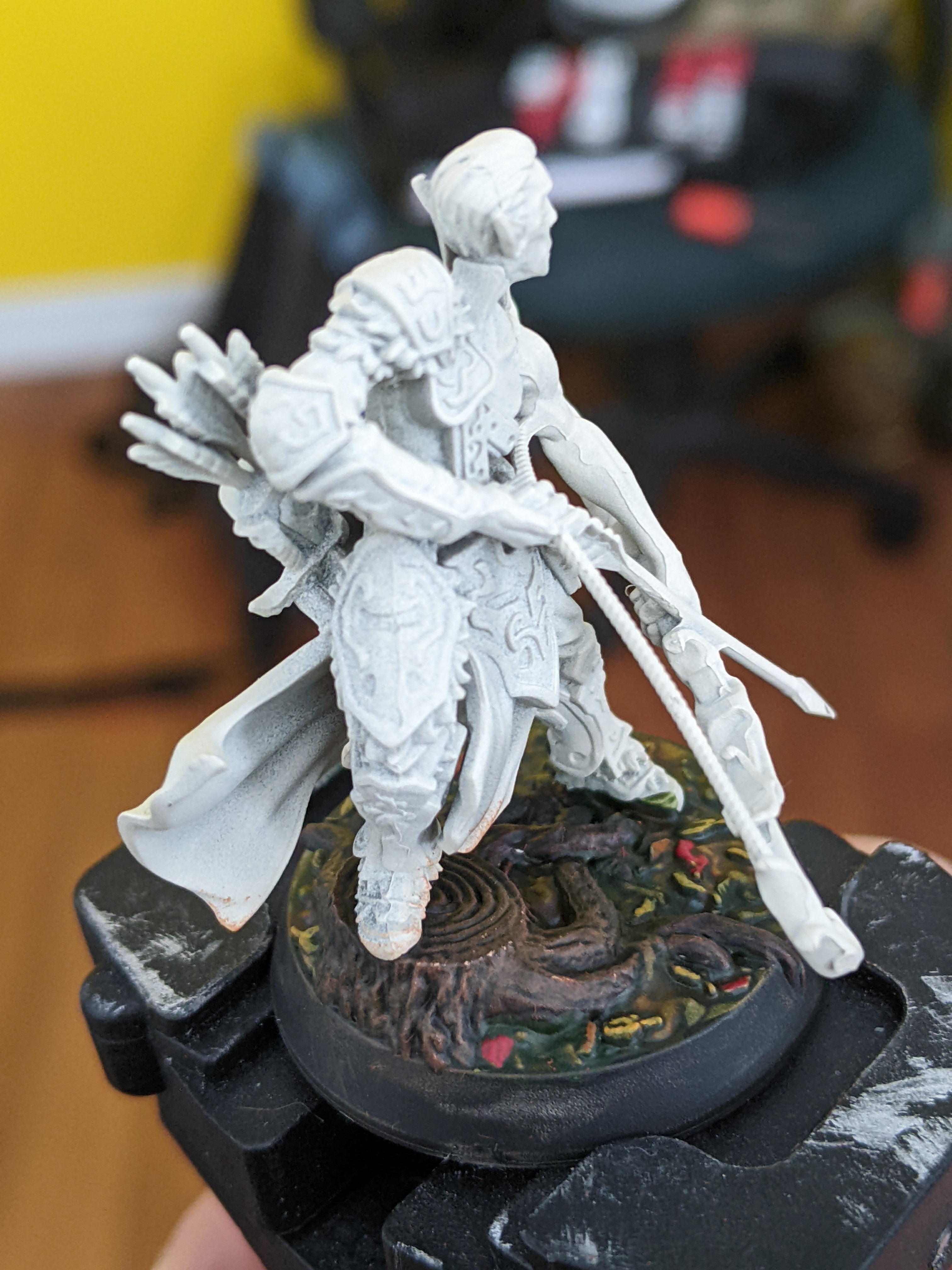
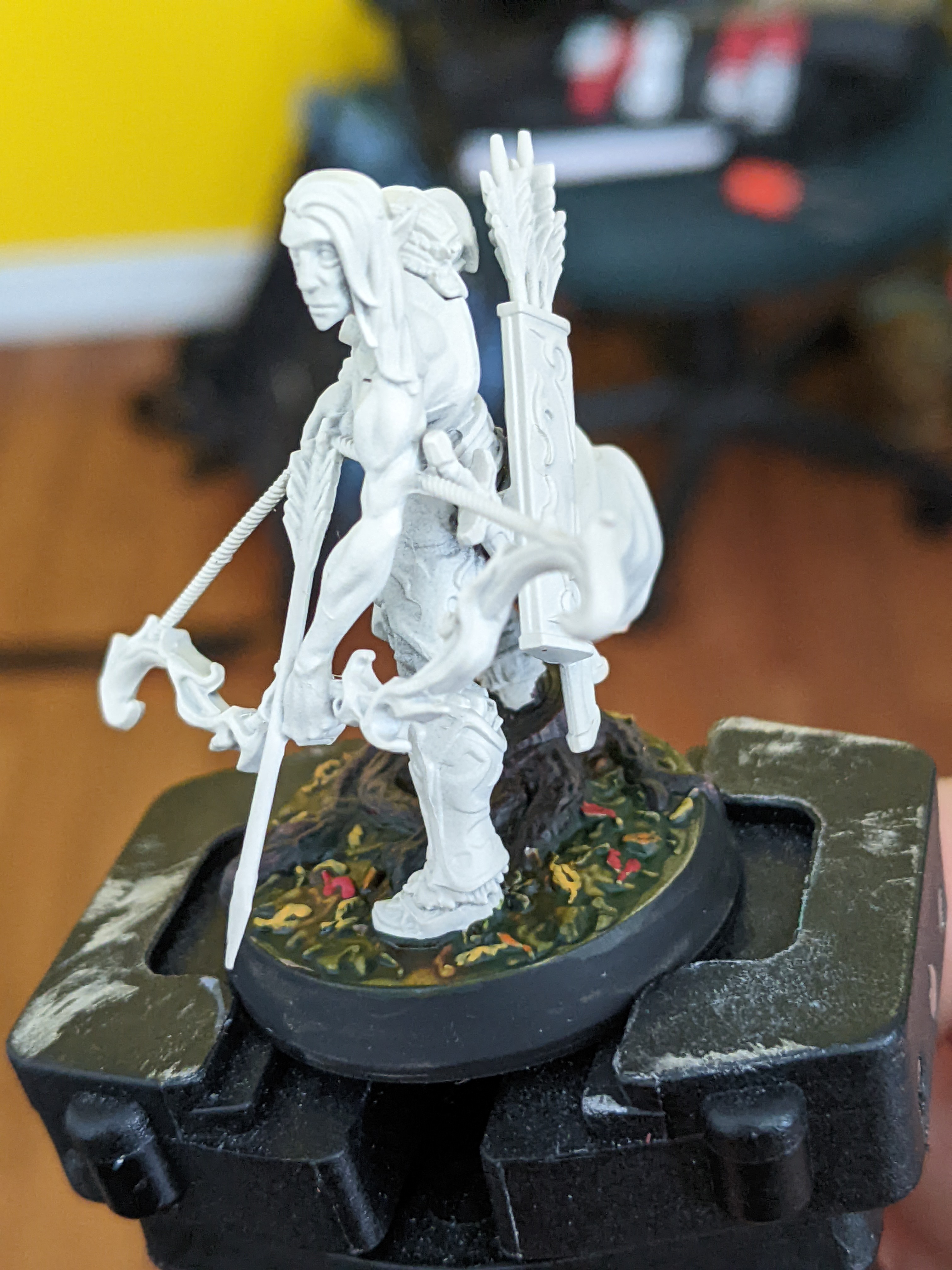
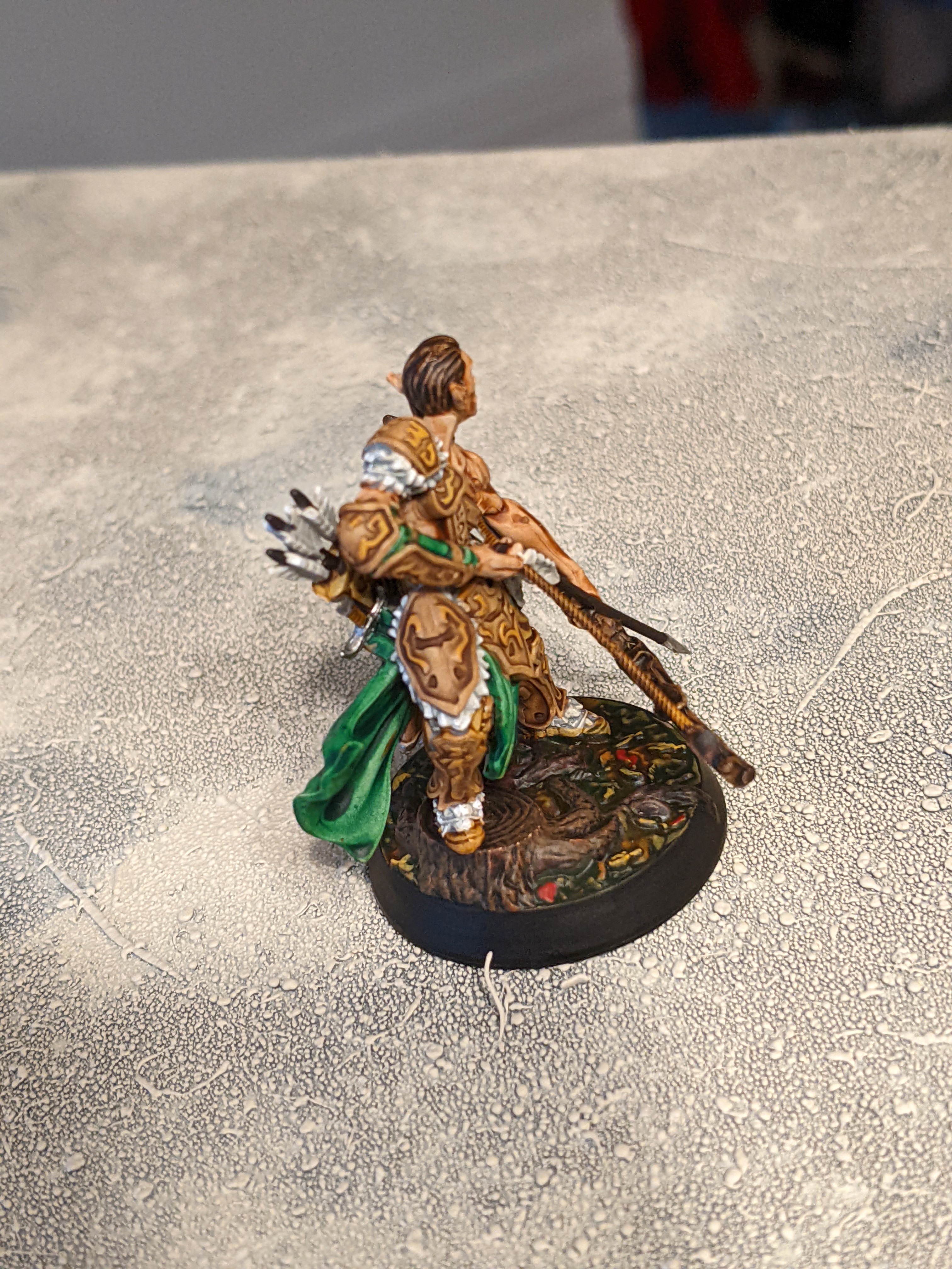
So with that I was pretty darn impressed with the results. Yeah some stuff didn’t work at all because of the darker underlayer and some stuff doesn’t look great because of the colours used but when it works or is used widely it looks really great. And keep in mind these 6 models only took me maybe two hours with the prime and drybrush as well. So yeah I think these will work well for painting quickly to a decent standard.

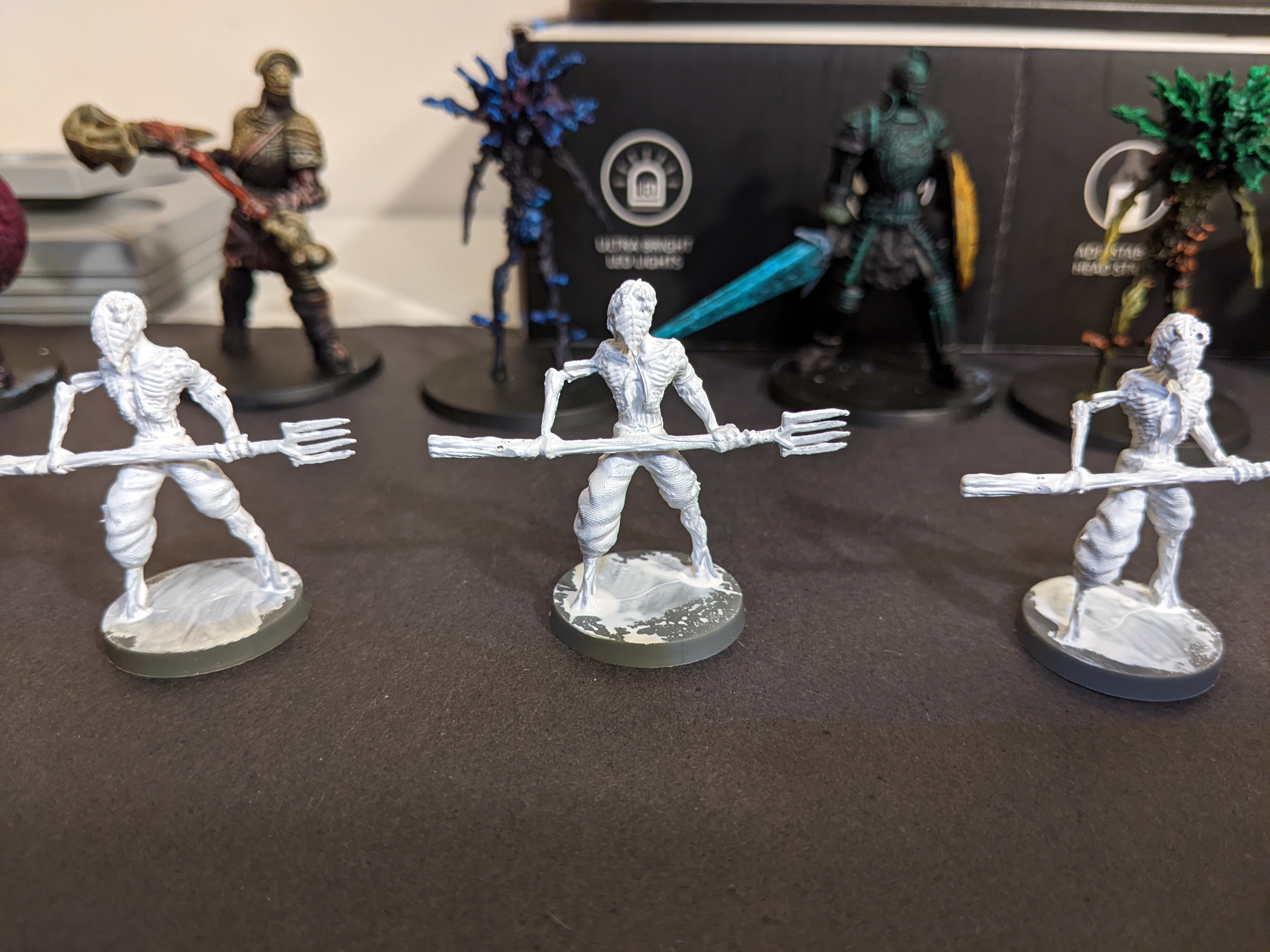
But some of the colours didn’t work because of my underlayer was too dark so out of curiosity I did a few more to give them another chance. I did three more models but instead I just did white prime job.
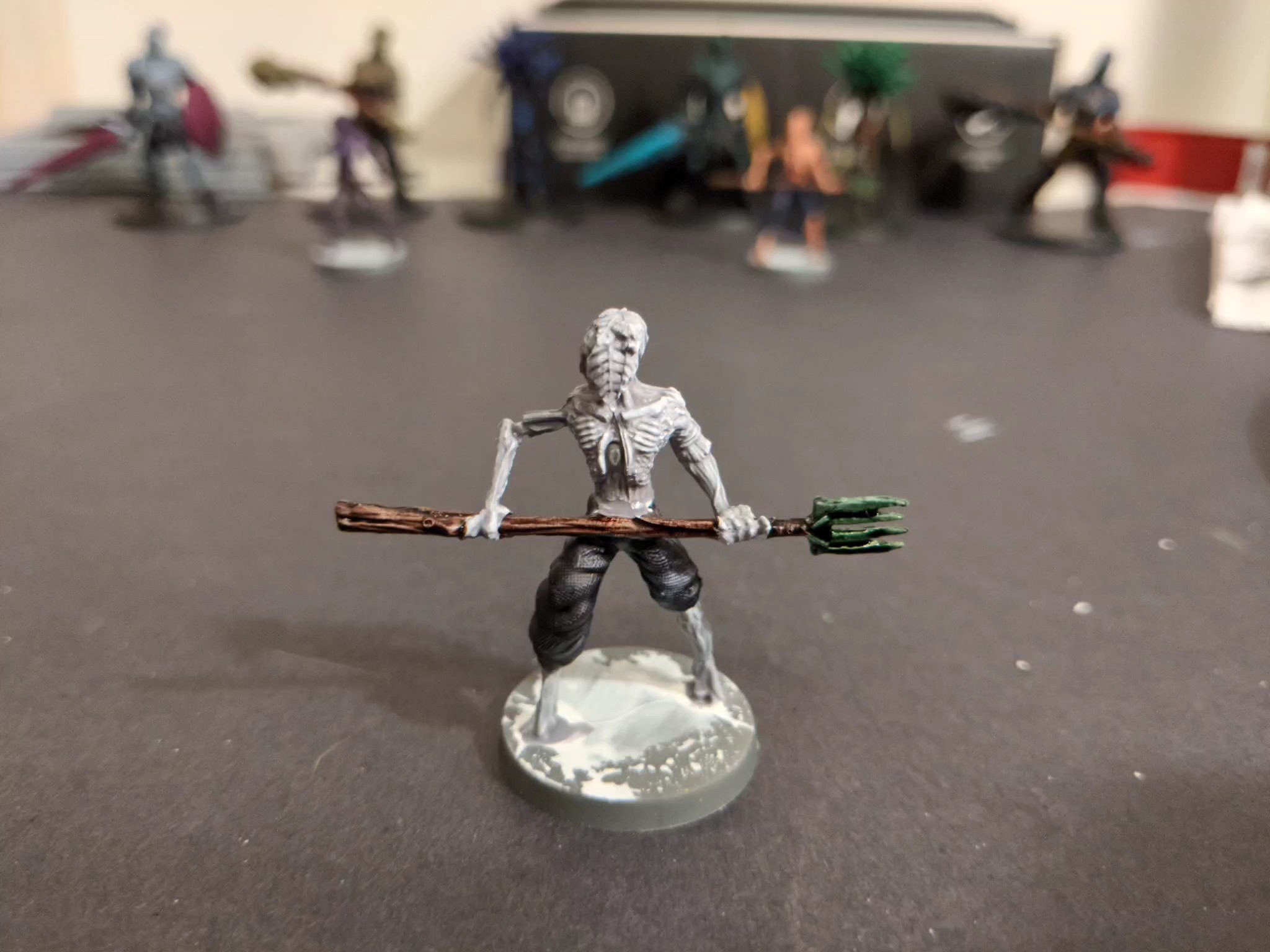
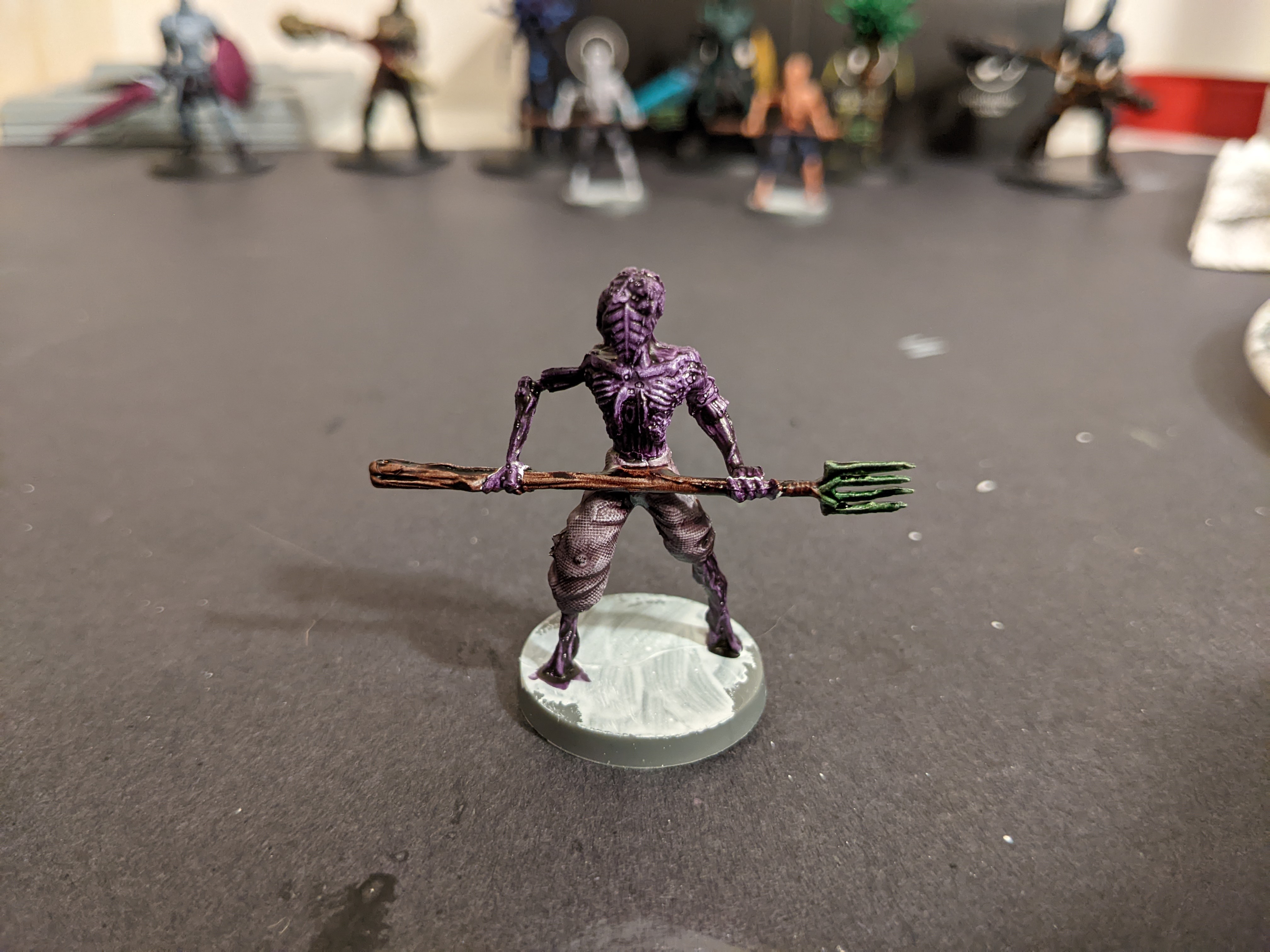
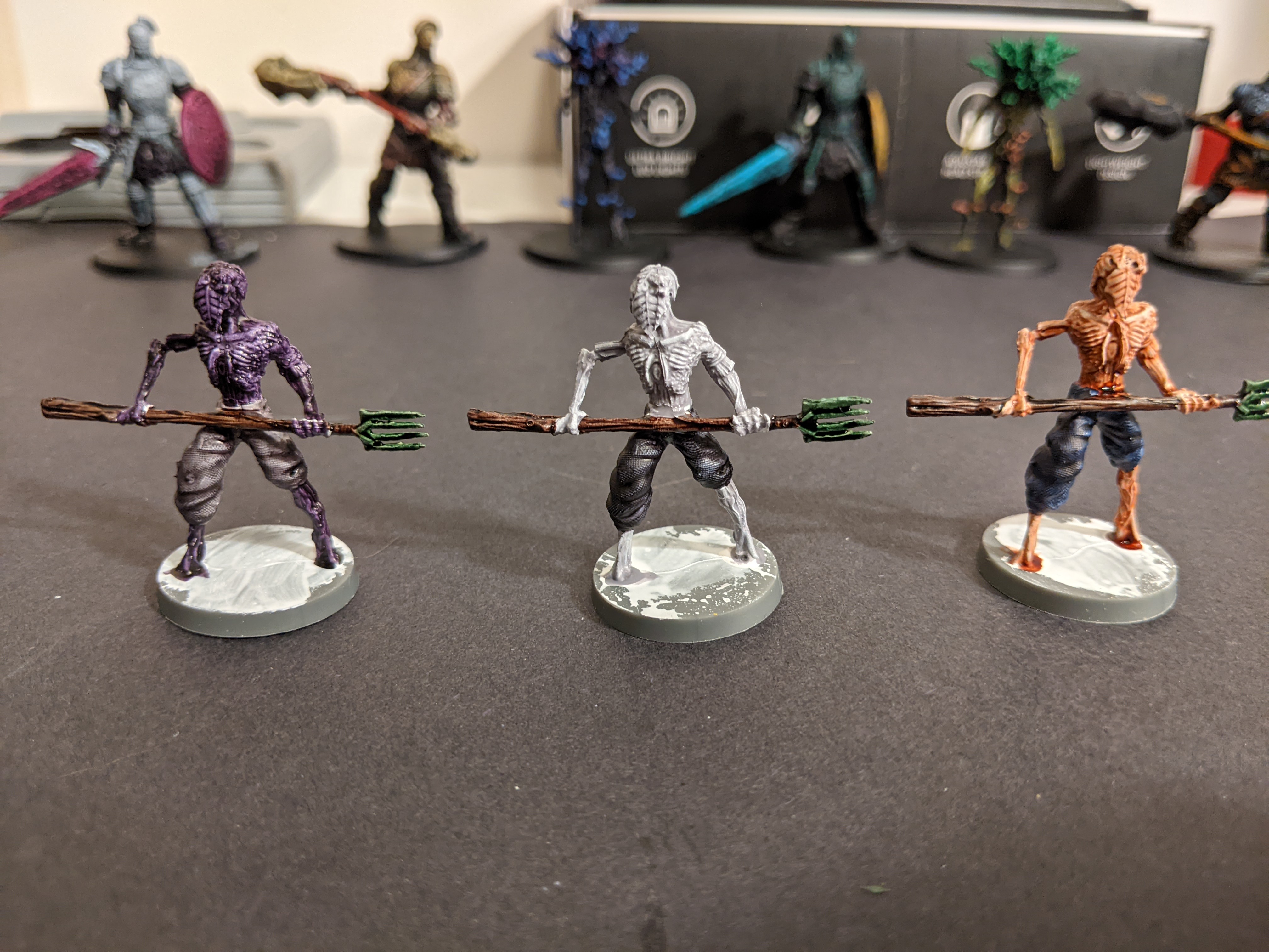
The models are smaller ones from the same set some plant monsters with pitchforks.

So with those ready here are the colours I wanted to try again.

Mostly the ones I thought went too dark before.
So each ones pole got Dark Wood for the handle, and Camo Cloak for the fork part. Then they got a “skin” tone and pants.

Monster the first

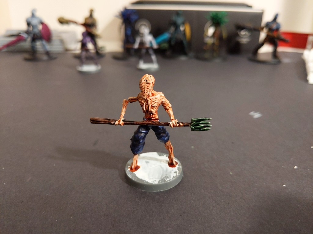
Ewww. Well that worked. That Crusader Skin looks very fleshy over the white and really make this guy look mosnterous. The Cloudburst Blue got the redeem itself too making the pants look very much like denim.

Monster the Second

Even over white that Holy White looks pretty gross. I don’t really think I’ll use this one and I shudder to think of what a stormtrooper would look like using this. The Grim Black is still very black as well so that one is probably not going to get used too much either. Not great here.

Monster the third

Okay a bit different but it’s not bad. The Gravelord Grey lightens up a bit over white which is nice. The purple is still really dark though and should probably still be thinned, even over white.

Overall I’m glad I did a little further experimenting. Some colours got a second chance to shine and only really two are pretty bad. I learned a lot here. Clearly the speedpaints aren’t totally mindless to use, it takes a bit more planning than just slapping it on there but that’s fine and I think with what I know now they will be great for batch painting with a nice looking result. For prime/underlayer I would probably try to go brighter than I did and make sure to do the parts that need it totally white. But yeah I’m still pretty excited about them and their potential. I hope this helps if you were thinking about using them. Happy painting!

10 Likes

It may be the mini or the lighting or something, but next to the other colours that Holy White looks practically unpainted, until I compare it with part of the genuinely unpainted base.

2 Likes

You can tell more in person but it doesn’t change it much. It just leaves a milky grey in the recesses.

1 Like

Thanks for the instructive breakdown. Nice results all in all.

The biggest positive I’ve heard about Speed Paint range is that the intensity of the pigmentation is more consistent across all the paints, which is one of the criticisms of Contrast paints.

The biggest negative is that they can reactive when painted over. I’ve not looked into this at all, just aware that it’s something people have found.

They seem to be very much designed for ‘one coat and done’, exactly as they are pitched.
(All second hand reports mind, I’ve not used them, or Contrast, myself)

2 Likes

And here we are, yet again… mini and heart in hand.

This time I attempted Galaden, the elven… hunter?.. from Descent 3rd Edition. Used the “Nerd Knight” tutorial again, which I want to stress is not bad. It’s fine! He does fine. Perfectly acceptable tutorial, glad it exists.

But gosh Sorastro’s are so much better… but that’s okay! The existence of “better” should never stop people from trying, right? Right.

On with the show!


Just a simple black wash on the ground and then brown for the tree stump Galaden is standing on. Black wash on the ground was an oopsie… should’ve left it… but whatever, end result will turn out fine.


Fallen leaves! Fallen leaves! Fallen leaves on the ground… sorry, now I’m gonna have that song stuck in my head for the rest of the evening. ANYway! Base done, drybrush of brown on the tree and then a bunch of contrast paints followed by yellow, orange, and red leave highlights. End result is pretty good.


Flesh contrast paint on the skin, dark brown on the arrow shafts, bow, and hair.

Gosh flesh contrast paints are great.


Okay, so decided not to use contrast paints for the light browns (armoured sections of Galaden, mostly, plus quiver). I think it was a mistake… the final results aren’t remarkably better using “base colour plus wash plus highlight”, but whatever. What’s done is done.

Cloak was done with green contrast paint, though (technically “Ork Flesh”, which is a little grim if you think about it too hard…).


Speaking of washes! Brown wash in all the light brown areas, and then “Apothecary White” for all the fur and fletchings. Oh, and yellow (Avarland Sunset, I think?) on the raised details on the brown areas.


White highlights on the feathers and fur, silver on the swords and arrowhead, green for the eyes.

Boom. Another one down. That leaves just one hero… I may try to finish her tomorrow night, just so I can say I painted all of them in March? I probably can’t, but I’ll think mighty hard about it.

5 Likes

A couple of battalions of French Line Infantry, plus skirmished bases.


8 Likes