I really like these two for looking largely like actual objects which are contemporaneous to their themes.

3 Likes
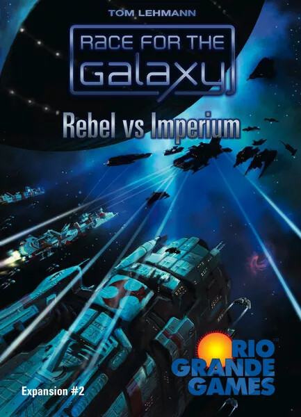
Yeah, I was actually going to comment about how I love RftG for nailing that 60’s-80’s scifi vibe.

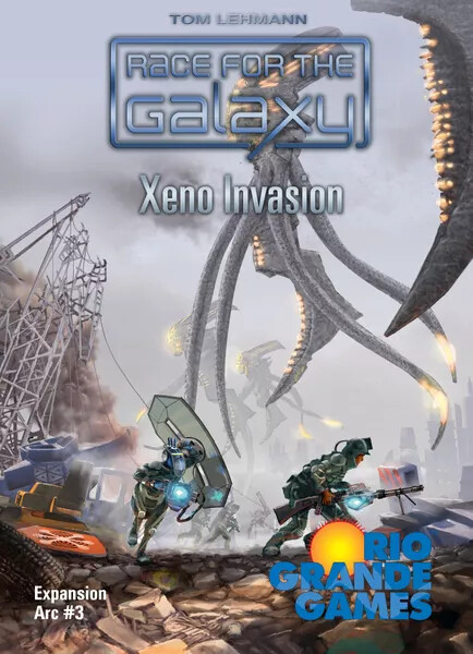
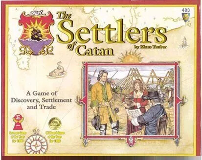
And Race for the Galaxy:

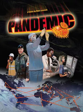
The Tick once monologued on how Science used to be BIG - zeppelins and flying fortresses and hollow mountains and underwater bases. These days it’s all molecule molecule molecule…
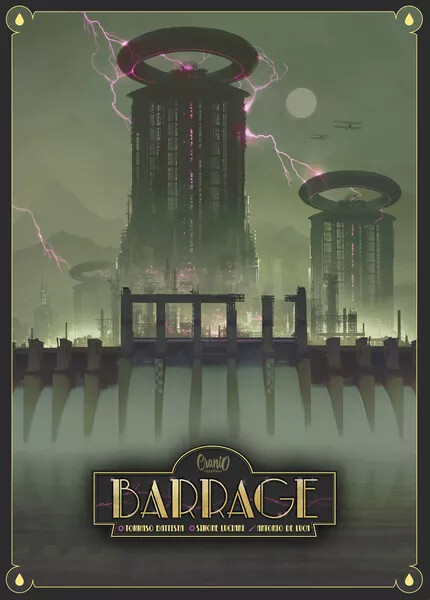
RftG captures that old science feeling. Barrage too.
4 Likes
That font for Barrage completely clashes with the image. That font belongs on some hotel management game or something.
4 Likes
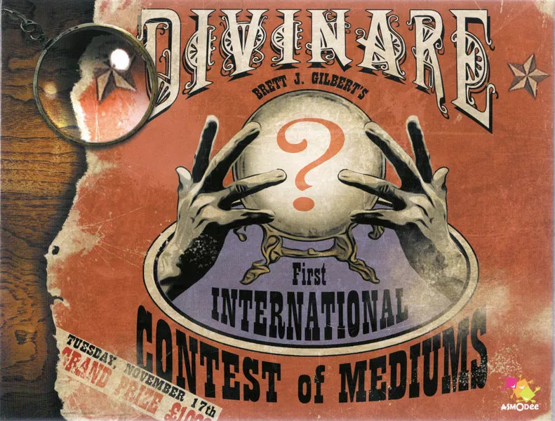
They’re trying to capture that “old-timey” feel by using an Art Deco-esque font. A great idea, but they could have gone for a different font in this execution that still feels Art Deco.
3 Likes
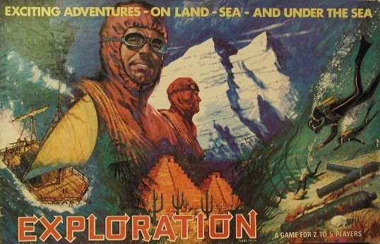
From my early childhood as inherited from my father and still giving me many happy memories. By today’s standards, the game wasn’t great but I loved the theme and approach to building your team and equipment before setting off on your expedition.
4 Likes
These are the worst that come to mind:

Those people fall in the uncanny valley for me. Actually, this thread (along with @lalunaverde’s “games that fit into their expansions” list) has inspired me to finally get Skullport - downsize on the shelf and upgrade the imagery.
This could benefit from some googly eyes.

Paul Sottosanti was my best friend in high school. I pity bought this to support him but ended up liking it so much it killed 7 Wonders and that got sold instead. It sounds like there were a lot of better names during development but Lookout banked on the real Neom getting more press and becoming a thing. Oops.
The dude there looks like Paul at his most hippy phase. His dad’s like a neurosugeon or something and he ran from that tree as hard as he could at some point.

This is the biggest cringe on my shelf. Those “asians” look like white actors in 50’s era asian make-up.
2 Likes
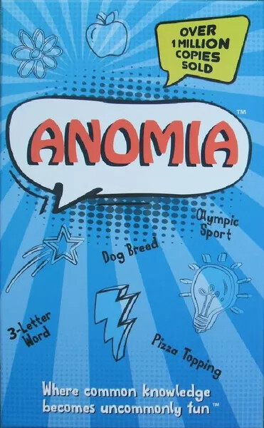
If we’re doing bad ones, I think Anomia and 6 Nimmt are tied for the title of “great game, but what the hell was the designer thinking??” (And there are many other editions of each which are similarly bad.)

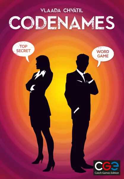
Honourable mention to Codenames for being bad, but mostly just because of how boring it is.
4 Likes
So 6 nimmt has the Hornochsen… because being a Hornochse is being an idiot… I am not sure „bullheaded“ is the same. I like the anniversary edition in blue a little better. But I am not sure anyone is thinking very much about the huge number of small cardgames that come out every year at Amigo ![]()
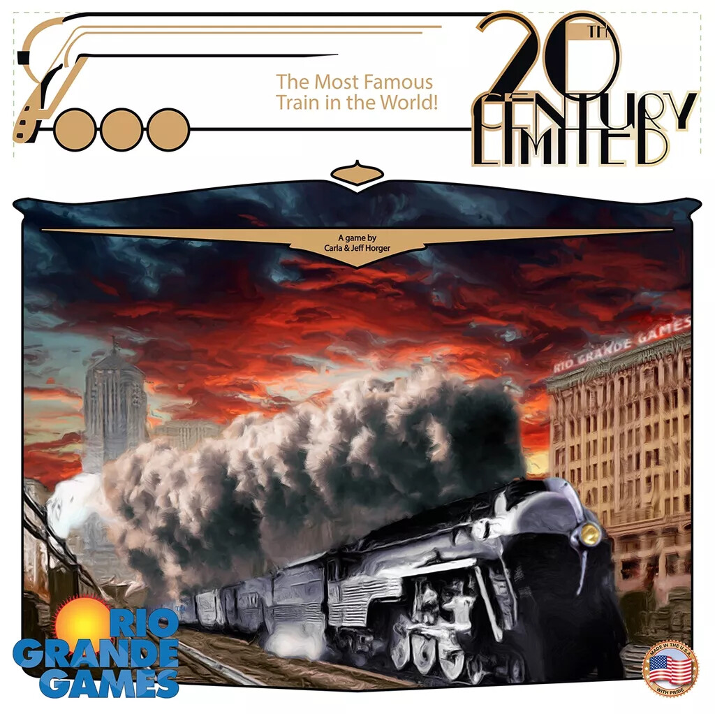
@pillbox that „art deco“ game… uhm… I hope you meant it as an example of how not to?
If you want to Art Deco how about this one (as an example I like):
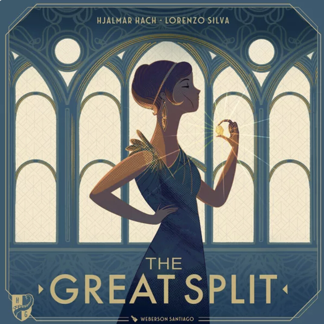
(of course it‘s blue)
4 Likes
Quite. That is, unless you can just slap an Art Deco font title on something
3 Likes
What is the most famous train in the world? I would have guessed Thomas. That train doesn’t look like Thomas.
3 Likes
I would suspect either the Orient Express or the Flying Scotsman
3 Likes
Oh yes, and Stephensons Rocket. What is that train??
2 Likes
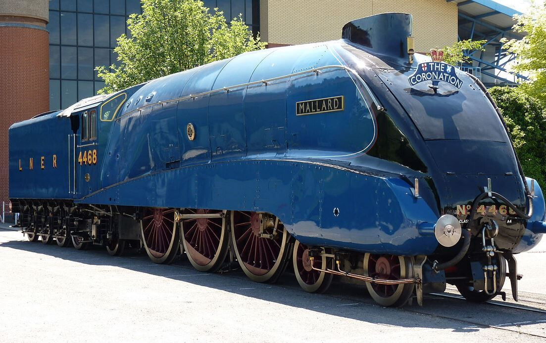
I think there’s some confusion here between famous trains (like the Flying Scotsman, Orient Express…) and famous engines (such as Thomas, Mallard, and, somewhat unhelpfully, the Flying Scotsman).
5 Likes
I think we could power a city block on the differential between what train people know and the rest of us.
4 Likes
Well, maybe on what they know about trains. But - do they know anything else??
2 Likes
Why would they need to know about anything else?? ![]()
4 Likes