Topic of the Week: Box Covers

Well the version of Die Macher I used to own was so ugly irl that the screenshot of the cover doesn‘t do it justice.

This yellow white tone that looked like it used to be white but was stained with tons of cigarette smoke:

And the „inspired“ collection of the state heraldry…

2 Likes

Does anyone know if Feuerland didn‘t have enough money for a full cover?

It is such a good game. I only wish it had a cover to go along with it. It‘s just not fully there… I mean most of the huge box is just a wash of blue and green… why? This looks like I could have photoshopped it and my photoshop skills are abysmal.

This is not terrible as much as it is embarrassing.

2 Likes

I’m in the OG Inis camp, and that’s the copy I have. But, reboxed in the expansion. Because it’s just a perfect fit. Who couldn’t?

I also need to post this here:
https://www.reddit.com/r/boardgames/comments/x2kt0r/aigenerated_box_arts_any_of_them_tickle_your_fancy/
The reddit conversation in the comments had me in tears.

1 Like

I like this an an object, not so much just as a cover.

2 Likes

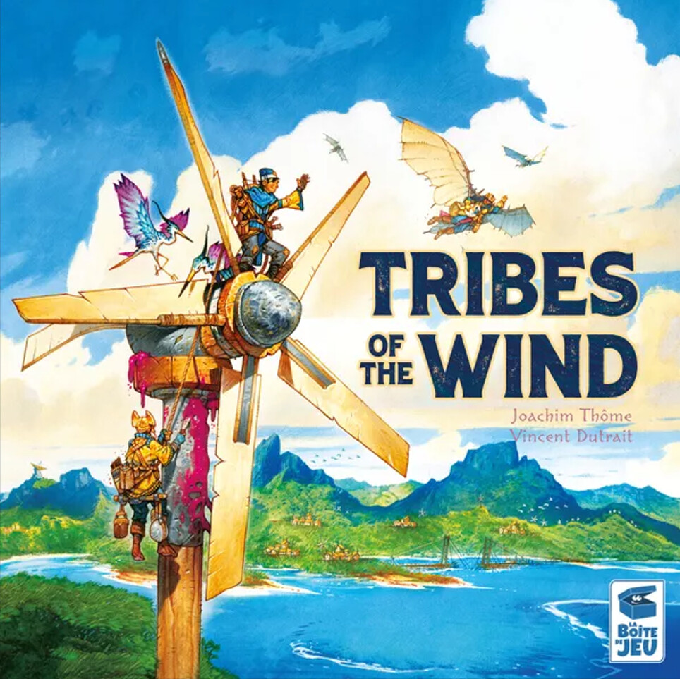
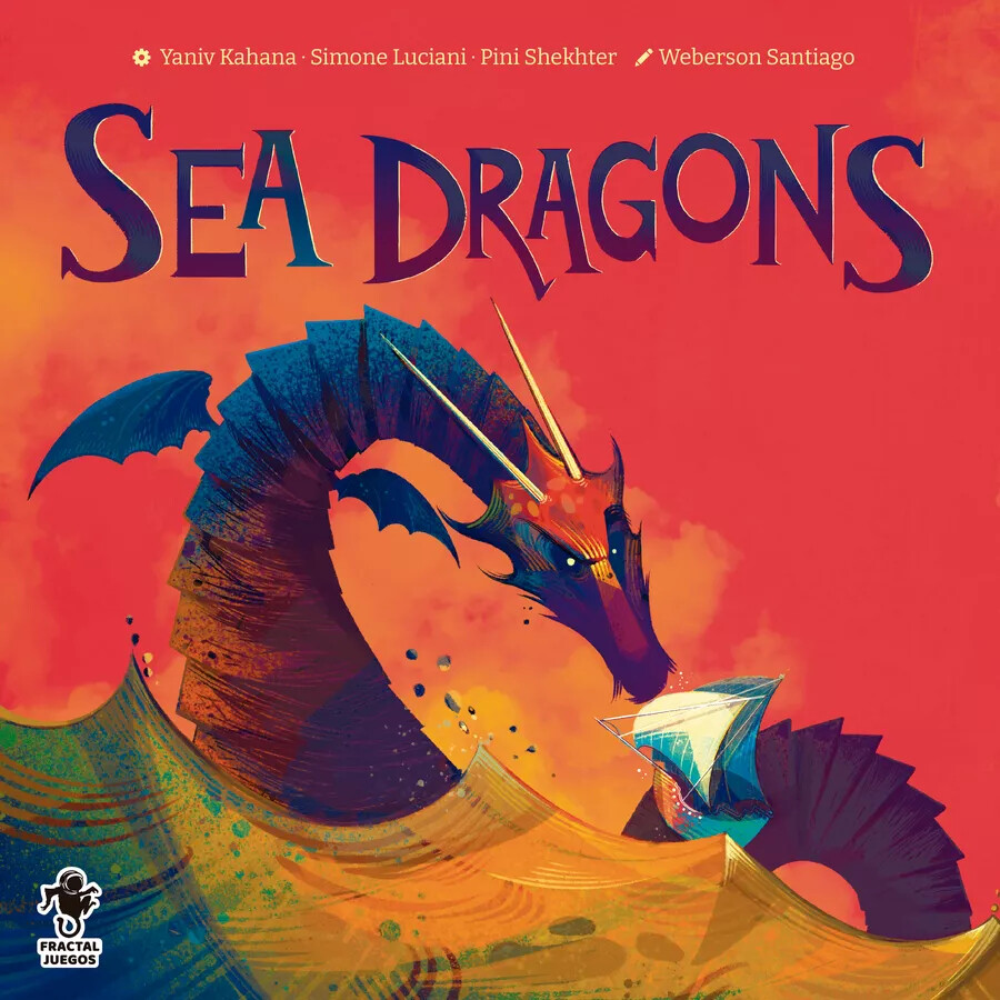
Im always fond of box covers that gives me a sense of adventure, like those type of children books. I understand that some people don’t like Vincent Dutrait precisely because of this. I feel the opposite on Dutrait

Noria wasnt by Dutrait but it has the same vibe

Indonesia is simple and so beautiful

And then you have something zany like Cosmic Frog

And Troops on a Map games need to show action. Kemet and Glorantha got this one right imo

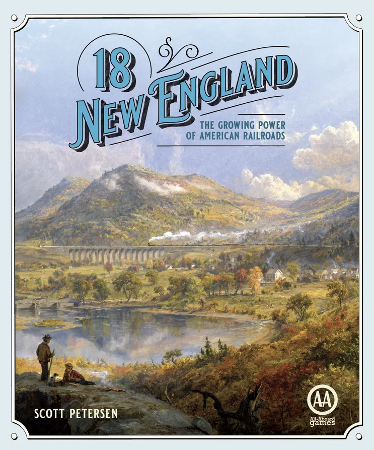
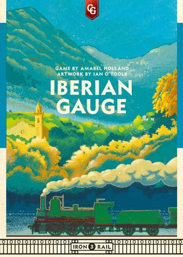
18NewEngland remains my fave from train games due to the fact that a train isn’t the central focus of the box cover lmao, but rather the landscape. Surprising but trains aren’t actually my thing…

Man, just give me landscape-focused covers and I’ll eat that all up

4 Likes

Glad to see I’m not alone in appreciating Indonesia.

Bios Genesis just looks like a bad Photoshop collage to me though.

2 Likes

It does! But it’s charming for some reason??? But then I’m one of those weidos who think Terraforming Mars art is just okay.

2 Likes

Actually, this makes me wonder - how well maintained is CMYK vs RBG knowledge going to be in this digital art design age? Is that importance recognised by publishers? The public? When everything is designed on screen, marketed on screen, how much weight is assigned to colour gamuts that look better in print?

2 Likes

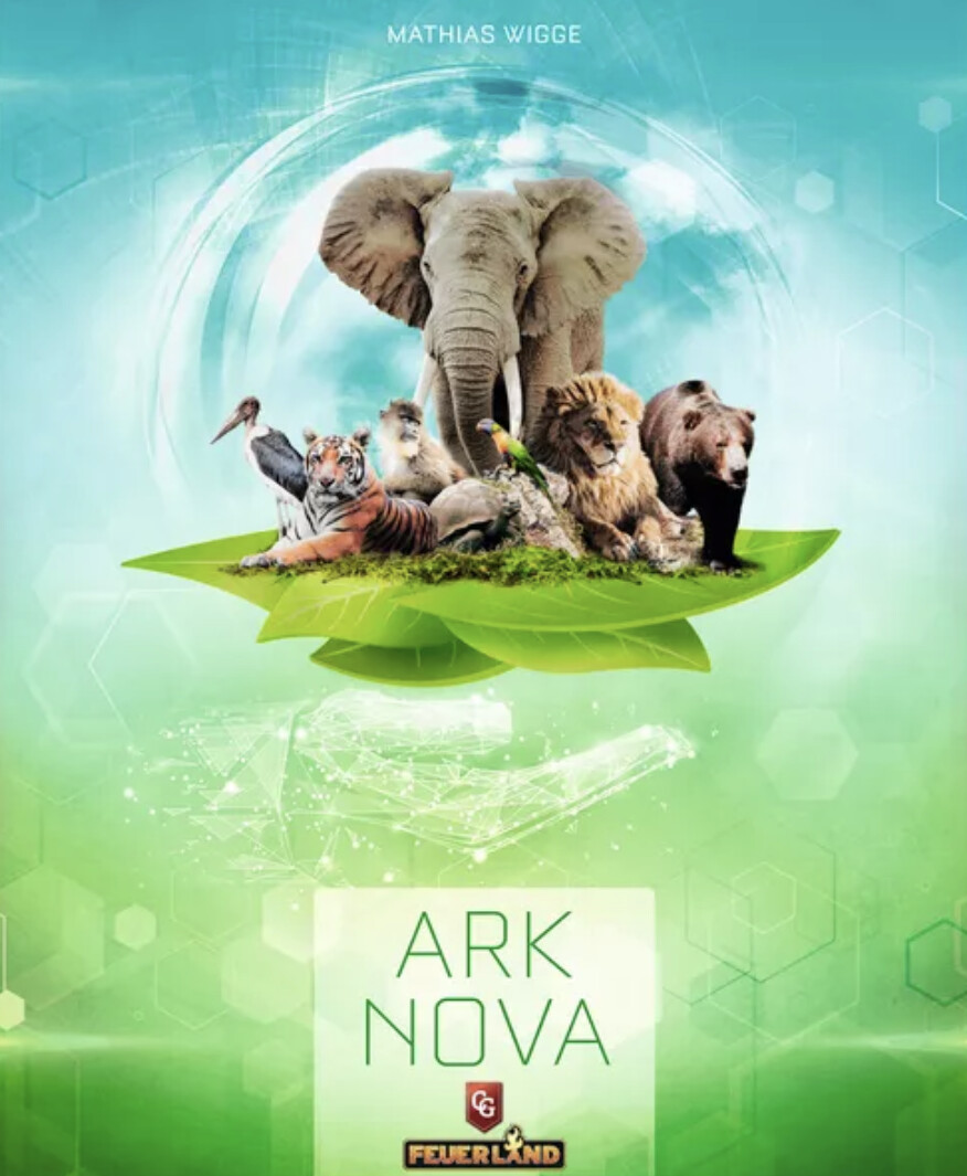
I am utterly convinced Feuerland realised a boardgame about zoos had a lot of mass appeal. Too much mass appeal! It’s a heavy game. What if someone buys it for their child because they like monopoly??? The answer is to hide anything attractive about the game. Make the title Latin for no reason, so people don’t even see Zoo on the box. Bring out the Encarta 95 clipart that doesn’t even fill the space. Make the pieces look as plain as possible.

4 Likes

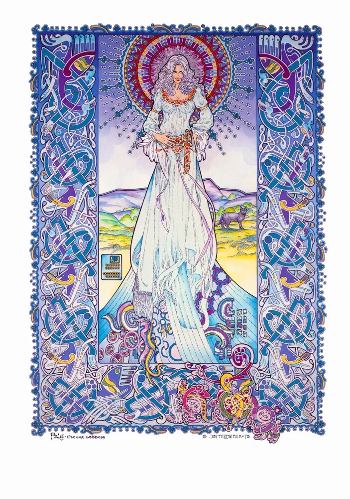
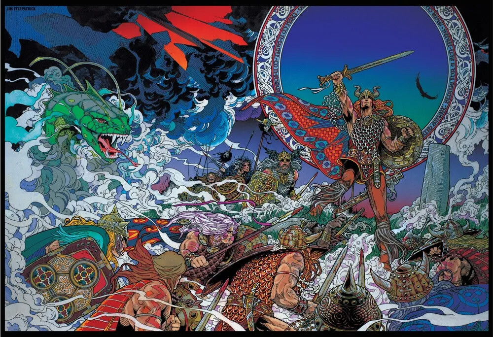
I’m so torn about Inis. The newer cover does look aesthetically better, but it does so by mixing a modern colour palette (that greyish dark blue, the most modern of colours) with traditional art. The old cover is kinda ugly, but it’s unapologetically presenting the art style. Head and heart :sweat_smile:

3 Likes

The previous discussion on this, bruitist was right to point out that the original image was much better than the version they used for the cover:

(Presumably, they butchered the art for the expansion in a similar way.)

4 Likes

Born to be van art.

4 Likes

Imma get a stick and test that theory.

2 Likes

Yeh, there’s a lot more to the original piece (including nipples).

When you see the original pieces, you realise how chopped up all the art in the game is. Like how this guy:

Is summoning a bunch of serpents:

Or that these guys:

Are just background characters:

8 Likes

I like it, too. For similar reasons as Pax Pamir (minus the purple color of course)

And Cosmic Frog is really something else, too. Agree with @RogerBW this should be on vans.

I like Dutrait. I forgot Unconscious Mind in my own list above (b/c this time I only looked at games I already have). That‘s half a Dutrait.

And talking about games I don‘t own (yet):

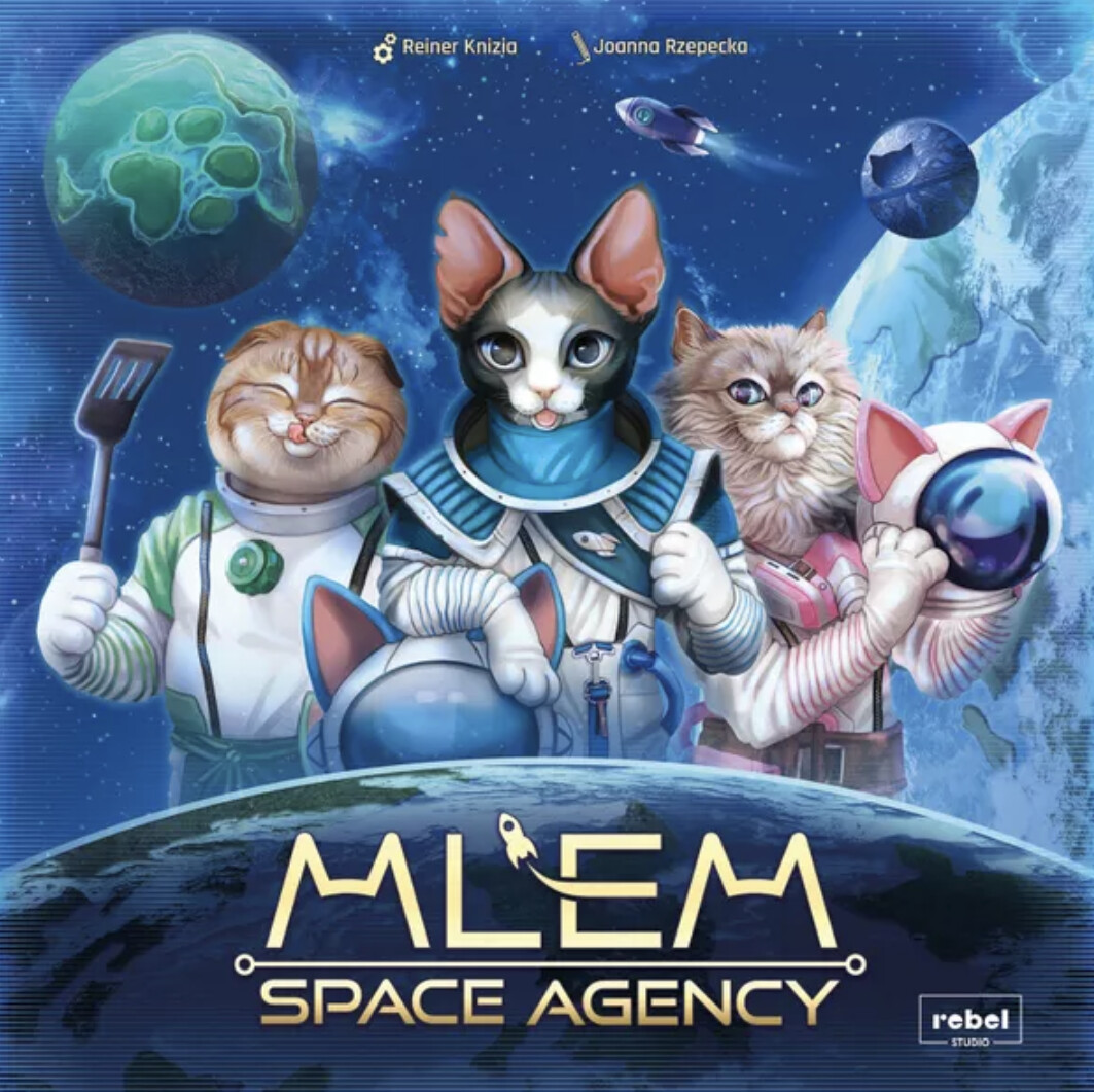
This is a true work of (reddit?) art and one of the best Knizia covers forever. Because cats of course. What else?
(also the font. Apparently a good sci fi font makes any cover instantly better)
This is Joanna Rzepecka first art credit on a boardgame. I got curious.

Blue is generally a good color scheme and very common on covers. I have a whole shelf filled with games with blue covers. Which is why Merv is so interesting in completely leaving anything even reminiscent of blue out of its palette.

4 Likes

The nipples don’t surprise me at all, as the Inis expansion art looks remarkably like something by Milo Manara.

I’m most definitely not posting a link to his work and anyone thinking of googling it themselves needs to be very aware that they could very easily stumble across something very rude indeed.

1 Like

My favs not shown yet:

pic3209553

4 Likes

Looked up Sea Dragons after listening to the most recent SU&SD podcast and the Weberson Santiago cover is lovely (as is to be expected).

5 Likes

I’ve been reading SENET magazine, which has boardgame art as a major theme. In that issue they’re interviewing Adrian Smith:


4 Likes

Oink Games do a lot with a little space

pic6398727

Scout is a particular favourite

Also the Ian O’Toole love in continues with the Iron Rail series

pic6336687

I do like more evocative boxes, if I didn’t like the games I’m not sure I’d ever suggest Power Grid or Race for the Galaxy

pic4459753

Although there is a pulpy sci fo charm to RftG

5 Likes