Favorite box covers? Worst you’ve seen? Boxes that give you feelings (of any sort) when you see them? Preferred editions or multi-print games?
Share the image and share the story (or just why).
Favorite box covers? Worst you’ve seen? Boxes that give you feelings (of any sort) when you see them? Preferred editions or multi-print games?
Share the image and share the story (or just why).
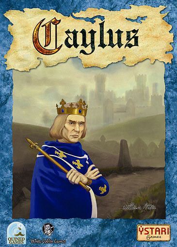
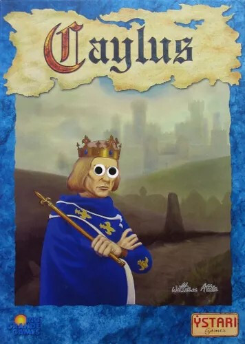
As a fan of interactive euros I’m a fan of a box cover where someone looks disappointed in your efforts. The best example is Prince Philip on the box of OG Caylus
He looks like my wife as any contractor leaves the house.
“Well, we can’t build another castle at this point so I guess this is as good as it’s getting…”
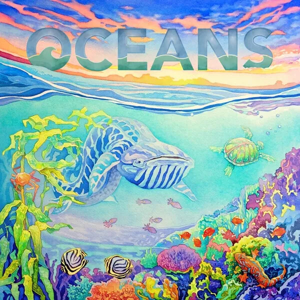
Kwanchai Moriya is awesome
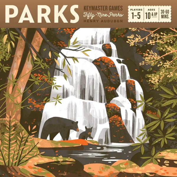
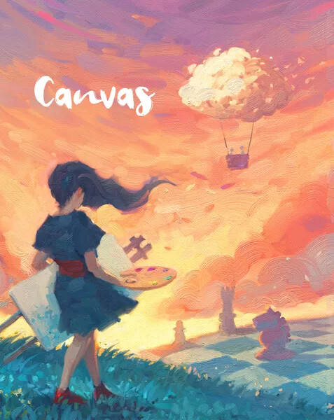
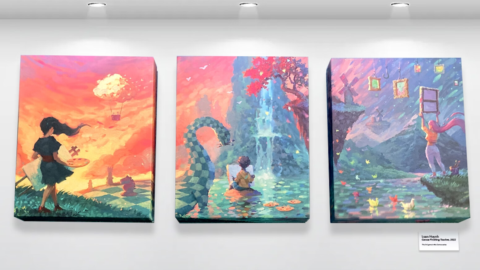
I have Parks and Canvas and would definitely put them in my list for art, yep.
Also, hats off to Canvas for this:
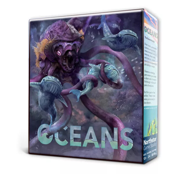
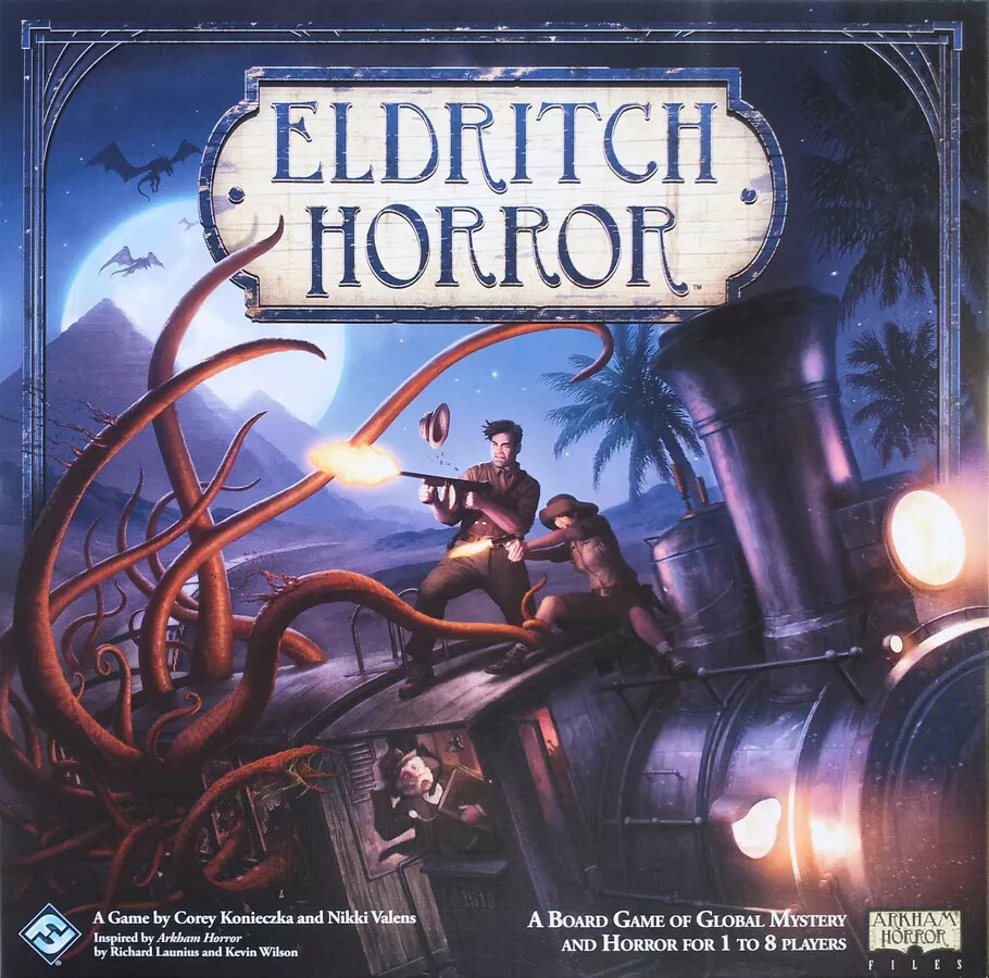
And I have to give a shout out to Eldritch Horror, for giving you exactly what you want: tommy guns vs tentacles on a moving train. Awesome.
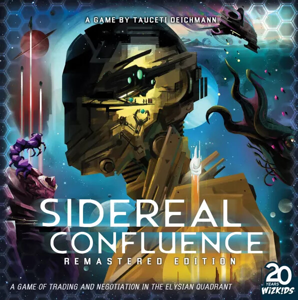
New Sidereal is absolutely one of the best. It‘s one even my partner who is not really that much into games named.
Parks also makes my list. I like the illustrative style.
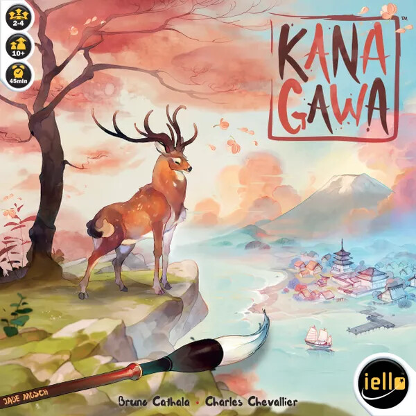
@SteveB_uk and Kanagawa is also on my list. It is possibly still in my collection because of the cover? No it is also a good game.
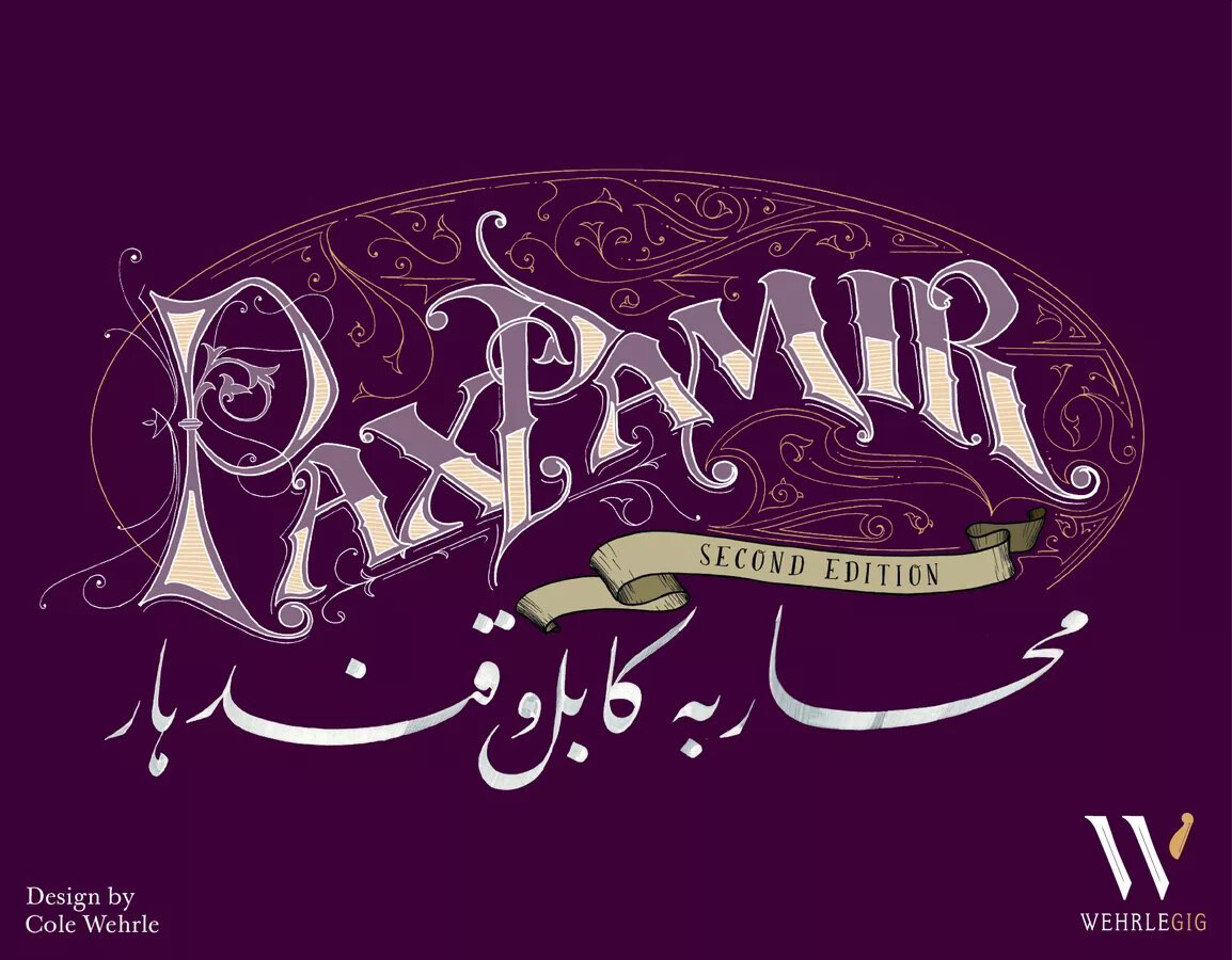
For some odd reason… I love this cover. I know it is just a fancy font and a bit of pattern… in my favorite color. This exact shade of purple. Well plus minus a few shades. I can‘t help it. Also helps that I like the game inside. But that color.
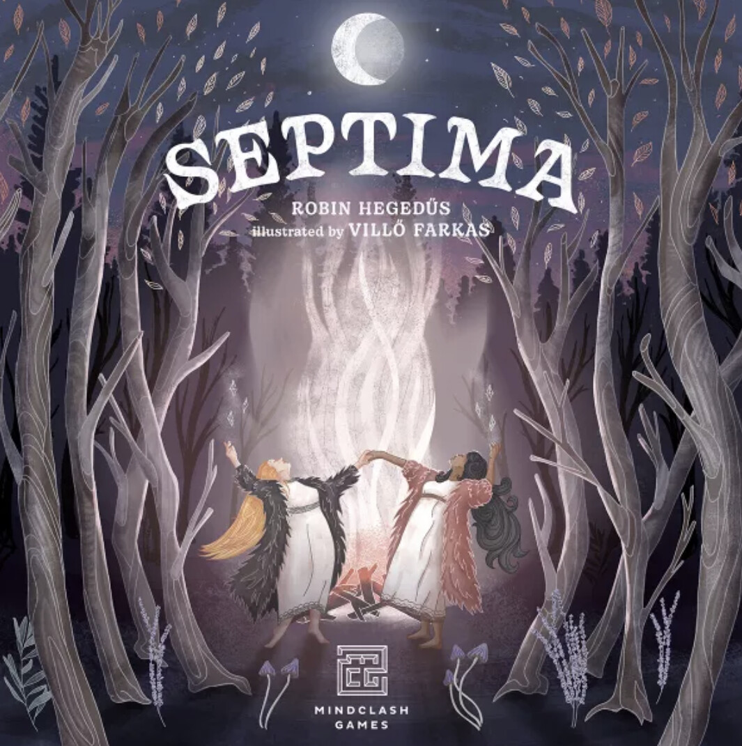
While I am at it with purple. This one has bonus witches:
Also my partner says the illustrative style reminds him of books from his childhood.
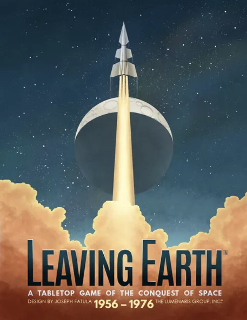
The next one is not purple but one of my absolute faves (my partner said he couldn‘t choose it because he was too influenced by the game inside so his view was biased—he loves Leaving Earth)
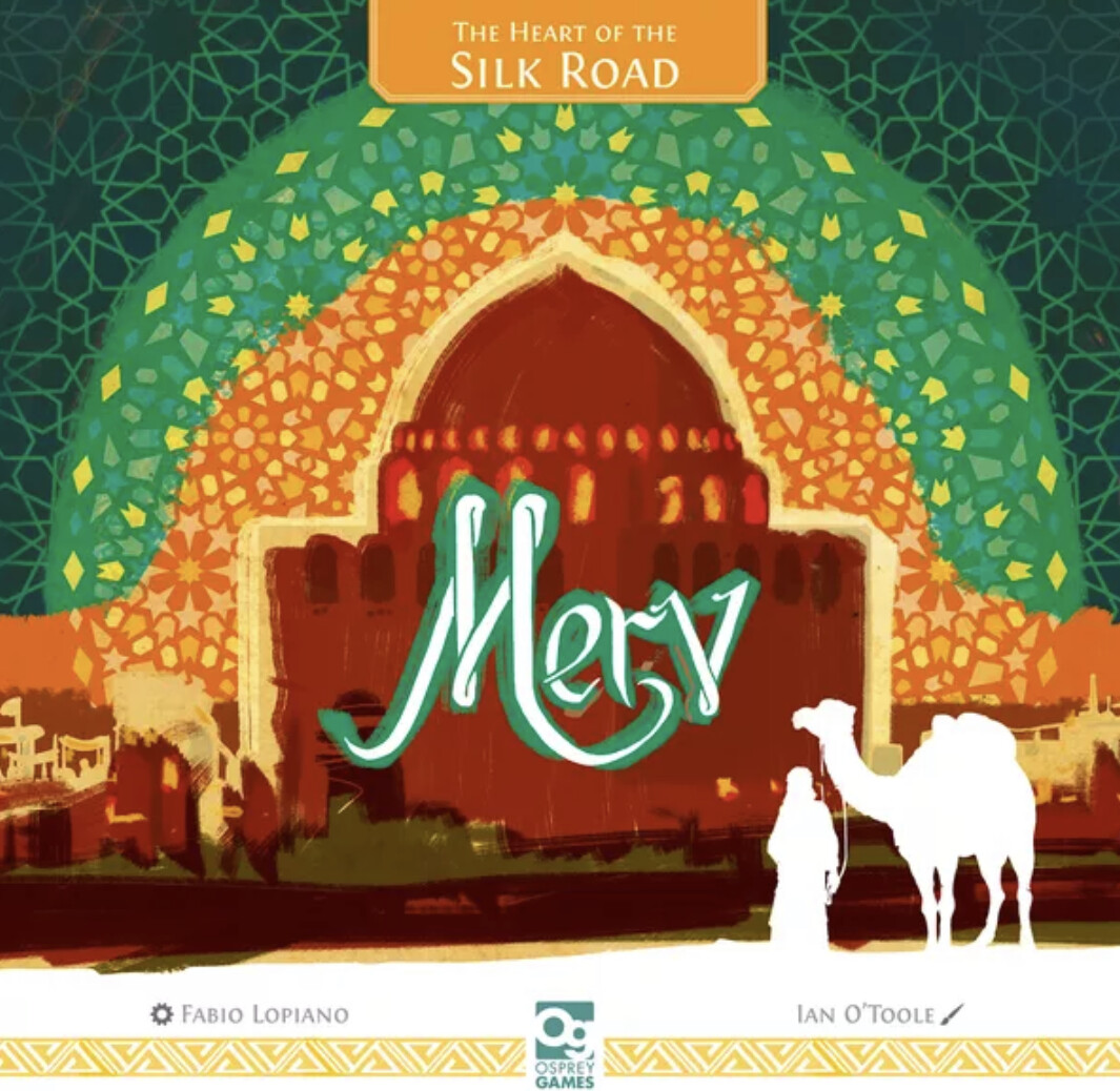
The next one is the first Ian O‘Toole I believe. I could probably also post all other games I have he did covers for (Black Angel—it returned from where I exiled it, Voidfall, On Mars, the new Ra…). Also there is this glossiness in the green lines in the physical version that makes it even more shiny:
Put the next one next to Hansa Teutonica and ask me what is the better route building game (I wouldn‘t know Hansa is on my pile of 3+ player shame). But I can never get rid of this one because outside and inside are just too beautiful. Also it is a good game.
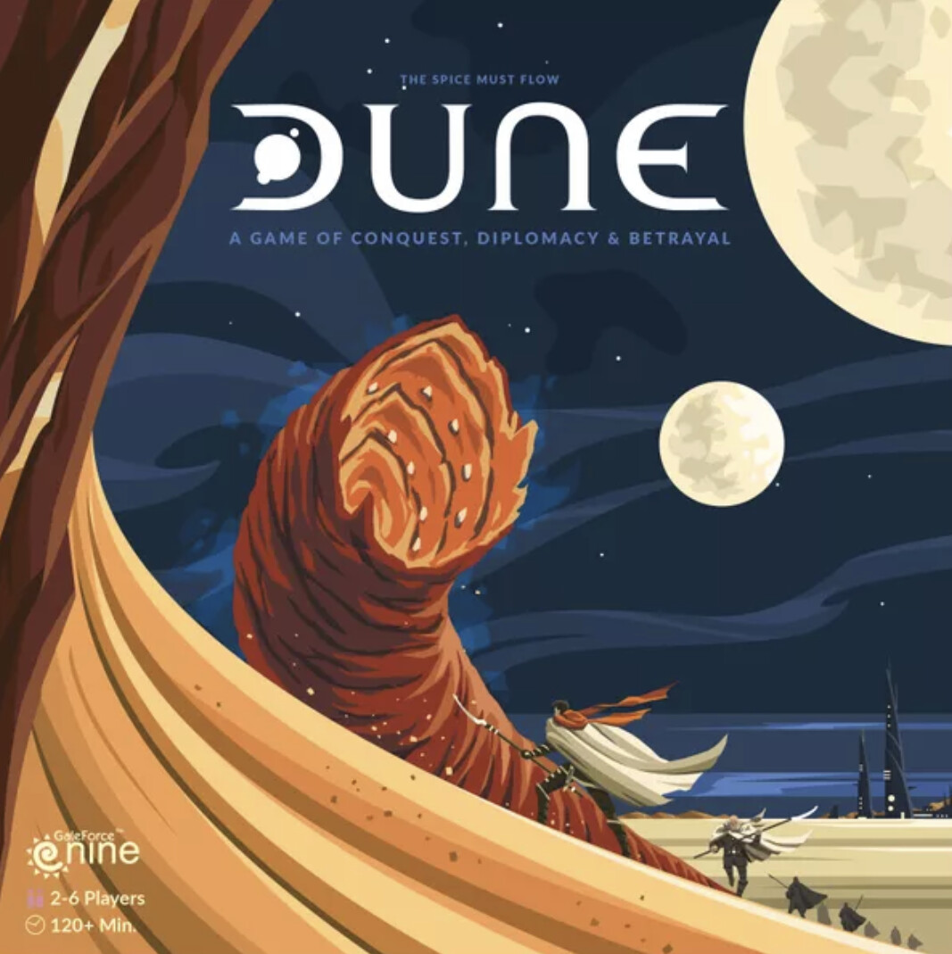
The new Dune also has this lovely retro thing with bold colors going on that I just like:
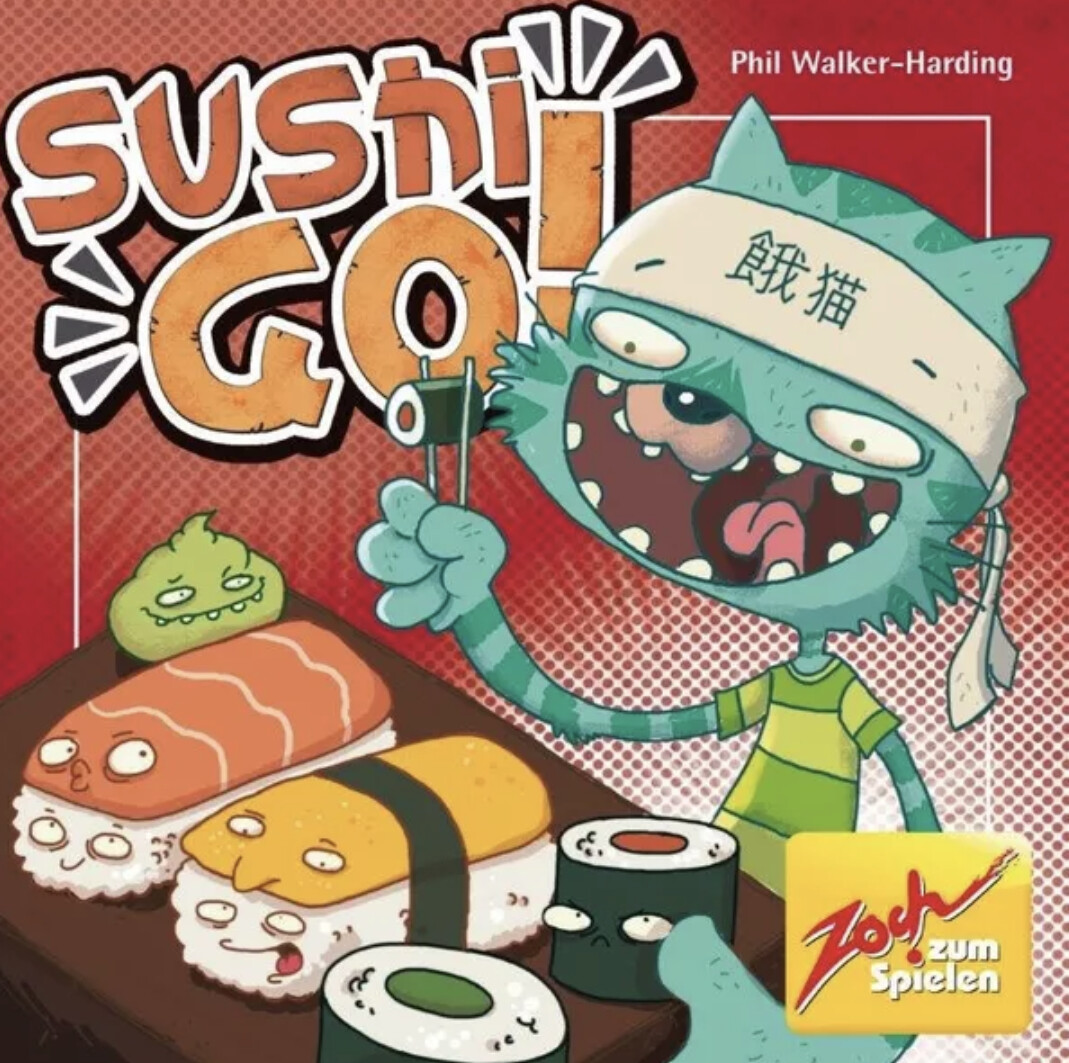
In a weird way I like the German cover of Sushi Go (I know how much „love“ this one gets internationally)
As counter-examples … yellow is the new beige:
Link to the last time.
I definitely prefer the boxes that aren’t trying to cram the entire colour gamut onto the cover.
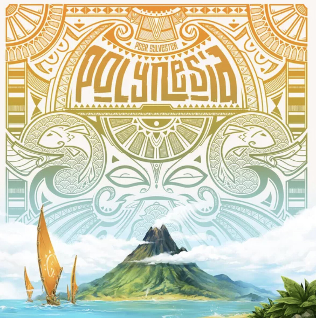
Leaving Earth, Polynesia, and Dune are my favourite mentions so far.
ah I did remember doing something with covers before. I think I am somewhat consistent. obviously i didn’t want to post 50 images here ![]()
I think the art is good, but I don’t like it. Too much red/green contrast.
This, for my money, is the better cover:
Which, sadly, I don’t own. But my copy is actually reboxed into the expansion, which is also lovely (and lovelier than the original art shown above, in my opinion)
Bah! 1st edition Red Lady is better than 2nd edition Geiss!
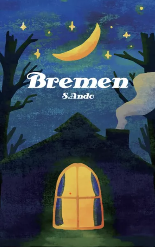
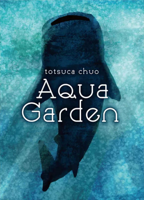
I have a certain fondness for some box covers from uchibacoya. I stopped myself from backing Aqua Garden just enough for the campaign to finish
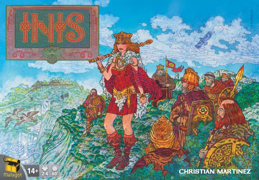
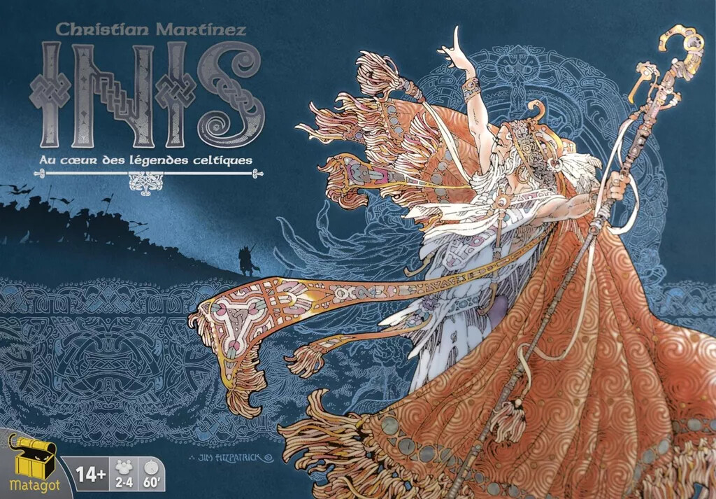
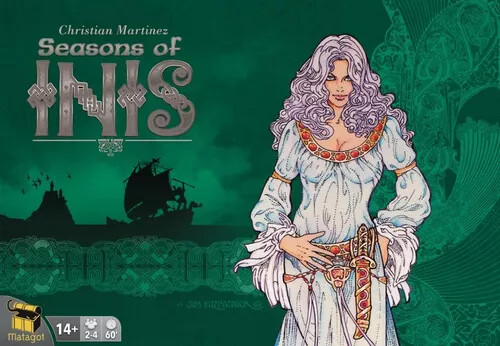
I agree on the new Inis. Much nicer. Sadly the whole game fits into the (also nice but not quite so) expansion box. So the big one is empty… it is on display though ![]()
Old Inis should be on a fridge of proud parents somewhere
Oh, it’s much better artistically, the original is a MESS! But I like it, it lets you know that you’re about to play a game with wildly overpowered god powers because the designers are having fun.

Deserves a mention for being one of the worst I’ve seen.