The Brass example is a great one. The new edition, and Brass Birmingham are stunning IMO and probably contribute towards the gameplay experience.
I’ve got an old copy (1999) of Stephenson’s Rocket which is ugly as hell and makes the game hard to play. Whereas the new edition, whilst no looker is much better and looks as though it would enhance the playability
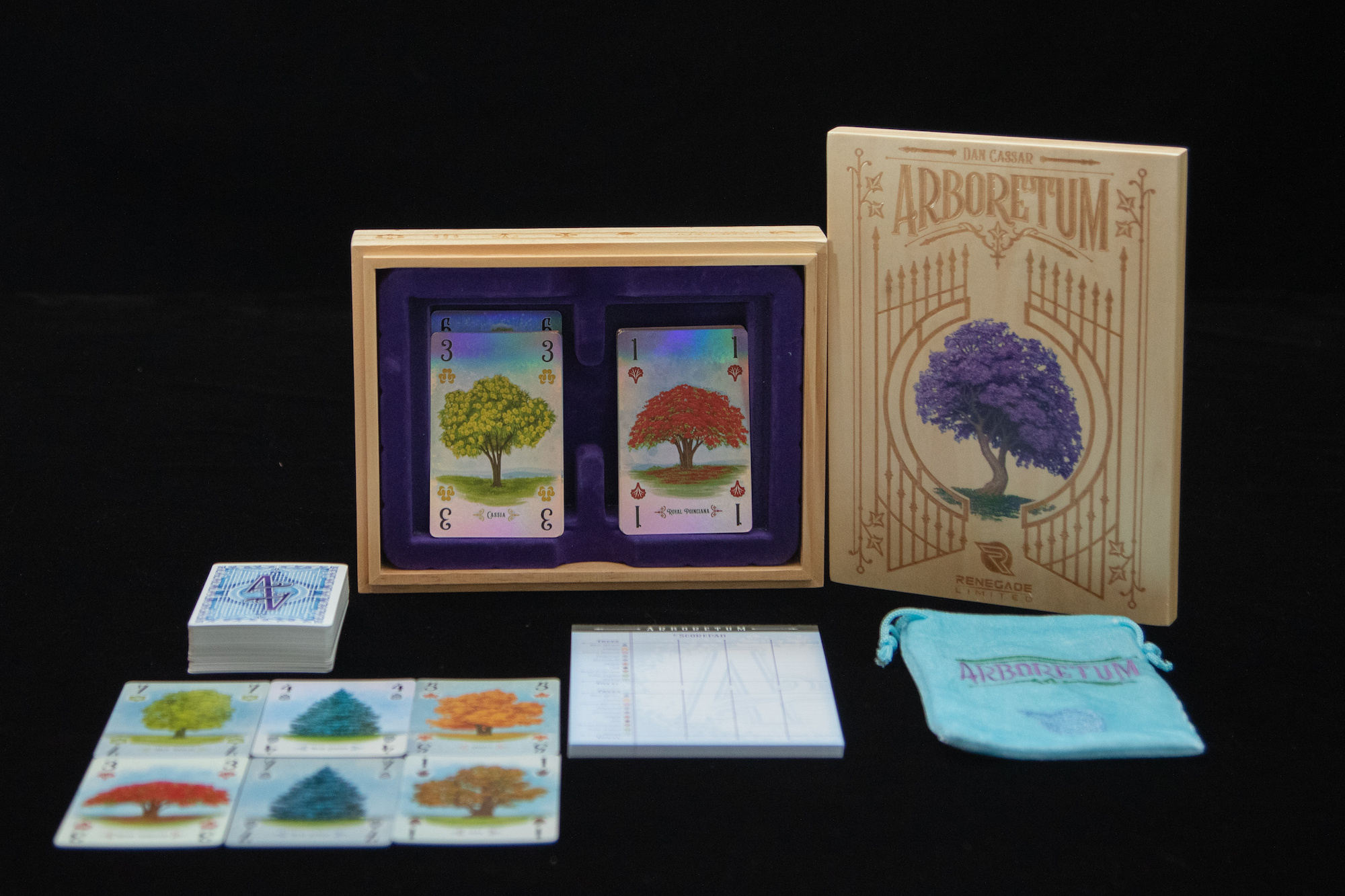
One of the silliest things about that Arboretum reprint is that the new box proudly sported a “Shut Up & Sit Down Recommends” sticker, and at the same time they’d gone and plastered a new logo+name design on the back of the cards.
Not the worst logo you’ve seen by a long stretch, but… If they’d actually paid attention to the SUSD review they were so proud to reference, they’d have noted that Quinns took a few moments to point out that anyone who designed a card game and then put their game logo on the backs of the cards was “an idiot” [direct quote], because look how beautiful the Arboretum card backs were with just some lovely artwork, and wasn’t that so much better?
(And those new card backs then cost them a bunch of money because they displayed the name of the game, but the initial copies they sold at Gen Con that year had “Aboretum” on the backs instead of “Arboretum”, and they decided to destroy the rest of that print run, re-print with the correction, and replace any purchased copies for free on request – and very good on them for doing all that, but it’s definitely “insult to injury” territory in context.)
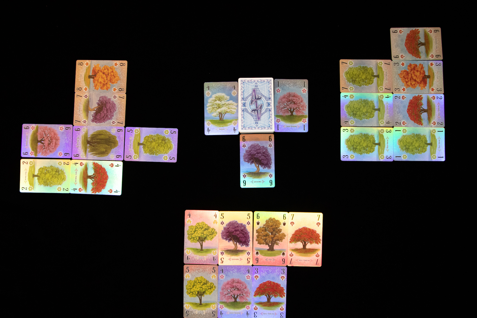
Great thread. One of the great losses in board game design is the original Arboretum art. I have the new edition and it’s very pretty, but it’s not got the same graphic punch.
While we’re on Arboretum, the new “deluxe” edition has some very questionable decisions. The wooden box/felt inner introduces a weight problem which is then solved by the included bag, which is nice enough, but the shiny cards? I’ve only seen people complain that they’re a bit tacky and/or less readable. I’m half tempted to pick up a copy just to see them in person…
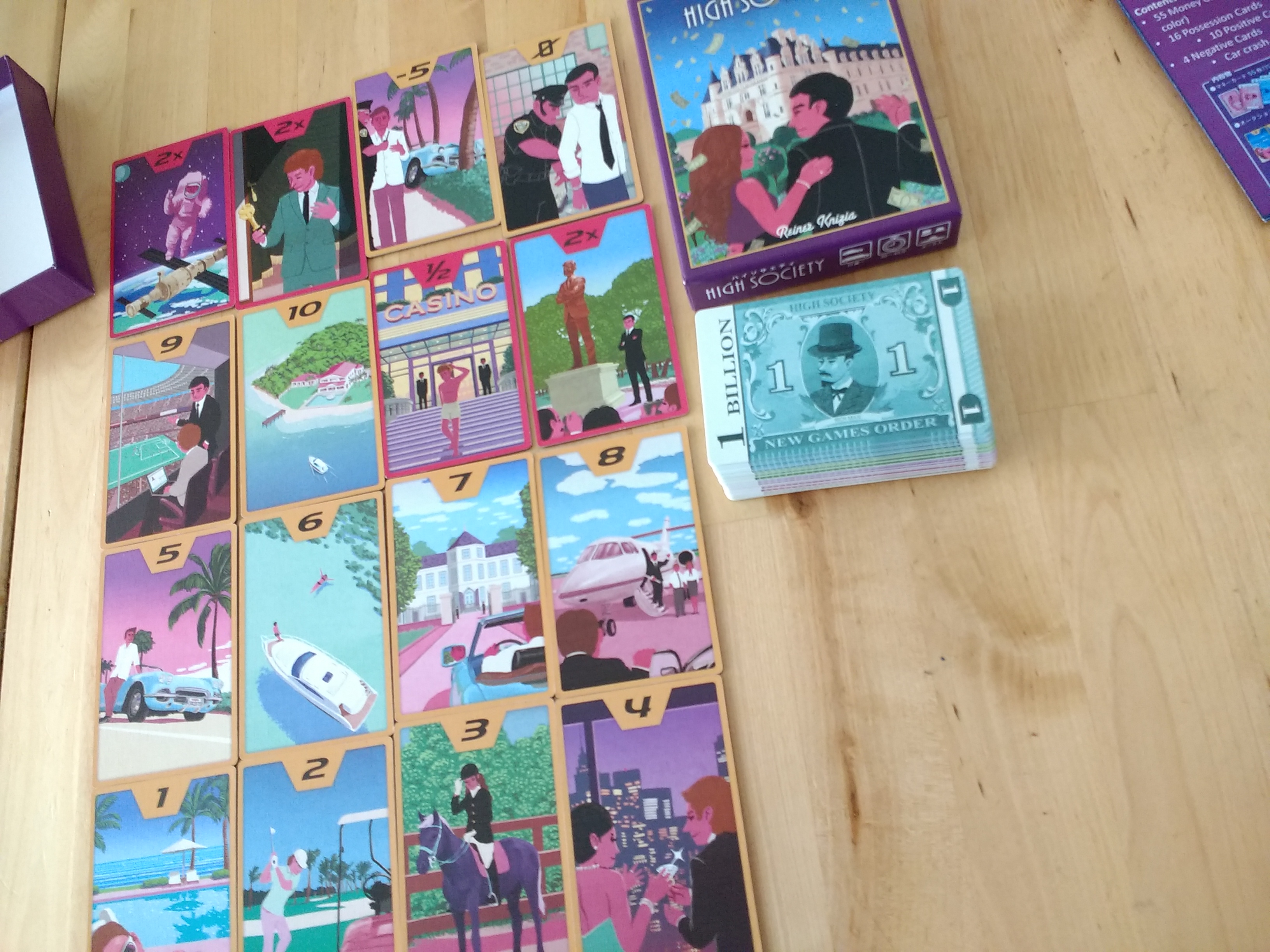
That was my next-favourite High Society design. I particularly like how inter-connected the pictures are – the way the -5 riffs off the 5 is the most obvious, but there are also many other cards showing a scene which matches details from the other images. It’s nicely done.
I’m the same. I love the original art. Especially that it comes with the story of how Matagot couldn’t afford to commission it, so it was commissioned by a friend of the company who kept the original art.
Everyone’s got in ahead of me about the Arboretum reprint. Beth Sobel drew some great trees and they got ruined by sub-par graphic and product design (I want to throw a shoe at whoever decided on the oversized box). Don’t even get me started on the gaudy monstrosity that is the “deluxe” edition.
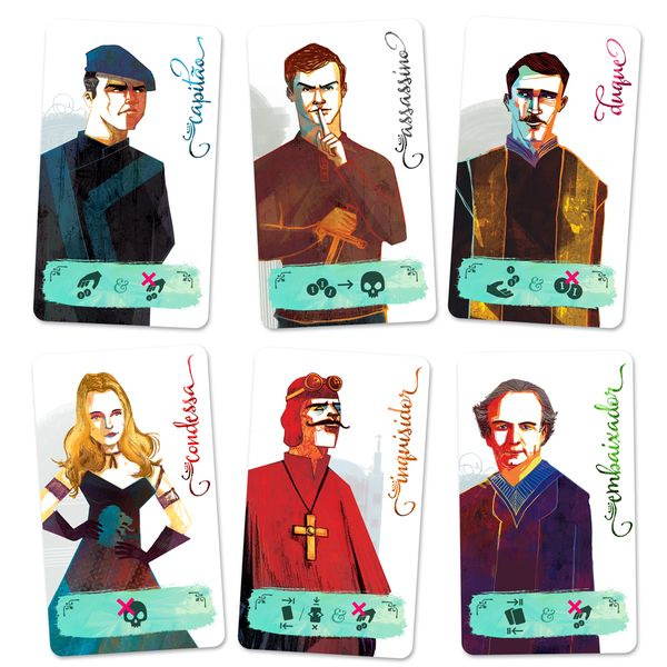
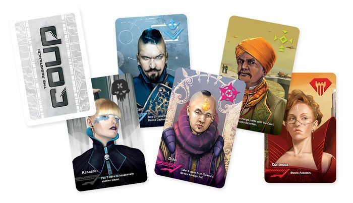
As for foreign editions. I’m miffed that we finally got an English release of Coup with the gorgeous Weberson Santiago art, but it was only available as an add-on to a stripped down version of Resistance: Avalon.
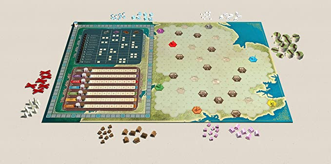
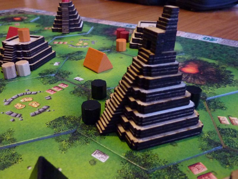
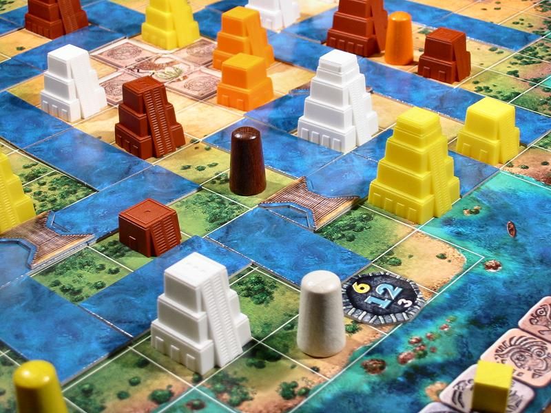
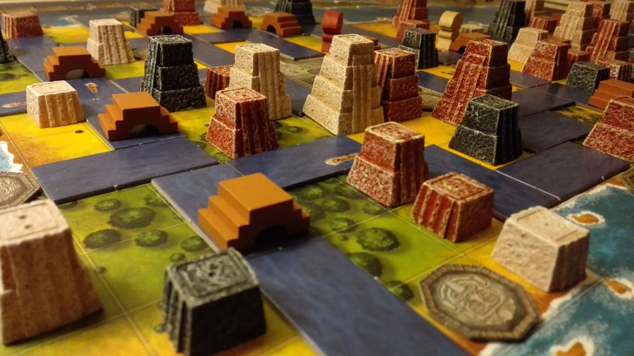
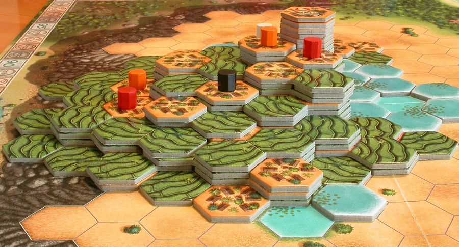
Similarly, the nice version of Tikal with chunky resin pieces not being available over here (unless you pick up an import copy at UKGE for a decent chunk of cash) is annoying.
yeah I mean it’s interesting to look at but I really don’t want to play it. (But my favoured version is the one I played first, which I think will be the case for many people and many games.)
I hate playing Circus Flohcati with the flea heads, it just turns my stomach (and I’m generally pretty accepting of art in games). Now I have Sakradi, which is still a bit odd, but not as nauseating.
Strong opinion the second:
The artwork is one of the things that turns me off Inis. When Quinns & Paul initially reviewed it, my first reaction was “Oh God, it looks like Jim Fitzpatrick-esque neopagan hippie colour-vomit”.
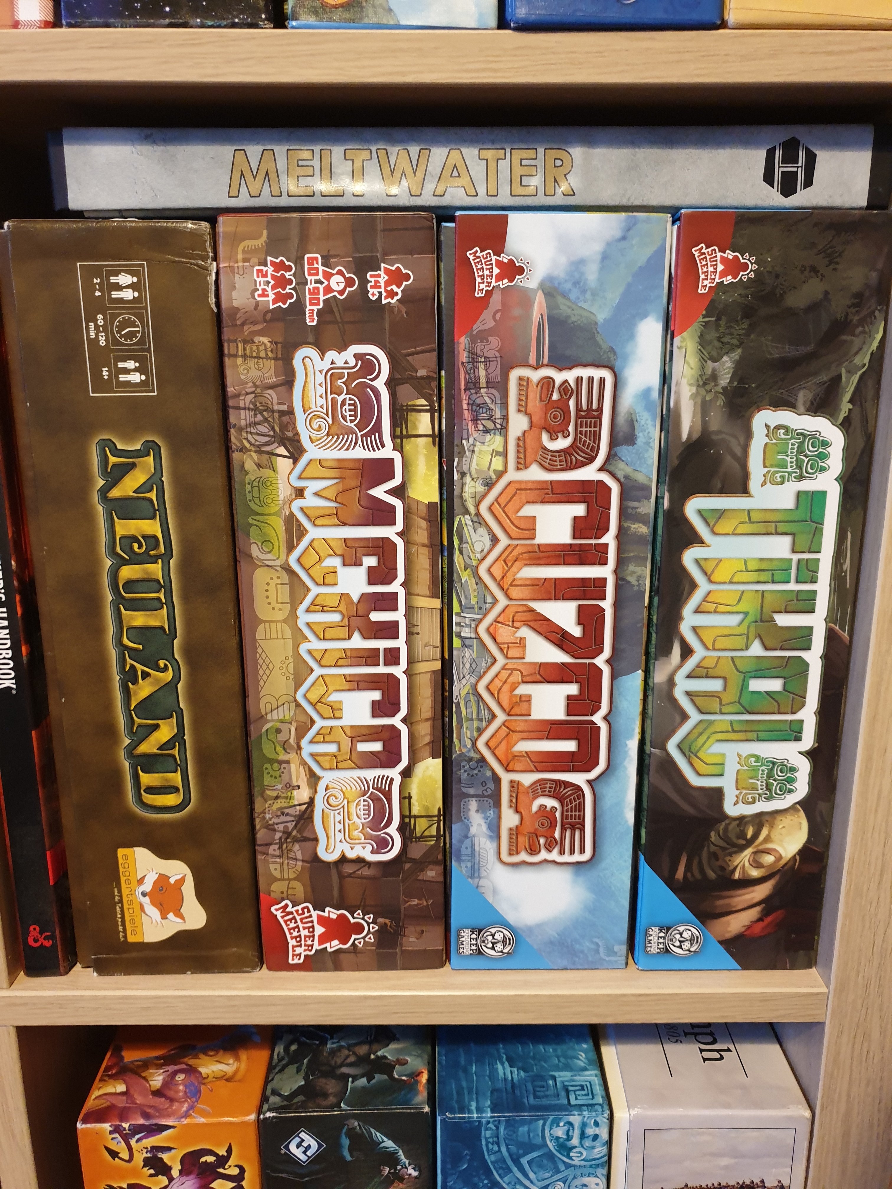
Super Meeple’s reprint of the Mask trilogy is just brilliant! I’m not sure if Tikal would get an English edition of Super Meeple since RGG still holds the rights.
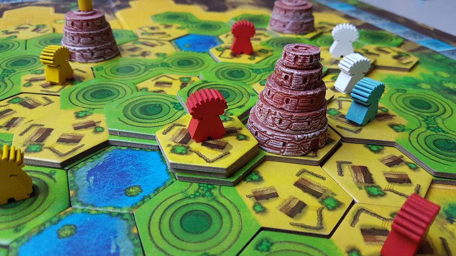
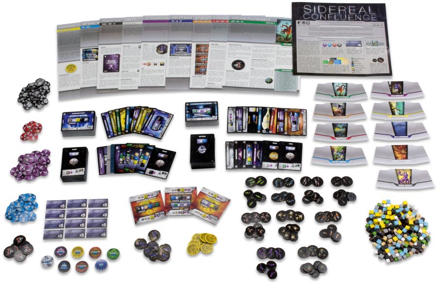
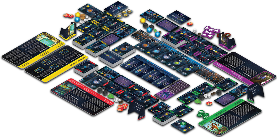
Yes, I was lucky enough to think “How am I ever going to find enough people to play Sidereal Confluence with me?” when I saw SUSD’s review. Now, thanks to Kwanchai Moriya’s overhaul, I still can’t think of how I’m going to find the people… but… I care less