A thread to show off your favourite card decks. Most designs are not Fully-illustrated standard card decks but can still be tremendously appealing and well worth showing off.
Especially as, when shopping for a deck, it’s often hard to ascertain what all the cards actually look like. The product photos can vary a great deal from shop to shop, but I’ve often found that the pictures cover a few face cards and no number cards at all, and I’m left with only a partial understanding of what the thing actually looks like.
I thought it might be nice to have a thread where people could share decent photos of decks they have and like (whether 52-card decks, or other sorts).
I’m currently awaiting some new decks, and one of the ones I bought last time (some years ago) was still unused, so I decided it was past time that I actually played a game with it, and thought I’d start this thread as a by-product :).
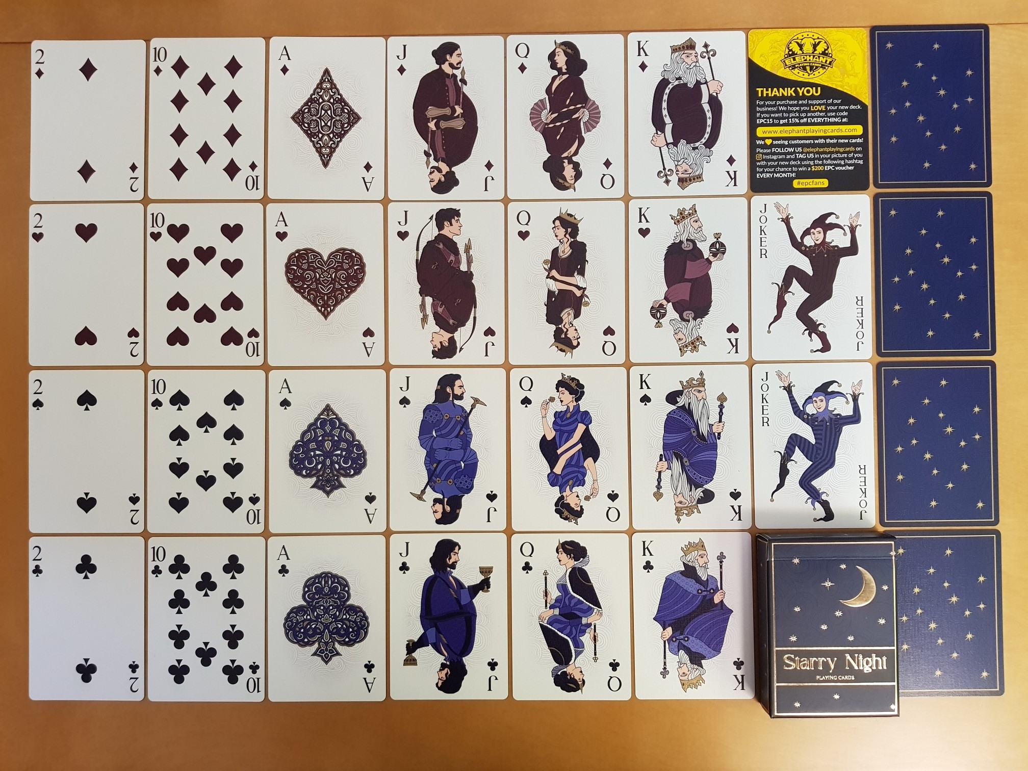
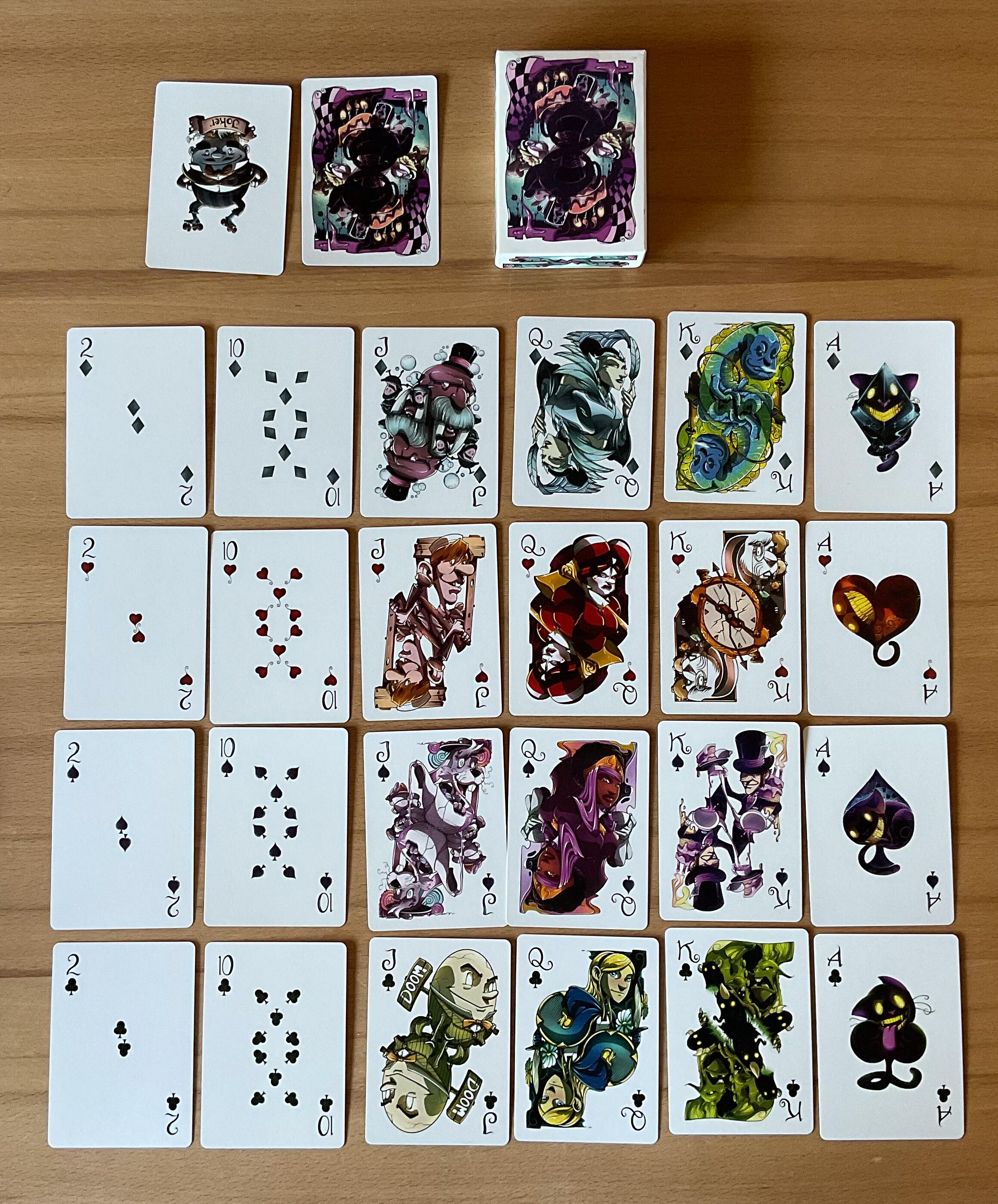
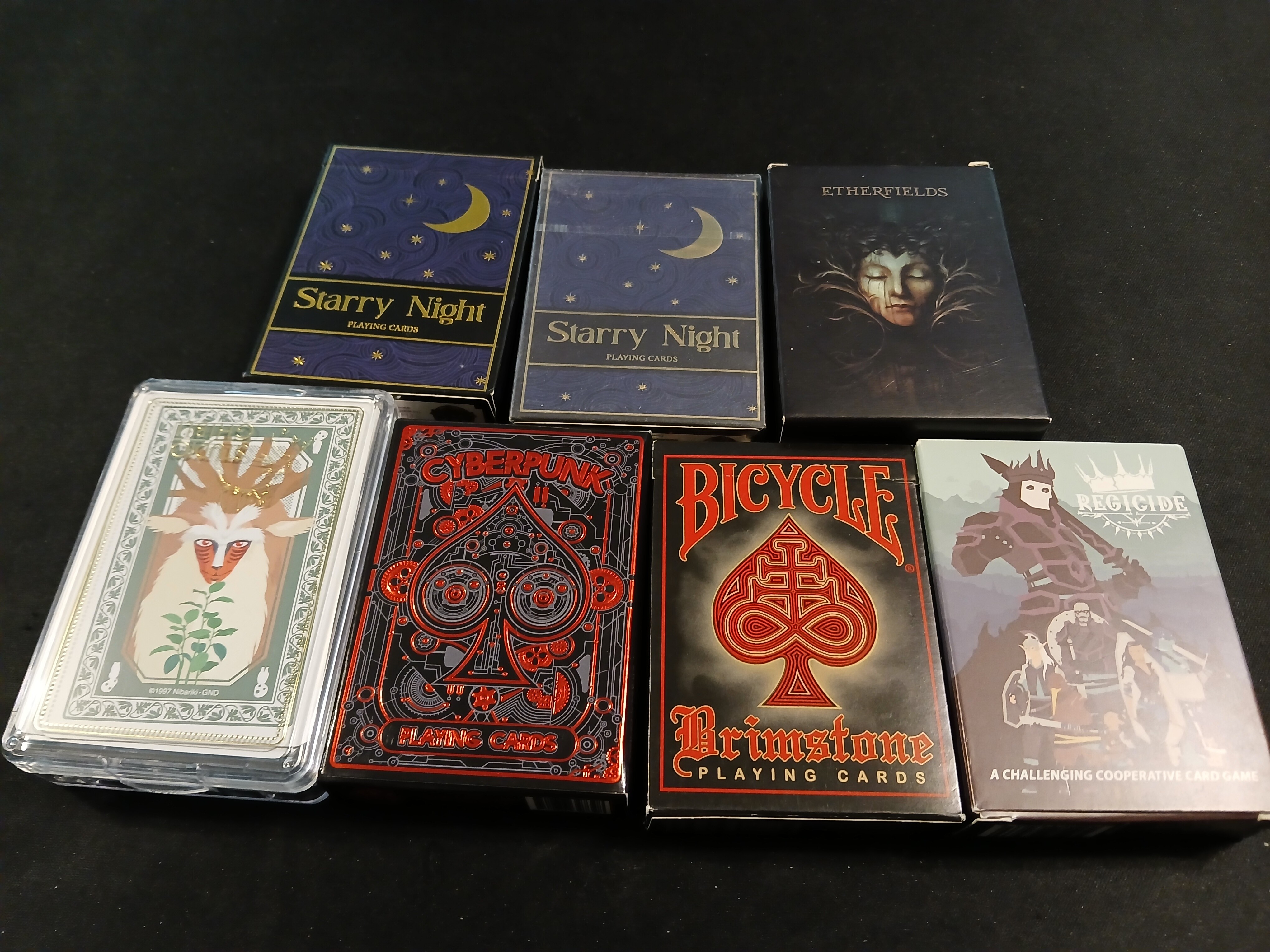
This is the Starry Night deck from Elephant Playing Cards (who seem to no longer exist, sadly). The 2-10 cards are plain enough, although the muted colour scheme and slightly squat suit icons keep them feeling like part of the set. I liked that every ace had a large design, and mostly I particularly liked the face card art. None of it is flashy, but it’s all very carefully designed and drawn with clean lines, those slightly-muted colours with pleasing contrast, and it feels both ornate and classic at the same time.
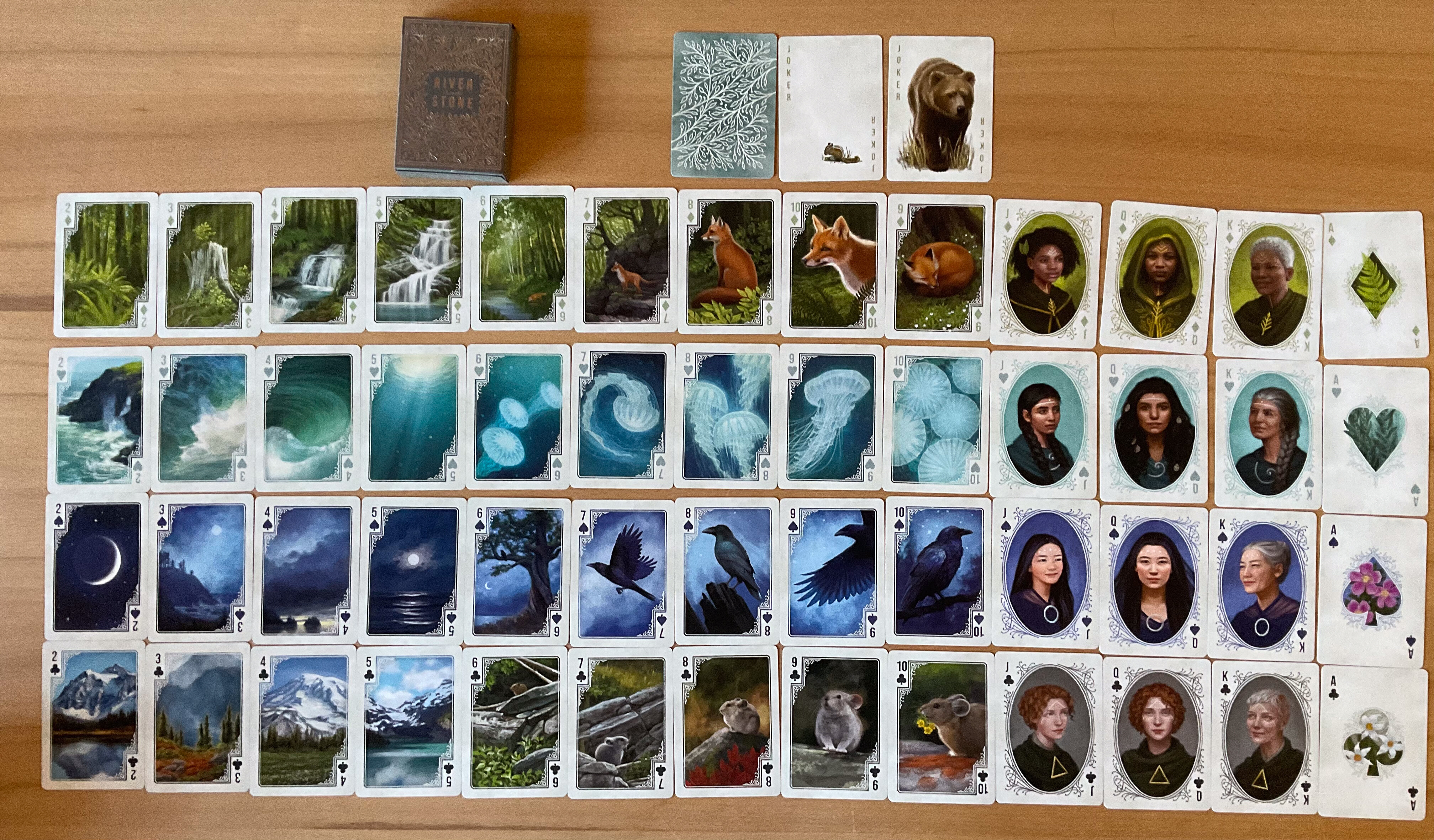
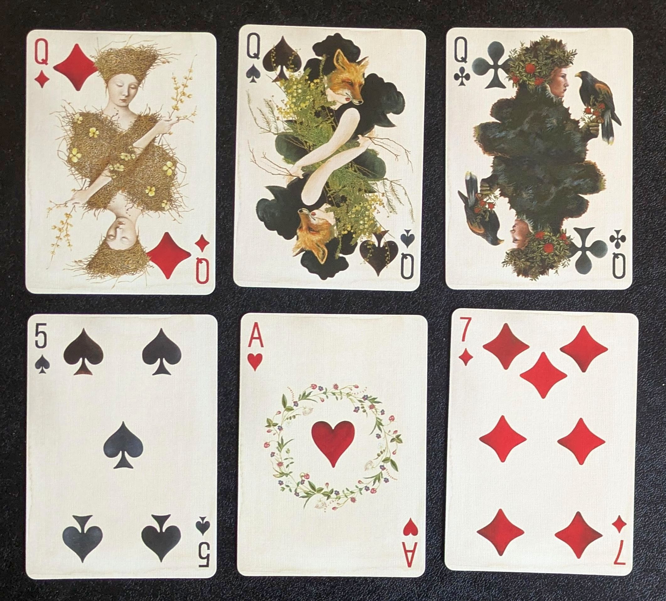
I think this is my only fully illustrated deck and definitely one of my favorites though I hesitate to use it because I didn’t buy a second copy to keep pristine. This is the River & Stone deck by Beth Sobel that I acquired via Kickstarter ages ago. I have not seen her do a deck since but I am not actively searching. If I wasn’t afraid of over-using it, the cards are quite nice to handle.
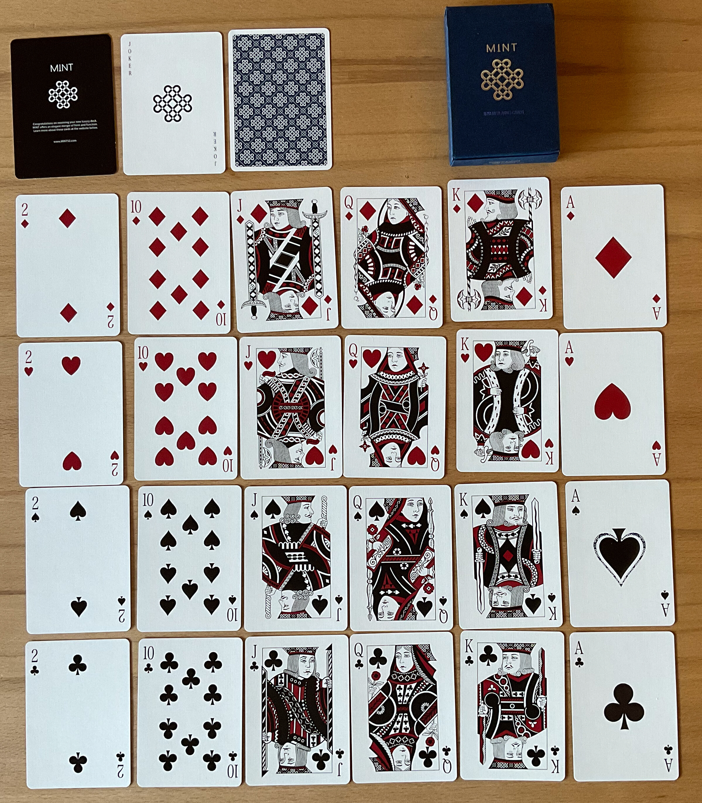
This one has a rather classic design and is not fully illustrated. However… the cardbacks are marked in order to be able to do some card tricks. I find it very difficult to read the little marks but I guess if I did practice it would become easy. The cards are quite thin to be used for cardistry (which I don’t even aspire to learn)
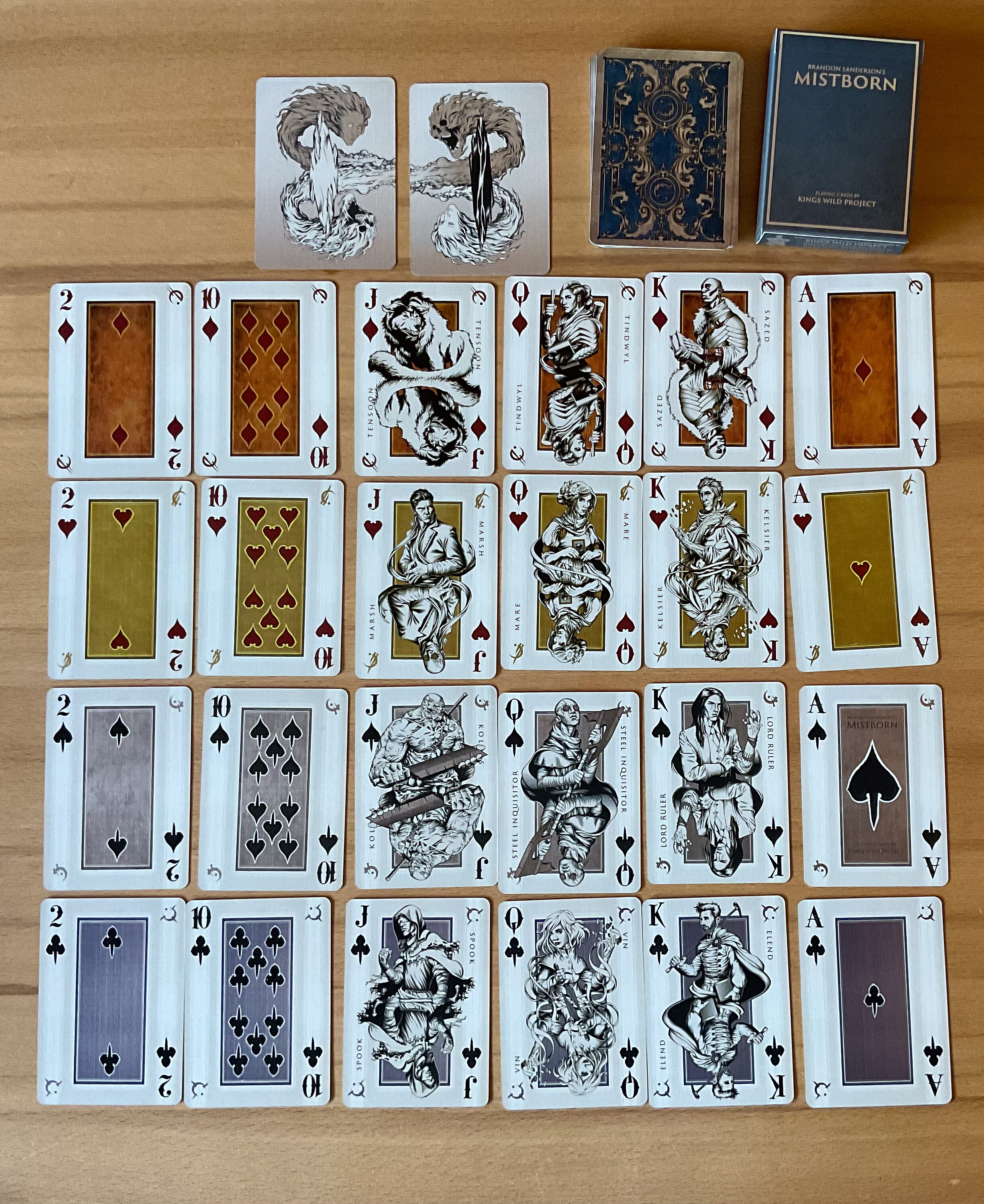
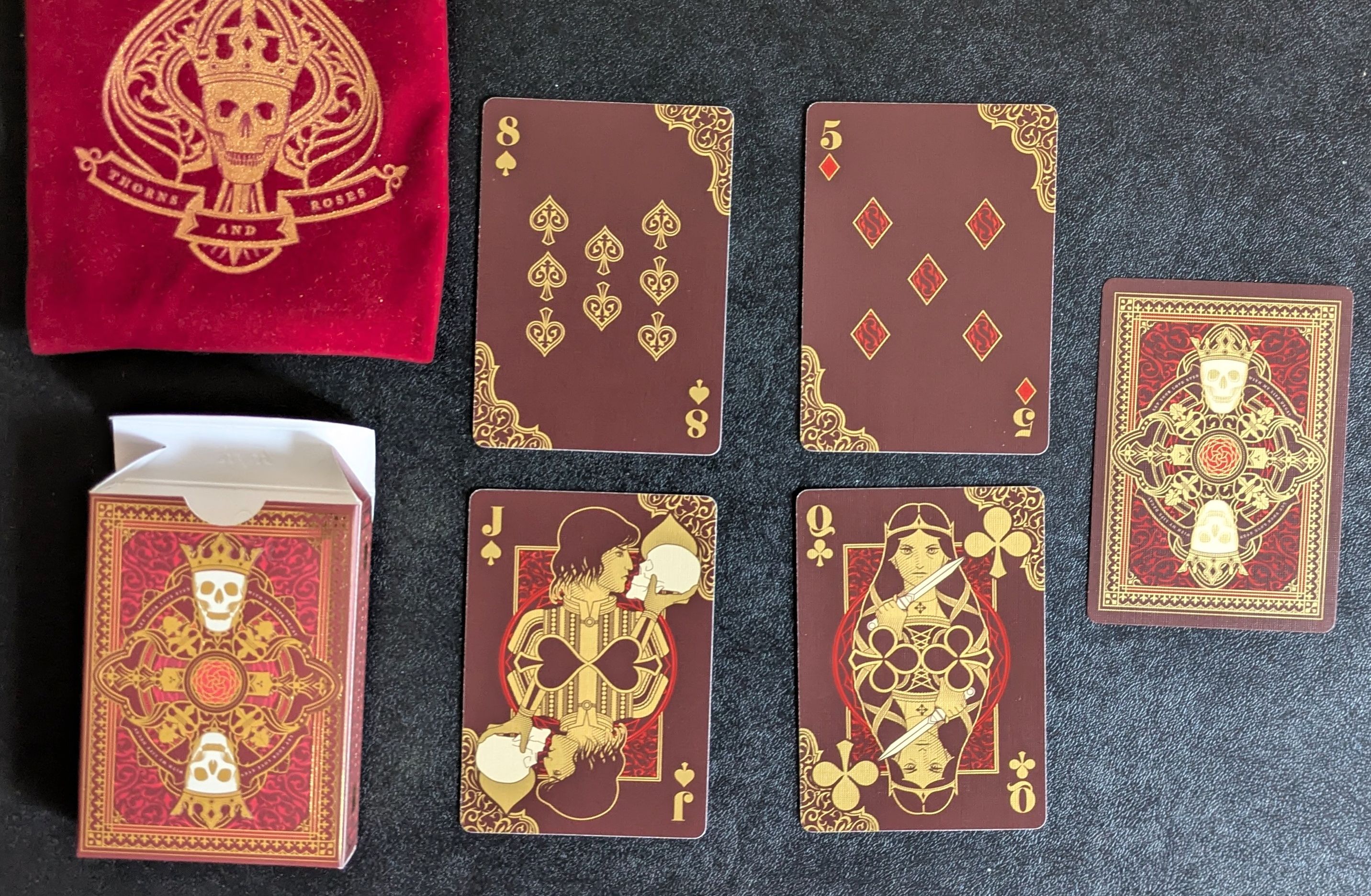
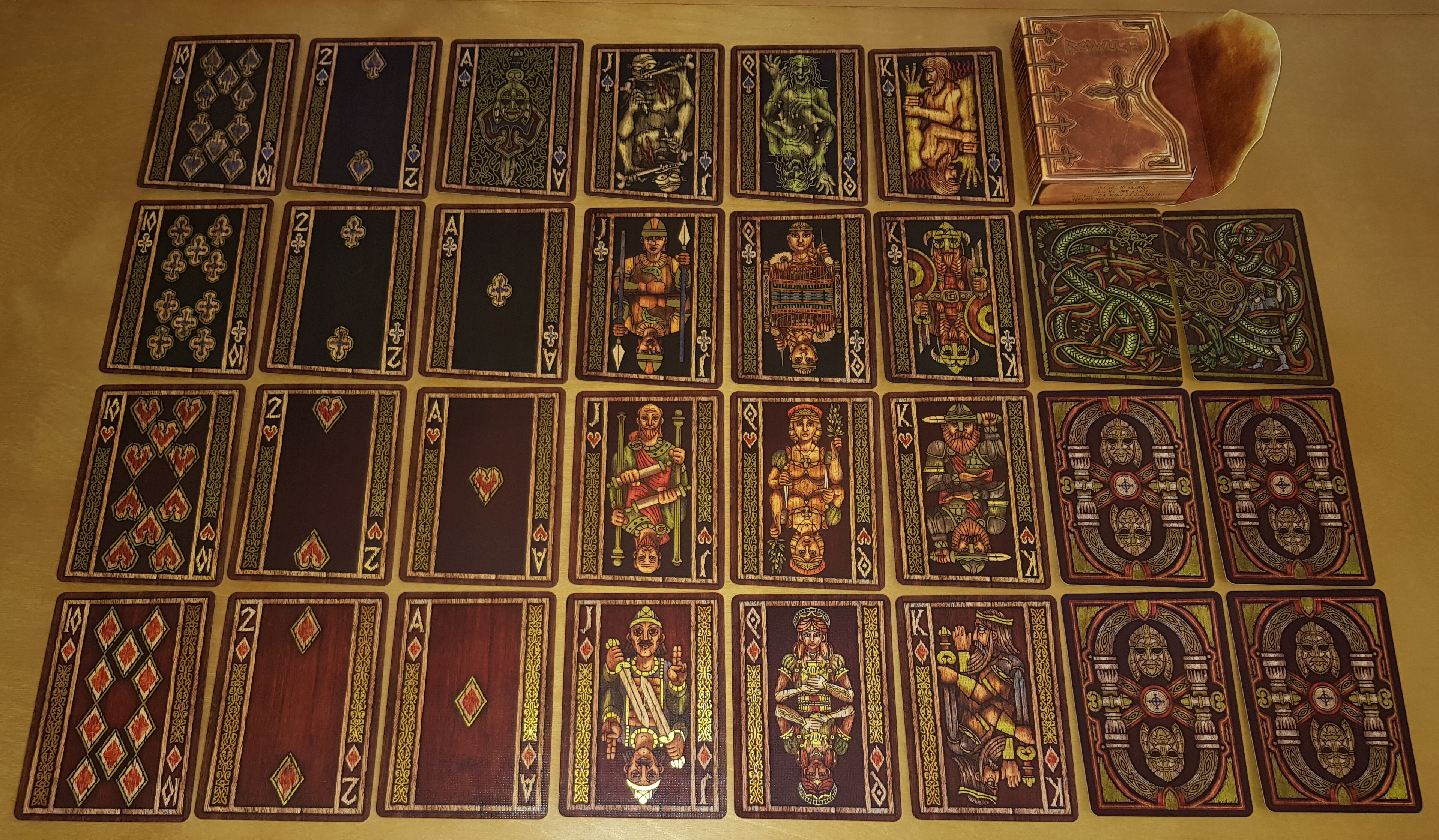
This is the Mistborn deck for the original trilogy. Liberal amounts of gold & silver foil make this one quite shiny. The characters are nicely illustrated. The cards feel a little thick and stiff so I doubt this will ever see actual use. It is more of a collector’s item I guess. I also have the Stormlight Deck and the 2nd trilogy deck. I’ll post this some other time.
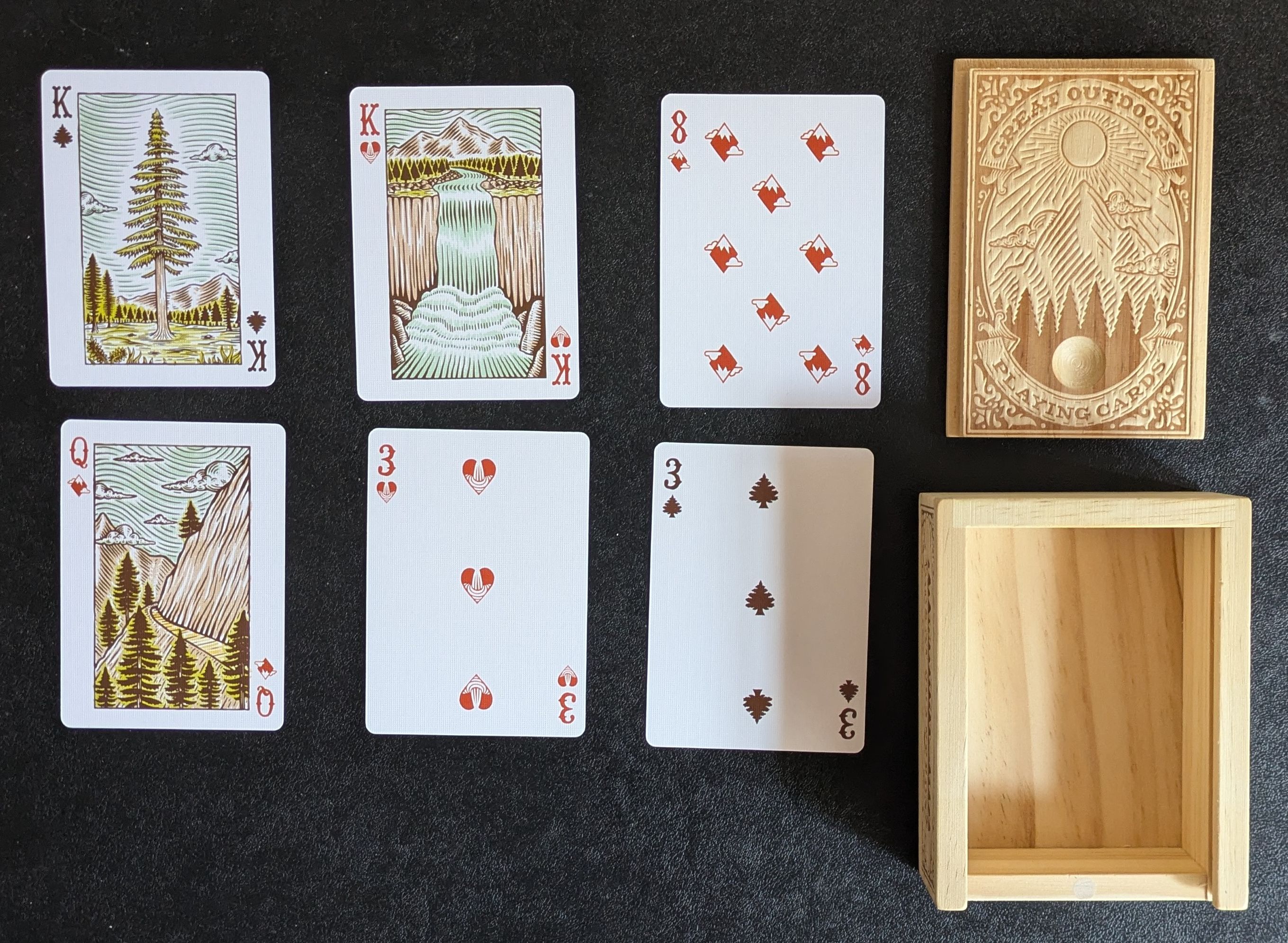
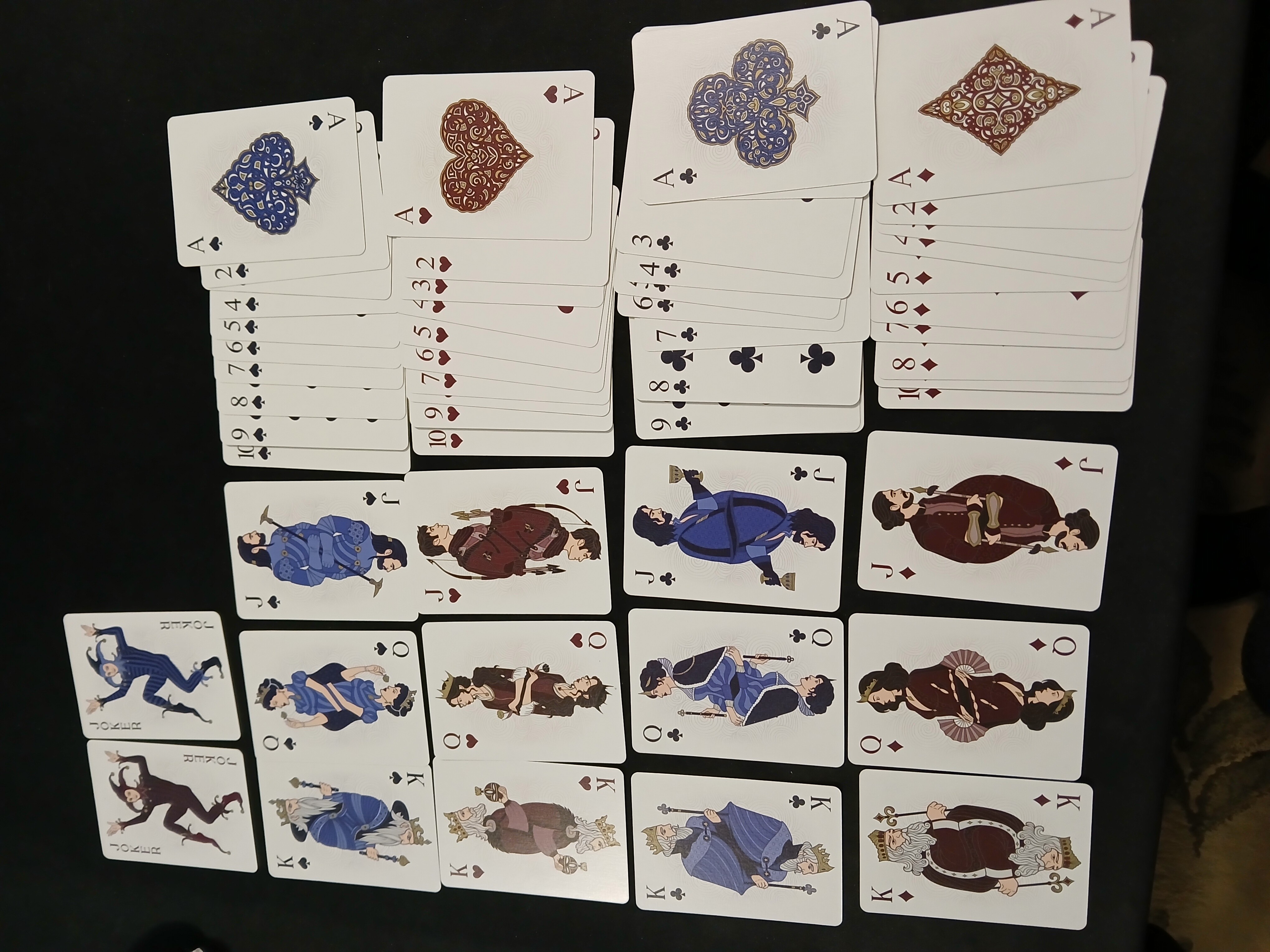
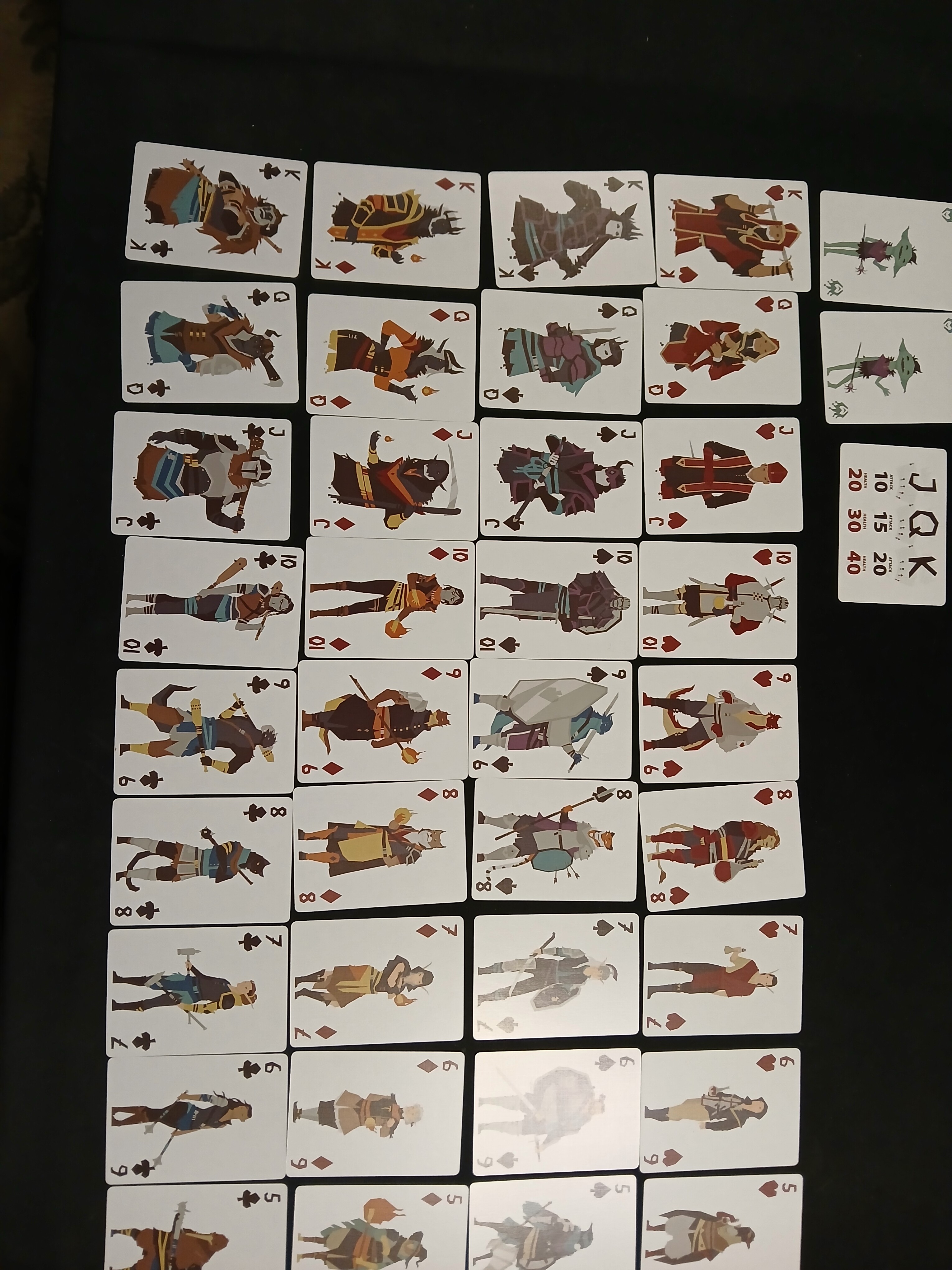
This is one of my favorites to actually use. This came with the Wonderland’s War kickstarter and I really like the illustrations on Jack, Queen, King and Aces and the whimsical number cards. The card quality is also quite nice and usable.
The drawback with writing a book about playing cards and divination is, you end up collecting playing cards. Individually it’s a cheap hobby but there are 100,000,000+ nice decks out there so it’s a problem.
The prettiest deck I have is probably this one from UUSI, who are a US art studio:
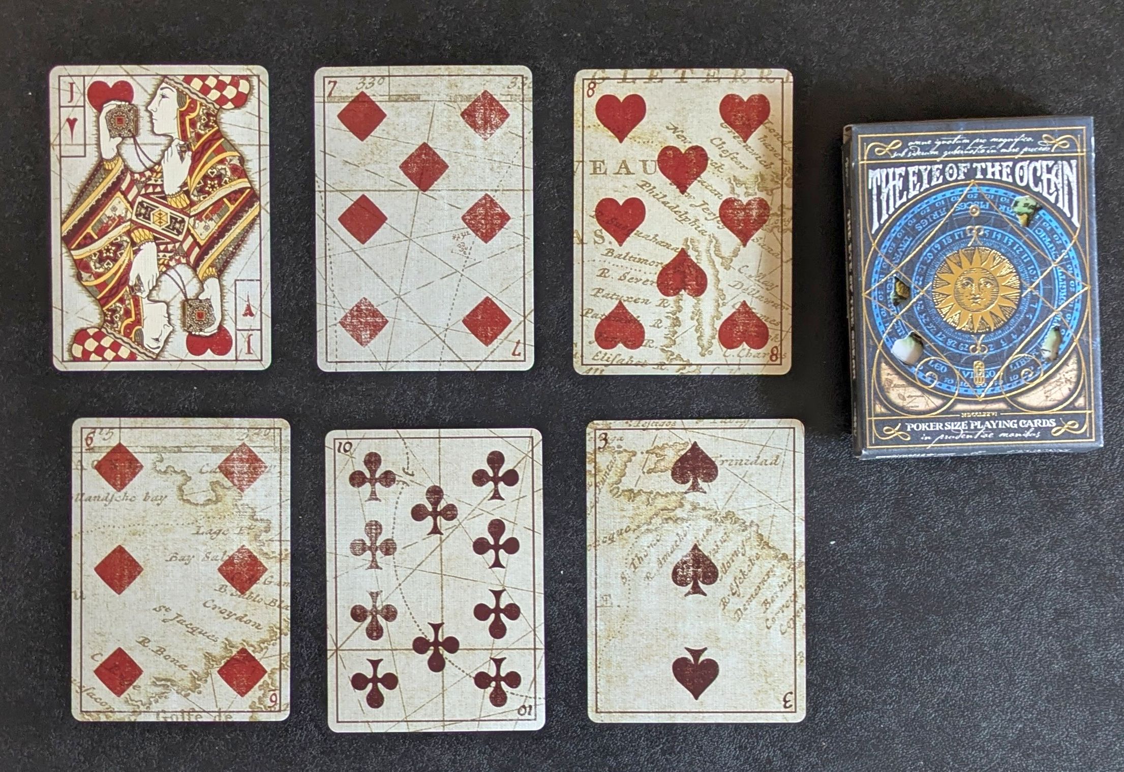
A very silly kickstarter called “The Eye of the Ocean” which has a full treasure map on the cards which you need to solve alongside the booklet and the first people to write to the author with the solution got a prize:
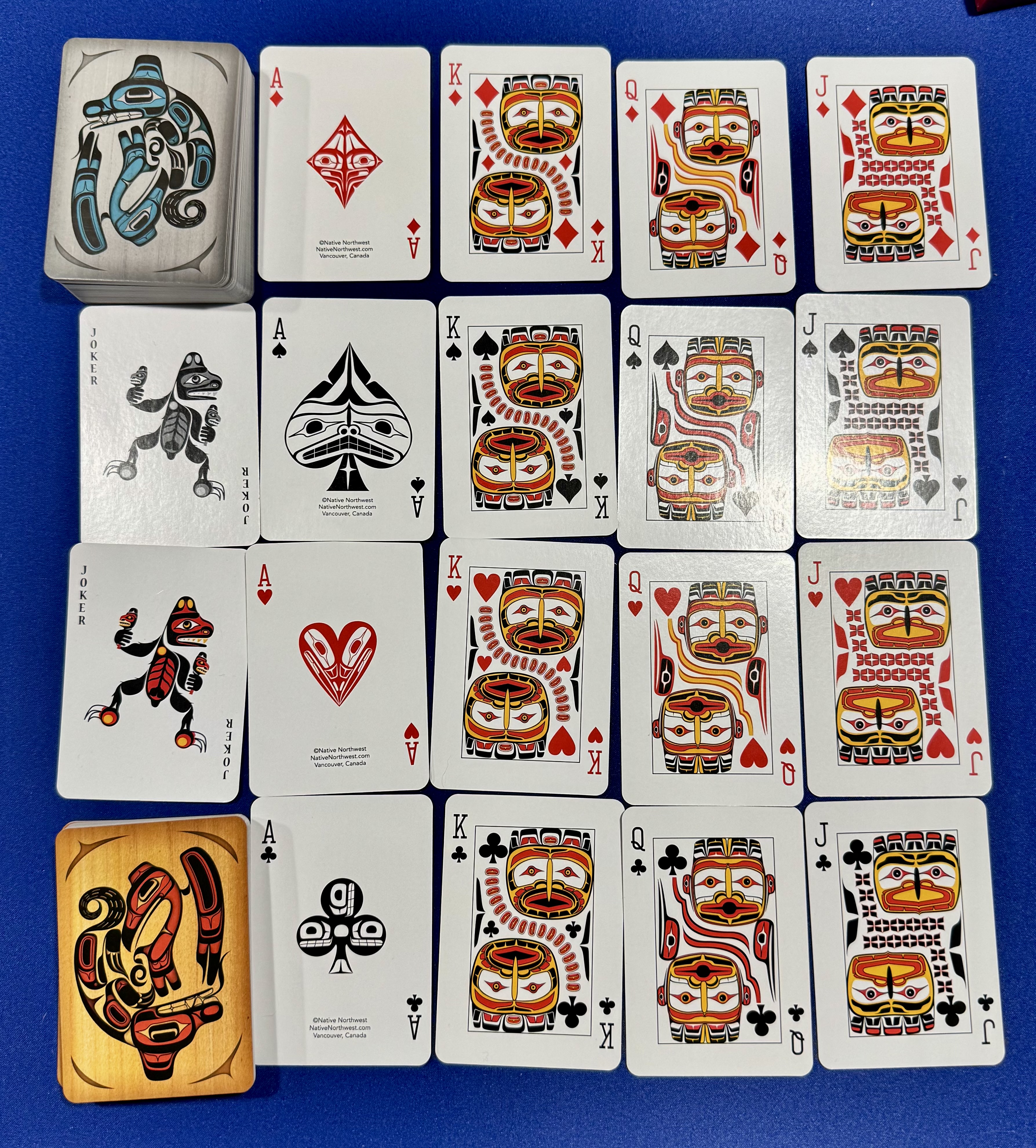
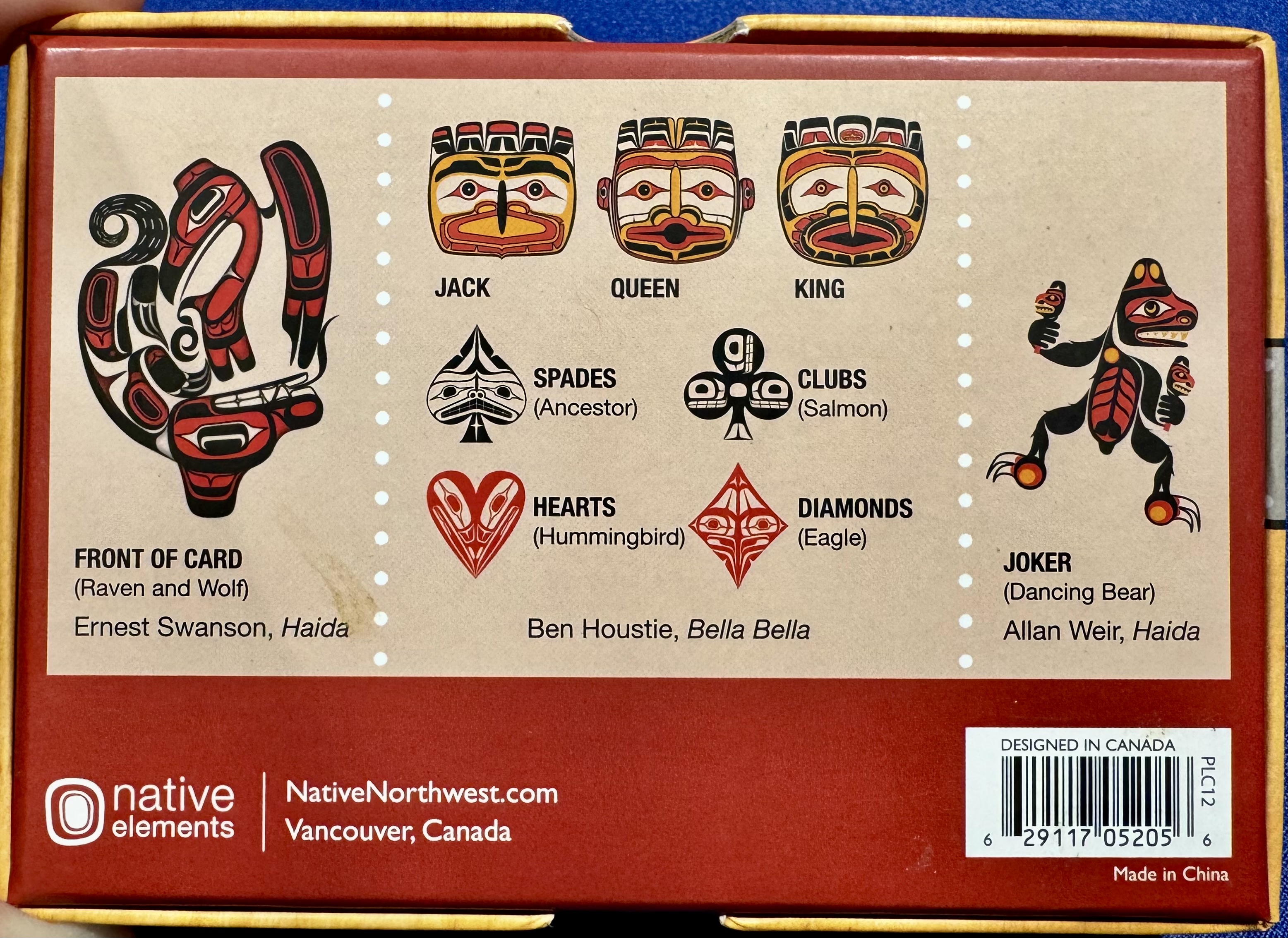
I sometimes pick up cool decks of cards when traveling. This is one of my favorites: designs from Indigenous/First Nations peoples of the Pacific Northwest region, picked up in Vancouver.
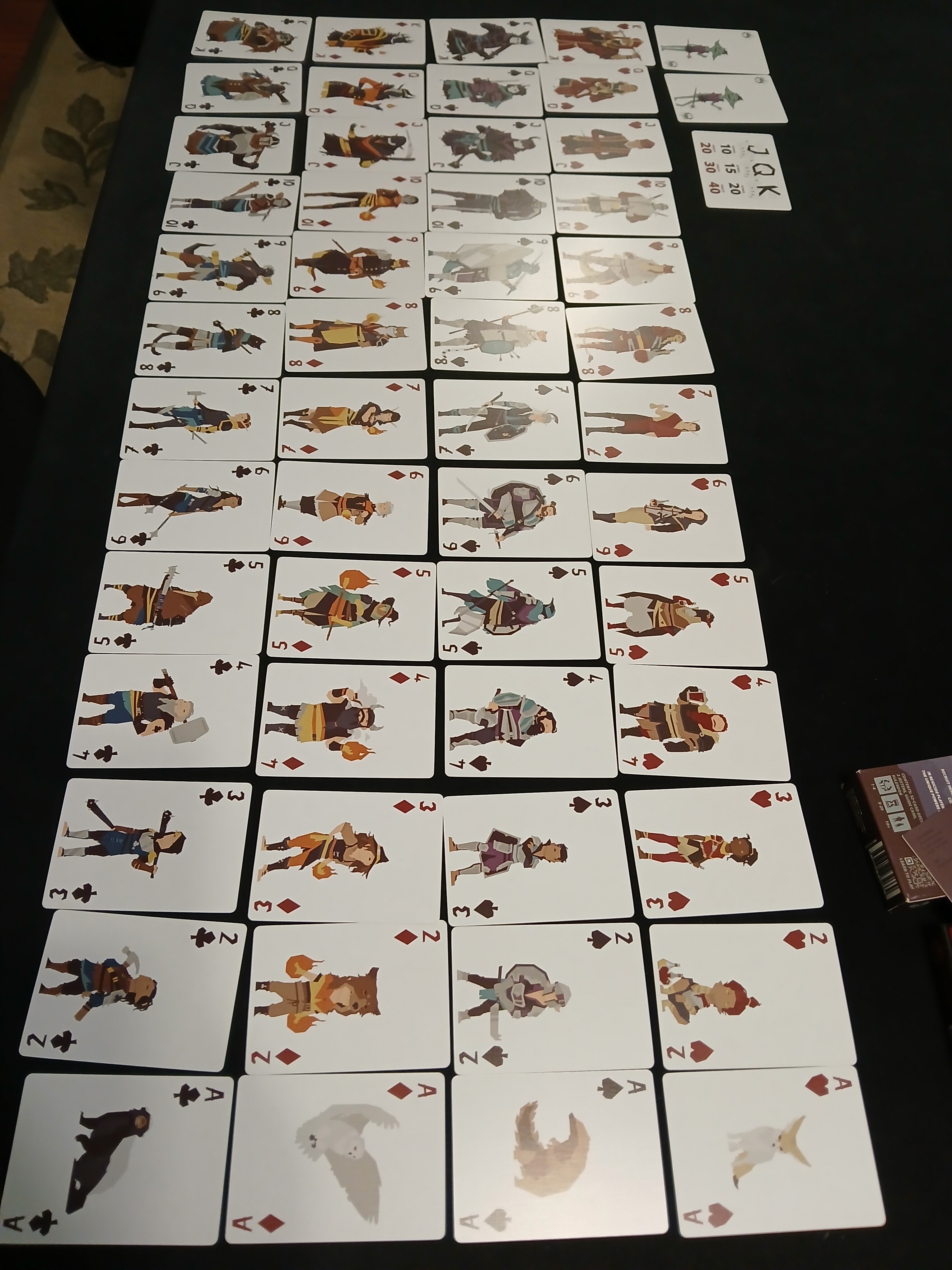
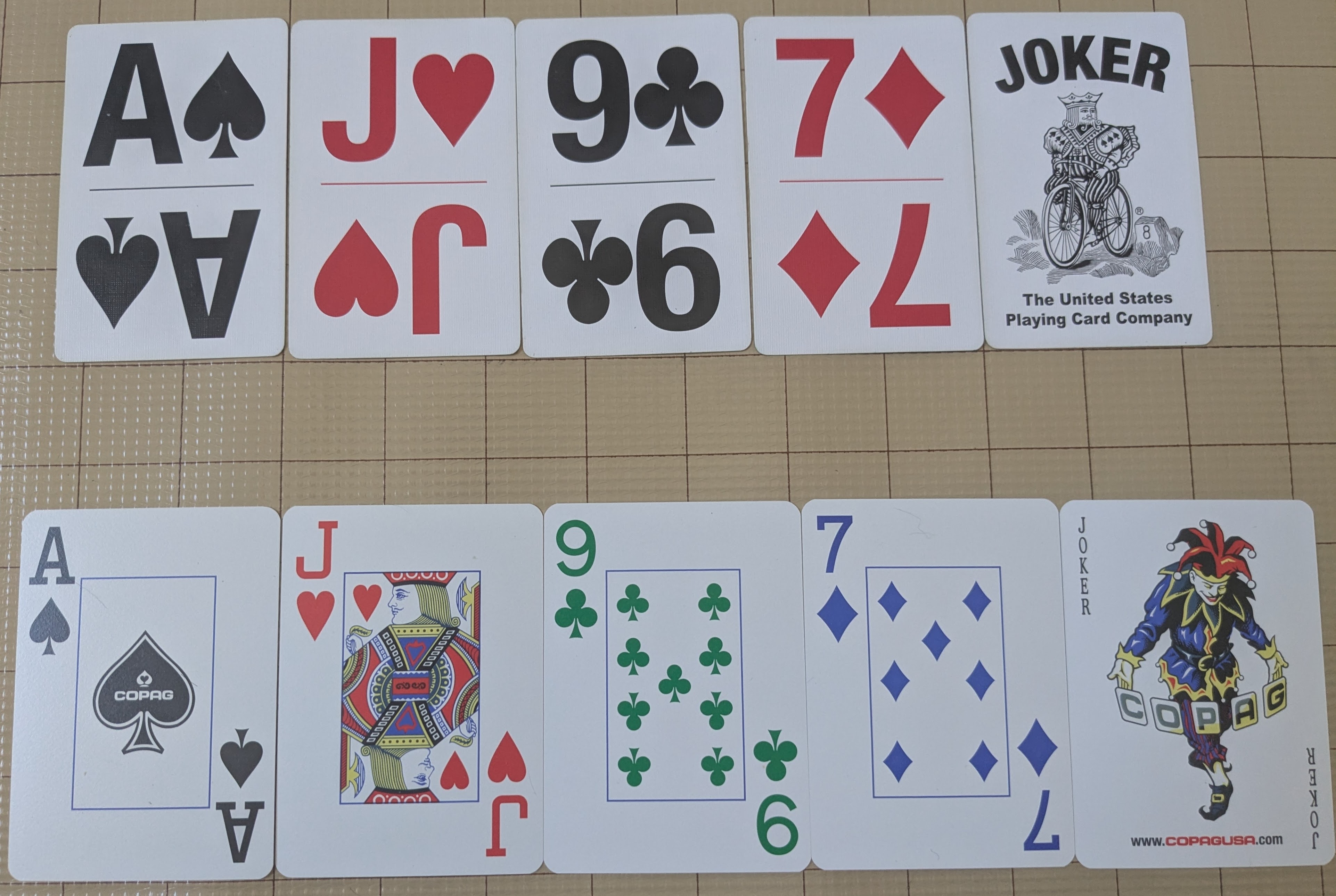
The one on top was for doing initiative in Savage Worlds. I wanted to be able to read the from across the table. (Though I do sometimes misread the 9 as a 6.)
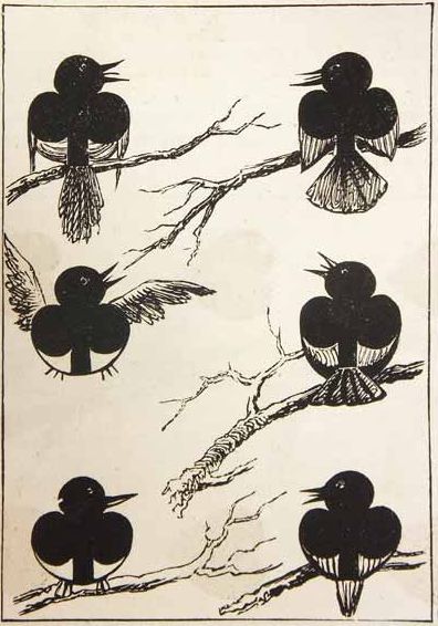
The one at the bottom I’ve never used but I just like the notion that clubs should be green (clovers) and diamonds blue (cuz white or transparent would be too weird).
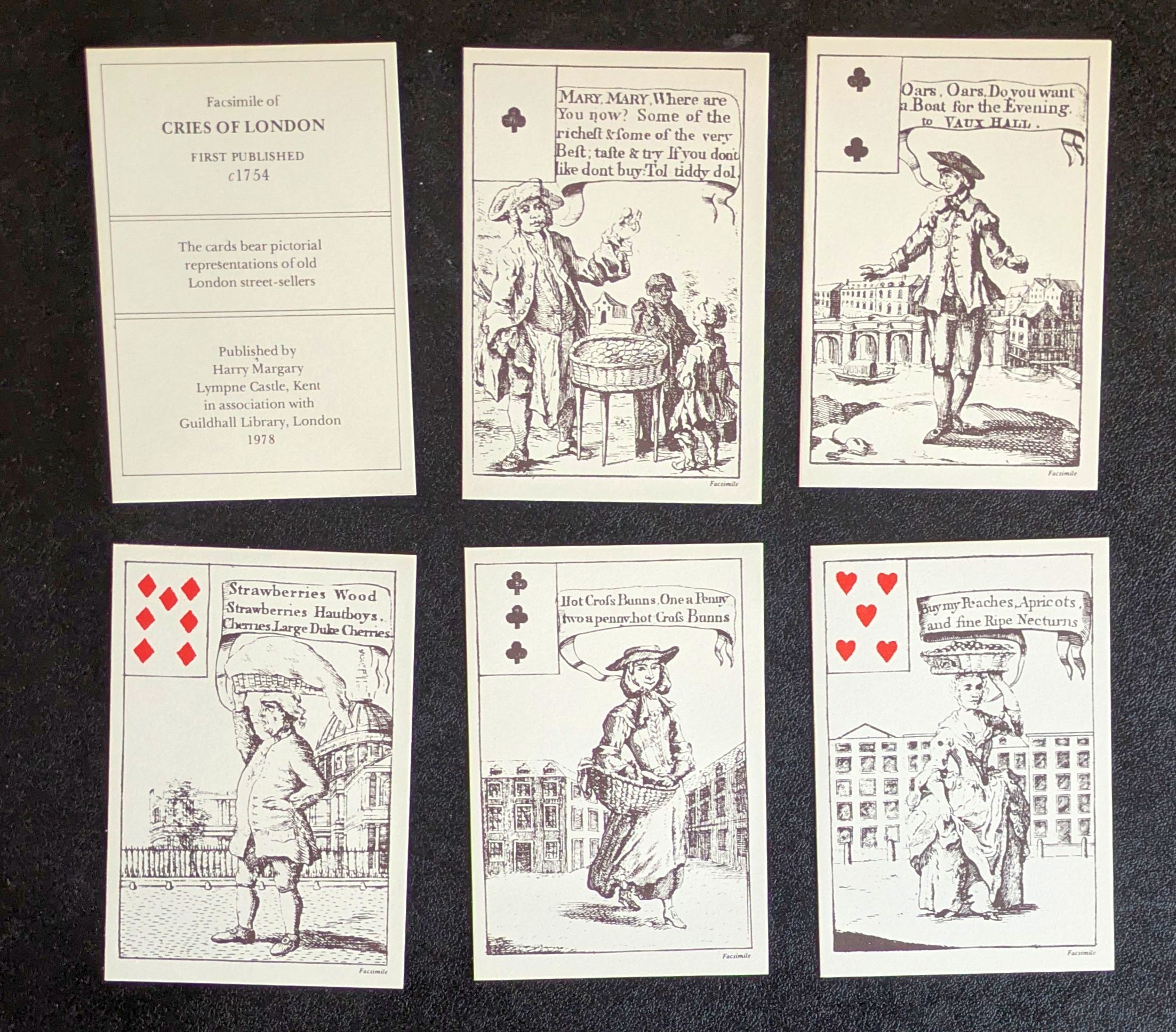
Thanks Roger! That’s incredibly useful to me for a card project I’ve had on the shelf for far too long, but had looked at again just a couple of days ago!
“Transformation” playing card decks are a favourite, where the artist draws over the pips and includes them in the card. That “Discovery” deck is a great one!
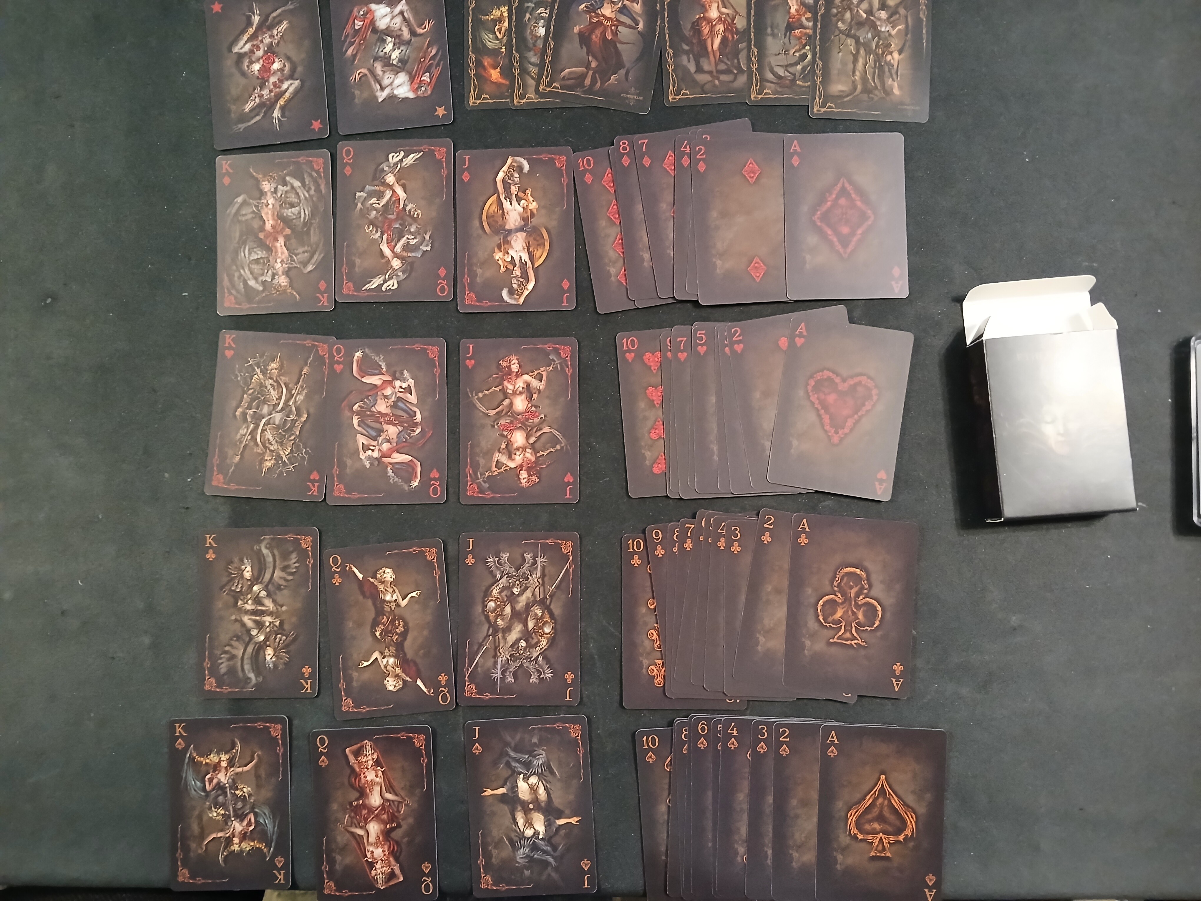
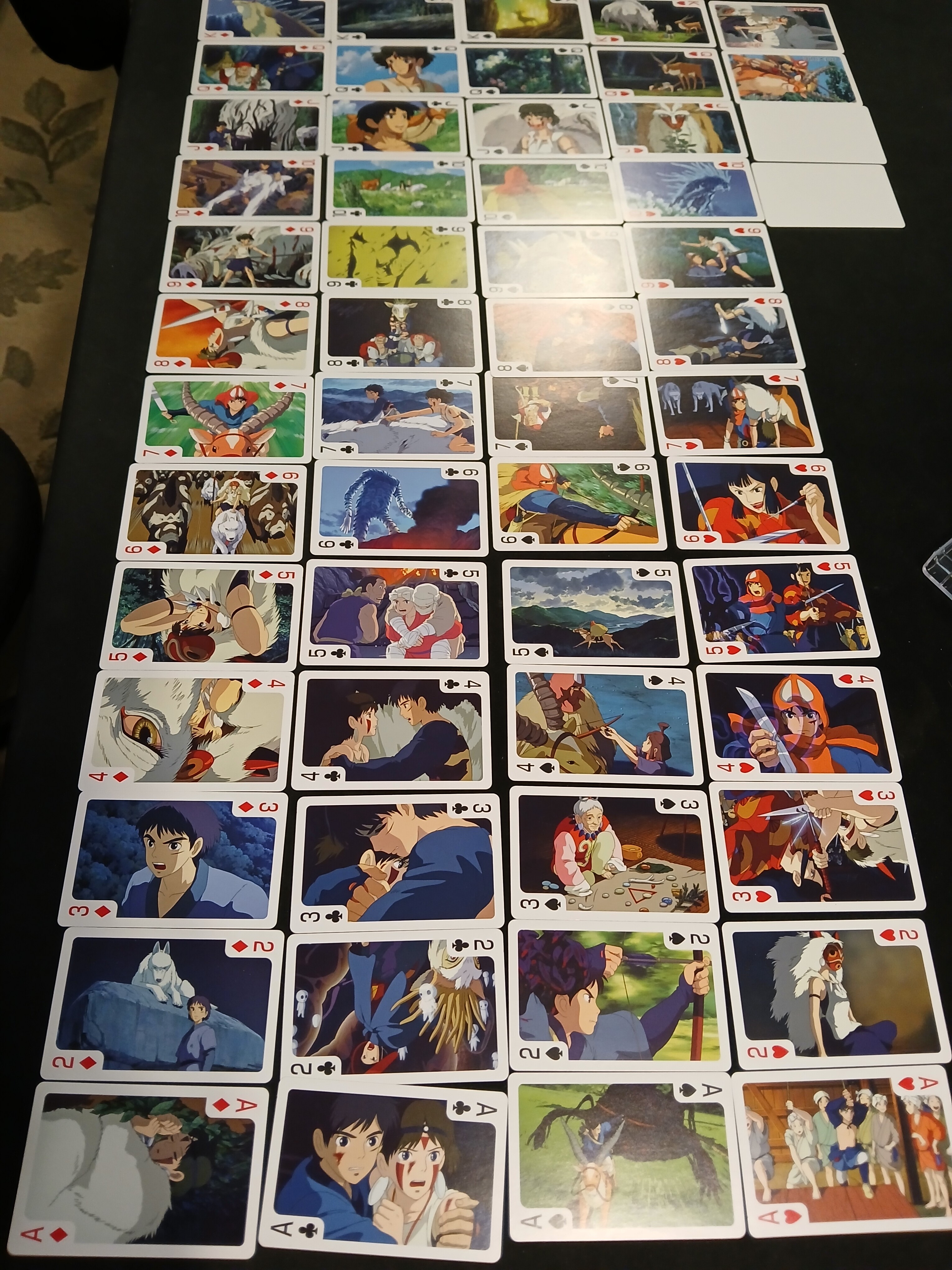
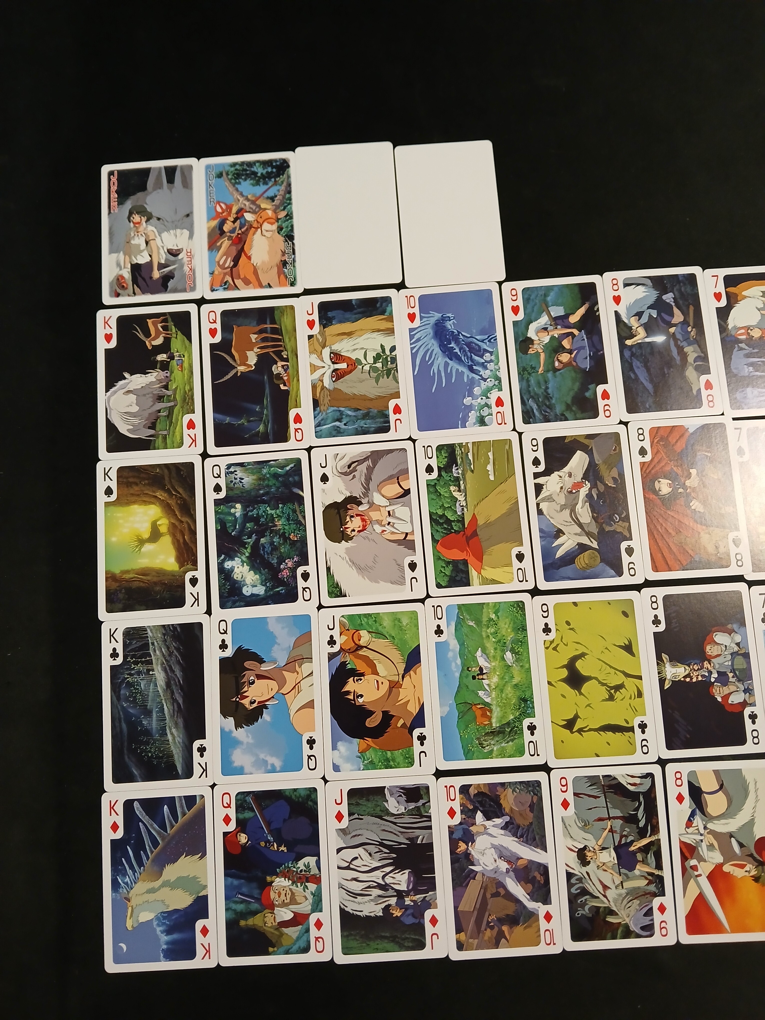
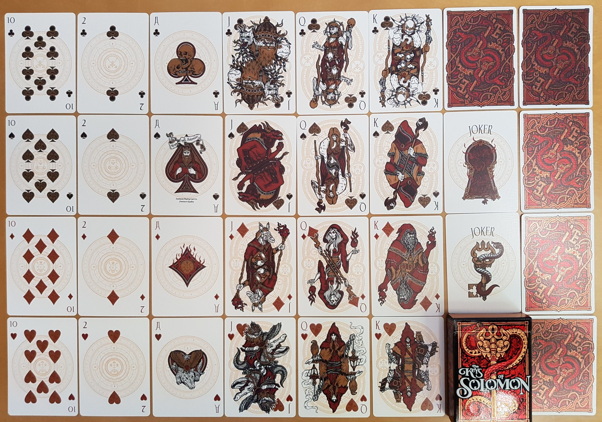
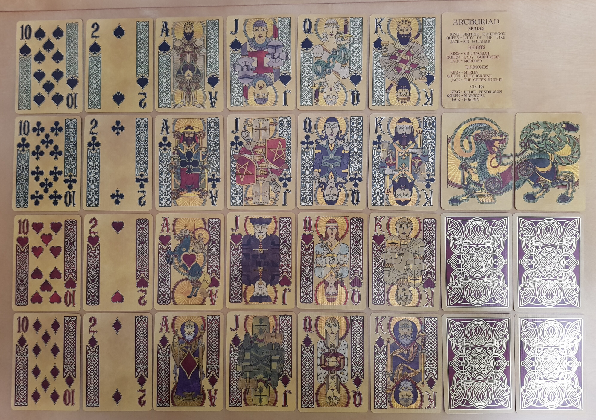
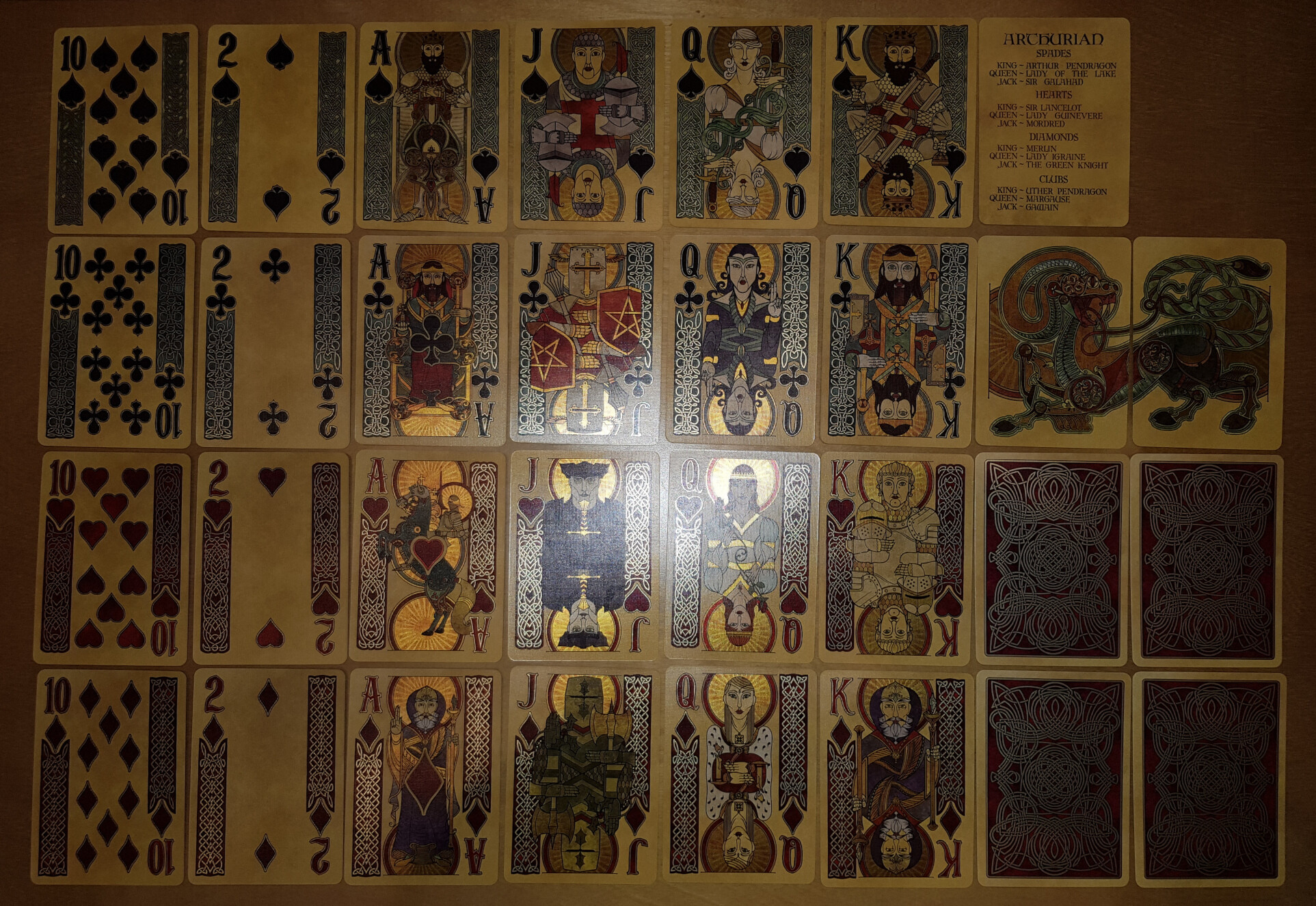
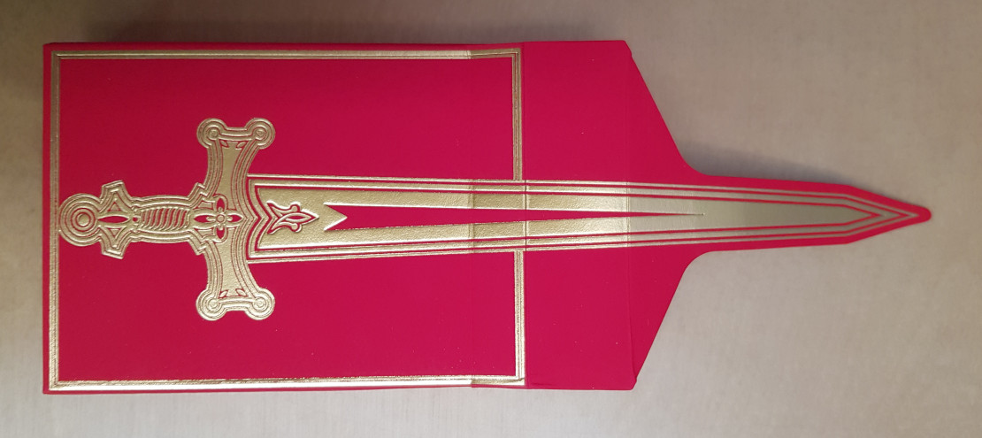
This is the Arthurian deck from Kings Wild Project, and it harbours a special loathing of cameras; but between these three examples, you probably get a decent impression.
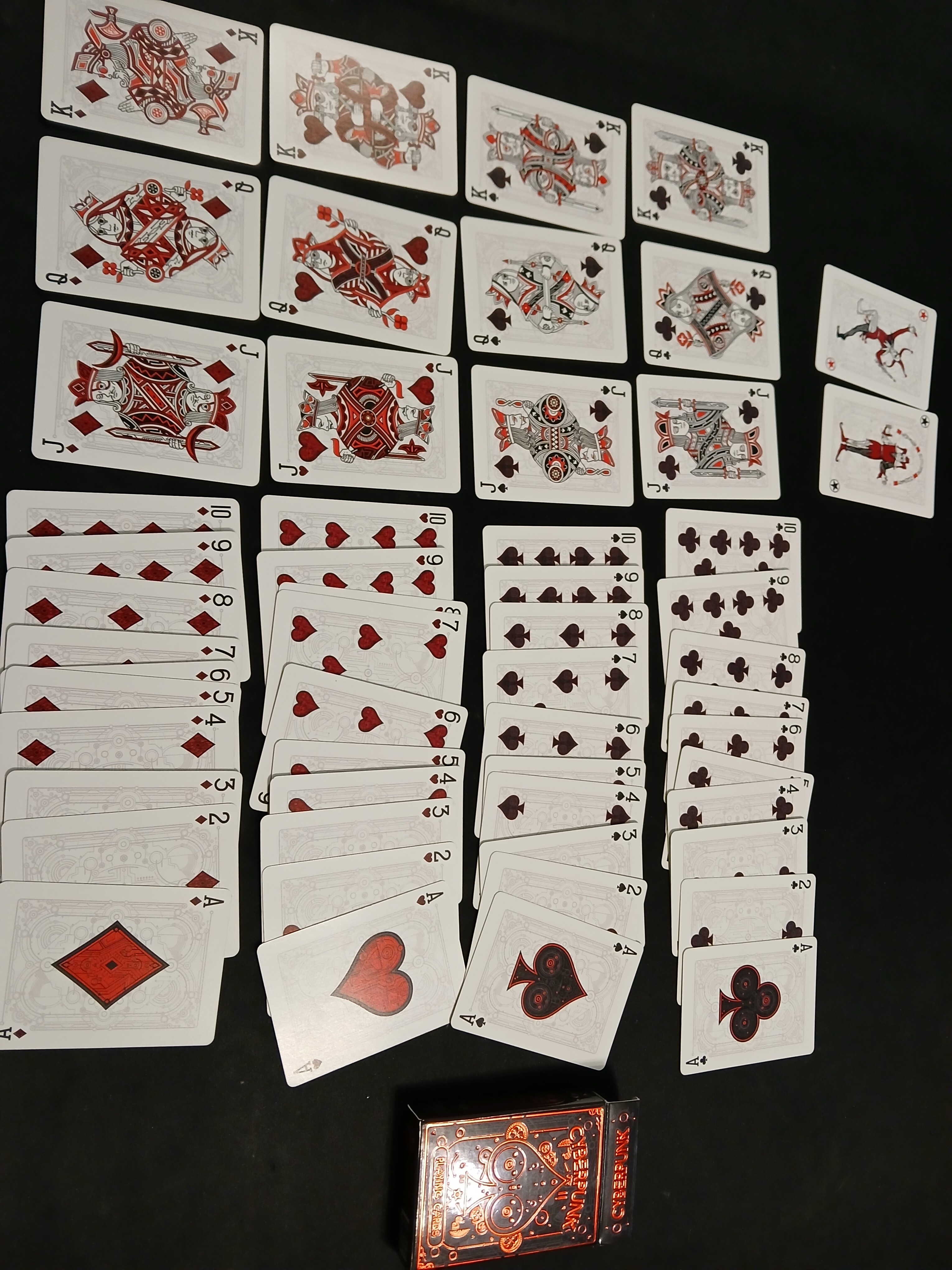
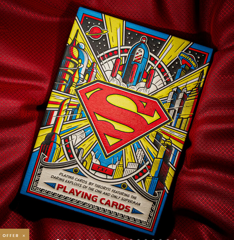
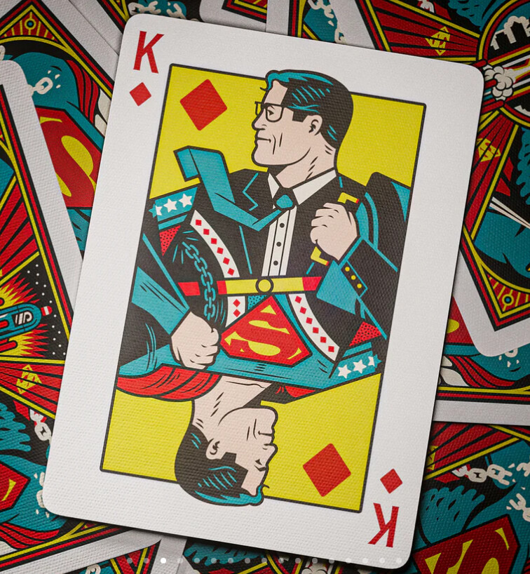
It’s even shinier than the Arthurian deck, and the gold highlights really catch the eye (in what will either be a nifty or a distracting manner, depending on your tastes).
My eyes only see the highlights at certain angles and the cards look very different with light glinting off them; but this phone camera seems to see the same colours at every angle, so I can’t show the effect.
These cards are a different material to the Arthurian cards. They’re thicker and glossier, and they don’t slide off one another as easily (in fact when they arrived they were slightly stuck together, and I needed to flick across the four edges of the deck several times to loosen them up). The thickness is presumably a factor in how they are not lying very flat (some of which may be due to my shuffling, but it’s very pronounced). The small suit designs in the card margins aren’t the easiest to read, either, but I got used to that quickly enough.
I’d normally think that was a lot of red flags, but as it turns out I’ve taken a liking to this deck and the way it catches the light. It’s kinda fun! (And the art and design are beautiful, with the wood-grain detailing throughout.)
It comes in another fancy-looking-but-awkward box, but I can cope with that.