Bitoku. I like bold use of colour, but…
5 Likes
Bitoku is my go-to example of an otherwise quite good game undone by poor artistic choices. It looks like a unicorn vomited all over the board, and it makes it very hard to parse.
This topic got me thinking and I came to the conclusion that while I love me some high production value (Everdell and its various iterations, Rococo, Honey Buzz, for example), I would never pay EXTRA for flashier bits and bobs. Also, minis would be a deterrent for me I think. They take way too much space while adding nothing to the gameplay, and since I’m never painting any of those, the game will always look, well… unfinished.
I think the best table presence I’ve ever seen, though, is Tzolk’in. Those movable gears are just instantly interesting.
Worst would probably be Suburbia. I had a lot of fun playing that game, and definitely want to play again, but man, it looks like an Excel spreadsheet.
5 Likes
Ever played First Martians? Aka Excel Spreadsheet: The Board Game?
3 Likes
Honey Buzz was the only one that got me looking seriously at the deluxe edition. Do I get more squidgy honey droplets? Do I get a pointless wooden honey stirrer? I want these things!
It’s like Everdell with the squashy berries - people always pick them up and play with them.
5 Likes
I have not! The only other Excely games I’ve played that even comes close would be Khôra, and that’s honestly nowhere near as bad as Suburbia, LOL
3 Likes
My partner would like to add Leaving Earth to the excel throne candidacy.
(I should have thought of that)
3 Likes
Those are my favorite resource. Of all of them. Across all games.
4 Likes
I will probably never play this game because I am at least semi seriously concerned that it would trigger a migraine ![]() See also Arborea
See also Arborea
2 Likes
Bitoku and Arborea are both examples of ‘too far in the other direction’ in my opinion
2 Likes
There IS such a thing as a happy medium.
3 Likes

6 Likes
I first played The Quacks of Quedlinburg with someone else’s bgg resin bits, and didn’t buy a copy of my own until i found a bits set on eBay. I mean, the cardboard is ok, but…
2 Likes
In gameplay perhaps, but I don’t think it looks like one…
1 Like
These two Euro-pukes are a great lesson that board game art should not be an art for itself, but rather in the service to the game. You are deterring the game itself by clashing with the game for attention.
I don’t think the problem is with the artists though. I feel like it’s a publisher problem. They want the artist, but not the graphic designer. They don’t want to pay for both, unless you hire someone like Ian O’Toole or Heiko Gunther
3 Likes
Well, that and fancy art sells more, while good graphic design sometimes get dissed for looking too basic.
4 Likes
It’s the mattress problem - do you make the mattress that people will love in the morning or the one that they love for 15 minutes and take home from the store?
4 Likes
First Martians both looks and plays like a spreadsheet. I don’t think I’ve ever been so disappointed by a game.
2 Likes
I’ve been tempted to buy Everdell - mainly because of the berries…!
5 Likes
I don’t want to make a statement about “games these days” or particular publishers, but I do get the feeling that a lot of crowdfunded games are designed to impress graphically and on first play more than to be enjoyable on repeated plays. (After all there’ll be another crowdfunder next year.)
7 Likes
I really wanted to go around and take pictures of a few of my favorite things. But that has proven to be a prohibitive amount of work. Here is a list:
- Ra statuette, most recent edition
- Moose first player figure, Feast for Odin
- New Frontiers giant resources
- Empyreal city figures
- White Castle
- The Wolves map
- Pax Pamir 2e blocks
- Poker chips - I have 75 low denomination, true ceramic ones that work for 95% of games. Then 200 less expensive composites for Pipeline and anything with Trains.
- Roll for the Galaxy insert. So orderly.
- Sushi Go Party - the board looks like a sushi table and the score tokens are soy sauce bottles and it all feels like you’re sharing a meal.
- The West Kingdom boards. Sure, we can complain about (the) Mico’s characters, and they have their own vibe. But especially the Paladins board, obscenely large, just looks like a town with people going here and there and the worker spots look like places you might go. I like.
- Tile market trays, a la Eclipse or Kemet.
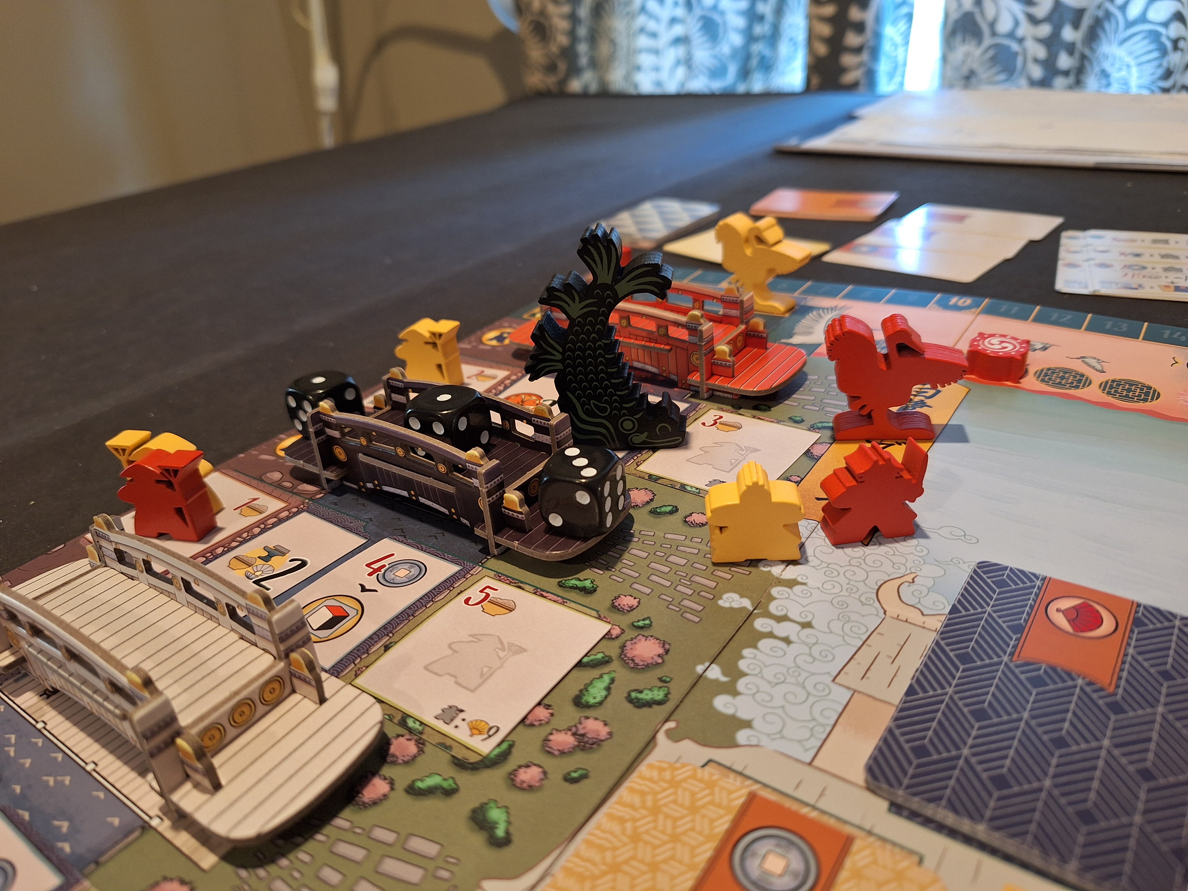
Let’s look at the picture I did take (that one is already on the table). This exemplifies what might be most important to deluxification: Attention in Detail, as opposed to Explosion of Bits. One chunky turn order marker carved into a Koi fish. A big ol’ Heron. Lovely cardboard bridges. These are all essentials to the game, just turned into something nice. Devir does this well. Allplay as well, just taking one thing that was already in the game and making it really nice, 1:1.
Re the wavelength question, I think I’m somewhere in the 60s. I like a bit of luxury baked in but not to take over the box. Just some spice to liven up the experience.
And it’s resolving into three catgories:
- Well crafted components (heavy, tactile, unique) that were already necessary for the game
- Good inserts that nail storage, setup, and table organization
- Art that turns the table into a canvas or a real setting
6 Likes