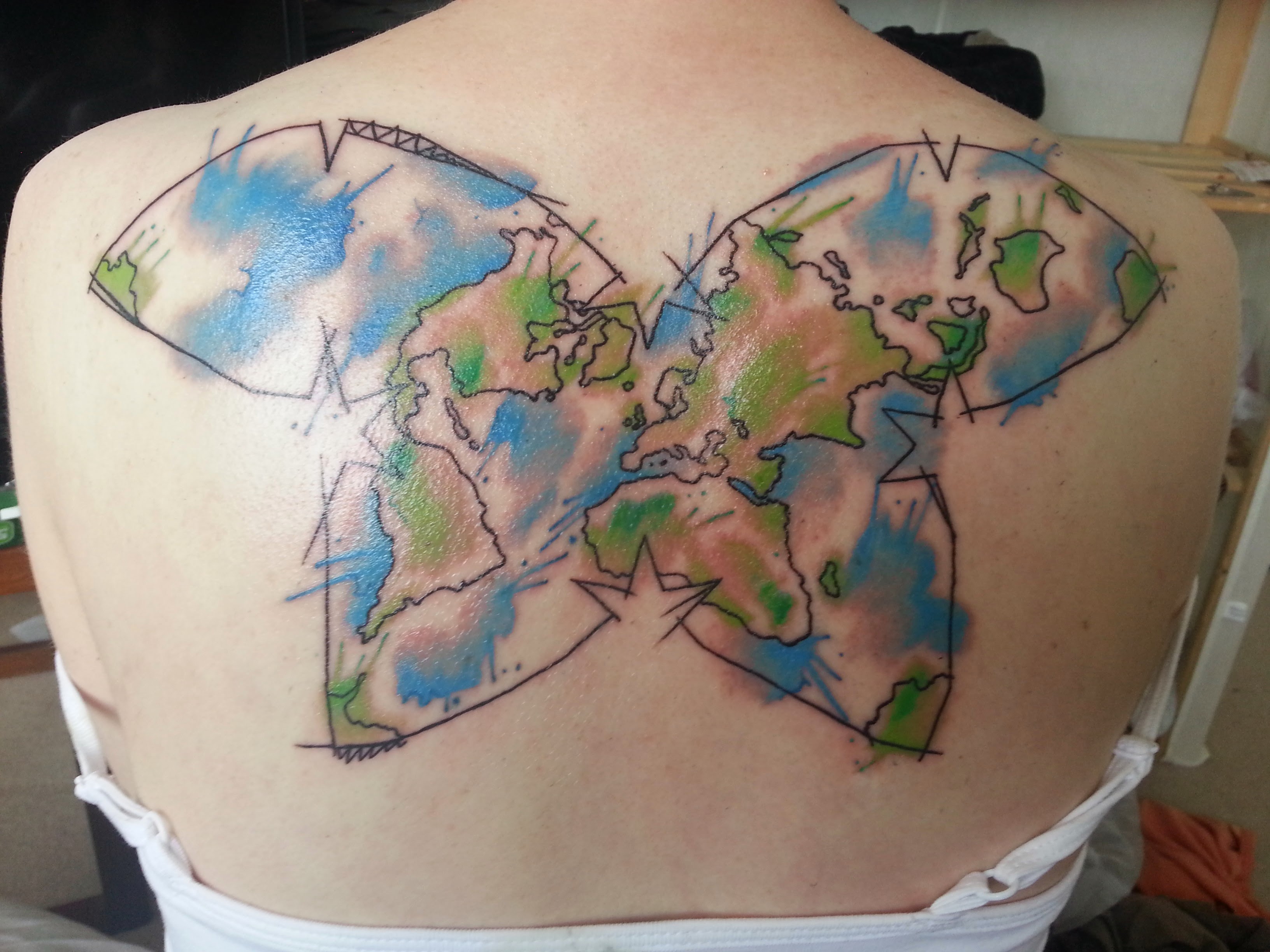
There was a slight digression in another thread on different types of map projections, that halted so not to divert discussion away from the topic at hand.
But I want to read more about people’s favourite map projections. Add some pictures, explain what great about your favourite, add in some interesting and unusual examples.
For a map at global scale, I’m usually trying to show which places do or don’t have some characteristic and therefore I look for an equal-area – usually Mollweide for simplicity. (I’m not really trying to say “the UK is north-west of France” on a map like that.)
Is anyone aware of a commonly-accepted population-distorted projection, so that equal populations map to equal area? Or GDP?
I’d be interested to see how a map like that defines the areas it uses. Does it treat the US as one entity, or does it acknowledge that it’s really multiple quite different areas with vastly different population densities? Similarly for places like Russia, Canada, or Australia where there’s lot of space, but a lot of it is sparsely populated.
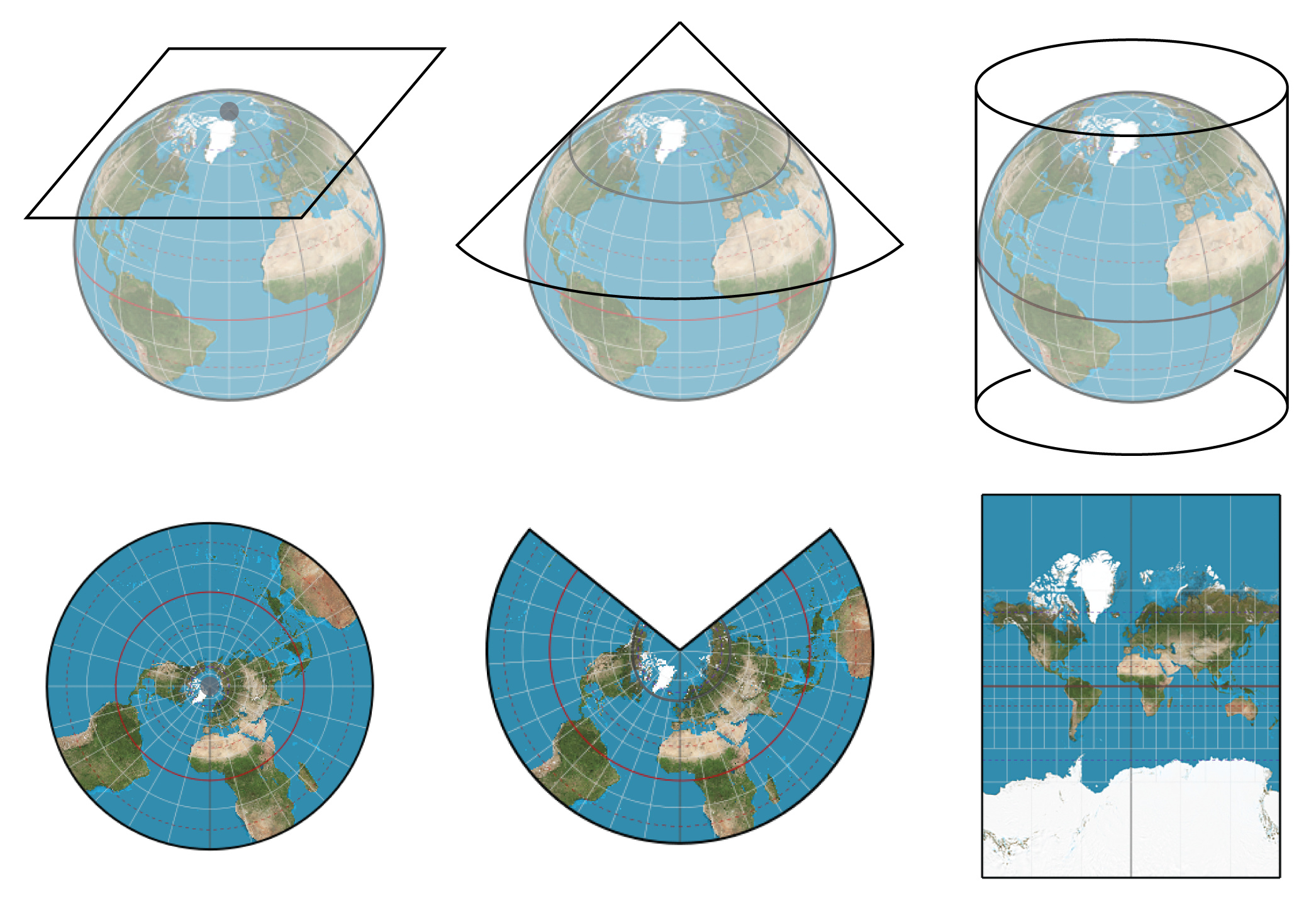
I’m not a cartographer, but I do work in a field that involves messing about with both projected and geographic coordinate systems, which can cause all sorts of fun problems.
(I suspect that’s only because lockdown has curtailed the outbreak of lobstering as summer arrived, or at least resulted in people not sharing their pink glowing skin outside their own homes)
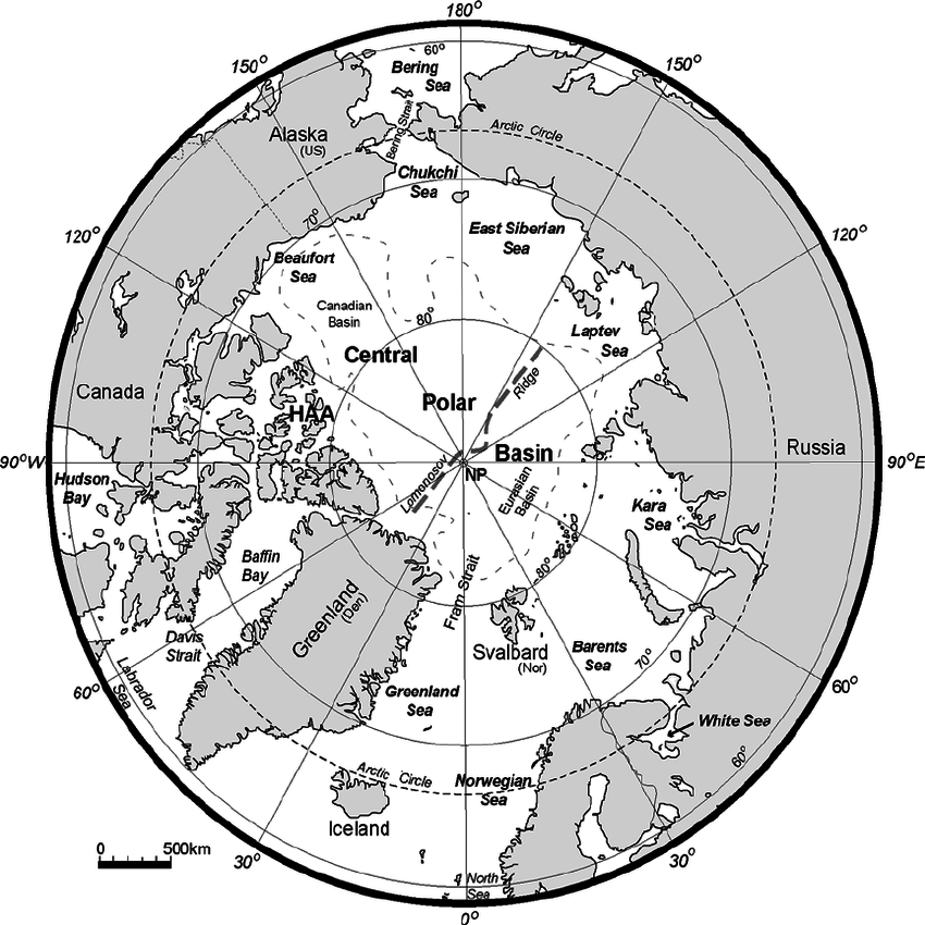
I tend to have fun where terrestrial meets marine. OSGB grid references, WSG84 lat and longs (with every unit under the sun), and UTMs variously used with no consideration of what other people on the same project might be using. The fun starts when they don’t bother writing down the geodetics and let you guess why your maps are nonsense
Bad enough that people on land, when telling you how to find them, will give an address (OK up to a point), directions (always terrible), or a Google map (centred not on the place but on its postcode, i.e. no better than the address but with spurious precision)… but hardly ever a simple WGS84 lat and long of where you are actually supposed to go.
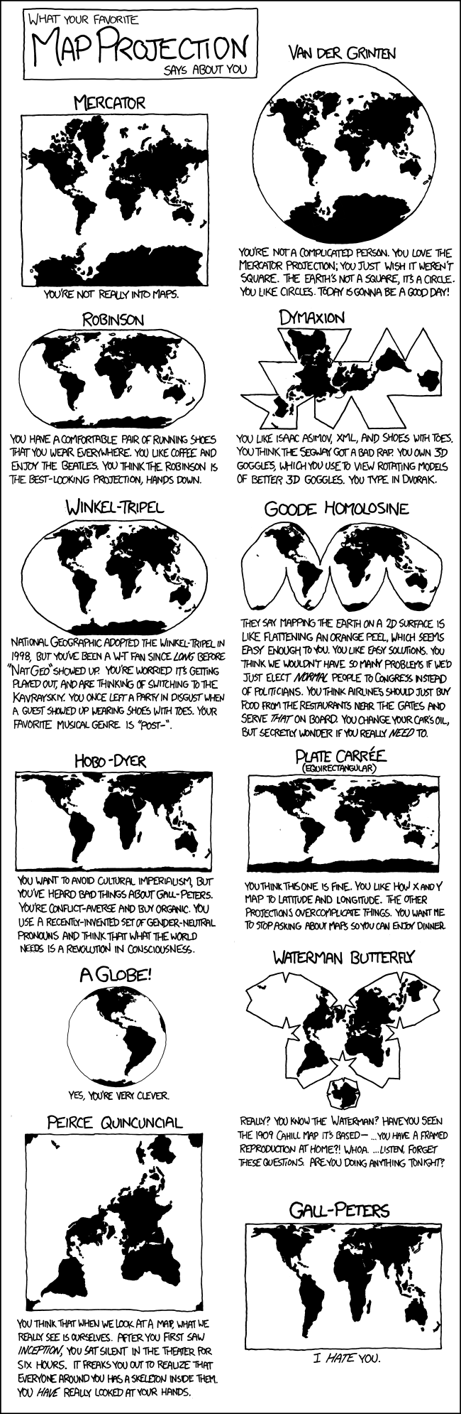
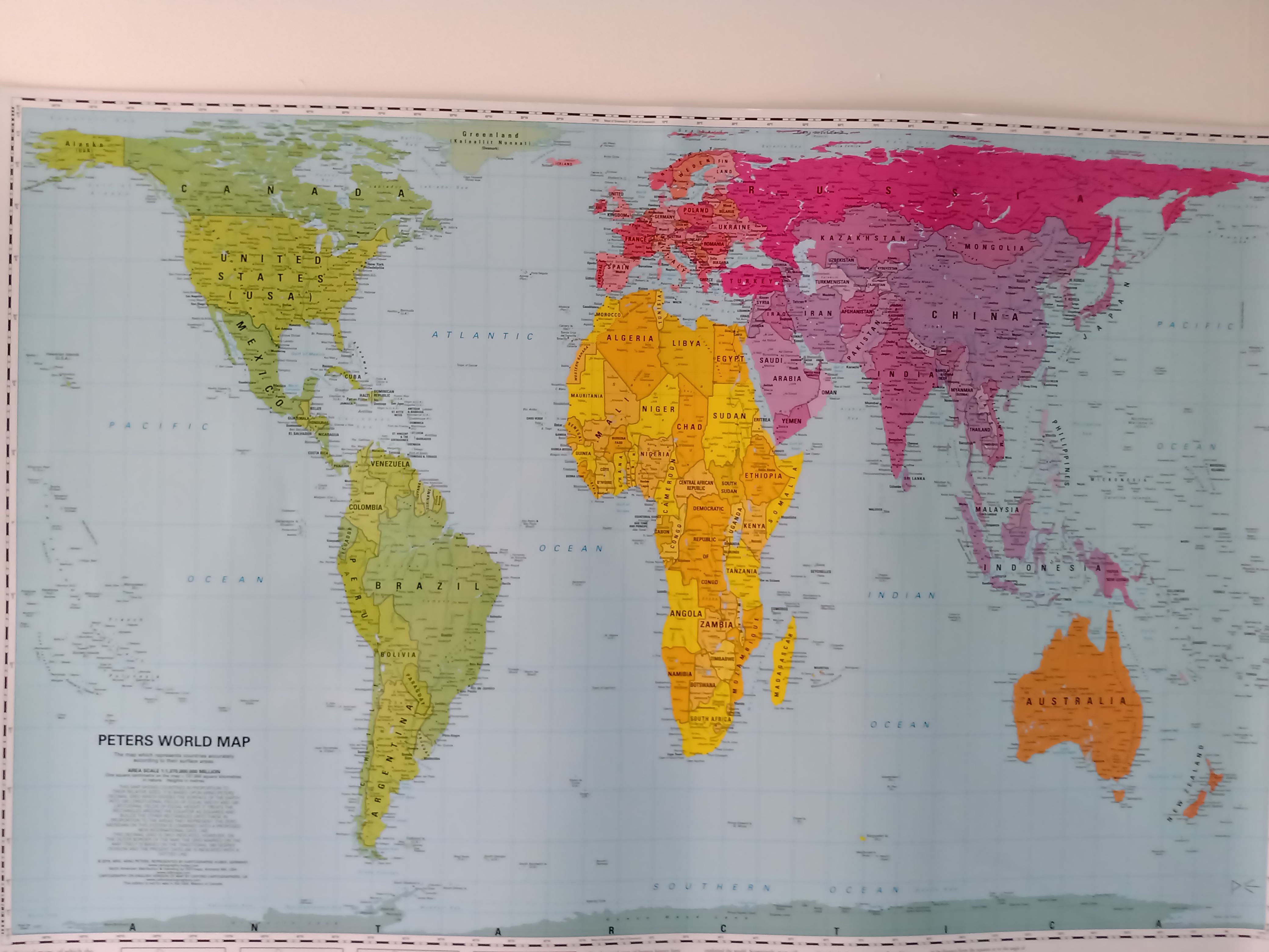
 ? I thought for sure Peters projection was amazing, especially for showing countries in their real sizes ! I had no idea it should be discarded!