A few samples from my collection:
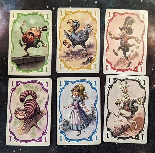
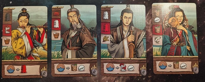
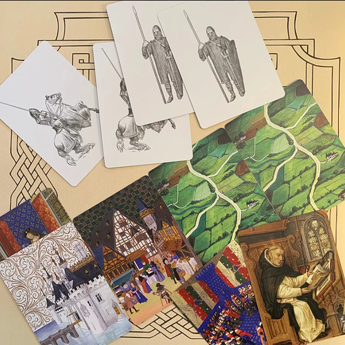
Very pretty cards. This is effectively my copy of Nokosu Dice (originally this is Parade in the non-German edition)
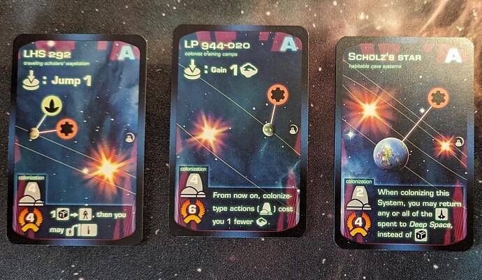
Next up an example of illustrations that are … functional? Possibly because the game was designed by a software developer? (not illustrated by one but it is entirely possible that that would be the look). Many people also hated a lot on the cover of Beyond the Sun which I actually liked.
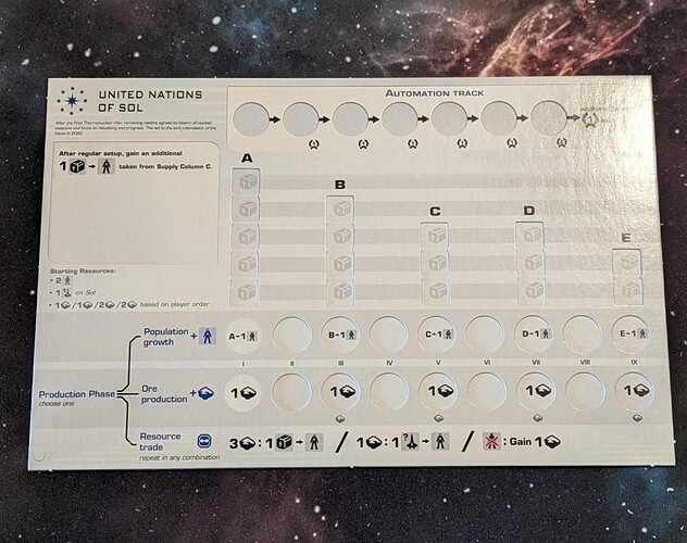
I must say, if you don’t want to go and invest in colors this minimalist approach with a small set of icons that are easily read is fine by me. The game speaks for itself and the way most actions explain themselves from the icons is very well done. The higher level ones get a little text but unlike an example further down this post the text actually fits on the cards which works for me.
Card art in BTS is also quite simple. But these cards have to give a lot of information so I guess a very illustration works best. I find it far more important to easily read which types of resources I get, if there is an ability when I get there and how much strength I need for colonization.
Very basic board. Compared with BTS this seems–despite the colors–even more basic. It is functional but nothing more. I wanted to contrast this one with BTS I admit

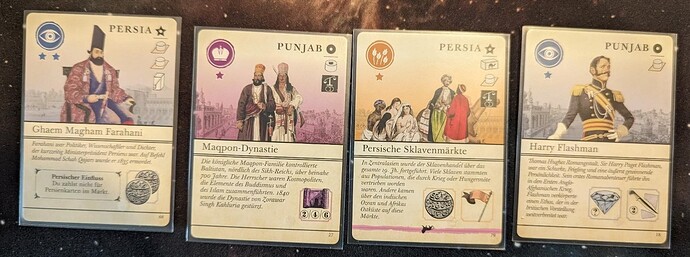
I like the general style of the cards in Pax Pamir 2. And luckily the number of action icons on the cards (bottom right) is not huge. Overall, once learned they are readable and someone took pains to match the backgrounds with the suits. This helps a lot.
For Legacy of Yu we did not get The Mico art–this is actually Shem Phillips himself credited here. The iconography is recognizable. It didn’t take long to learn it all and once you know the cards are easy enough to read. I think this is not a standout style but I found the overall look of the game pleasant.
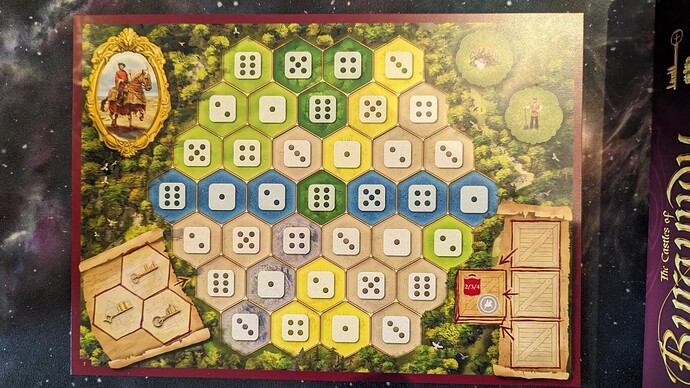
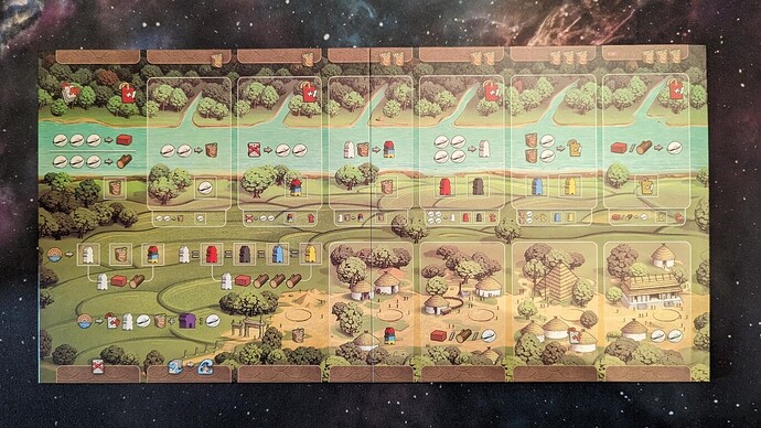
The board for Legacy of Yu has pleasant enough colors with enough contrast so the icons remain readable and its layout is generally useful. Most of it is covered by cards most of the time btw.
I don’t mind The Mico as much as others (yes yes “The” is a bit … The Doctor…) but the depictions of people take some getting used to. However, I found the iconography and illustrations in the West Kingdom trilogy a) consistent and b) useful. This was especially important for Paladins and Viscounts. Less so for Architects which is a bit simpler.
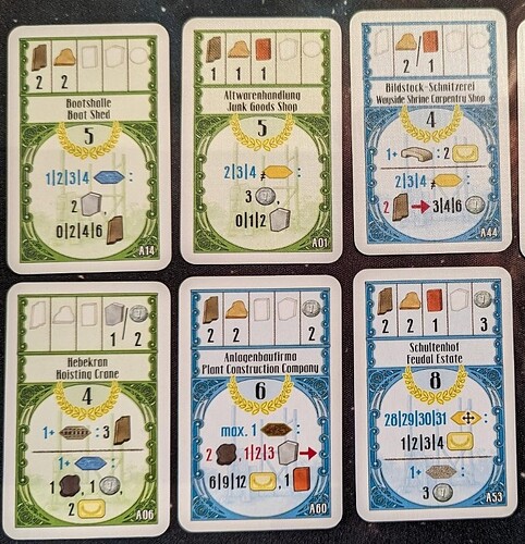
A game I previously complained about. These are cards from Oranienburger Kanal.
The top part which is the cost and the VP is ugly but fine. The general industrial look of the board and the other materials is fine. It matches the theme. I can even live with the yellow cover. And no it is nothing new that Uwe Rosenberg games come with a glossary explaining every single card because as much as he would like to icons do not suffice as can be seen here. But this oen really takes the cake with the attempt to make a language out of icons.
If you play this game a lot maybe you won’t need the glossary after a while. But there are 4 different decks of cards to use in the base game…
I usually run from ugly games… so imagine how good this game is that I am keeping it! Most Uwe games suffer from “meh-diocre” art at best…
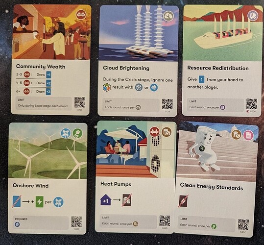
Daybreak is one of the better examples of how to make lots of cards work. The illustrations all have a consistent graphic style that is matched throughout the game. Consistency is key here because the actual style is fine by me but nothing I want to rave about … what is important is that most cards work easily without lengthy text. But they kept the amount of iconography limited and used some small amount of text where the icons will not suffice. Smart choice that. There is an internet glossary that I have consulted once!
