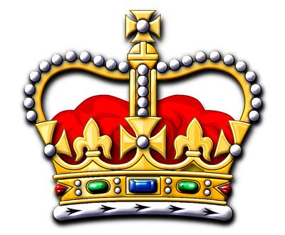
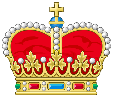
I don’t know whether you’ve ever noticed, but each monarchy that has an heraldic crown has a slightly different one. British royal crowns are depicted as having crosses alternating with fleurs-de-lis above the circlet (on English-Welsh crowns the crosses are crosses patée, on the Scottish crown, crosses crosslet ending in pearls), French crowns have fleurs-de-lis, others have various combinations of trefoils, decorative “strawberry” leaves, and pearls. British royal crowns have two arches crossing at the top and the sub-sovereign prince of Wales gets one, but on the Continent the sovereign gets four arches and the heir-apparent two. The arches may be smoothly rounded or may bulge before coming down to a depressed centre.
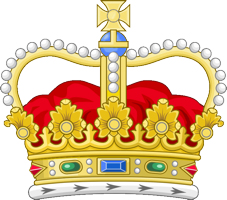
I don’t want to suppose that the graphic designers and neo-heraldic artists who designed the heraldic crown for the Empire simply did an image search and re-used some previous crown. But that’s all I’m really capable of myself. Ideally, the Empire’s heraldic crown ought to have the comparatively tall profile of the British “St Edward’s crown” so that it does not appear too squat in insignia like these:

![]()
That means that the ermine lining of the cap of maintenance ought to be depicted as protruding below the circlet, as in British convention.

The circlet ought to be set with conventionalised leaves that could be described as oak leaves, perhaps like this:

But perhaps without pearls decorating the leaves.
There ought to be three half-arches shown (as in British examples) because that is clearer, and the pearls on the arches ought to be few and large enough for the symbol to be represented at small size. The half-arches ought to bulge out at the sides and curve down at the top as in St Edward’s crown (above).
The mound (mundus) on the top ought to be sky blue (representing the “pale blue dot”) and surmounted by a cross patée in due proportion, with the arms about as wide as the ball, and with no pearl in the centre. (The cross is interpreted as part of the astronomical glyph for Earth, ♁, any possible Christian interpretation having been forgotten.)


